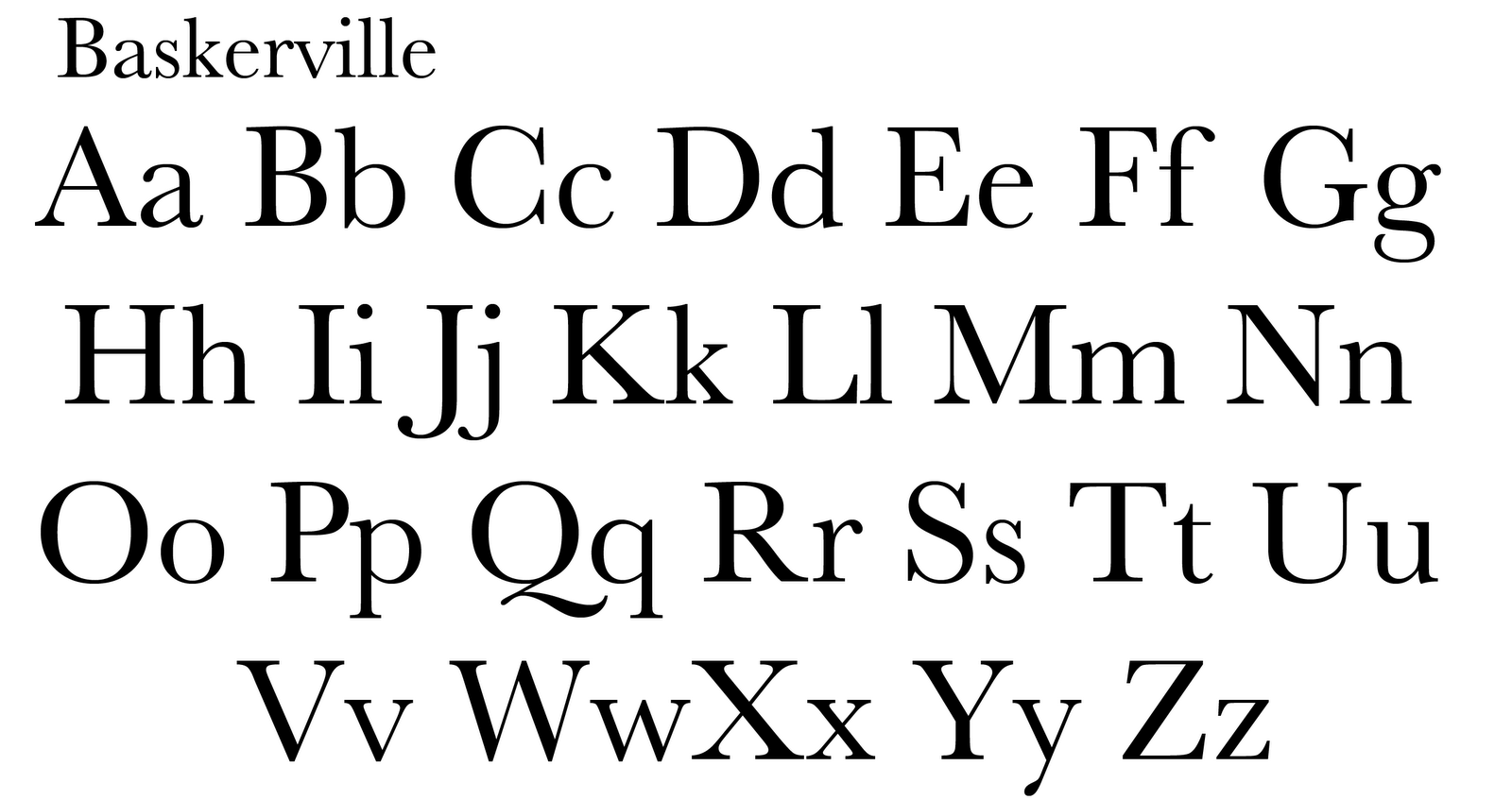
The research on the five classic typefaces has lead me to me picking Baskerville as my favorite type. Baskerville had a eye appealing class that I didn’t get from any of the other texts. After being able to recognize Baskerville I found the type on many brochures and magazines that had a sense of elegance, importance and exclusiveness. The Sculpted Serifs leave you with a nice disappearing sharpness that you don’t see in the other types, in the others you have an abruptness at the end of each letter. Curved brackets of Baskerville help transition the thick body into thin sharp ending of each serif. I also appreciated the fact that Baskerville was made in the 1700’s and is still relevant. Benjamin Franklin integrated this typeface into to a portion of the federal governments publishing.
The typeface I disliked was Bodoni. I felt as if Bodoni was unfinished having unsculpted serifs leaving a jagged and abrupt look to the typeface. I felt as if the thick to thin contrast was to great. Bodoni felt as if it had been deconstructed but too much had been removed leaving it bare. Unlike Baskerville smooth transitions Bodoni was all right angles with very thin serifs that are harsh on the eye.