Robert Thorne vs. Filippo Marinetti
Robert Thorne
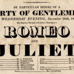
Robert Thorne, a British type designer developed a font that he named “FatFace” in 1803 (Industrial Expansion) which had a super bold look to it. This new font was used for posters, pamphlets and whatever was needed to be used on text to be extra eye-catching and to stand out. It originated from the term Egyptian serifs. Shortly after this the font started getting more creative having, shadows, inline, italics, and 3D characteristics added to it.
Filippo Marinetti
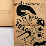
Filippo Marinetti created futurism work (1910-1918) he was a poet and writer, Marinetti created a work called “The Words to Freedom” about chaos of war. There are barely any images, just fonts laid out where “speed and noise” create visual poetry. The font was in swirls and had a lot movement which kept the eye busy and looking all over the page.
Comparison
Typography can be a very important part of graphic design, while reading through chapter 2 of Guide to Graphic Design the work by Robert Thorne and Filippo Marinetti really kept my interest. Both artist use typography to make art, without using many colors or images. If Thorne did not create the idea of “FatFace” maybe Marinetti would not have thought of “The Words to Freedom”.

