Piet Zwart
Piet Zwart lived from 1885 to 1977. He was a Dutch designer, typographer, photographer, and industrial designer. He worked in the Netherlands during the 1920s and 1930s. He worked for the NKF Company for a great deal of time. He was influenced greatly by Constructivism and De Stiji. This is expressed in his work as he often used primary colors along with black and white.
Bradbury Thompson
Bradbury Thompson was an American designer who lived from 1911 to 1995. He worked in a print shop in Kansas and later moved to New York in the 1930s. There he worked for Westvaco Paper Company, working on their periodical Westvaco Inspirations for Printers from 1938 until 1962. He was influenced by modernism. This is expressed in his work as he had very simple and rational designs rather than decorative ones.
Designer Comparison
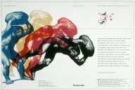
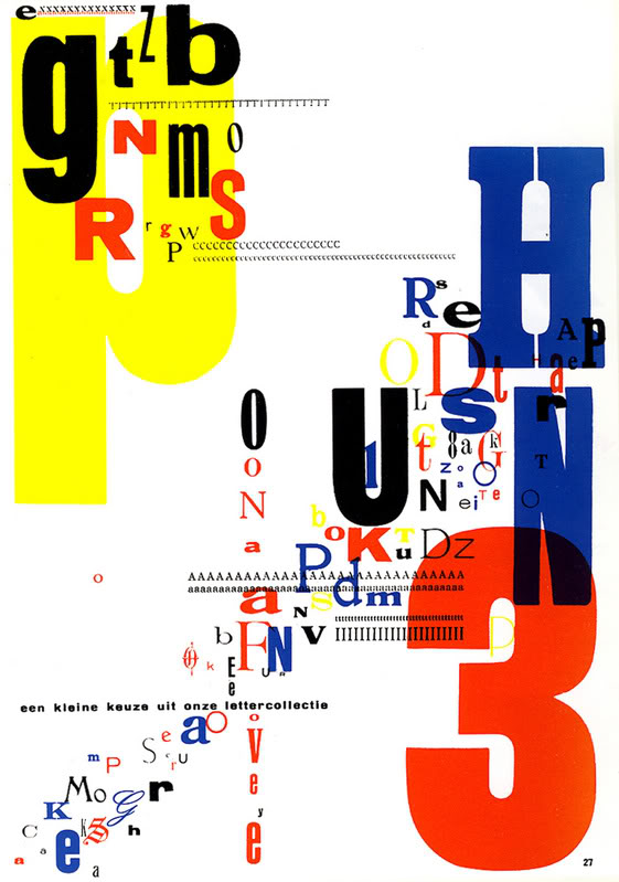
A personal logo designed by Piet Zwart and Bradbury Thompson’s spread from Westvaco Inspirations for Printers #152 have several similarities. These two works relate to each other in the sense that they both use solid colors. Zwart uses the primary colors while Thompson uses the four main printing colors. Neither work is clearly based on, or in response to the other. Thompson’s work was done about 20 years after Zwart’s, yet they are very similar in regards to color and overall composition. They are balanced in a similar way and are both complex yet simple at the same time. Both works are visually appealing and successful works.