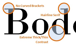
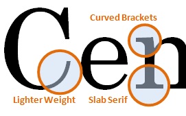
The two typefaces I chose are Bodoni and Century. Bodoni is more appealing than Century is because of it’s severe contrast between thicks and thins in the letter forms. The Century font has a slight difference between thick and thins, but it isn’t as noticeable or distinguishable. The contrast of weights within the letters of the Bodoni font makes it more modern looking and interesting. Having more similar thicks and thins doesn’t require the viewer to be as engaged by the type. It is easier for viewers to glance over the words rather than pay attention to the words created by the font. If viewers are not engaged by the font, then it is not doing it’s job.
The other main difference between the Century and Bodoni fonts is in their brackets. The brackets on the Bodoni font are completely straight, while the brackets on the Century typeface are curved. Although it can be argued that the curved brackets on the Century typeface is more visually appealing than the straightness of Bodoni type, it can be counteracted by stating that they are over-compensating for the lack of interest of the font because of the similar thickness of the letters. I do appreciate the flourish that the curved brackets bring to the Century font, but it distracts the viewer. Although it is not over the top like some elegant typefaces, it is enough for the viewer to focus on the form of the letters rather than the message the type is conveying. The curved brackets do not appear to have any function other than to be aesthetically appealing. Having straight brackets on the Bodoni font allows viewers to focus on the message of the words rather than the letters themselves. There is nothing unnecessarily added to the type. Having the bare minimum, but not to the extent of Helvetica, makes the Bodoni font more appealing and functional than the Century font.