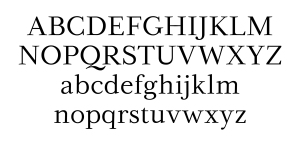
Out of the five classic typefaces, Baskerville is my favorite due to its drastic contrast in the thickness within the letters. This is very pleasing to the eye. As well as contrast in thickness, Baskerville has very dramatic Serifs. For example, the y and g specifically are fancy looking.
Without a doubt Helvetica is my least favorite font out of the five. It is the only font that does not have any serifs. Also It is one thickness throughout. In my opinion is just too boring. However, helvetica is one of the most commonly used fonts in the worlds. Commonly found in books and websites. Interesting fact, iOs also uses the font helvetica. It’s popularity is due to it being very easy to read. The main thing I do not like about helvetica is that the dot to the I’s are squares. Baskerville, however, uses cirlces to dot the I’s. That is my Baskerville is my favorite and Helvetica is my least favorite.