Brand and Identity Design:Art Director / Advertising
The two career paths I’m interested in is becoming an art director or something within advertising design. Being an art director requires artists to develop and create an overall visual appearance for a brand or company to bring in their target audience. I would like to go into Advertising Design or marketing communication to bring in the target consumer. One aspect I would like to experience in identity design is “branding” a company from the ground up.
When I took a semester off I went to different lectures within the Creative Design fields and advertising stuck out to me. I went to a lecture at SVA and seeing their work and how they developed a image that fit the brand so perfectly made me want to go in the field.
http://www.sva.edu/undergraduate/advertising
-Video/Images on page of advertising examples.
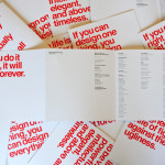
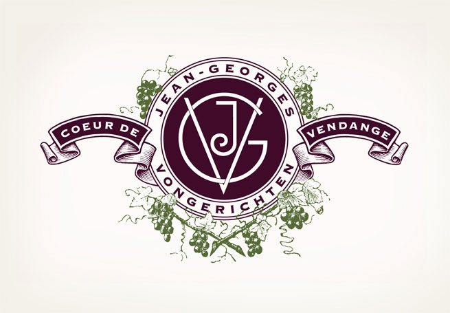
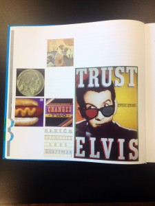
One of my favorite Graphic Designers is Louise Fili, who is featured in this months EYE issue. Within her work she has a common theme that many brands fit into. I would describe it as a elegant, old fashion, european (italian) with a simplistic design. She works off of old Italian Art Deco designs, which work with modern designs today.
http://www.louisefili.com/
-Different brands she has designed for and bio.
Publication Design: Art Director / Advertising
When working for an company an overall theme works better for me than doing freelance work. I need an object, subject, or common theme when it comes to my work or else it looks horrible. I realized I wanted to be an art director when I had an internship with a “Swag” Company. They resourced items, such as an bag, pen, or shirts, with the company’s logo and designs on them. So I was able to work with art directors and designers in creating, for instance, a BMW bag.
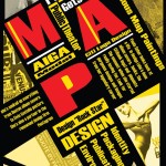
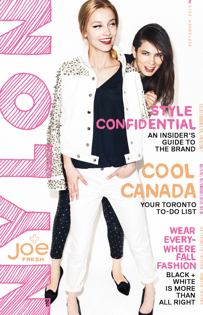
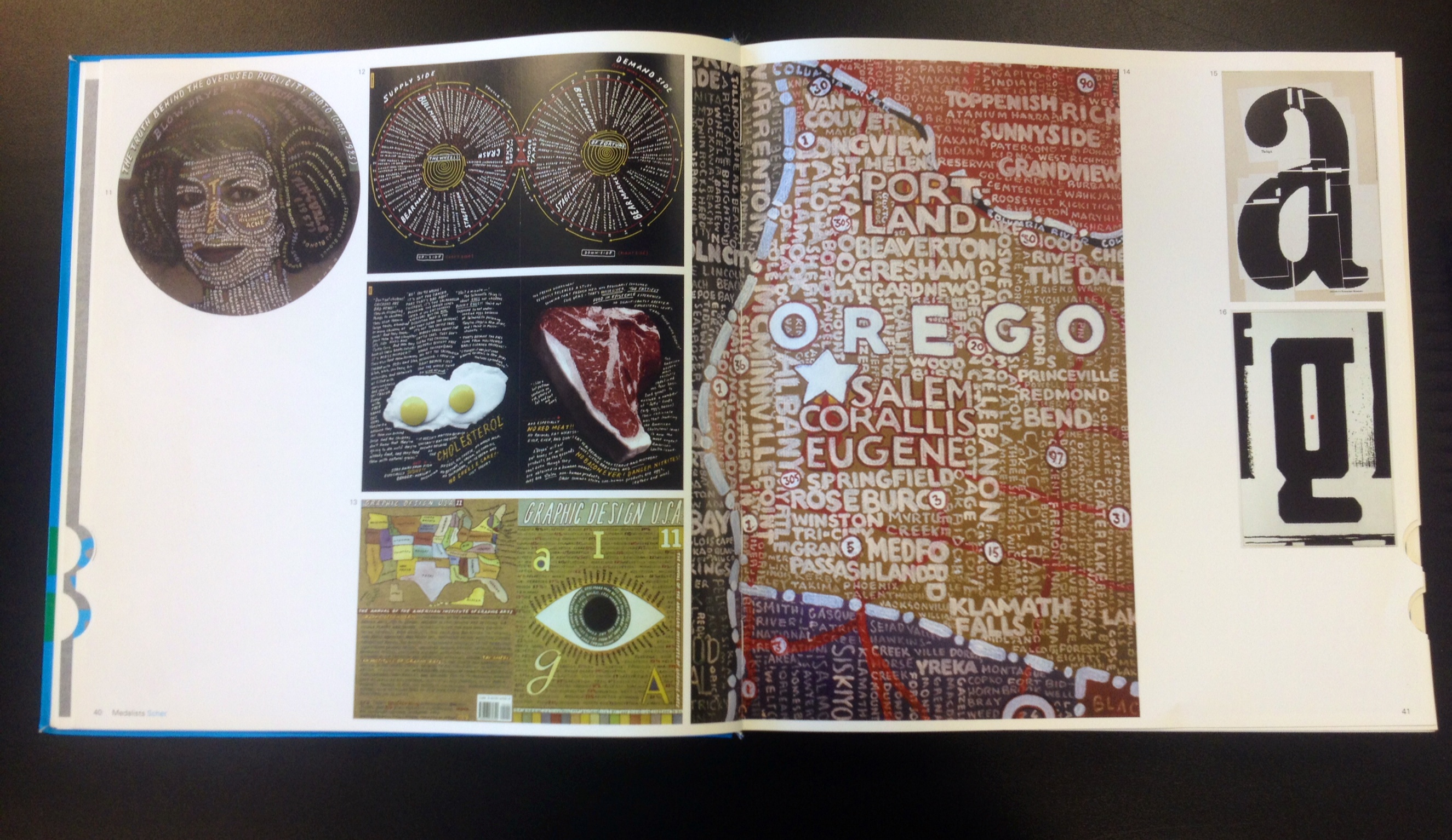
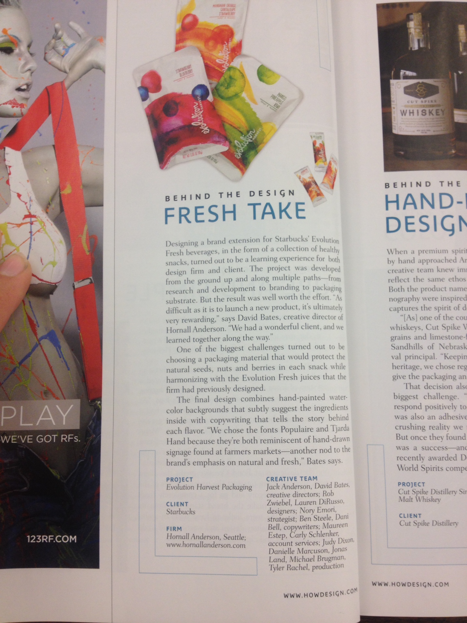
Art Directors are not always in the light as much as the artists and photographers are but I would like to become specifically an magazine art director. I love putting together and collaging spreads from an magazine. One of my favorites is Nylon Fashion Magazine. This small magazine has a great eye for detail and knows how to brand themselves on the web even better. Another magazine that is great is HOW magazine. There layout is clear and organized and looks almost like webpage itself.
This month’s issue of HOW is Adam Ladd.
http://www.ladd-design.com/index.html
-Great ideas on what Branding is, and what makes a good overall look for a brand.
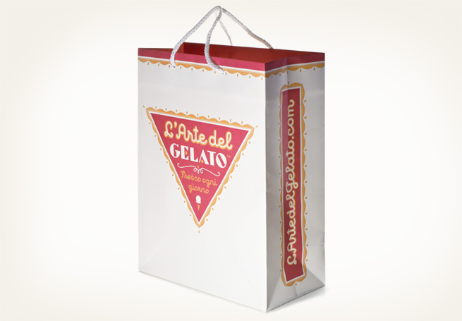
This month’s issue of Nylon is Haley Stark.
http://haleystark.com/
-Website underconstruction, but great examples of how the magazine’s image is very consistent.
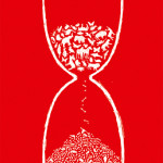
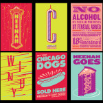
Research Photos:

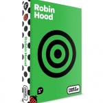
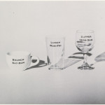
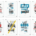
Above are examples from Louise Fili.

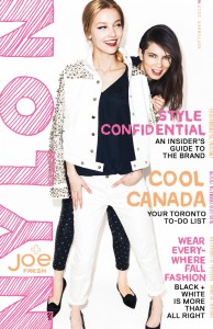
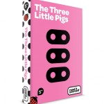
Above work from Haley Stark.


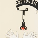
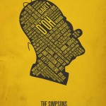
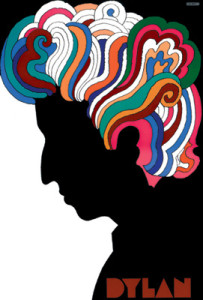 Dylan, Milton Glaser, 1966
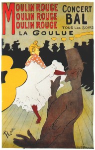 Moulin Rouge, Henri de Toulouse-Lautrec (1891)