By Chandler Ives

Random Words

50 Random Words


  1. Energy
  2. Fedelini
  3. Moat
  4. Muscle
  5. Priest
  6. Rat
  7. Summer
  8. Swim
  9. Territory
  10. Wolf
  11. Alligator
  12. Alto
  13. Freckle
  14. Helmet
  15. Hose
  16. Purchase
  17. Spandex
  18. Sunshine
  19. Swamp
  20. ThursdayTop of Form
  21. Amusement
  22. Attack
  23. Cheque
  24. Daniel
  25. Daughter
  26. Partner
  27. Reading
  28. Refund
  29. Step-aunt
  30. Tendency
  31. August
  32. Bag
  33. Blanket
  34. Lentil
  35. Nitrogen
  36. Pantry
  37. Pepper
  38. Seal
  39. Tent
  40. Wind
  41. Adapter
  42. Agreement
  43. Anime
  44. Building
  45. Dock
  46. Nest
  47. Persian
  48. Powder
  49. Ravioli
  50. Singer


Pairs:


  1. Anime, Wind
  2. Singer, Ravioli
  3. Tent, Seal
  4. Nitrogen, Blanket
  5. Lentil, Pantry
  6. Pepper, Nest
  7. Persian, Adapter
  8. Re-fund, Step Aunt
  9. Muscle, Priest
  10. Energy, Rat
  11. Alto, Freckle
  12. Summer, Territory
  13. Wolf, Alligator
  14. Amusement, Helmet
  15. Daniel, Attack
  16. Swamp, Partner
  17. Ravioli, Building
  18. Persian, Nest
  19. Hose, Wind
  20. Singer, Moat


The Design and the Play

The article The Design and the Play focuses on how to engage design students and encourage their creativity. Rand says in the article that most of a students success will depend mainly on their natural talent. He later goes on to talk about two different types of design assignments, one of which is seen in a more professional setting which has lots of limitations and rules and one that has more opportunity for abstract art and no creative limitations. After reading this I think it is important to emphasize that designs have to be more than just aesthetically pleasing, they must have meaning behind them. Although you may be able to get away with making good looking pieces for clients with no meaning behind them, you would be a much more accomplished designer if your work has true meaning behind it. Out of all of the examples Rand chose to display in the article I liked Mattise’s composition the best because of its simplicity.

The Five Classic Type Faces

Helvetica

After learning about the five classic type faces, Helvetica is still my favorite because of how easy it is to work with in Graphic Design. The other four fonts are more stylistic with their variety in line size and serifs, because of this people may favor them because they are more visually pleasing. The reason I still favor Helvetica is because of it’s simplicity and how universal it is. Another type face out of the five that I favor is Century, it is one that everyone has heard of and is the second simplest out of the five.

Helvetica pic

Design Comparisons

Paul Rand

Paul Rand is an American designer who is most noted for his logo design. Some of his most recognized logo designs are ABC, IBM, UPS, and many others. Some of Rand’s most famous work was for the magazine covers of Direction magazine, Rand did these designs for no fee granted he could have full artistic freedom.  Another designer who I found interesting was Peter Behrens, who was a German architect and designer. I’m going to be comparing one of Behrens pieces to Rand’s IBM poster.

ups-logoibm-logo abc-logoibm-poster-design


Peter Behrens

Behrens, who was a German Architect and Designer was very important to the modernist movement, which is essentially the dynamic expression of abstract form, while being used for practical manners. Behrens is responsible for designing AEG from the ground up, this is also known as brand identity. He designed their logo, packaging, and everything else in between.

aeg

The piece from Behrens that I am going to be comparing with Rand’s IBM poster is Behrens poster for AEG electric lamps, and is pictured below.

These two pieces are comparable because they are examples of historic pieces of Graphic Design from the 1900’s. It is interesting because they are both marketing tools for two different corporations which the designers worked for. Rand worked for IBM while Behrens worked for AEG. Rand’s poster is an example of design being simple, yet effective. The poster uses symbols for each letter and is a creative solution to the design problem. Behrens poster is a poster for electric lamps that uses circles repetitively around the focal point (the lightbulb) and the typography up top. The poster uses three different colors, all of which work well together. In my opinion Rand’s poster is a stronger design because of the color theory, and simplicity.

lamp poster

Graphic Design Is

Graphic Design Is…

My definition: Graphic Design is the art of visually representing something in efforts to make an impact on an audience. Terms that come to mind when thinking about Graphic Design include color theory, typography, negative space, creativity and expression, amongst many others that are included in my list below.

  • Creativity
  • Relaying a message
  • Typography
  • Iconography
  • Imagery
  • Color Theory
  • Expression
  • Imagination
  • Art
  • Combining pictures with words
  • Individuality
  • Advertising
  • Marketing
  • Branding
  • Tangible
  • Communication
  • Stylizing
  • Visualization
  • Visual arts
  • Page layouts
  • Historic
  • Lines
  • Simplicity
  • Composition
  • Organization
  • Designing logos
  • Making an impression
  • Symbolism
  • Shapes
  • RGB CMYK
  • Concepts
  • Proportion
  • Aesthetics
  • Cultural
  • Publishing a finished product
  • Informative
  • Passion
  • Influencial
  • Useful
  • Structural
  • Functional
  • Dimensional
  • Digital
  • Revolves around technology
  • Useful
  • Modern
  • Technical
  • Psychedelic
  • Turning ideas into a design
  • Individuality

Quotes from famous designers

Design is a way of life, a point of view. It involves the whole complex of visual communications: talent, creative ability, manual skill, and technical knowledge. Aesthetics and economics, technology and psychology are intrinsically related to the process.

Paul Rand


Graphic design is the paradise of individuality, eccentricity, heresy, abnormality, hobbies and humors.

George Santayana


Graphic Design, which fulfills aesthetic needs, complies with the laws of form and exigencies of two-dimensional space; which speaks in semiotics, sans-serifs, and geometrics; which abstracts, transforms, translates, rotates, dilates, repeats, mirrors, groups, and regroups, is not good design if it is irrelevant.

Paul Rand

“I strive for two things in design: simplicity and clarity. Great design is born of those two things.”

-Lindon Leader


“Design is intelligence made visible.”

 –Alina Wheeler

Inspirational Images


Thumbnails


What is Graphic Design?

Chapter 1 Response

Through reading Chapter 1 in Guide to Graphic Design by Scott W. Santaro, I was able to explore the different areas of Graphic Design. Almost all of the different fields were interesting to me but a few of them stood out more than the others.

Interaction Design

The first area from the reading that I could vision myself doing down the road is Interaction Design. Interaction Design is a computer based medium which designers create final products which users interact with either on a computer, or with touch screen devices. This area is more commonly known as website design. The thing that interests me most about this area is the ability to customize virtually anything you want. Also you are able to make your graphics come to life with things like scroll over effects, and various animations.

Portfolios in Interaction Design:

William Beachy  (info page)

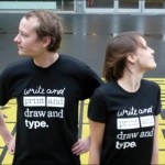
Ethan Marcotte  (personal portfolio)

Dan Cederholm  (personal portfolio)

Type Design

The second area, which interested me as a potential career path from chapter 1, is Type Design. I think type design would be an interesting path because you are essentially creating something that may be used by hundreds of others down the road. I think I would be a good fit for type design because it goes hand in hand with logo design, which is something I consider one of my more successful areas.

Portfolios in Type Design:

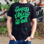
Sean McCabe  (personal portfolio)

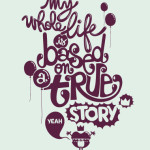
Jordan Metcalf  (personal portfolio)

Logo Design
The last area from chapter 1 that I could see myself doing as a career path is logo design. This is an area that I’ve worked with quite a bit and can see myself doing down the road. This field is also essential to Brand and Identity design, which is what it is classified as in the book.

Portfolios in Logo Design:

Ivan Chermayeff  (personal porfolio)

Tom Geismar  (company website)

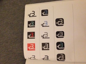
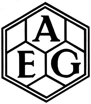
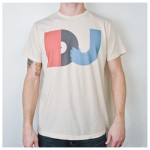
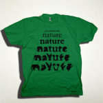
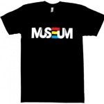
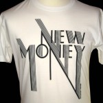
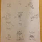
Here are a few logos that I personally have created in the past:
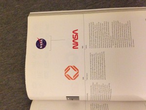
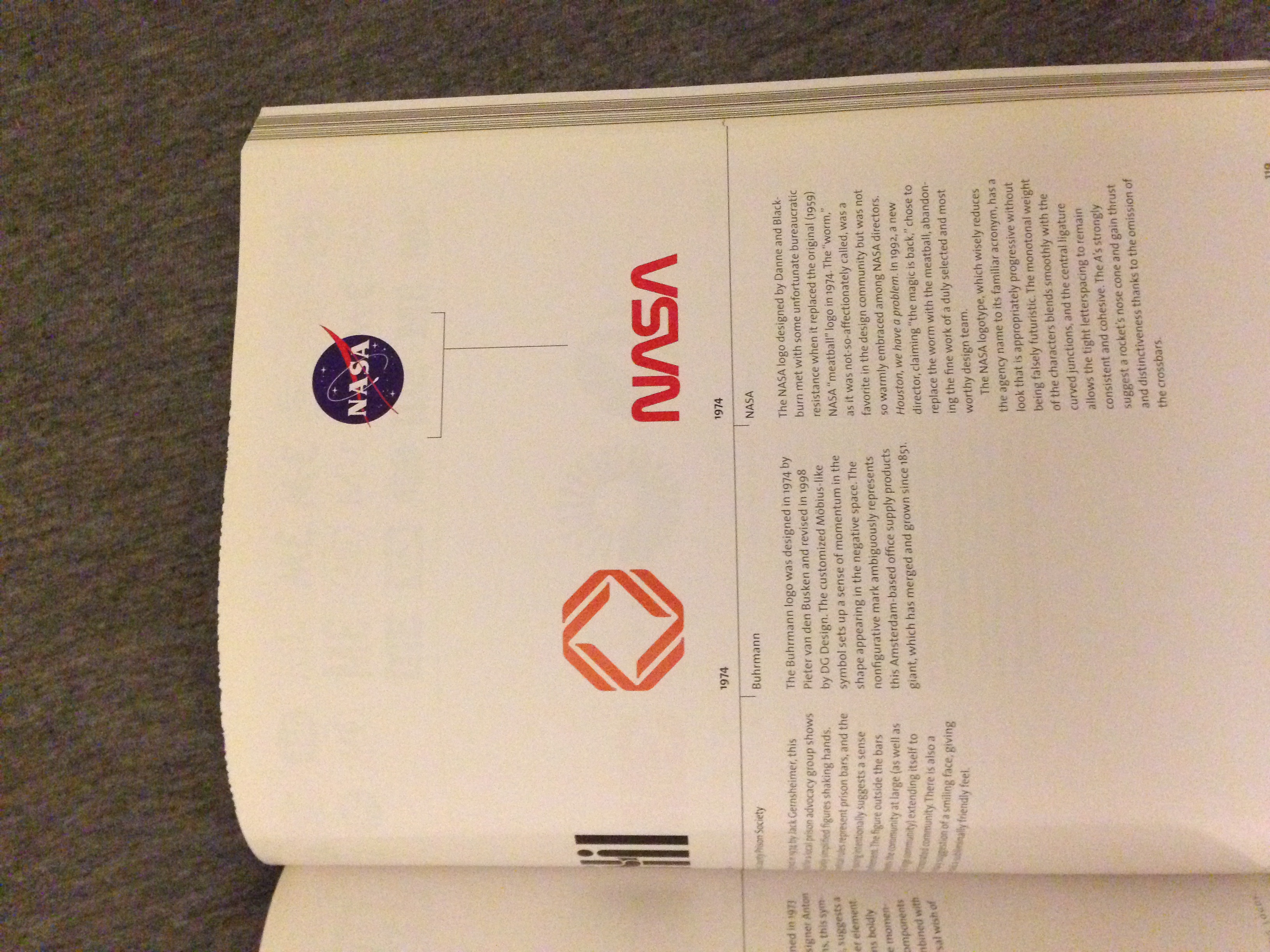
nonawnsenselogo

Tape2Tape-Logo
Tape2Tape-profile-Pic

Book Research 

The book I researched from the library is called Designing Logos, by Jack Gernsheimer. The book shows examples of famous logos that have been created in the past, and talks about the process designers should take when designing a logo.

IMG_2387

IMG_2388 IMG_2389