By Courtney Bethel
Random Words
50 Words:
- phone
- pen
- paper
- lights
- water
- pizza
- cat
- doctor
- police
- angel
- time
- box
- finger
- Channing Tatum
- book
- dreams
- music
- sunshine
- duck
- dragon
- Spain
- home
- chocolate
- owl
- mustache
- purse
- leaves
- scarves
- rainbow
- America
- school
- tattoo
- Harry Potter
- baby
- nail polish
- car
- bunny
- makeup
- flag
- sweater
- summer
- cake
- cow
- monster
- snowflake
- elephant
- Autumn
- shell
- sword
- stone
20 Pairs:
- pizza flag
- elephant shell
- mustache cow
- paper car
- doctor bunny
- summer sweater
- angel time
- sunshine owl
- Harry Potter nail polish
- stone water
- rainbow cats
- chocolate home
- finger dragon
- Autumn pen
- America Spain
- duck police
- phone dreams
- makeup lights
- cake music
- snowflake monster
Design and Play
The article by Paul Rand talks about how all students should be taught rules for designing, and not relying only on their natural talents. However, he mentions that no matter how hard you study, “a students ultimate success will depend largely on his natural talents…” I understand why he says this, but at the same time I believe that if you work hard, you will be rewarded later in life. One of the things that Rand mentions, is that when students aren’t taught these rules they become “handicapped by the absence of certain disciplines…” which I agree with. Graphic Design isn’t the hardest major out there, but that doesn’t mean that it doesn’t require dedication, talent, and a basic understanding of what looks good and what does not. He also talks about how “without rules or disciplines, the students will have no motivation, test of skill, or ultimate reward – in short, no game.” Unfortunately, I think that this is where most of our generation is headed.
5 Classic Type Faces
After looking at the five type faces, Helvetica is my favorite, followed closely by Century. The reason that helvetica and century are my favorites is because of their simplicity. Both of these fonts, to me, are very eye catching as well as very legible. Whatever project you are doing, you can use either of these fonts and it is easy to make it work with a design. I also really like how century has a sort of cursive effect to its letters, like the “t” and “y”, unlike all of the other options. Helvetica doesn’t have any serifs which makes it unique, compared to the other four. I think both of these fonts have a professional effect to them which also makes them more appealing.
Design Comparison
Paul Rand (1914-1996)
Paul Rand was considered to be one of the most influential American graphic designers of his time, and looking at his work I can see why. He designed many posters and corporate identities, including the logos for IBM, UPS and ABC. Rand studied at the Pratt Institute from 1929 to 1932, and the Art Students League from 1933 to 1934. He taught design at Yale from 1956 to 1969, and beginning again in 1974. He was interested in Modernism and logo designs which is what he did with his career. I really like his logo designs, because he helps prove that great works wont go out of style.
Ivan Chermayeff (b. 1932)
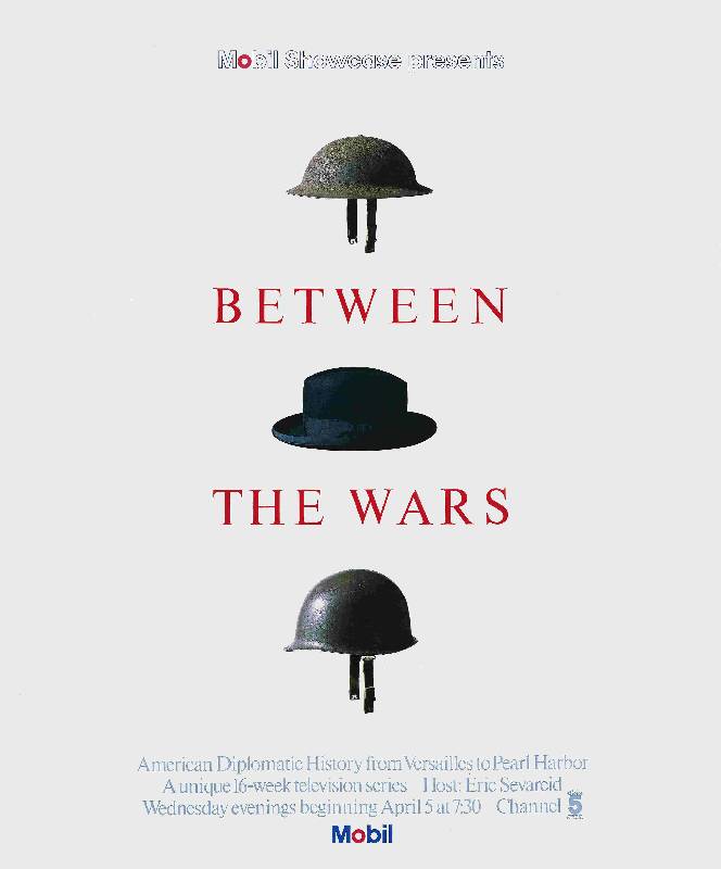
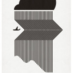
I really like Ivan Chermayeff’s poster Between the Wars because it is a very simple way to convey a huge message. Once I started looking into his work, I realized that he has created a vast majority of logos that are still popular today. He has created logos for Showtime, NBC, The Museum of Modern Art and many more. Chermayeff studied at Harvard University, the Institute of Design in Chicago, and graduated from Yale University, School of Art and Architecture. In 1956, Chermayeff and Tom Geismar began their firm Chermayeff & Geismar & Haviv and they are still designing today, almost 60 years later. Chermayeff was interested in Advertising Design, and almost all of his works have been advertisements, or logos for companies.
Paul Rand and Ivan Chermayeff are very similar in the fact that they are both graphic designers that focus on logos, but have both branched out and done books as well as posters. Rand was Chermayeff’s teacher at Yale and he then became one of Chermayeff’s biggest inspirations. Chermayeff mentions that not only was Rand an inspiration, they were good friends. I think that Chermayeff’s work reflects the simplicity and timeless effect of Rand’s work.
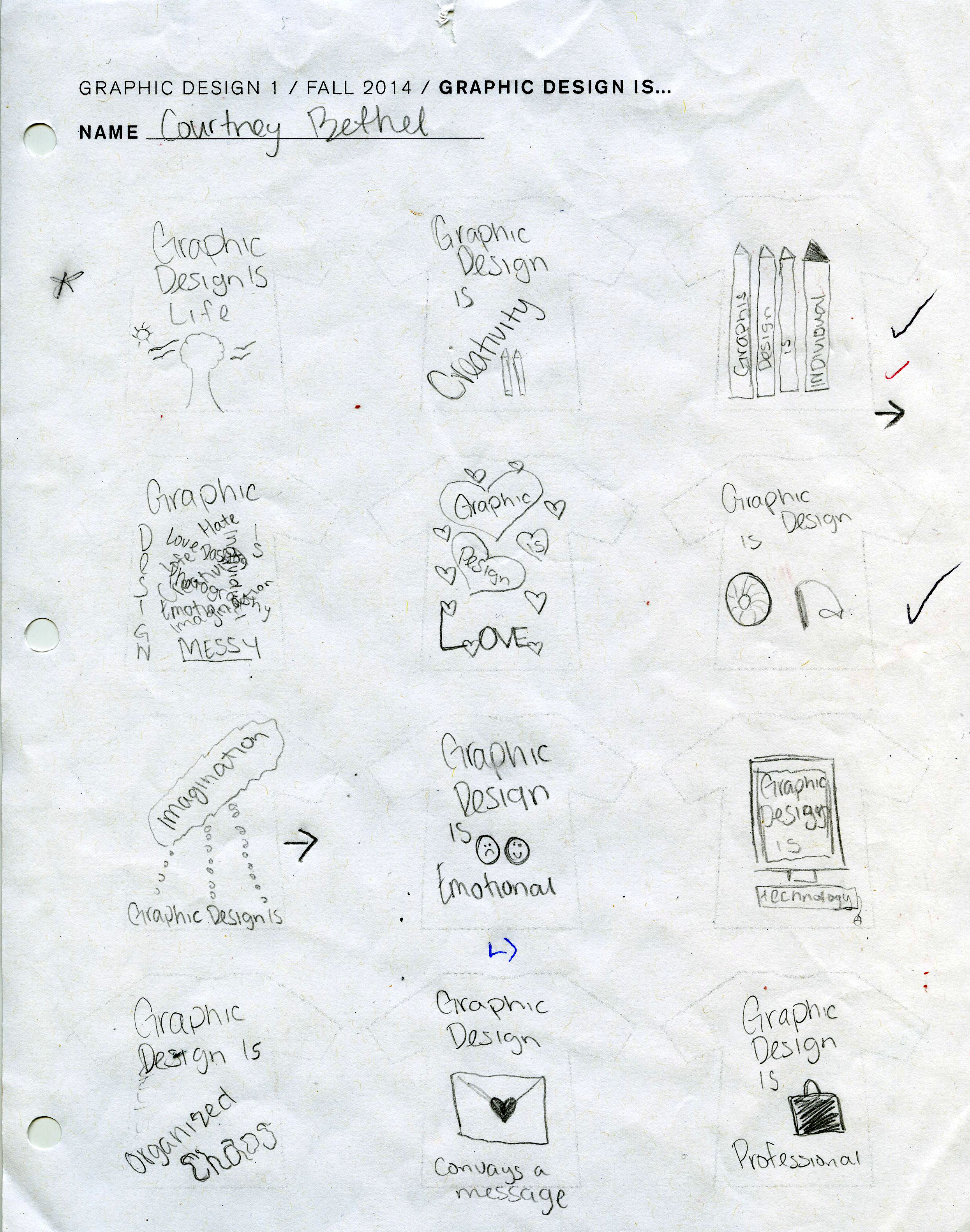
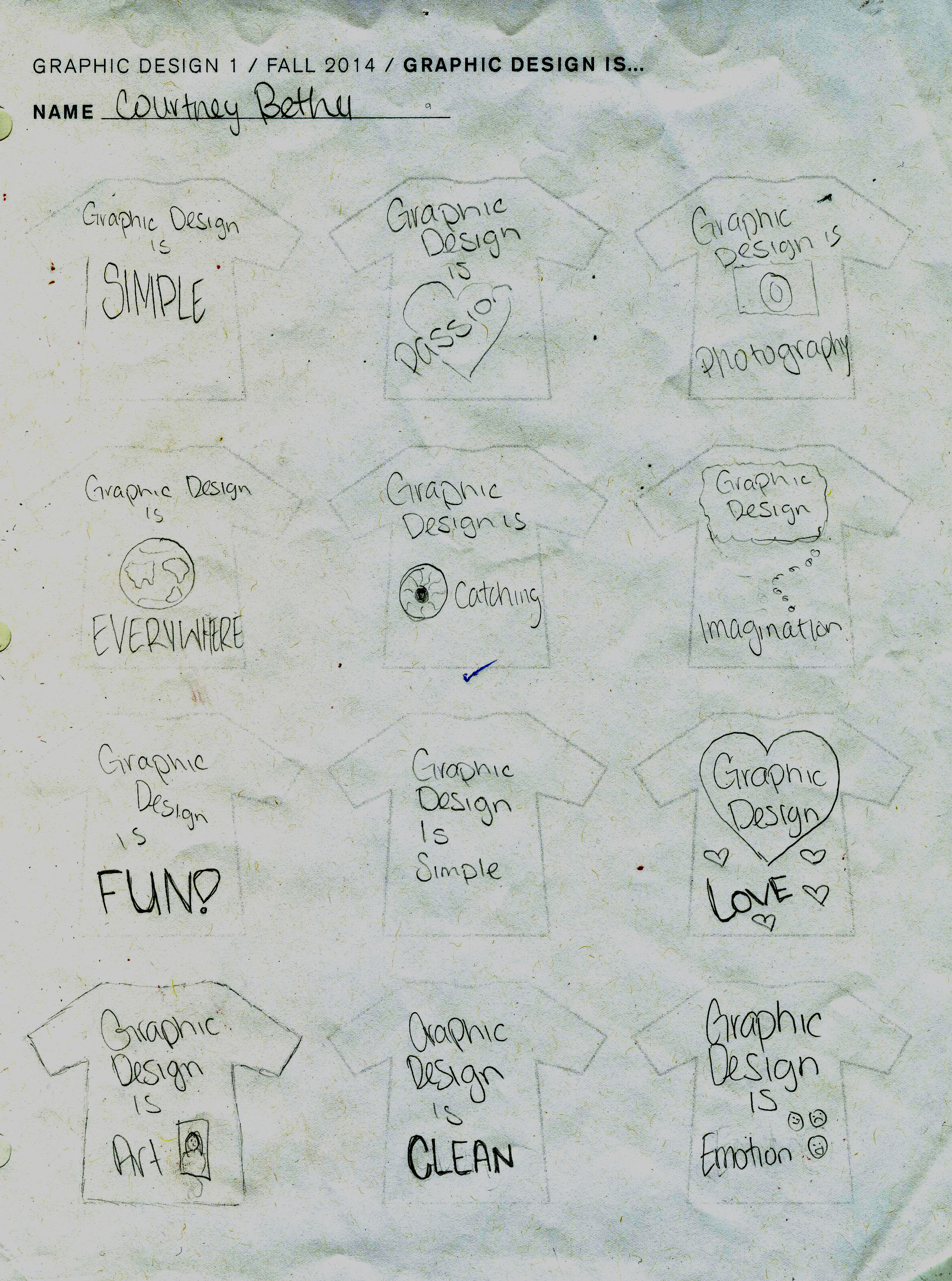
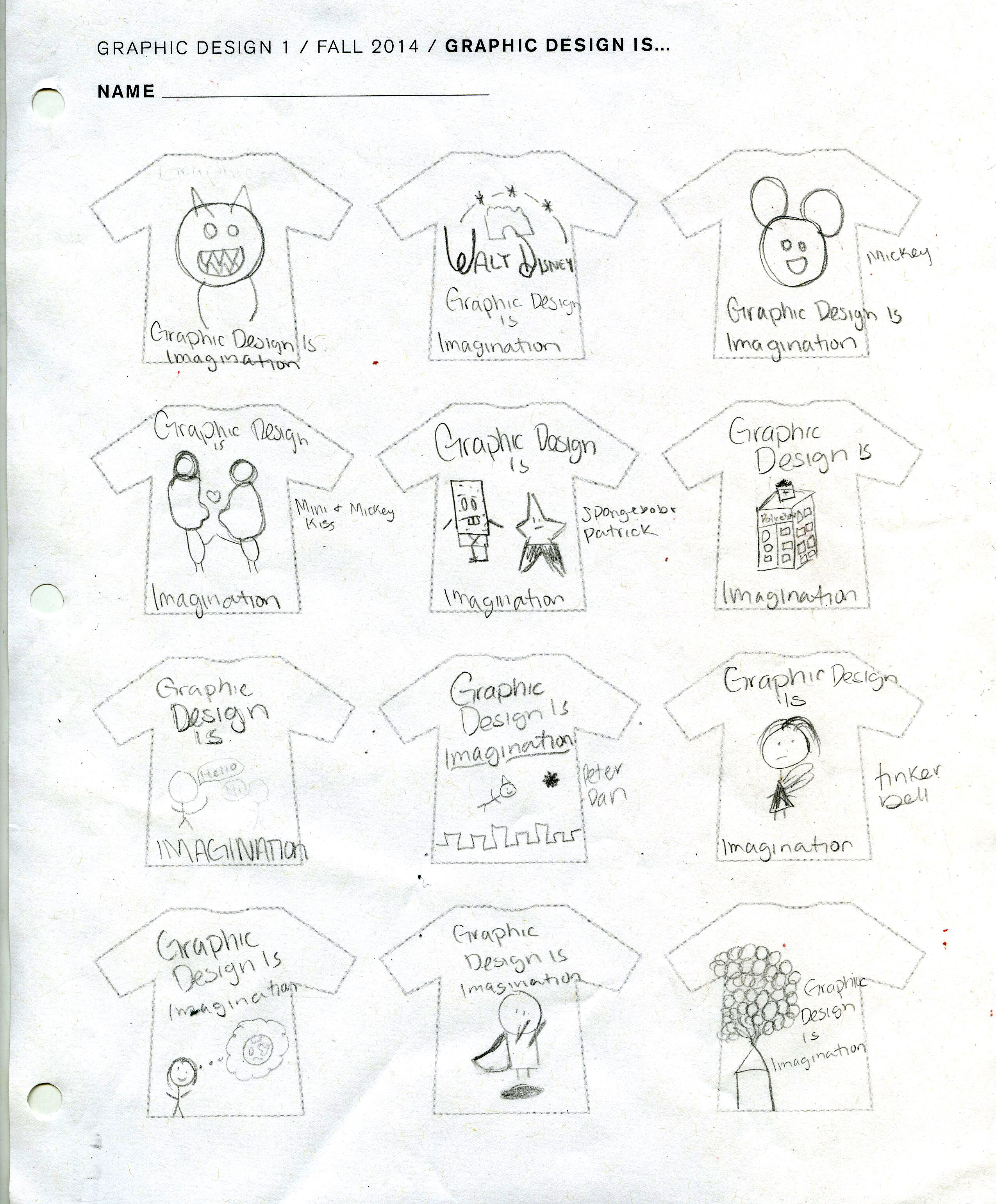
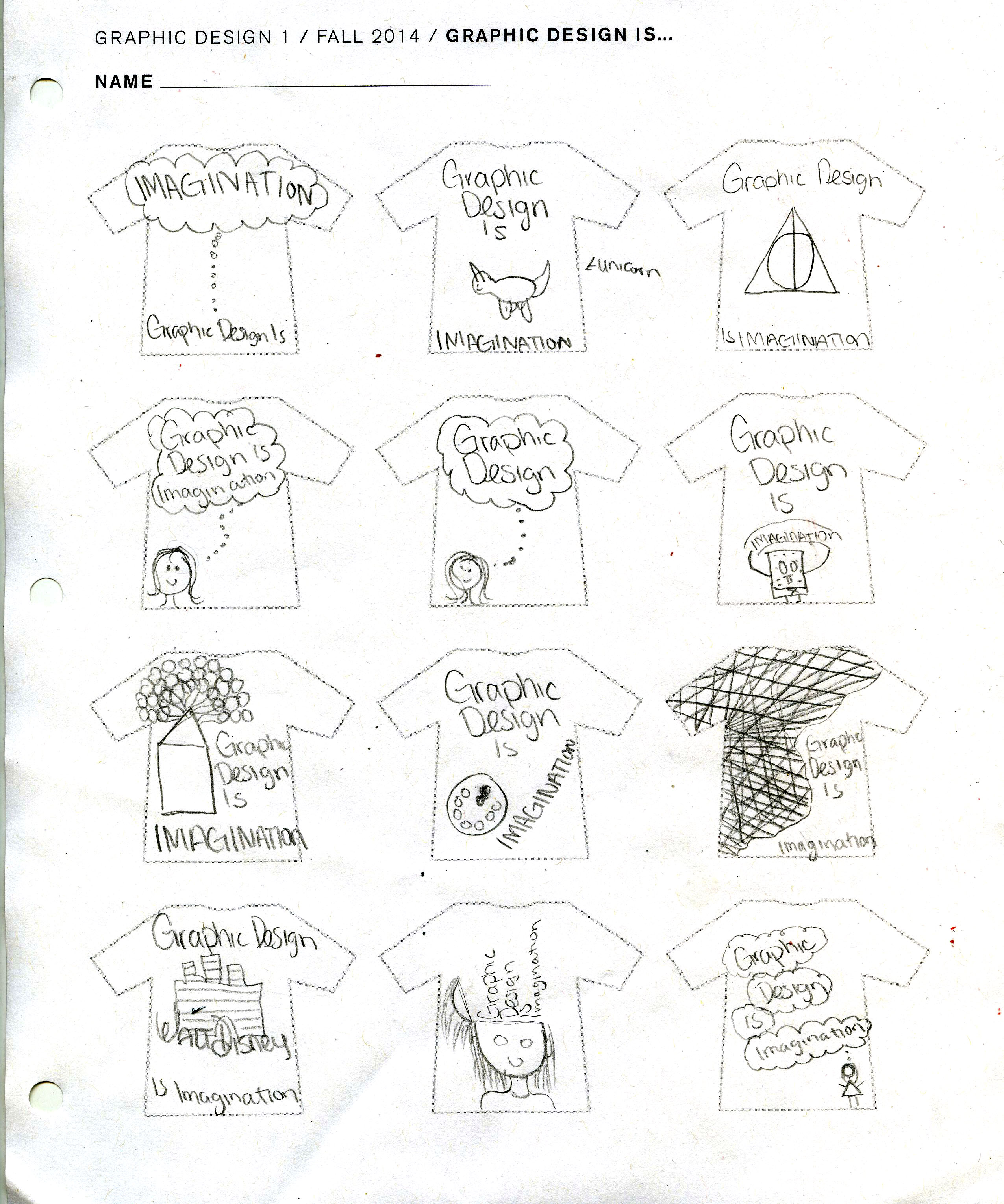
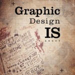
Graphic Design is…
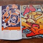
Graphic Design is all around us. It is on our food, our clothing, our appliances, everything! A world without graphic design would be like a blank canvas, all the walls would be bare, our food would be boring, our clothes would all look the same, there would be no personal expression, and there would be no need for art in any matter. Graphic design is what makes everything unique and special in its own way. It is what catches your eye when you are walking down the street, it is what makes you want to try a new restaurant, it even helps you choose what brand of pasta you want to buy. It can be clean and simple, but it can also be “messy” and unique. One of the main things that I truly love about graphic design, is that no matter what you choose to do, there is no wrong way. Sure, it might not please everybody, but very little work does. I love art that has no boundaries, and is unlike other works of art. To me, graffiti is a type of art, but many people look at it and say that it’s dirty, but it’s all up to your own interpretation.
- Life
- Passion
- Love
- Creativity
- Fun
- Enjoyable
- Everything
- Art
- Emotion
- Inspirational
- Never right or wrong
- Simple
- Complex
- Clean
- Organized mess
- Therapeutic
- Typography
- Photography
- Professional
- Interesting
- Conveys a message or meaning
- Important
- Rule Breaking
- Personal style
- Individual
- Organized Chaos
- Eye catching
- Everything is different (never the same)
- Imagination
- Easy
- Colors
- Everywhere
- Always changing
- Marketing
- Advertising
- Publishing
- Posters
- Logos
- Book Covers
- Communication
- Information
- Visually appealing
- Packaging
- Labels
- Happiness
- Technology
- Drawings
- Web based designs
- Where words translate to images
- All around you
“There are three responses to a piece of design – yes, no, and WOW! Wow is the one to aim for.” -Milton Glaser
“The public is more familiar with bad design than good design. It is, in effect, conditioned to prefer bad design, because that is what it lives with. The new becomes threatening, the old reassuring.” -Paul Rand
“It’s through mistakes that you actually can grow. You have to get bad in order to get good.” -Paula Scher
“Good design is all about making other designers feel like idiots because that idea wasn’t theirs.” -Frank Chimero
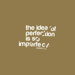
“A designer knows he has achieved perfection not when there is nothing left to add, but when there is nothing left to take away.” -Antoine de Saint-Exupéry
What is Graphic Design?
Everyone always says, do a job that you love and it wont feel like a job. For me, that job is graphic design.
Advertising and Marketing
What interests me for a career path in graphic design is creating different types advertisements, and in the future I want to find a way to incorporate marketing into my work. My ultimate dream is to follow in my mothers footsteps and become a civilian for the military, which will then allow me to travel around the world while still doing the job that I love. My junior and senior year of high school I got the opportunity to work for an organization that mainly focuses on graphic design, advertisements and touches on marketing. While I was working with them I realized that this is what I want to do for the rest of my life, because it is what I love. I was able to create posters, movie schedules, logos, business cards, and much more. The main reason I think this is a good fit for me is because I love the idea of being able to create something from scratch that instantly catches someones eye and makes them want to keep reading, or find out more information.
The Graphics Magazine is very useful for me, because it has a lot of inspirational layouts and portfolios that anyone can view. I really like the CMYK Magazine because it has also has a lot of blogs, contests, and portfolios that the viewer can look through.The last magazine that I found in my area of interest is Eye Magazine, because it has a lot of great images and designs, as well as different articles that you can go through.
I really like Peter Harris because his works for magazines are very inspiring, his portfolios are so much fun to look at as well.
Type
One thing I really love about type, is you can be as creative as you want. It is essentially the base of the design, whether people realize that or not. They really isn’t a guideline to what you can and cannot do. Depending on what type of ad, or logo you are creating, you might not use the same type as a poster or even a book cover.
A major part of graphic design also has to do with type, so I found I Love Typography to be very helpful, with a lot of great information and ideas. Another useful typography website is MyFonts because it allows you to see and download fonts that you want to use in your design.
Luke Lucas is a very inspirational typographer. Looking at his work has helped me realize how important type is, and also how fun it is.
Packaging
On daily life, whether it is a new poster, a movie advertisement, CD/book cover, or even something as simple as food packaging or a bottle of water, graphic design is present and it is what makes that particular item interesting. If we walked into a store and everything was just white with a few words on it, it would be extremely boring. Everything that we use on a daily basis is a form of graphic design, from a water or soda bottle to the designs featured on our clothing. This is why I find it so fascinating, it is all around us everyday whether we realize it or not.
I really like boredpanda because it has a lot of interesting and creative ways that show how packaging can be unique.
Paola Giustacchini is an italian graphic designer that focuses on packaging. Her work is often simple, but still very beautiful.
Research
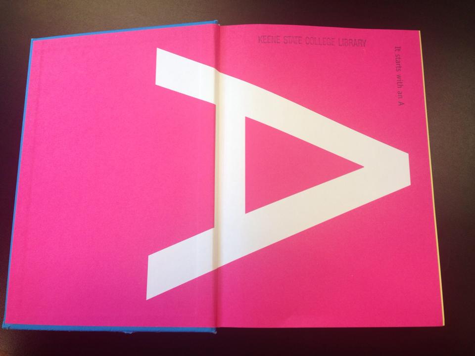
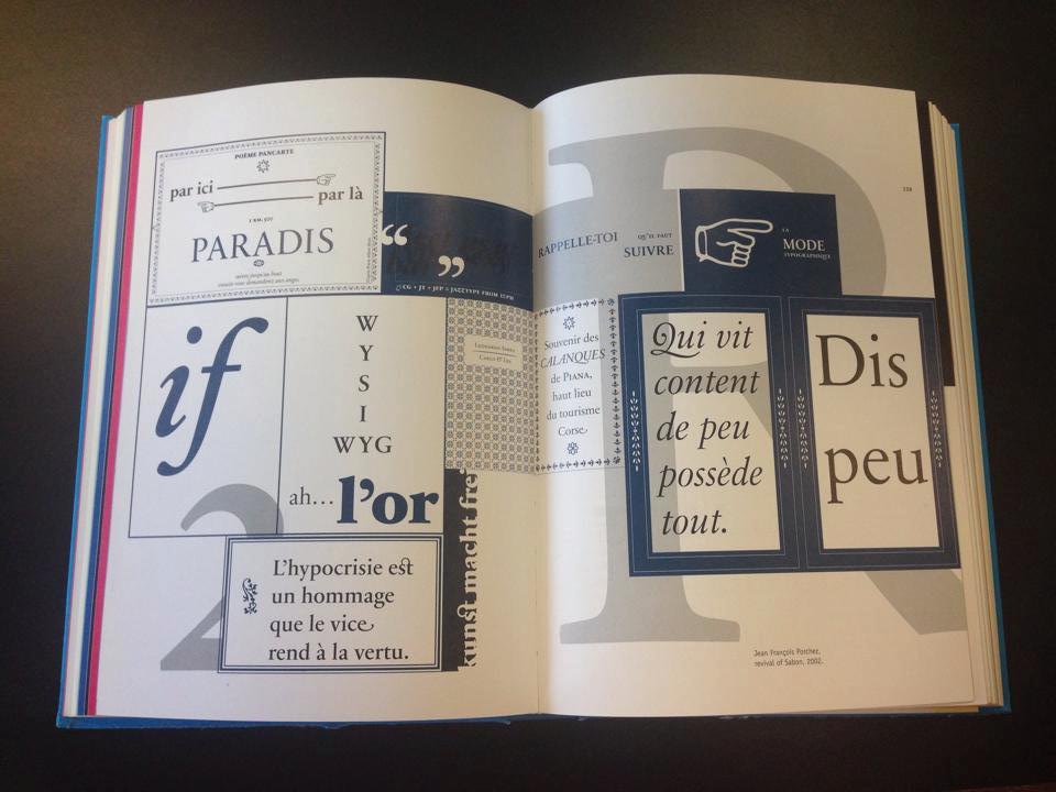
I found the book Creative Type by Cees W. de Jong, Alston W. Purvis, and Friedrich Friedl. I picked this book because as soon as you open the cover, it catches your attention. Inside, there are a lot of great Type ideas.
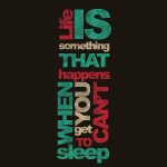
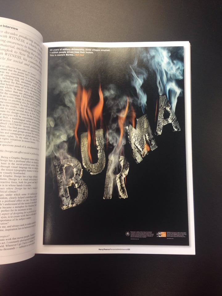
In the book, Graphic Design Annual 2009, I found this image that can be used as a poster, or a flyer to get their meaning across.
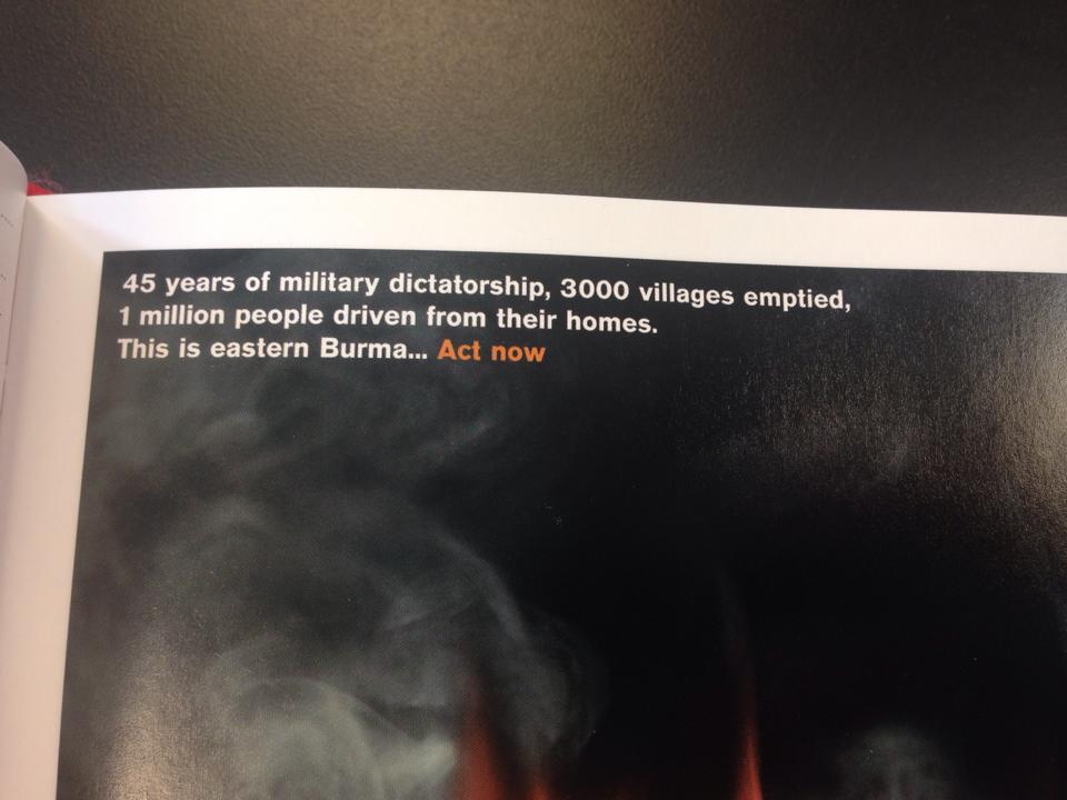
I really like this page, because it has a strong type that instantly catches your attention. Then you read in the upper left hand corner, and you see what they are trying to get across.
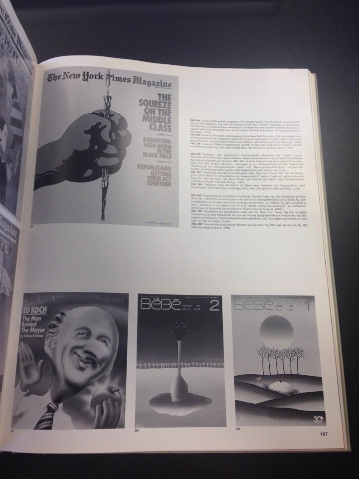
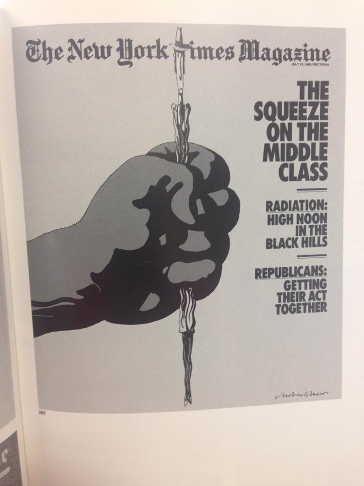
The next New York Times Magazine cover I found was in, Graphis Annual 81|82. I really like this cover because it gets the point across and is eye catching, even without all the colors that we use today.
