By Denise Grattage

Random words

Words:

  1. Bed
  2. Blankets
  3. Fur
  4. Animals
  5. Cat
  6. Rags
  7. Cloth
  8. Store
  9. Shoes
  10. Feet
  11. Human
  12. Frog
  13. Pond
  14. lily
  15. Flowers
  16. Garden
  17. Japan
  18. Asia
  19. Continent
  20. Earth
  21. Land
  22. Grass
  23. Field
  24. Farm
  25. Pigs
  26. Hot dogs
  27. Baseball
  28. Bat
  29. Night
  30. Moon
  31. Stars
  32. Sun
  33. Light
  34. Nucleus
  35. Protons
  36. Neutrons
  37. Electrons
  38. Science
  39. Chemicals
  40. Food
  41. Pizza
  42. Italy
  43. Pasta
  44. Tomato
  45. Fruit
  46. Apple
  47. Red
  48. Rose
  49. France
  50. Snails

Pairs:

  1. Fruit, Frog
  2. Night, Shoes
  3. Red, Grass
  4. Asia, Snails
  5. Field, Moon
  6. Chemicals, lily
  7. Animals, Baseball
  8. France, Farm
  9. Rose, Nucleus
  10. Science, Rags
  11. Pasta, Stars
  12. Garden, Fur
  13. Cloth, Tomato
  14. Bed, Pizza
  15. Protons, Food
  16. Italy, Feet
  17. Pond, Cat
  18. Apple, Bat
  19. Blankets, Flowers
  20. Store, Continent

Design and Play

At first reading the title “Design and the Play Instinct” I was confused as to what this had to do with designing but after reading I found there to be a lot of good information, this paper talks about the different elements of design and of the very nature of the designers. It is always helpful to read and learn about the different basics of design like, contrast, composition and placement, color, etc. the paper went over mainly the need for layout and how geometry plays into that. I knew before hand that placement was very important and this paper has helped me to understand just how some artists determine their placement choices. The other thing I found interesting was the talk about games and how that helps one to learn, this concept was another I was familiar with, humans do best on something when they are having fun and enjoy what they are doing and playing games gives the student a new and fun way to learn.

Typeface Comparison

The five typefaces we had to look at were for the most part very similar and unless one looked hard enough would in fact say they were the same, but looking at them there were some key differences; like how one was sanserif and the ones that were serif had different types of serifs, also the differing thicknesses of the type, etc. I chose to look more closely at Baskerville and Helvetica, I much preferred Baskerville over Helvetica for a few reasons. Baskerville is a serif type and I just prefer serif typefaces to sanserif ones like Helvetica, they tend to be a bit more ornate with the different shapes and curves of the serifs unlike sanserif that just seem too plain. Baskerville is a thick and thin typeface meaning in some spots the type is thinner it resembles handwriting more so than Helvetica that is one uniform thickness. That’s not to say I don’t like Helvetica because I do like it in some contexts, every typeface has its use but compered to the other typefaces I just didn’t like it as much, one thing I did prefer about it though was that the “g” had a more modern look without so much swirling, that Baskerville’s had also the g was closed. Another thing was that there was more of a size distinction between the upper and lower case letters in Baskerville that I liked. Each Typeface is good and they each have a purpose that suits their styles.

Design Comparison

Henri de Toulouse-Lautrec vs. Vladimir and Georgii Stenberg

Looking through our graphic design book I was most interested in the work done by Henri de Toulouse-Lautrec a French artist and designer from the late 19th century and the Stenberg brothers Vladimir and Georgii Russian designers from the 1920s-1930s. I like them because even though they were from different time periods their style of work was different but at the same time very similar, also the topic in which they based their work was very similar; Toulouse designed some of his work for the Moulin Rouge night club in Paris. While the Stenberg brothers designed posters for the cinemas in what was at the time Soviet Russia. While they may be two very different things both a cinema and a night club were places for people to congregate and have a good time.

I looked specifically at Toulouse’s “La Goulue” and the Stenberg brothers “Poster for Man with a movie camera”, I found them interesting because while they are from two different time periods and of a different composition style they at a base level share the same artistic style. Both pieces have this cut out look to them, that invokes a sort of collage feel. As well they both use very simple and vibrant colors, the primary colors, but while they look the same and share a similar topic they are uniquely different, Toulouse’s has a more artistic feel and the Stenberg Brothers as with the Constructionist movement has a more dynamic and purposeful image.

Graphic Design is…

My take on what Graphic Design is

Graphic design is many things, art and business, fun and hard work, subtle and bold, simple and complex. its hard to really put into words what graphic design truly is, sure there are many dictionary definitions on what it is, but they don’t do the craft any justice. Designing is something that takes an eye for what looks good and what the audience wants to see, to be able to take an illustrators work or even a designers own art mix it with some well placed typography, play with the colors and layout and hope to have a well designed logo, book cover, poster, website, etc. Graphic design is many things complicated or not but more often than not many don’t notice the work that goes into what they see everyday, design is everywhere.

Quotes

Design is a plan for arranging elements in such a way as best to accomplish a particular purpose.
Charles Eames

Design is where science and art break even.
Robin Mathew

Design is the search for a magical balance between business and art; art and craft; intuition and reason; concept and detail; playfulness and formality; client and designer; designer and printer; and printer and public.
Valerie Pettis

Design is the conscious effort to impose a meaningful order.
Victor Papanek

Design is in everything we make, but it’s also between those things. It’s a mix of craft, science, storytelling, propaganda, and philosophy.
Erik Adigard

50 Sentences Free Write

1. Art 2. Creative 3. Innovative 4. A lot of work 5. Fun 6. A mix of art and practicality 7. Enticing  8.Many things 9. Difficult but rewarding 10. Digital art 11. Expensive  2. Word art 13. A mix of typography and placement 14. Imaginative 15. The old Reinvented 16. Flexible 17. Enjoyable 18. Conventional but not 19. Breaking boundaries 20. Contradictory 21. Visionary 22. Dynamic 23. Compelling 24. Influential  25. Important 26. Inconspicuous 27. Harmonious 28. Balanced 29. Purposeful Chaos 30. The arrangement of design elements 31. Bold 32. Subtle 33. Repetitive 34. An identity 35. Thought provoked 36. Engaging 37. Inviting 38. Design 39. Stimulating 40. Creativity meets the business world   41. Diverse 42. Unique 43. Package design 44. Web design 45. Branding design 46. Book, DVD, and CD design 47. Many things in one 48. Profitable 49. Original 50. Progressive

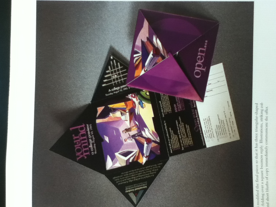
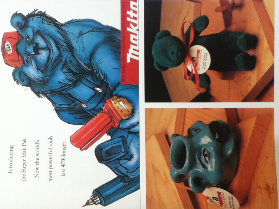
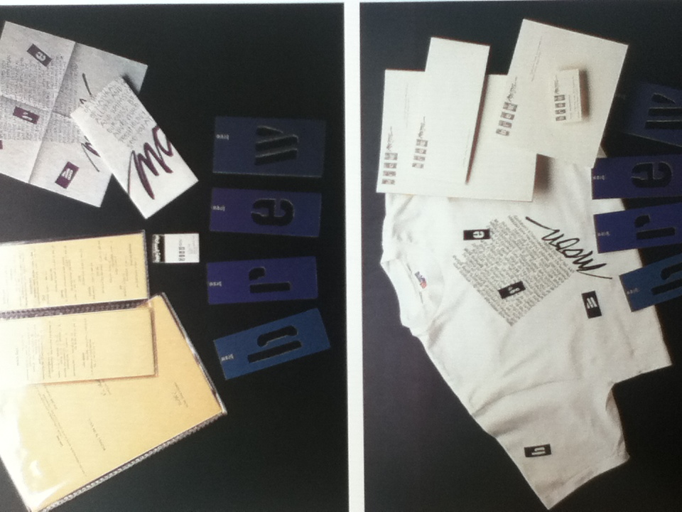
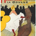
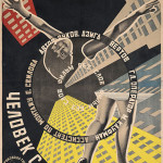
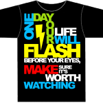
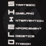
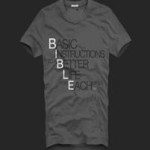
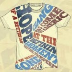
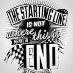
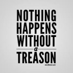
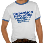
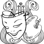
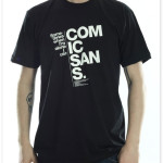
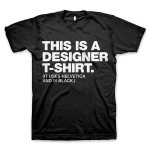
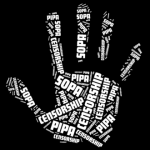
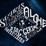
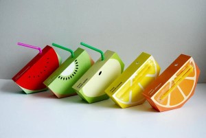
Inspirational Images
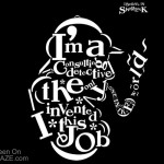
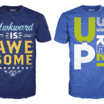
Thumbnails

What is graphic design?

Graphic design is art that is both aesthetically pleasing and has a practical purpose.

Areas of interests:

I am currently interested in package design, logo/Brand design, and web design. I want work in those lines of work because you have the opportunity to be creative and innovative but still making a decent amount of money.

Package design is something that has staying power we are always going to need to pack and hold products and designing a new and interesting design will help to sell your product. Also I like the idea of creating designs for items that will make people choose that product, I know for myself at least how the package looks plays a big part in whether I choose one product of another, better looking designs tend to mean the company put more work into the product so it’s going to be of better quality.

I like logo/Brand designing because the brand design is the very identity of the business or product. I particularity like logo designing because logos are very iconic, quite literally they are icons, even if someone doesn’t quite remember what the name of an organization is they will remember the logo.

Web design is of course a field of work that is very upcoming and popular, I Have taken a web design and construction class and I liked having the ability to design something that I can change on a moment’s notice and not really have to go through the whole process of reprinting something. As many of the modern world uses computers and internet there is a need for websites and having a professional looking site is a big advantage to those that don’t

Book Examples:

IMG_5367 IMG_5369 IMG_5370 IMG_5373 IMG_5415 IMG_5416 IMG_5418 IMG_5420


Designers:

Preston Grubbs Is a designer who has done both some really creative package designs as well as some logo works.

Simon Laliberté Is a Canadian designer and Art director who specializes in Packaging, branding, and screen printing.

Lance Brown Is a multimedia artist and designer, he does paintings, illistrations, logo designs as well as web designs.

Milton Glaser is a famous graphic designer who is well known for his “I heart New York” and his New York magazine logo among other projects.

Mike Langley is a web designer who does custom word press sites and has an online portfolio of his works.