By Erin D'Aleo

50 Words and Pairs

Words

1. Fairy Godmother 2. Sherbert 3. Shower 4. Deodorant 5. Armchair 6. Scaffolding 7. Strudel 8. Pumpkin   9. Pterodactyl 10. Baby Wipes 11. Lobster 12. Leaf 14. Postage Stamp 15. Corduroy 16. Irishman 17. Sediment 18. Catastrophe 19. Vermifuge 20. Anesthesia 21. Capreccio 22. Gargoyle 23. Nudiustertian 24. Bourgeoisie 25. Tongue 26. Bullet Train  27. Tiger 28. Casino 29. Chansonette 30. Hypogeum 31. Anglophile 32. Typewriter 33. Barracuda 34. Lollipop 35. Monster 36. Quinoa 37. Bunny 38. Calisthenics 39. Chimpanzee 40. Zoanthrope 41. Croissant 42. Quire  43. Sarcophagus  44. Chimera 45. Maple Sugar 46. Rapscallion 47. Periscope 48. Teapot 49. Sweven 50. Barbie

Pairs

1. Bunny Calisthenics

2. Sherbert Postage Stamp

3. Pterodactyl Fairy Godmother

4. Bullet Train Strudel

5. Maple Sugar Rapscallion

6. Anglophile Teapot

7. Barracuda Casino

8. Quinoa Gargoyle

9. Tiger Galaxy

10. Zoanthrope Periscope

11. Irishman Baby Wipes

12. Pumpkin Sheildmaiden

13. Lobster Leaf

14. Typewriter Tongue

15. Deodorant Croissant

16. Barbie Lollipop

17. Corduroy Hypogeum

18. Sarcophagus Chansonette

19. Chimpanzee Shower

20. Nudiustertian Chimera

Design and the Play Instinct Response

The best way for me to approach constraints in a project is to initially think about them in regards to music. Oftentimes, in jazz songs, there are large solos for one or multiple instruments. These solos may or may not change keys, but while one is playing certain bars, they must stay in the designated key or else the solo sounds horrible, in most cases. But with eight notes, multiple octaves, and any number of rhythmic variations, an instrumentalist can easily work within the parameters, the only confines being what he or she knows or is willing to improvise upon. Occasionally, playing an odd note is good, because although it may initially sound off, it might fit better in the large scale.
For this reason, I think parameters and constraints are often good, because it gives me obstacles to overcome and a way to challenge myself creatively in order to solve a problem. It also allows me to come at a problem from multiple angles and create multiple solutions that work. There is no one answer to anything (except maybe a math problem), and as a result I think each person has to choose what works best as a design or solution, as well as what works best for them or their client.

An idea that I like from the reading is the one regarding the grid. Typically seen as squares, the ideas from The Modulor and the Japanese floor plans offer other options in place of a square grid. Instead, they propose an infinite option of grids and layouts for creative or utilitarian purposes. With all of the other factors placed into the equation, the grid can easily evolve to take a new layout that still allows someone to work within the space. The Fibonacci Sequence and the Golden Ratio are also two pleasing mathematical sequences that allow a designer to view different possibilities based upon the numbers and proportions.

The saying “All work and no play”, although not actually mentioned in the text, is challenged here, particularly in the addition of paper cutout work such as Henri Matisse’s or Picasso’s painting. Paul Rand implies that there is an element of fun working with parameters that challenge a designer and a viewer without suffocating them or giving them too much freedom. This would allow them both “work and play.”

Classic Typeface Comparison

Baskerville and Garamond

Although there are elements that are pleasing to the eye in all five of the Classic Typefaces, I decided to focus on Baskerville and Garamond, the two oldest of the five typefaces.

Garamond

Garamond is the older of the two typefaces, created in 1617 by Frenchman Claude Garamond. Due to primitive printing technology of the time, Garamond was created to be able to deal with the printing process. As a result, the aesthetics of the type are less pleasing to the eye than it’s eighteenth-century English counterpart, Baskerville. The letter forms for Garamond are more consistent, and appear to be based off of a slightly ovular circle, with less variation in the thickness of the strokes and an angled stress that runs through the letters, which are really only particularly noticeable in the  vowels a and e. The serifs on this typeface also seem to be heavier as a result of their size and thickness. The downward strokes evoke an older feeling that, couple with the heavy serifs give this typeface an almost clumsiness that seems to belong to the older textbooks I used to read in high school and grade school, which for me evokes a much more boring feeling that the more dynamic Baskerville.

Baskerville

Baskerville, on the other hand, is an English font published in 1757 by businessman John Baskerville. Just looking at the font in comparison to Garamond, it immediately has a more elegant and dramatic feel. Having a printing process that was much more effective and better resources allowed typefaces to change. For example, the serifs are not a heavy and are much more sculpted for stylistic purposes than for printing purposes. The angle of the stress is much closer to vertical, and more easily noticed by the eye, making it more appealing to the viewer. The heavy brackets in Garamond were virtually eradicated by Baskerville in his development of his typeface, giving it a much more streamlined feeling when reading it. Overall, the thinner type flows lighter and I find it easier to read. Especially in a book with hundreds of pages and very small type, I feel like this type would work better when it came to squishing lines of type on a page, because it would not be so much black with little letting between them. Overall, I find Baskerville more eye-catching and reader-friendly, and would be more inclined to turn to Baskerville first.

Design Comparison

John Heartfield vs. Tadeusz Trepowski

It is amazing that when there is a large-scale war, how much it affects the populace can be seen not only through books and novels but largely through art. Take Guernica, for example, in which the famous painter Pablo Picasso was so distraught by the bombings in the city he painted a mural 3.5 meters high and 7.8 meters wide. The April 26, 1937 bombings induced chaos in the Basque region’s city, and many died as a result of the bombs dropped by German and Italian warplanes. The black, white, and gray mural has become a symbol of anti-war and a reminder of the suffering, shock, and pain experienced by victims of bombings. Graphic Design has been affected in similar ways by the wars of the past centuries, especially including those of World War I (WWI) and World War II (WWII). War posters and war propaganda are some of the most visually impacting and influential pieces to come out of their eras, and the diversity in which designers expressed their opinions on the war is equally amazing.

Designer John Heartfield was born in Germany in 1891 as Helmut Herzfeld, but as a protest against the Weimar Republic and the German militarism occurring in home country, he changed his name to John Heartfield. He criticized the Nazi party in everything he worked in, and was a pioneer in the use of art as a political weapon. A member of the German Dada movement, an offshoot of the Dada movement. The Dada movement sprouted out of the aftermath of WWI as a reaction to a world perceived as mad by many artists and designers. Heartfield specialized in photomontage, and his work was showcased all over the world. For many years, he stayed in Germany to do his work despite the threat of assassination. He ended up dying in East Berlin in 1968.

Tadeusz Trepkowski was a Polish designer born in 1914, and became part of an outgrowth of Dadaism known as Surrealist philosophy. Surrealist philosophy involved juxtaposed images placed in certain ways to help solve problems. This issues were usually complex and the resulting images had a larger visual impact than what was usually seen at first glance. Trepkowski worked mainly in poster design, commercial art, and display design. He lived through both WWI and WWII, so it is easy to understand why Trepkowski had designed powerful war posters.

In regard to these two designers, I specifically looked at John Heartfield’s 1936 photomontage Have No Fear – He’s a Vegetarian, and Tadeusz Trepkowski’s antiwar poster from 1953 commonly known as Nie! Both war posters rely on a strong understanding of the time and the conflicts occurring then. Despite being designed about twenty years apart, the emotions such as anger and frustration that accompanied many who lived through the war are evident. Both also heavily rely on the importance of symbols, such as the Nazi swastika and the French helmet on the rooster in Have No Fear – He’s a Vegetarian or the outline of a bomb in Nie! But what also makes these two pieces of design stand out from each other are just as important. John Heartfield’s use of a black and white photomontage showcases the subject in a brighter light. Unlike Nie! color would be much more distracting and take away from the message that Adolf Hitler is hungrily eyeing France as his conquest, or in this case, his victim. The photographs also make it seem more like it could have been a photo that was real, which also helps showcase the amount of irony Dadaism is known for. Nie!, on the other hand, features a muted color palette of shades of brown against a stony blue background. Trepkowski’s use of a warmer color on the building featured against the background inside the bomb immediately evokes the image of a city burning, such as London during the Blitz. Trepkowski also uses graphic elements instead of photomontage, creating a much more poster-like feel rather than that of a photograph.

Have No Fear - He's A Vegetarian. John Heartfield, 1936 Antiwar poster. Tadeusz Trepkowski, 1953.

Graphic Design Is …

My Perspective

Graphic design is communicative, but more specifically, a conversation. It can be verbal, such as motion and interactive graphics, but can also speak silently through images, words, or lack thereof. Graphic design can seem like it is shouting or whispering, depending on the style of the artist and the message that is being portrayed. Colors, typography, and everything else about a piece affects what is being “heard” by the audience. I think the best design sparks a conversation between the viewer and the work, and the person would be able to walk away thinking about the visual impact. For me, I also think graphic design is best when there can be multiple interpretations, while the message from the designer can also get across to the viewers. Also, it can transcend language barriers and communicate to people all over the world.

Graphic Design Is …

1. Choice      2. Filling in the blanks      3. Harder than it looks     4. A conversation     5. Universal

6. Visual thought      7. Communicative      8. Full of messages      9. Everywhere

10. Challenging boundaries      11. Complexity simplified     12. Frustrating     13. Work      14. Limitless

15. Not always what it looks like     16. A language     17. Simply complex     18. Inspiring     19. Strange

20. Propaganda      21. Advertising      22. On purpose     23. A lifestyle      24. Personal      25. Emotional

26. Capitalizing on ideas      27. Opportunities      28. Constantly changing      29. What you make it

30. Whatever you think     31 . An interpretation of visuals      32. Talkative      33. Blurred Lines

34. Thinking outside the box     35. Underappreciated      36. Thinking outside the box      37. Speaking

38. Twisted    39. Evolving      40. Anything     41. Everything      42. Thoughtful      43. Jaw-dropping

44. Confusing     45. Cutting edge     46. Functional     47. Art with results     48. More than doodles

49. Life     50. A way of thinking

Excellent Quotes

“You can have an art experience in front of a Rembrandt… or in front of a piece of graphic design.” – Stefan Sagmeister

“It’s through mistakes that you actually can grow. You have to get bad in order to get good.” – Paula Scher

“A designer knows he has achieved perfection not when there is nothing left to add, but when there is nothing left to take away” – Antoine de Saint-Exupéry

“Good design is all about making other designers feel like idiots because that idea wasn’t theirs.” – Frank Chimero

“I want to make beautiful things, even if nobody cares, as opposed to ugly things. That’s my intent.” – Saul Bass

“Never fall in love with an idea. They’re whores. If the one you’re with isn’t doing the job, there’s always, always, always another.” – Chip Kidd

Inspirational “Conversation” Ideas


24 Thumbnails 

Guide to GD/Chapter 1 – What Is Graphic Design?

Although there are many different types of graphic design, not all of them interest me to the point where I could see myself pursuing a job in that aspect. But on the other hand, there are definitely some that I am excited to explore as career options.

Package Design

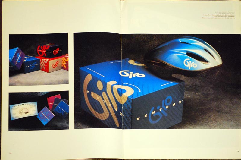
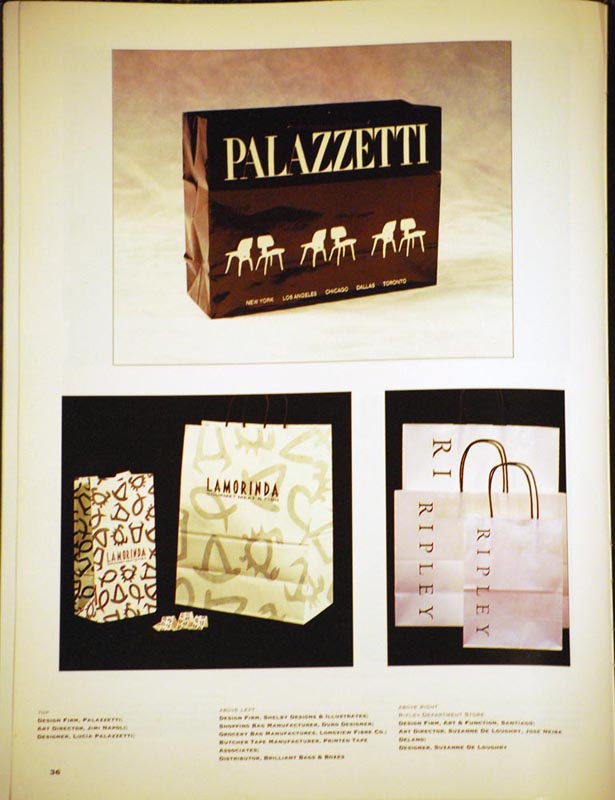
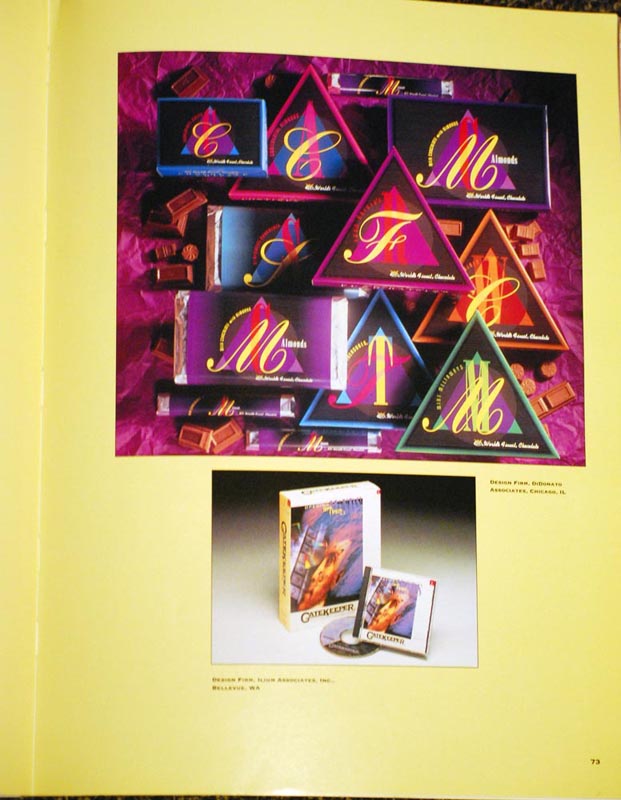
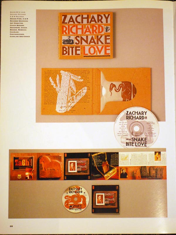
The first and foremost is Package Design. Package design is a design which functions three-dimensionally on products around the world. This includes everything from pharmaceuticals and cosmetics to carry out bag designs. I definitely notice when items are packaged in certain ways. If I was a package designer, the items I would look forward to designing would definitely be CD covers and booklet designs for record labels as well as food packages (although I might always be hungry) and more. This is of interest to me because not only do I enjoy designing flat things but I like to hold products and items in my hands. But not only do I have fun doing this, but I enjoy spending time on a design and making layouts. I also think that I can use both text and an image together in harmony.

This personal portfolio showcases some of Joey Campos‘ design branding and packaging design for Marvel, most recently for Man of Steel, as well as some of his other projects for big-name brands such as Hot Wheels.

Publication Design (Including book jacket and book layout design)

This brings me to my second area of interest, which is publication design. I have designed pages and covers for books before, and my work is mostly in the 2010-2011, 2011-2012, and the 2012-2013 yearbooks for Plymouth Regional High School. This is another location where working with text and images is enjoyable for me. It is also interesting to me because I enjoy reading, not only books, but magazines and newspapers as well. I think that this area could also be a potential career for me due to my organization, which I could use for both text and images when designing a striking cover or making a layout that is interesting and engaging. Also, this field is a good fit for me due to my love of reading, and I think without that, it would be harder to capture a good idea for a book or publication.

This personal website excepts some of the work that Ruth Ansel has done for magazines across the nation, including Harper’s Bazaar and Vanity Fair, among others.

Motion Design 

The third area of design that strikes my interest is motion design. Since I am less into the programming aspect of design, this would be a better fit than interaction design. I think visuals are a very powerful way to tell a story. I enjoy watching movies and trailers and have always been interested in the behind-the-scenes process. By combining certain elements, whether it is music or dialogue or visual, a story is told. This could be a good fit for me because I enjoy both movies (and other visuals) paired with music. I also enjoy trying new things and challenging myself.

Luke Harris has a different approach to his motion graphics. From party invitations to music videos, he has a large variety of work in his small portfolio.

Research

The book I researched was simply called Packaging. It was published in 1995 by Rockport Publishers, Inc. I enjoyed looking at the variety of designs, even if the book and designs are almost 20 years old. Some I recognized because they are still around today, such as the game Taboo (not pictured).

Upload1 Upload3 Upload4 Upload2


Designers from Packaging

Although Michael and Giovana Jager designed items for the Boston Globe Project before the turn of the century in the book Packaging, they have gone on to create their own business, JDK. Product design is definitely their forte, with clients like Patagonia, Virgin Mobile, Microsoft, and Nike.

Belonging to the international design consulting agency Pentagram, designer Paula Scher designed work for Oola Corporation in the book. She is known for her branding of the famous Tiffany & Co. and Citibank. Her focus is mainly branding and packaging.

He designed beer bottles and label designs in the book, but Primo Angeli now has an extensive array of work on his website. He does branding, packaging, and publication design, the latter mainly in the form of posters. Some of it you might even recognize, like Ben & Jerry’s Ice Cream or Veryfine.