By Jenny Dalrymple

Random Words

50 Words

  1. dream
  2. light
  3. letters
  4. arrow
  5. buddhas
  6. lake
  7. spider
  8. State House
  9. monarch
  10. quartz
  11. son
  12. people
  13. dissertations
  14. wax
  15. hurricane
  16. freedom
  17. insects
  18. Midas
  19. Sylvia Plath
  20. wedding cake
  21. valley
  22. dome
  23. metamorphosis
  24. leather
  25. tempo
  26. eye
  27. solar flame
  28. briefcase
  29. Lindsey Lohan
  30. classroom
  31. Eiffel Tower
  32. subway
  33. Jesus
  34. laboratory
  35. black hole
  36. tunnel
  37. bedroom
  38. Kobe Bryant
  39. boyfriend
  40. love
  41. Asia
  42. Steve Carrell
  43. Albert Einstein
  44. revolution
  45. battlefield
  46. Youtube
  47. Pluto
  48. presentation
  49. Van Gogh
  50. beer

Word Pairs

  1. spider/quartz
  2. Kobe Bryant/State House
  3. Jesus/black hole
  4. subway/Van Gogh
  5. briefcase/beer
  6. freedom/dome
  7. Albert Einstein/leather
  8. love/battlefield
  9. wax/boyfriend
  10. insects/wedding cake
  11. bedroom/dissertations
  12. lake/solar flare
  13. Lindsey Lohan/buddhas
  14. dream/classroom
  15. Steve Carrell/monarch
  16. Pluto/hurricane
  17. Asia/Eiffel Tower
  18. laboratory/Sylvia Plath
  19. Midas/metamorphosis
  20. eye/tempo

“The Design and the Play”

I have mixed feelings about Rand’s beliefs.

I do believe that there has to be rules in order to learn how to design. It forces the future designer to work with what he has, and learning how to be as effective as possible without having too many options to flood the creative process. It definitely is a “test of skill”, the “ultimate reward”, and motivating for there to be rules. By making the design work with little resources is the test of skill, and it is rewarding when you’ve made something beautiful even though you didn’t have a lot to use, and it is motivating to do the best possible job. If there aren’t any rules when learning how to design, the designer will get lost in fancy fonts and drop shadows without learning how to be an effective designer. Also, it makes the designer learn how to verbally communicate better because it will take more effort o make an good argument for the elements you chose. 

Rand states that when it comes to developing a grid and filling the grid, the “creative ability for the former is no less than that for the latter”. I do believe that creating a grid that will make the most of its contents does take creativity, but I also think that creating such a grid doesn’t require more creative ability than making the designs that will fill the grid. Although a designer must consider all elements that are going to be put into the grid to figure out how it’s going to work best, few creative and artistic choices must be made. When making the grid, size, positioning, layout are all things that must be creatively decided. When it comes to filling the sections with designs, content, typography, color, images, pattern, and so much more have to be decided. Without a completely effective grid, the design still has potential to work rather than if the grid system chosen is excellent but the design is lacking.


Bodoni and Century Typefaces

bodoni-features      century-features

The two typefaces I chose are Bodoni and Century. Bodoni is more appealing than Century is because of it’s severe contrast between thicks and thins in the letter forms. The Century font has a slight difference between thick and thins, but it isn’t as noticeable or distinguishable. The contrast of weights within the letters of the Bodoni font makes it more modern looking and interesting. Having more similar thicks and thins doesn’t require the viewer to be as engaged by the type. It is easier for viewers to glance over the words rather than pay attention to the words created by the font. If viewers are not engaged by the font, then it is not doing it’s job.
The other main difference between the Century and Bodoni fonts is in their brackets. The brackets on the Bodoni font are completely straight, while the brackets on the Century typeface are curved. Although it can be argued that the curved brackets on the Century typeface is more visually appealing than the straightness of Bodoni type, it can be counteracted by stating that they are over-compensating for the lack of interest of the font because of the similar thickness of the letters. I do appreciate the flourish that the curved brackets bring to the Century font, but it distracts the viewer. Although it is not over the top like some elegant typefaces, it is enough for the viewer to focus on the form of the letters rather than the message the type is conveying. The curved brackets do not appear to have any function other than to be aesthetically appealing. Having straight brackets on the Bodoni font allows viewers to focus on the message of the words rather than the letters themselves. There is nothing unnecessarily added to the type. Having the bare minimum, but not to the extent of Helvetica, makes the Bodoni font more appealing and functional than the Century font.

John Heartfield and Shigeo Fukuda

Two designers that interested me are Shigeo Fukuda (1932-2009) and John Heartfield (1891-1968). Both of the artists were very interested in political, anti-war posters. Perhaps the war that influenced their views the most was WWII, where Heartfield was involved in the Hitler rebellion, producing anti-Nazi posters, and Fukuda was developing his personal style as a student.

During his schooling, Shigeo Fukuda became interested in the Swiss International Style, which preaches simplicity and minimalism. This school of design is seen in his work as he uses solid colors and bold lines. His anti-war ideas were easily reflected in his work because of the readability and universality of his style. Both sides involved in a war would be able to understand the message Fukuda showed.

The work of John Heartfield directly reflects his anti-Nazi views as he uses swastikas and pictures of Nazi leaders like Hitler and Goring. His skills in the new medium of photomontage allowed the people in the posters to be easily recognized because they were from real photographs.

The two pieces of design I chose are Fukuda’s war poster “Victory” from 1989, and Heartfield’s magazine cover from the October 1934 issue of AIZ. Both of these designs are anti-war and anti-Nazi with the image of a fist. Heartfield’s cover features a very dominant and powerfully raised fist that contains people raising their fists too. The people inside the arm give color and shadow to the arm as well as reinforcing the overarching image and concept. The cover has very little type and a solid background of a similar color to the images of people in the large fist. Having the fist be the only image on the page allows the image to be unobstructed and easily read. The time period (and probably text) shows that it is a anti-war design, while the imagery alone on Fukuda’s design display its anti-war statement. Using only the three colors of red, black, and white, Fukuda shows a fist coming out of a swastika as well as a tag saying “Victory – 1939…1989”. I interpret the imagery to mean that people had to fight and struggle against the Nazi regime. In the design, two years are presented. 1939 is the year that World War II began and 1989 is the date that the poster was circulated. Similar to Heartfield, Fukuda introduced little type to the design and kept a solid background. Just like the magazine cover, this was done in order to focus on the image and the concept presented.

I do not think that Fukuda’s poster is in response to Heartfield’s cover because of the large amount of time between the printing of these two designs. Fukuda may have gotten loose inspiration from the AIZ magazine cover, but because there is such a large difference in style and the fist is a universal symbol of strength and struggle, the two are not directly related.

AIZ Cover - Heartfield Victory - Fukuda

Graphic Design Is…

creative / carpal tunnel inducing / technical art / inventive / Adobe / changing / Mac / typography / labor intensive / eye-catching / interesting / everywhere / love / better than chemistry / try and try again / rule-breaking / redefining / passion / simple / marketing / challenging / thought – provoking / inspiring / packaging / unglamorous / organized chaos / fun / social research / book jackets / posters / branding / collaborative / stressful / culture-minded / thoughtfulness / relevant / layouts / print / web / bold / rebellion / functional / innovative / a process / conceptual / forward-thinking / revision / invisible / powerful / language

My Perspective of Graphic Design
Graphic design is loud. Not in the sense that the design is busy, aggressive, or flashy, but that it is eye-catching and striking. A design can be filled with bright colors and harsh, strong lines but it can also be simple and captivating. No matter which way a design is loud, it must be in order to catch people’s attention and make them interested. If graphic design isn’t loud, it’s commonplace, mundane, and essentially ineffective and useless.

Excellent Quotes

  • Designing a product is designing a relationship – Steve Rogers
  • Visual design is often the polar opposite of engineering: trading hard edges for subjective decisions based on gut feelings and personal experiences. It’s messy, unpredictable, and notoriously hard to measure. The apparently erratic behavior of artists drives engineers bananas. Their decisions seem arbitrary and risk everything with no guaranteed benefit – Scott Stevenson
  • Design is where science and art break even – Robin Mathew
  • Design is about making things good (and then better) and right (and fantastic) for the people who use and encounter them. – Matt Beale
  • Art is like masturbation. It is selfish and introverted and done for you and you alone. Design is like sex. There is someone else involved, their needs are just as important as your own, and if everything goes right, both parties are happy in the end – Colin Wright

Inspirational Images

Thumbnails

Three Designs
 

What Is Graphic Design?

Areas of Interest: Design Careers
Identity is key in each of these career paths, but the identity can change from book to book or slightly from issue to issue, whereas in advertising design the identity is the same for every design made for a specific company. Not centering your designs on a single identity keeps designing interesting and allows you to explore more avenues and styles of design.

With publication design, many facets of graphic design must be taken into account when making a design. Typography, images, and web design are all crucial elements in creating a good layout on screen and on page. This makes it so designers can use all their skills often, instead of focusing on one area of design for too long. There would be some consistency when you are working for one magazine versus needing a new identity and brand for each project that comes along. This field would be a good fit for me because it would still allow me to work with literary ideas and people, but it would let me have a more consistent, established work environment and process.

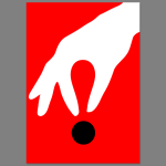
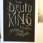
When it comes to book jacket design, every book has a different style and a different message that needs to be conveyed to the potential reader. If the message on the cover is too vague or unappealing, nobody will want to pick it up and the book will collect dust on a shelf. This is how the cover design contributes to the success of the author. As a writer myself, helping other authors through my preferred medium would be a rewarding experience. Also, working for the company may give me an edge in getting my own work published. Book jacket design would be a good fit for me because I wouldn’t just enjoy creating the cover, but I would enjoy learning about the book through reading it and talking to the author about the novel. I would love the entire process of making the book, not just my contribution.

Research
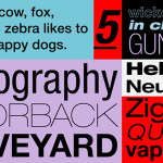
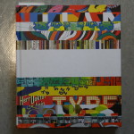
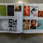
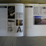
The book I researched is called “Graphic Design Referenced: A Visual Guide to the Language, Applications, and History of Graphic Design”.


Designer Links

Helen Yentus
On her portfolio page, Helen Yentus shows the book covers that she herself has designed and also book covers that she was the art director for.

James Marsh
James Marsh has many different mediums of art on his portfolio page. He includes studio art, illustrations, book covers, as well as prints. His book covers can mostly be found under Illustration: Publishing.

Rodrigo Corral
Rodrigo Corral displays his magazine designs as well as book cover designs and studio art. His art can be viewed together as tiles, or lined-up vertically and individually.

Doylepartners.com
Doylepartners.com shows the different designs and companies they have worked for in tile form. They have many different types of designs showed, like motion design, print designs, and packaging designs.