By Johnny

T-Shirt Design Process

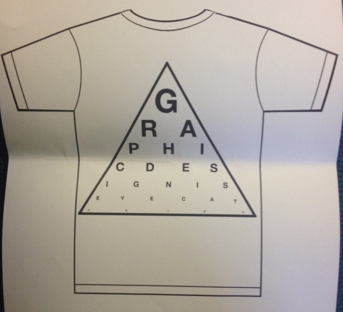
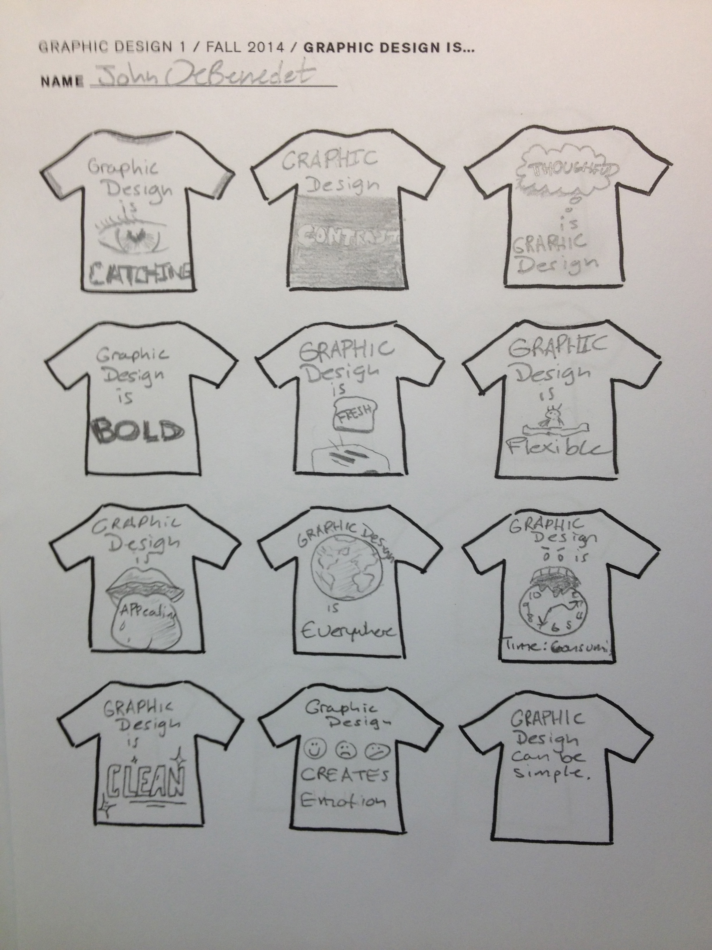
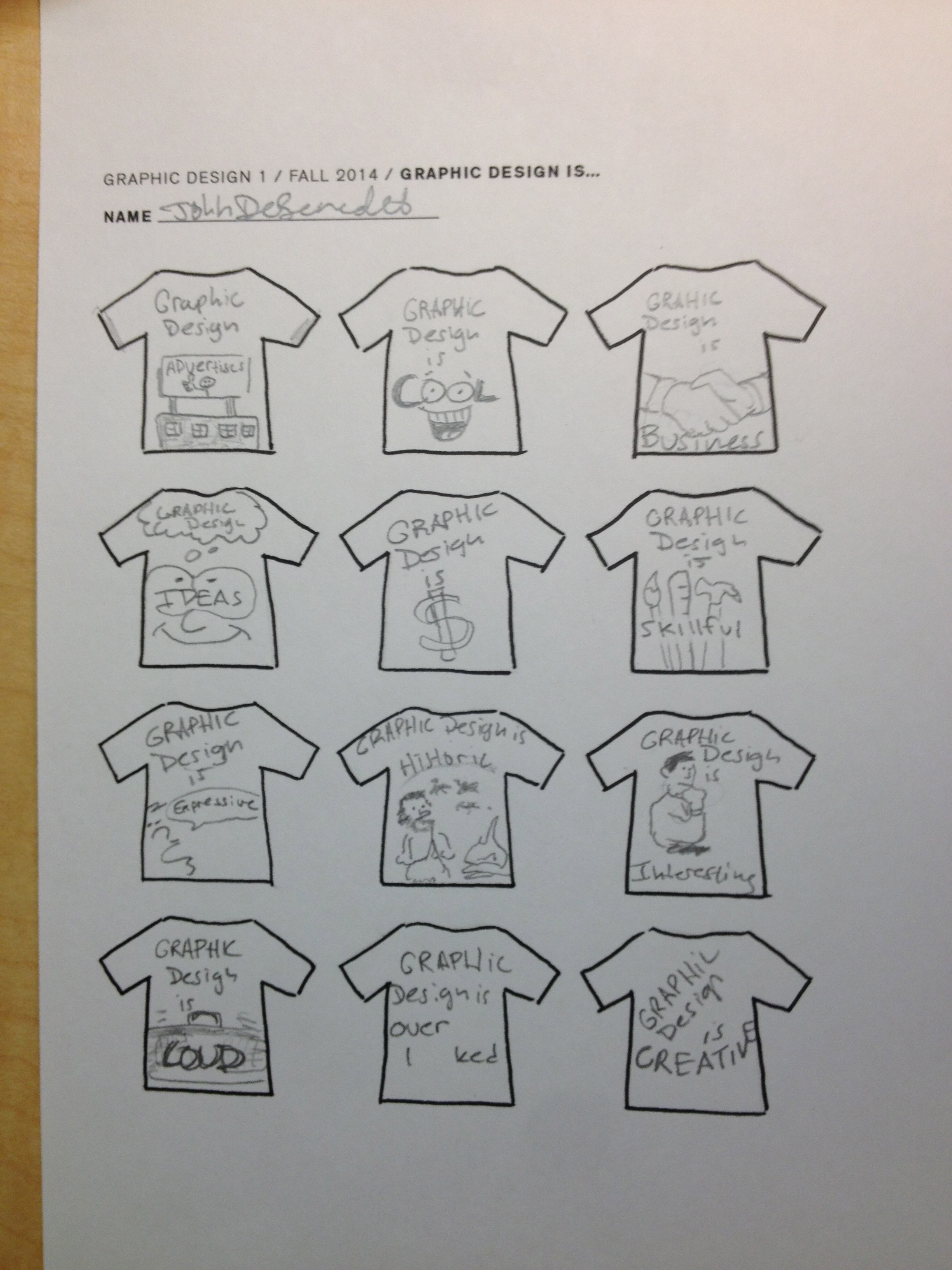
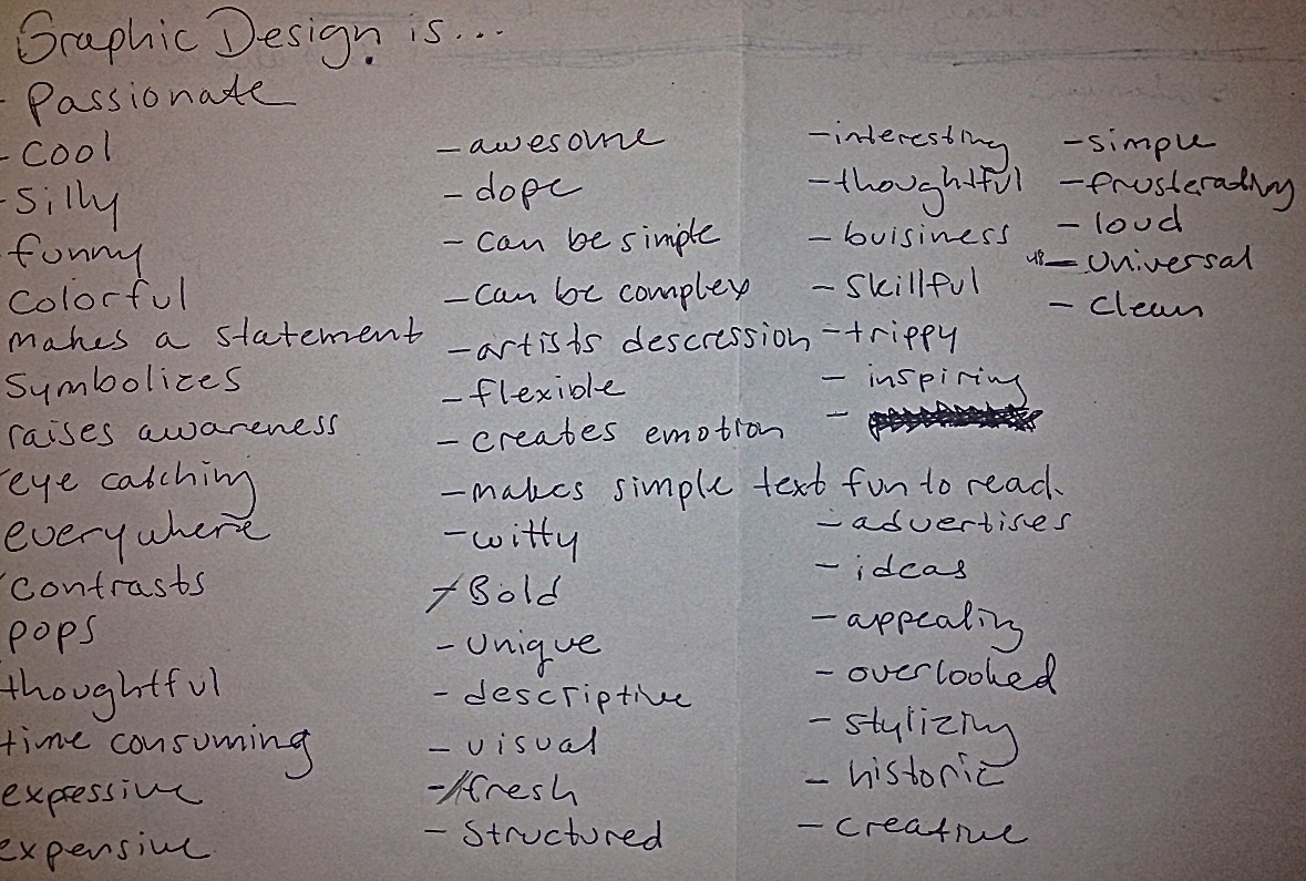
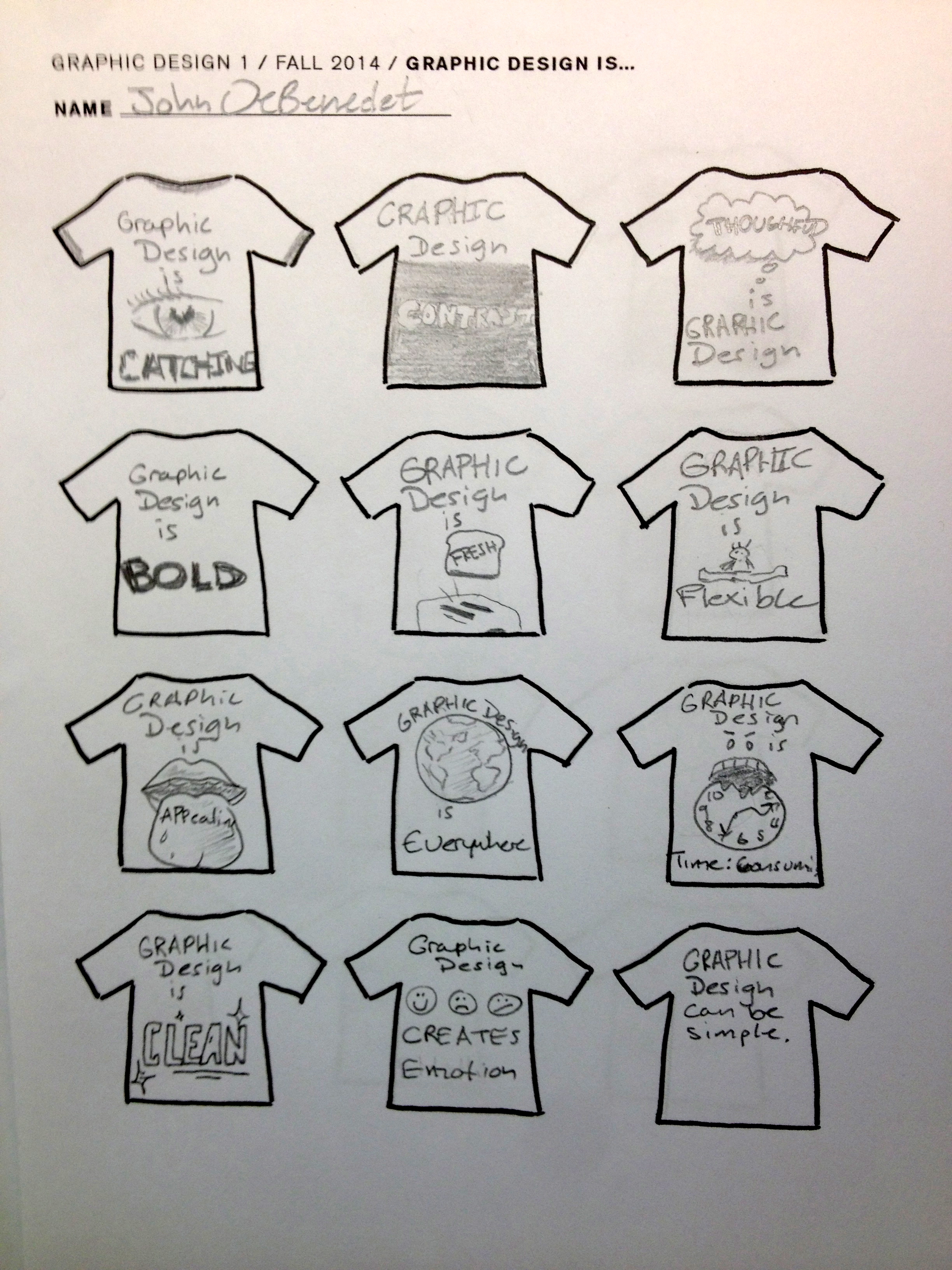
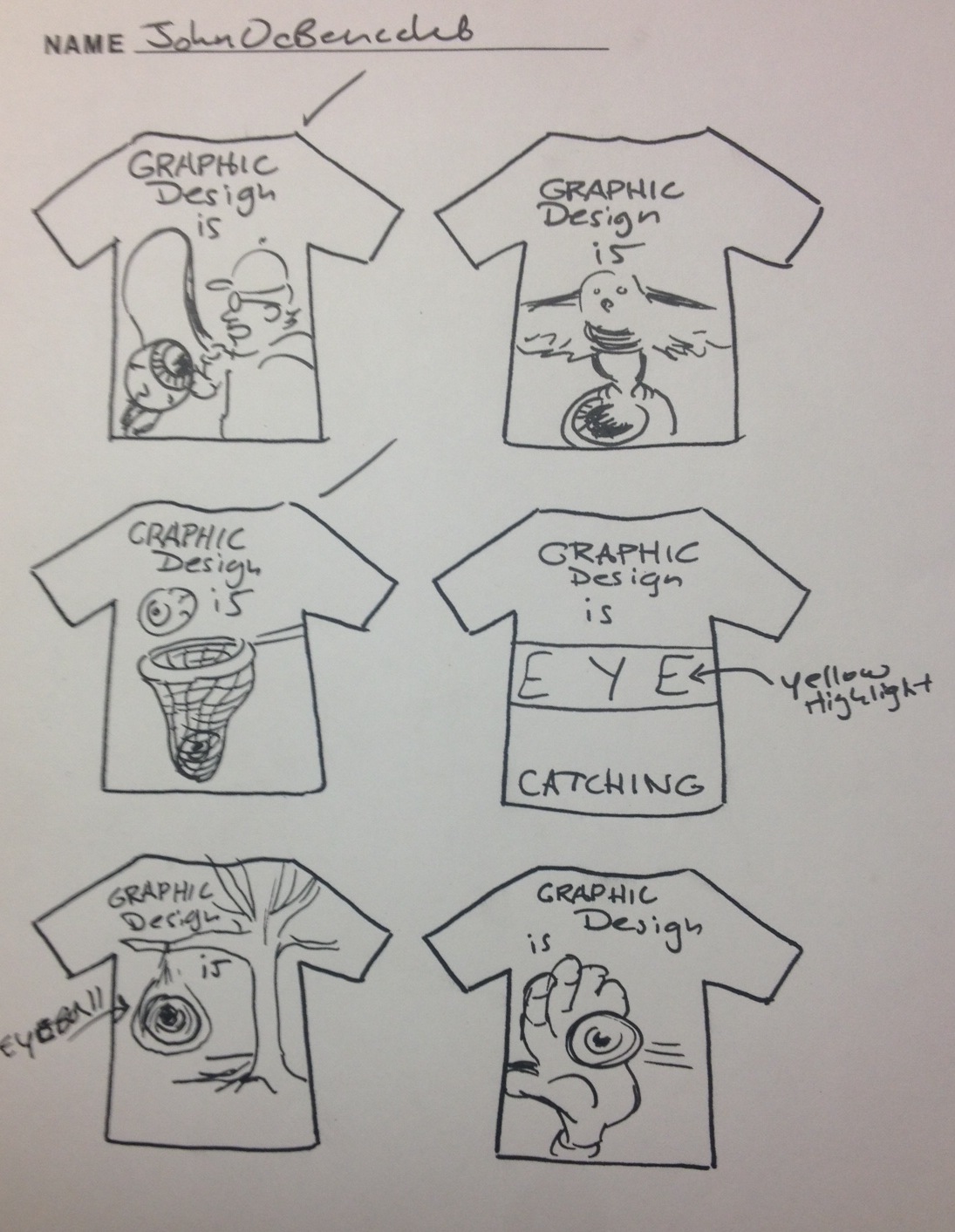
For our class project we were asked to design t-shirts based off of what we think graphic design is. This was not a simple make a single design and iron it on but we took many steps to create our final t-shirt design. We started with making a list of what we personally thought graphic design is and narrowing it down to one. My final thought was that graphic design is “eye catching.”

image (8)


Next, we were asked to make 24 individual thumbnails of some rough t-shirt designs.

IMG_0476 IMG_0477

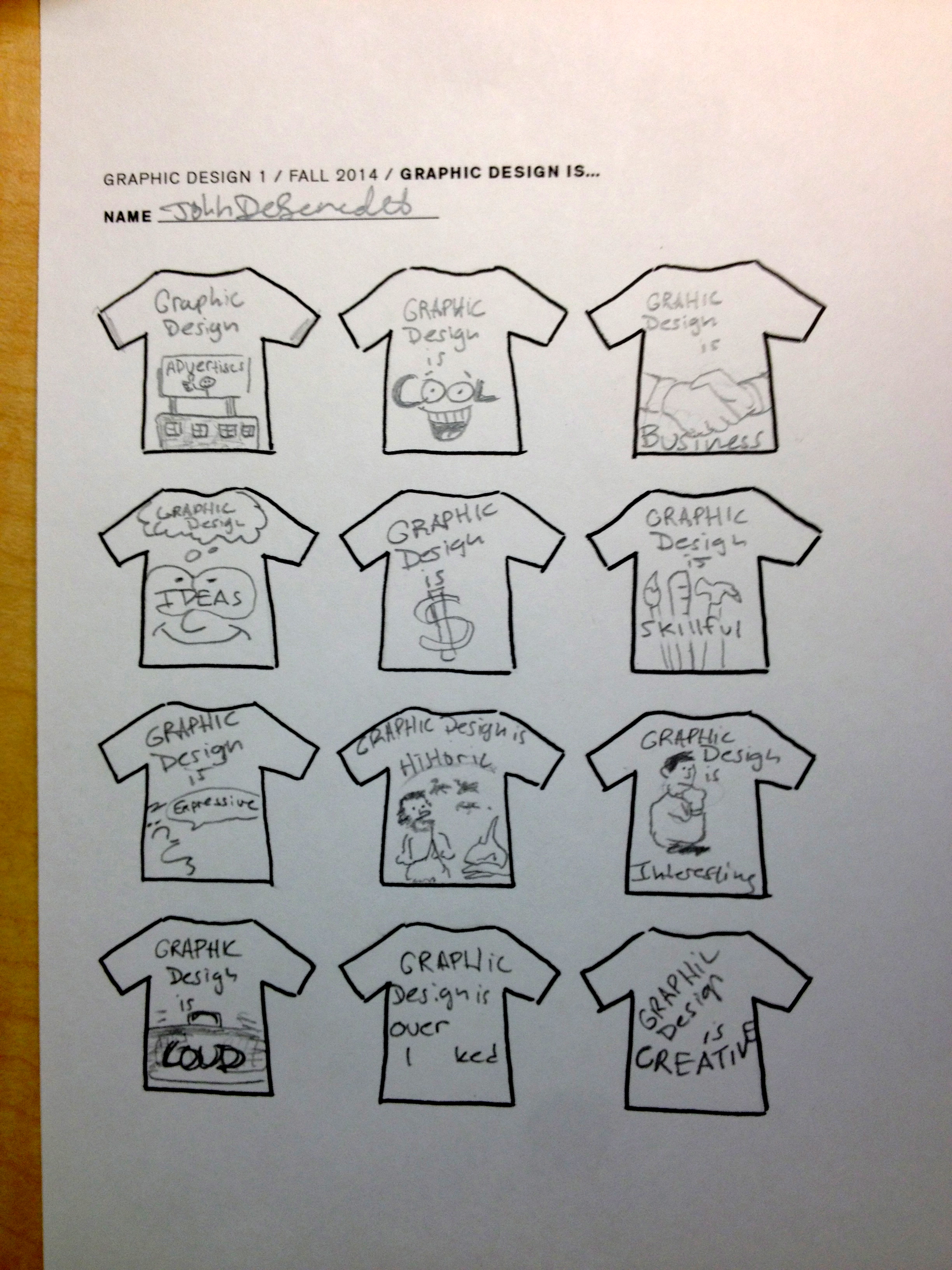
We then began to critique and choose what designs worked and why and what designs didn’t work and why. After this we were assigned to make 36 more t-shirt designs with one single phrase trying to communicate what our thoughts on graphic design is.

image (6) image (7) image (3) image (4) image (5) image (2)

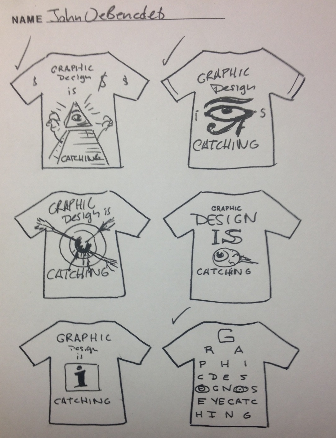
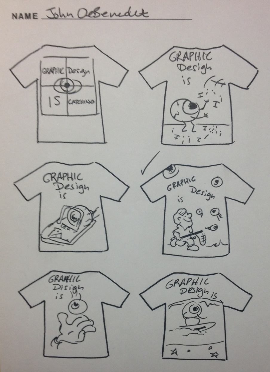
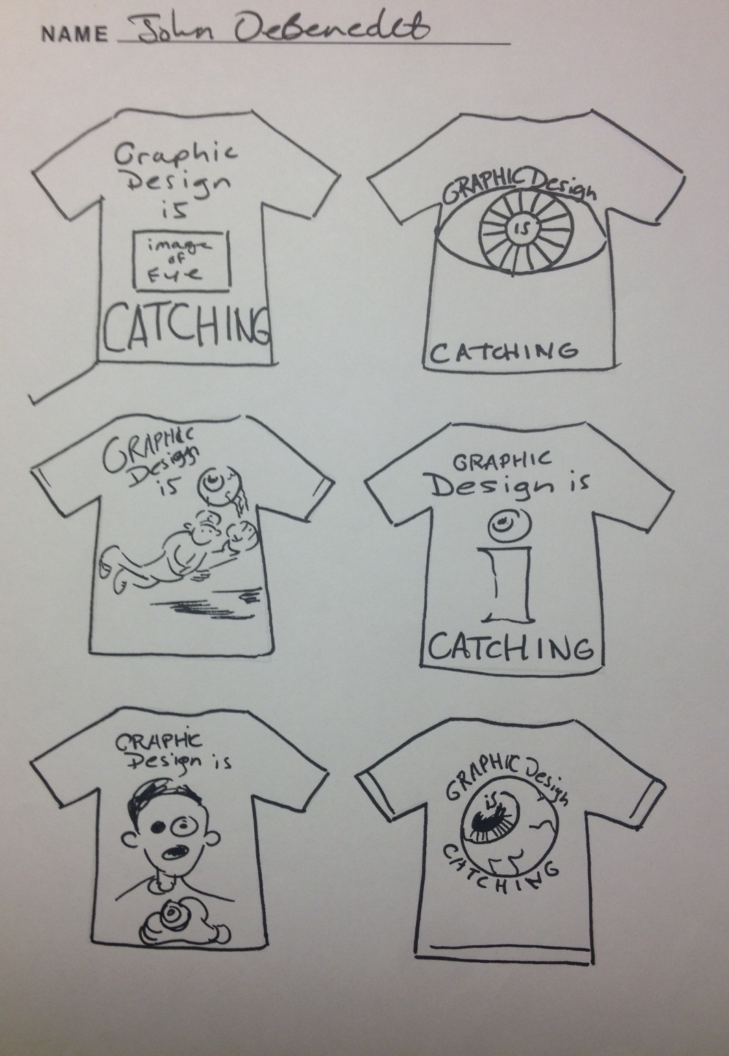
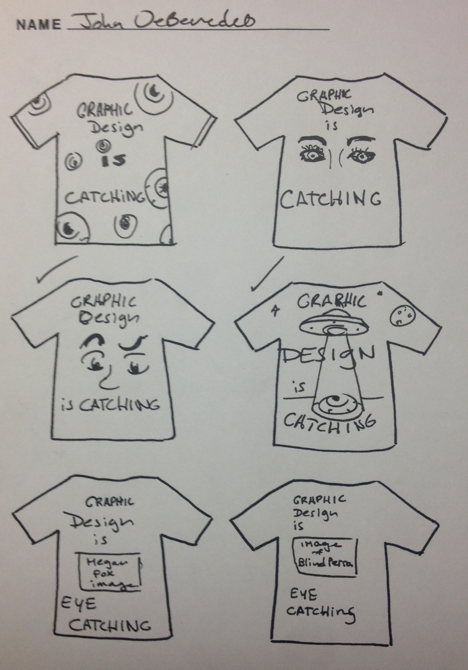
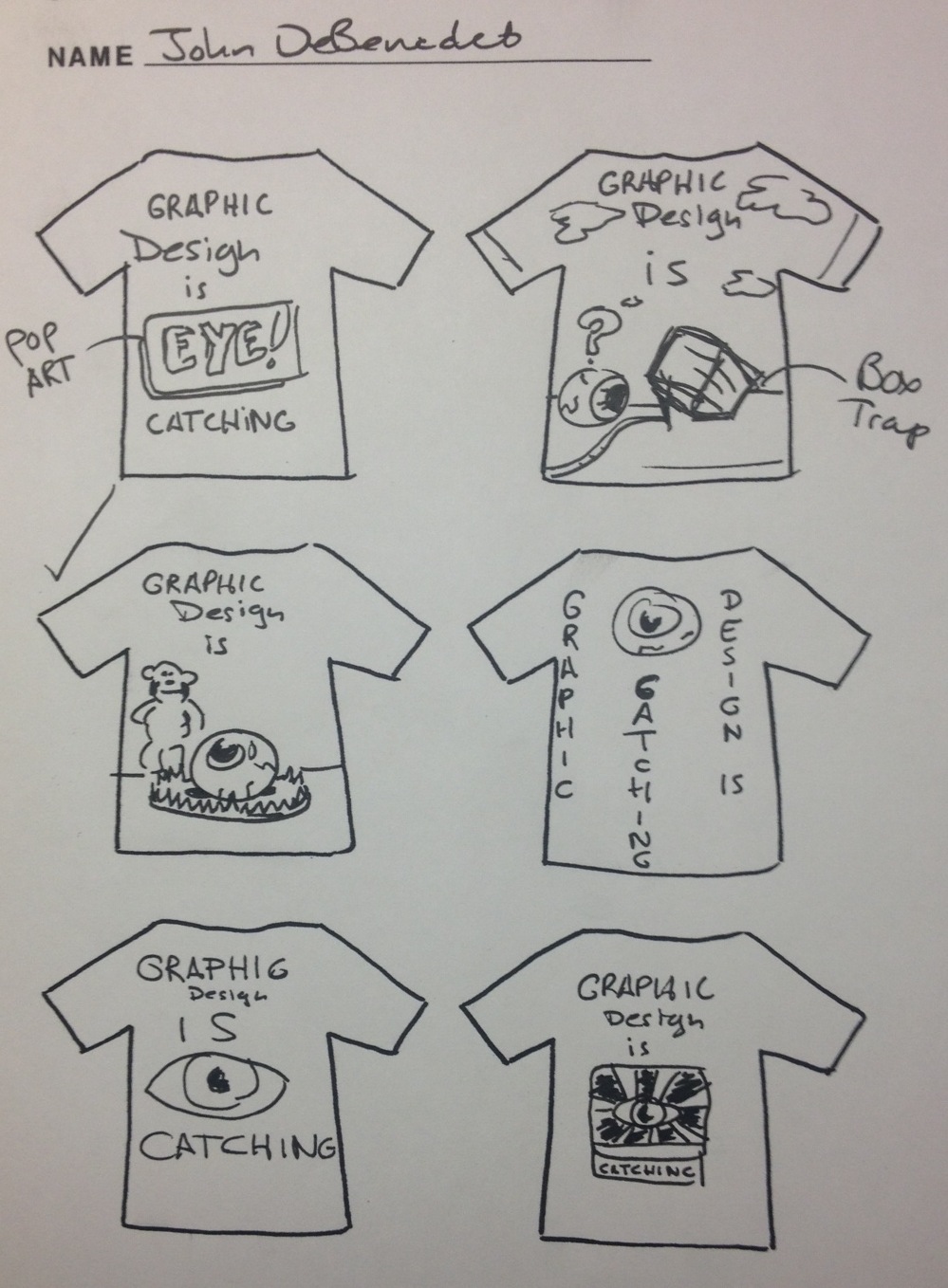
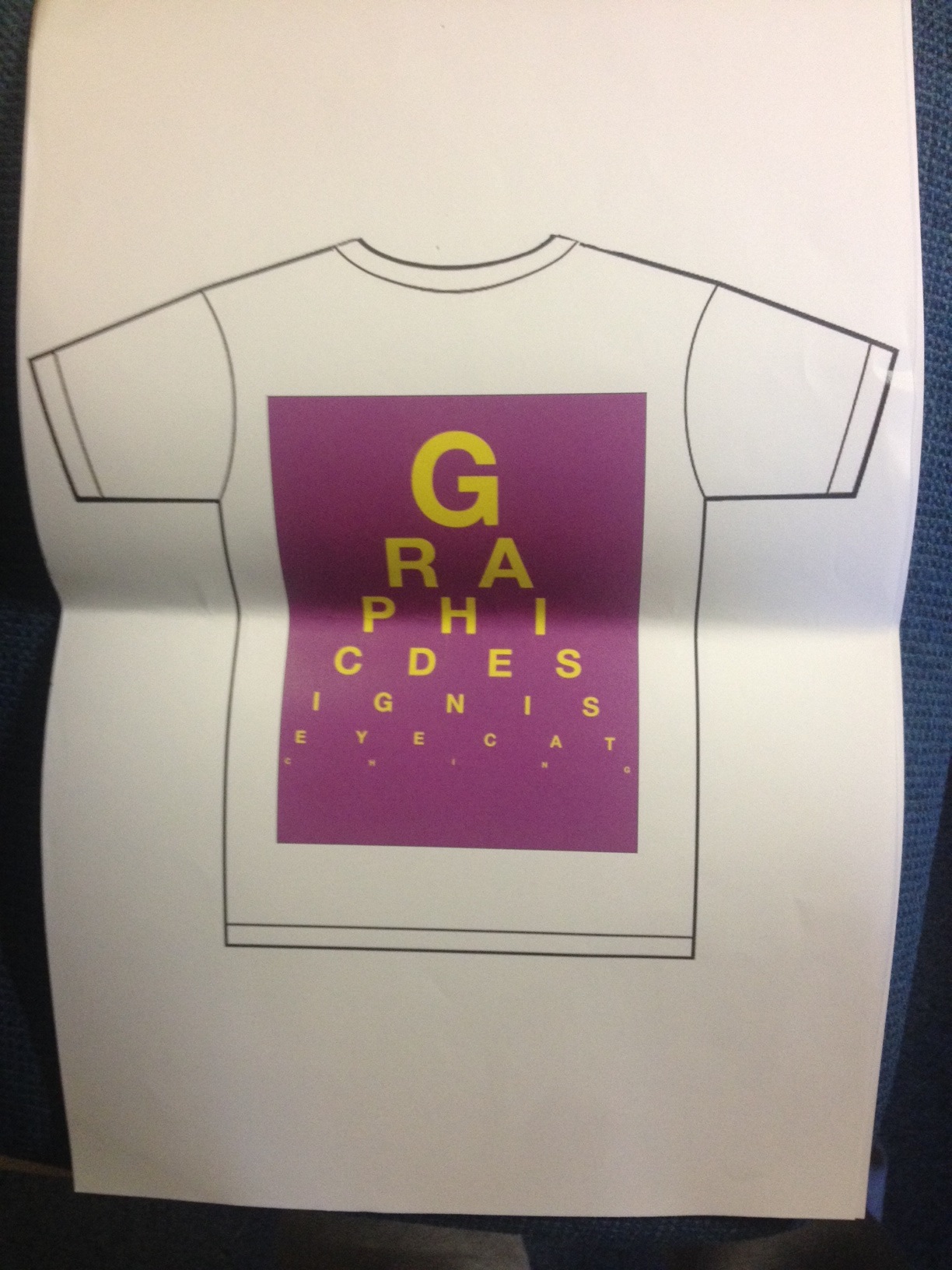
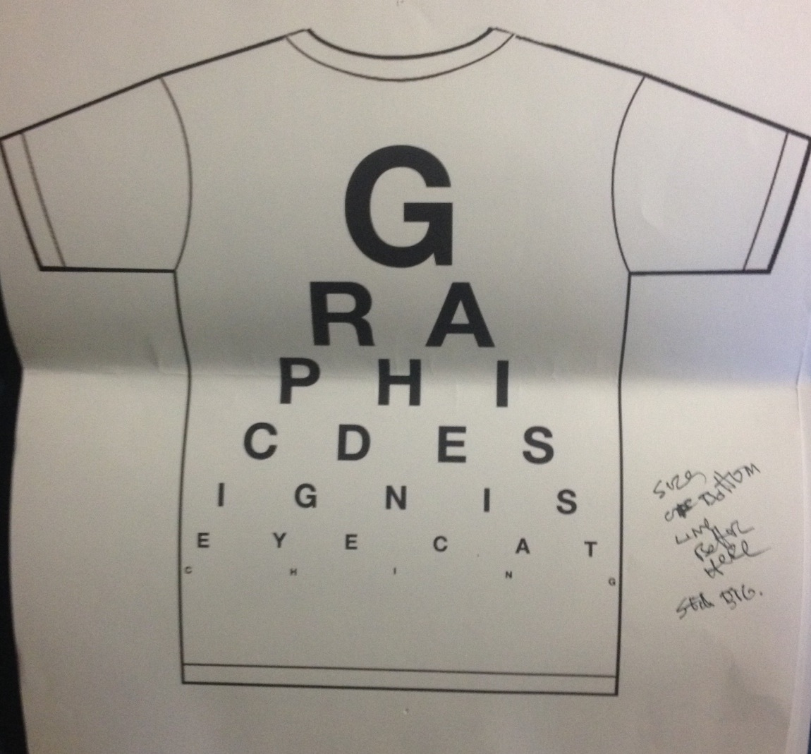
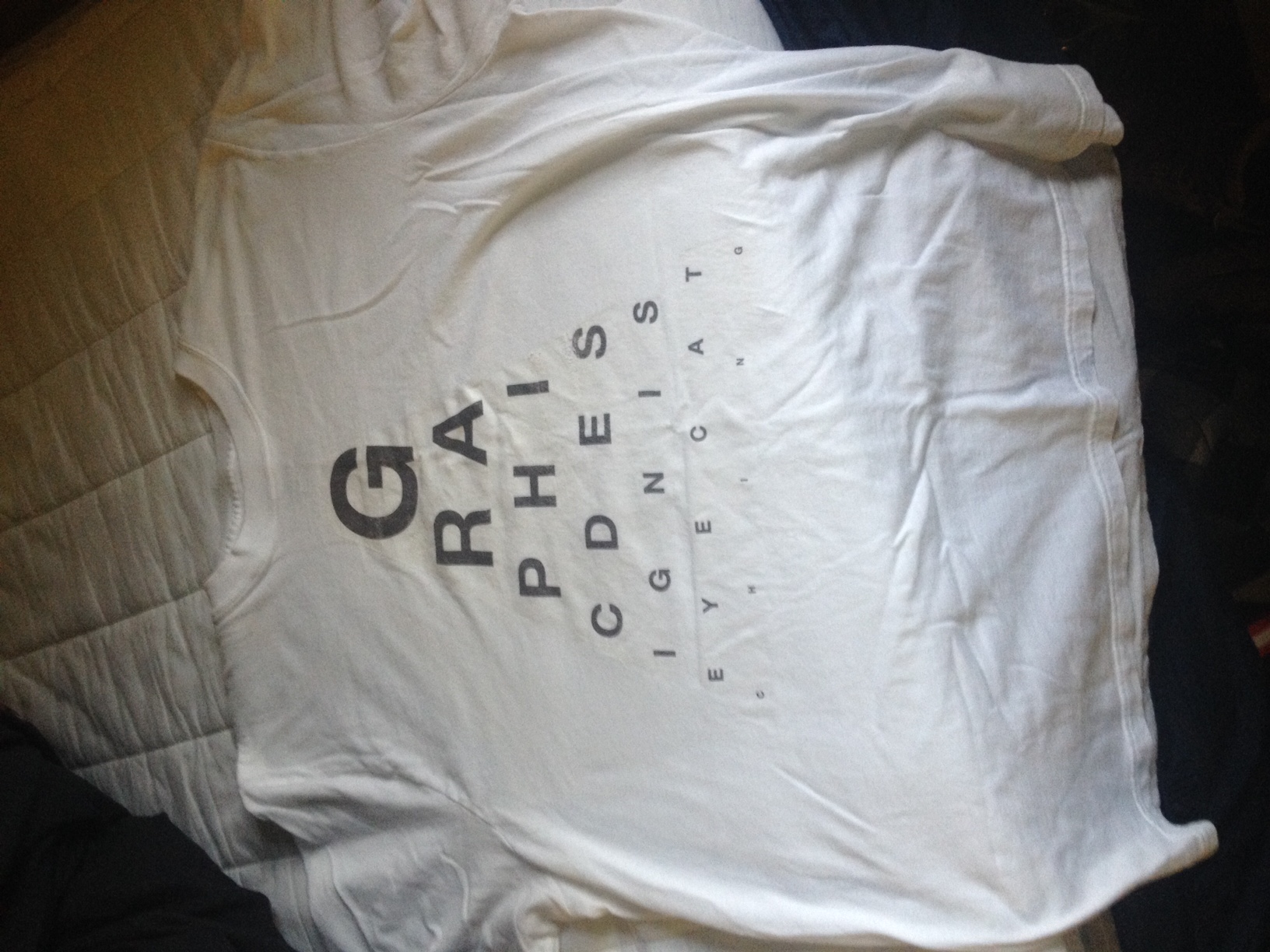
After this we narrowed it down to our best design mine was the last design on the first page which is graphic design is eye catching and the design is based off of the design of an eye test chart that can found in the doctor’s office. Below are just a few of many designs created on Adobe Illustrator/ Photoshop. The last one is the design that I used for my final t-shirt. I think the design was simple compared to some of my original thumbnails but was the best as far as the composition.

image (9) image (10) image (11)


Here is a picture of my final t-shirt-
image (12)

Design and the Play Instinct- Response

In the article Design and the Play Instinct by Paul Rand, he describes how ultimately a students natural talent is what will ultimately make them successful. Two problems exist with this according to Rand, the first is if you give students too much freedom with there work there final work will be meaningless without any structure whereas if the student is instructed with to much direction they’re creativity is restricted and thus the end result is a meaningless solution. Rand explains that teaching should be mutual between the student and the instructor. Alfred North Whitehead explains, “The pupils, have got to be made to feel they are are studying something, and are not merely executing intellectual minutes.”

5 Classic Typefaces

The font that I enjoy the most is Helvetica Neue, a sans-serif typeface which means that it does not include the small lines at the end of the characters. This typeface was only used for display use. I found this pretty interesting because in modern society Helvetica Neue can be found almost everywhere, from computer keys to commercial advertisement. I like Helvetica Neue because it is simple and modern yet its still a great looking typeface without all of the fancy serifs. The typeface that I dislike the most out of the five classic typefaces is Century, a serif typeface, which means that lines continue off of the character. I dislike this font because I feel as though Century has less elegant lines that. For example, Garamond and Baskerville have beautiful lines that go from very bold to very thin, unlike Century who’s lines stay relatively consistent and they also remind me of every and any textbook that I have read in my life.

50- Random Words

Random Words-

  1. rhythm
  2. skirt
  3. library
  4. mist
  5. head
  6. boundary
  7. sky
  8. smash
  9. discovery
  10. downtown
  11. wax
  12. oatmeal
  13. ice
  14. gun
  15. cloth
  16. motion
  17. vegetable
  18. tramp
  19. toothpaste
  20. humor
  21. balance
  22. test
  23. rest
  24. name
  25. fowl
  26. adjustment
  27. underwear
  28. slope
  29. twig
  30. shame
  31. stomach
  32. form
  33. meal
  34. scene
  35. rifle
  36. carriage
  37. truck
  38. star
  39. babies
  40. umbrella
  41. history
  42. cemetery
  43. children
  44. zebra
  45. cat
  46. pipe
  47. jeans
  48. shape
  49. direction
  50. care

Pairs-

1.rhythm- vegetable

2.skirt- shape

3.library- toothpaste

4.mist- humor

5.head- fowl

6.boundary- sky

7.smash- rest

8.discovery- name

9.downtown- zebra

10.wax- shame

11.oatmeal- carriage

12.ice- adjustment

13.gun- care

14.cloth- form

15.motion- cat

16.balance- children

17.test- pipe

18.stomach- babies

19.meal- star

20.scene- history

21.rifle-cemetary

22.truck-jeans

23.umbrella- direction

24.children- twig


Design Comparison

Filippo Marinetti and Piet Zwart were both innovators at the style of design that they worked in. As for Piet Zwart(1885-1977) he was a pioneer of modern typography. Although Zwart was formally trained as an architect and photographer at the School of Applied Arts in Amsterdam in 1902, he later began to experiment with different typography methods such as bold lines, mixing upper and lower case letters, etc. He did not adhere to traditional typography rules, but used the basic principles of constructivism and “De Stijl”( abstract, economical style. It was influential on the Bauhaus and constructivist movements.) in his commercial work. His work can be recognized by its primary colors, geometrical shapes, repeated word patterns and an early use of photomontage.

Like Zwart, Filippo Marinetti(1876-1944) found design later in his life as he was originally a poet editor. Marinetti was also an innovator of a style of design which is called the futurist movement. Futurism was introduced when Marinetti published an article of Futurism in a Paris newspaper. Marinetti’s stirring words established futurism as a revolutionary movement in which all the arts were to test their ideas and forms against the new realities of scientific and industrial society. 

scrabrrrrraanng.low            c011167d19cf6e2fba5c3a5cd6b9839d

The first piece on the left-hand side is titled “SCRABrrRrraaNNG” by Filippo Marinetti, 1919. Compared to “Trio-Reclameboek” by Piet Zwart, 1931. From taking a glance at both images you can see the physical resemblance that they both share. Both pieces use multiple fonts, both use bold and thin lines, and they both seem as though they are hiding some kind of message to tell to the viewer. Both of these pieces seem as though they are breaking the rules of the design norm for their period. I also found it interesting how both designers found graphic design later in their lives and how they were both founders of their own style.

Graphic Design is…

My Perspective 

Graphic design is using the elements of text, icons, and color to make a well-composed statement that represents an idea or simply sends a message.Graphic design can be found everywhere throughout our daily lives. All you have to do is take a look around! Without graphic design I feel as though our lives would be a lot more plain. We use graphic design for business, advertising, or by using designs to express ourselves.

Graphic Design is…

Passionate, cool, silly, funny, colorful, makes a statement, symbolizes, raises awareness, eye catching, everywhere, contrasts, pops, thoughtful, time consuming, expressive, expensive, awesome, dope, can be simple, can be complex, artists discretion, flexible, creates emotion, makes simple text fun to read, witty, bold, unique, descriptive, visual, fresh, structured, interesting, thoughtful, business, skillful, trippy, inspiring, advertises, ideas, appealing, overlooked, stylized, historic, creative, simple, frustrating, loud, universal, clean, exciting

5 Quotes

“There are three responses to a piece of design – yes, no, and WOW! Wow is the one to aim for.”

-Milton Glaser

“You can have an art experience in front of a Rembrandt… or in front of a piece of graphic design.”

-Stefan Sagmeister

“It’s through mistakes that you actually can grow. You have to get bad in order to get good.”

-Paula Scher

“A designer knows he has achieved perfection not when there is nothing left to add, but when there is nothing left to take away.”

-Antoine de Saint-Exupéry

“Digital design is like painting, except the paint never dries.”

-Neville Brody

 Inspiration

1518287064616_R5vacDFt_l tumblr_mbscnbeAIW1qzqwamo1_500 Pop-Art-Ray-Ban-Rare-Prints-Ads images-2 images-1 subway-logo-large cool_graphic_tshirt_designs_7 images-2 stock-vector-idea-concept-125214002 graphic-design-inspiration-1 images three_dimensional_typography_004 images-3 images-5 cyberexe-1765341 images-4 art-coke-design-graphic-design-gritty-illustration-Favim.com-40457 images-6 graphic-design-mujjo-logo-colour GraphicDesignPlagiarism13 cyberexe-1765341 graphic_Design_in_the_letter_G_by_Mattie7777 graphic-design-breda-2012-big

Thumbnails 

IMG_0476IMG_0477


What is graphic design?

103549306Everywhere

Graphic design is everywhere from the logo on the cereal box that we eat in the morning to the cover of the book that we read in class, Graphic design is a major factor in our lives whether we realize it or not. In result, graphic design can be broken down in to many categories. Just a few of the categories that interested me during the reading included Brand and Identity Design, Publication Design and Package Design.

Brand and Identity Design really caught my eye because one single logo can make such a statement and can give a face to a company or brand. Brand and Identity design takes a single logo or design layout and brings a unique look to a company and can give the consumer something visual to remember. I think I could succeed at this because I love to draw and have a great eye for color schemes and  I am always constantly admiring logos and graphics on products. I also think it would be an awesome feeling to create and see my own logo on a product or sign.

A great brand and identity designer is Steff Geissbuhler. He is often referred to as one of the most important graphic design artists ever. He designed for Time Warner Cable, NBC, Crane and Co. and many more. Listed below is his personal website.

http://www.geissbuhler.com/

Publication Design this area of graphic design allows the designer to create layouts for periodicals, which can include journals, newspapers, magazines etc. I also like how text, graphics and photos can be combined to creates unique layouts that give a magazine or newspaper it’s own identity. More than 75,000 periodicals are published each year in the United States alone. That number shows how many job opportunities can possibly arise within this branch of graphic design. I think that I could succeed with this field of graphic design because I like messing around with different fonts, and enjoy taking pictures. I am also pretty good with computers and could learn how to use web based design programs.

Kate Moross is a great publication designer from England. Who has designed for Nike, Topshop and Google. Listed below is her personal website.

http://katemoross.com/

Package Design I also found that package design pretty interesting. This branch of graphic design seems pretty awesome because the final product is tangible. This includes designing for everyday life products such as food and beverage, cosmetics, household products and pharmaceutical. I think this would be a good fit for me because I am a designer and consumer so I can design packages that I could see myself buying.

I couldn’t find a single package designer but I did find a packaging company that I thought everyone would enjoy it is called Festina Watches. It is a German waterproof watch brand that packages the watches in water!

http://www.festina.de/en/herrenuhren.html

http://theinspirationroom.com/daily/design/2014/3/festina_engineered_for_water_1.jpg

I checked out the book, Icons of Graphic Design by Steven Heller and Mirko Ilic. This book with over 1,700 illustrations displays some of the most influential graphic design work from the early 1900’s to the present. Below are just a few of many works that I found interesting.

icons_of_graphic_design

IMG_0466

IMG_0467

IMG_0468

IMG_0469

IMG_0470

IMG_0471