By Jess

Random Words

  • Tree
  • Rabbit
  • Computer Mouse
  • Tomato
  • Chicken
  • Bottle
  • Panda
  • Knife
  • Milk
  • Crow
  • Phone
  • Nail Clippers
  • Bed
  • Apple
  • Zebra
  • Fork
  • Rug
  • Egg
  • Beef
  • Bread
  • Squirrel
  • Bananas
  • Dove
  • Plate
  • Lion
  • Sofa
  • Dolphin
  • Orange
  • Bathtub
  • Chocolate
  • Hamster
  • Light Bulb
  • Shark
  • Fridge
  • Giraffe
  • Computer
  • Spectacles
  • Fire
  • Spice
  • Turtle
  • Fish
  • Dog
  • Drawer
  • Sheep
  • Lamp
  • Carrot
  • Scope
  • Ice Cube
  • Quilt
  • Screw


1. Beef/Turtle
2. Sheep/Screw
3. Whale/Bed
4. Bathtub/Dove
5. Fish/Quilt
6. Bread/Panda
7. Milk/Lamp
8. Spectacles/Knife
9. Tomato/Hamster
10. Computer/Ice Cube
11. Phone/Chicken
12. Crow/Bottle
13. Giraffe/Chocolate
14. Lion/Spice
15. Dog/Fork
16. Drawer/Zebra
17. Rug/Apple
18. Plate/Nail clippers
19. Fire/Fridge
20. Light Bulb/Tree


Design and Play

The “Design and The Play Instinct” article by Paul Rand compares two types of instincts that the human designer fights with. Playing is compared to limitations of designing while discussing the art of design. The brawl between creativity and limits is a very tight match. On one hand a designer wants to create a piece that is smart and appealing. but also must concentrate on certain rules and regulations on the design and for what purpose it is being created for. Rand explains that in order for good design there should be a ‘happy medium” when teaching students the art of design. He states: “If possible, teaching should alternate between theoretical and practical problems…But this can happen only after the student has been taught basic disciplines and their application. He then is able to invent his own system for ‘playing the game'”. I agree with him. The only way to have that happy medium between rules and creativity is to teach the student the rules of the design one aspect at a time. Then once he or she is aware of those rules they can now create their ingenious works of design with the background of fundamentals in mind. There is always going to be that need or want to explore outside of the given assignment, but there are certain aspects to focus on and understand before expanding on those wild ideas.

5 Classic Type Faces

After studying, reading and learning about the 5 classic types faces (Garamond, Baskerville, Helvetica, Century and Bodoni), I came to the conclusion that I appreciate Garamond most. With Garamond, the thick strokes and downward slope on the serifs appeal to me. The fact that the font is not as stiff and monotone compared to some of the other fonts (like Helvetica) is kind to my eyes. There is also something about the old style of the font that i appreciate; it reminds me of the old printing used in the past and gives me a sense of history.

If I were to choose a font that I liked “a little less” out of the 5, Century is what I would have to pick from the group of fantastic fonts. The curved brackets and the lighter weight of the typeface, where the pen would find its end point on the letter is pleasant. Compared to Garamond’s sculpted serif, Century’s slab serif doesn’t settle as well with me; it looks like it was cut-off abruptly. Both are nice fonts, with similarities and differences, but the sense of flow and history rather than the thought of modern day and “edginess” when studying the fonts forced me to choose Garamond over Century.

Design Comparison

Victor Moscoso (1936)

During the 1960s and 1970s, residing in San Francisco but from Spain, Victor created psychedelic rock posters and advertisements with relation to the Underground Comix. Along with billboards, t-shirts and many other materials, his psychedelic designs and styles full of vibrant colors and hypnotizing creations were influenced by the artist Josef Albers; one of his teachers from Yale, Albers was the first of the rock poster artists to use photographic collage on a majority of his posters. Moscoso received international consideration from his work and created many album covers for musicians including Herbie Hancock, Jerry Garcia and other known artists of the era.

April Greiman (1948)
During the late 1970s and early 1980s, Greiman was one of the first designers to to hold of computer technology to use it as a design tool. Those who thought that computer technology and digitalization would harm the design world were proved wrong by the work that Greiman created from it. She utilizes color, image and words to express her voice through her pieces.

Both artists used their creative abilities to create a new form of design. Moscoso with the unique psychedelic posters for local musicians and Greiman with her innovative use of the new computer technology to create works of voice and style.

Graphic Design is…

My Perspective of Graphic Design:
Graphic Design is everywhere. It is important for someone who is trying to reach out to others in order to inform, teach or gain. Whether it be a poster to promote a local band and their upcoming show or a billboard trying to tell drivers that alcohol and driving don’t mix; graphic design needs to be eye-catching and interesting in order to get it’s audience to see even think to take a closer look. Without an interesting design that pulls the nearest eye toward it, certain words, images or announcement are missed or neglected.

Graphic Design is…

Art
A form of expression
A stress-reliever
Better than nothing
Better than Sex
Boring
Exciting
Informing
Worth another look
Releasing inner thoughts
A work in progress
Bold
Political
Beautiful
Ugly
Is Wants you!
Smart
Dumb
Forever
Everywhere
Invisible
Something you can’t get enough of
Just one of many forms
Something that pulls from your imagination
Used to pull the viewer in
Captivating
Your worst nightmare
Your wildest dreams
A money maker
Good for the soul
Confusing
Clutter
Inspiring
Freedom
Creative
Loud
Soft
Hard
Easy
Pushing the limit
New
Old
Relaxing
Geometrical
Asymmetrical
Words
Images
Colors
Shapes
Amazing

Inspiring Graphic Design Quotes

Good design is obvious. Great design is transparent.
Joe Sparano

I am always doing that which I can not do, in order that I may learn how to do it.
– Pablo Picasso

Everything is designed. Few things are designed well.
– Brian Reed

Have the passion, take the action & magic will happen.
– Bar Rafaeli

Design is where science and art break even.
Robin Mathew

Inspirational Images

Thumbnails


What is Graphic Design?

Areas of Interest:

Motion Design:

I am currently a Film and Graphic Design major so therefore it is easy for me to say that my interest lies within the topics of art in motion. My main focus for the future is to become an animator or get a job along those lines. It goes without saying that as a Film major I love film and many forms of art that comes with it, but with the combination of design and film and some, motion design seems to be the area of design I am most interested in.

Interaction Design:

Using visual art to develop a program that can be used and explored through by its users just sounds cool to me. It has become clear that I like to create certain pieces or projects that include my viewer, user or audience and calls for their reactions or emotions towards what I create for them. Just like making a film for an audience to watch; creating a software for a user to use and interact with satisfies me equally.

Brand and Identity Design:

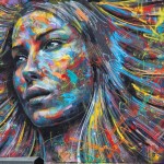
I intern at a local labeling company where I work with the marketing team contributing various ideas and illustrations for the company to use to promote their products. I see many logos, spec sheets, and general company strategies and designs used to capture the eye of the average curious customer. Having experience through the label company gives me more knowledge on what to expect from the area of brand and identity design.


Research:

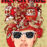
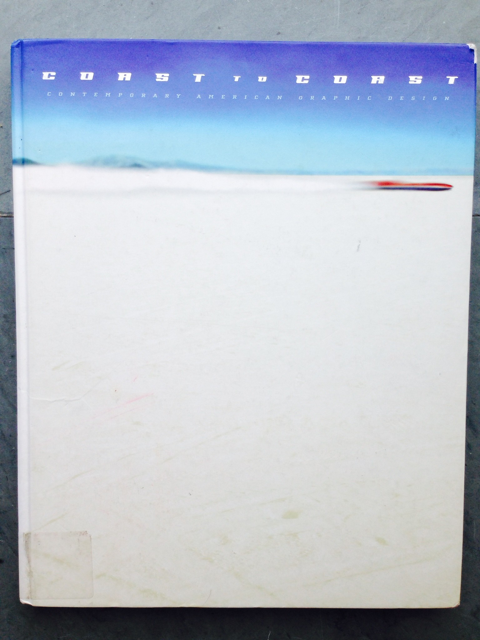
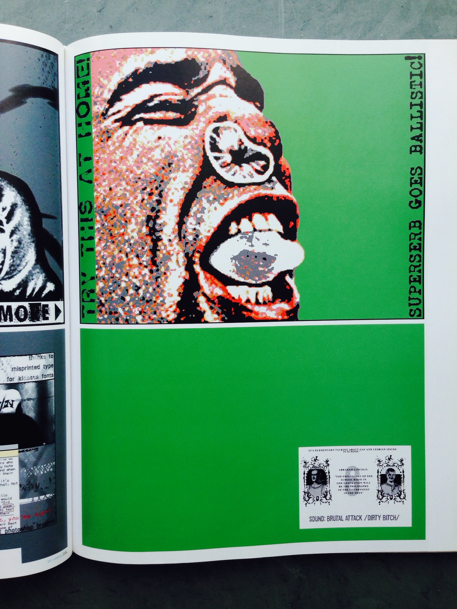
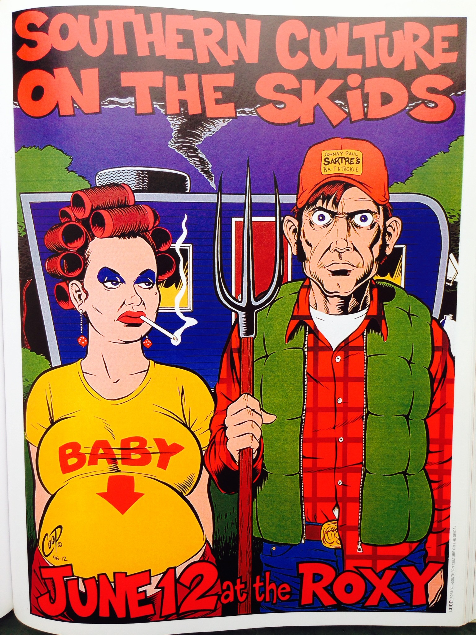
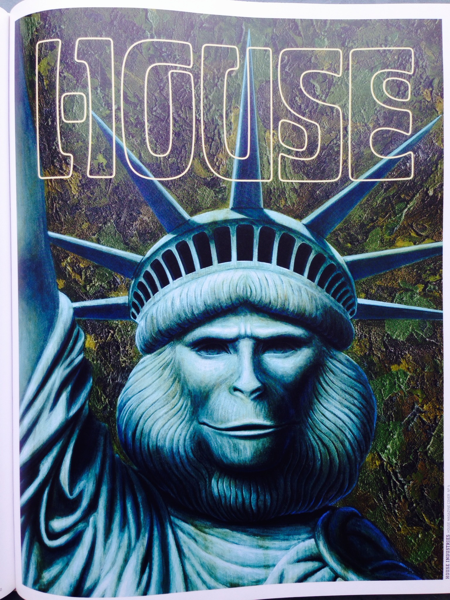
The book I chose to research is called “Coast to Coast: Contemporary American Graphic Design”.

photo (2)photo_2photo_3 (2) photo_5 (2)

Here you’ll find moving slides of pictures promoting certain topics and links to works for one to explore.

– www.surround.ws

When you first enter this website you are met with a quote: “Demanifest Unite In The One Manifest_”. It then provides you with link to News, Projects and more information about the foundation.

– www.phantomresearchfoundation.com

A bird flies across the screen in front of an image and below this animation are links, information and picture for exhibitions, projects and performances for artists promoted by the group.

– www.futurefarmers.com

A vast amount of images lined up in squares fill the page. The website title and the links to works and contact information stand out on the website in one big white rectangle.

www.graphichavoc.com