Paul Rand, the author of “Design and the Play Instincts”, establishes the strains of being a teacher and how to keep a student captivated by his or her work. He later states his opinion on how a teacher can keep the students engaged. Paul Rand came up with the idea that giving a lot of limitations to students will force them to think out of the box, more so than if he or she had the independence to do anything they desired. Rand states;
“I believe that if, in the statement of a problem, undue emphasis is placed on freedom and self expression, the result is apt to be an indifferent student and a meaningless solution. Conversely, a problem with defined limits, implied or stated disciplines which are, in turn, conducive to the instinct of play, will most likely yield and interested student and, a very often, a meaningful and novel solution”
The Chinese toy, The Tangram, is a little square that is divided into 7 different shapes: five triangles, one square, and one rhombus. The purpose of this games is to make any kind of figure or pattern. This game intrigued me the most due to its simplicity but mostly its hidden value. In order to be a graphic designer one needs to be able arrange different shapes and construct and image. Paul Rand makes it clear that having an eye for abstract is a very essential to design.
When critiquing a project it is clear whether or not time and thought was put into it. Rand believes that having meaning behind your work makes it more worthwhile. Meaningless work will never stand out or make a difference in the world. Everyone wants their art work to be remembered.
I agree with everything that Paul Rand stated. Without rules students would never put in that extra notion to make their work that much better.
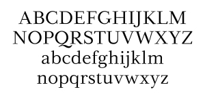
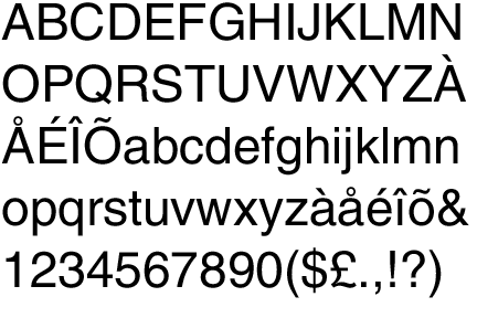
Out of the five classic typefaces, Baskerville is my favorite due to its drastic contrast in the thickness within the letters. This is very pleasing to the eye. As well as contrast in thickness, Baskerville has very dramatic Serifs. For example, the y and g specifically are fancy looking.
Without a doubt Helvetica is my least favorite font out of the five. It is the only font that does not have any serifs. Also It is one thickness throughout. In my opinion is just too boring. However, helvetica is one of the most commonly used fonts in the worlds. Commonly found in books and websites. Interesting fact, iOs also uses the font helvetica. It’s popularity is due to it being very easy to read. The main thing I do not like about helvetica is that the dot to the I’s are squares. Baskerville, however, uses cirlces to dot the I’s. That is my Baskerville is my favorite and Helvetica is my least favorite.
In the class text there were two designers that caught my eye.
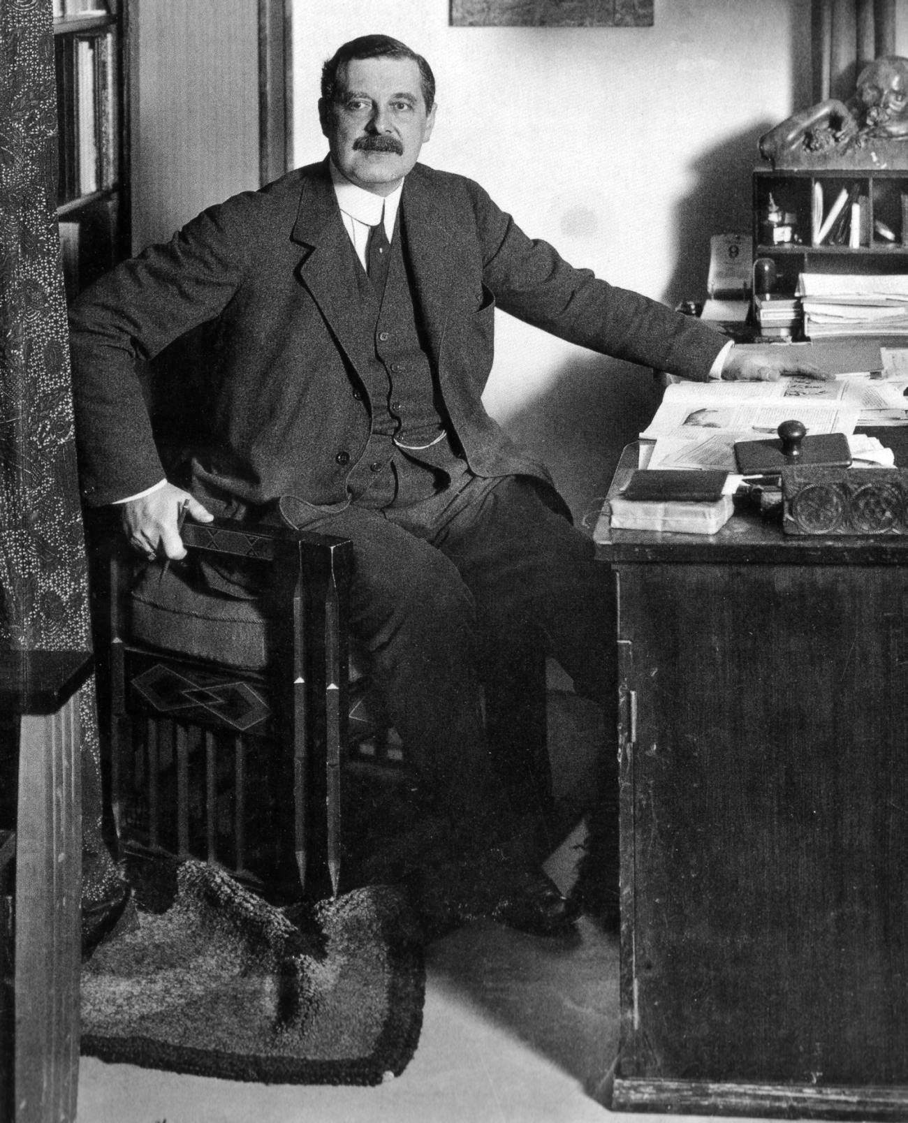
Henry Van De Velde (April 3, 1863- October 15, 1957)
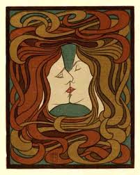
Henry Van De Velde was born in Amtwerp, Belgium on April 3, 1863. He was a painter, Architect, and an Interior designer. He is one of the main founders and representatives of Art Nouveau in Belgium. He spent a lot of time in Germany and influenced a lot of the architect and design in the 20th century. In the beginning he was actually a painter but in 1892 he devoted his time to interior design. Van de Velde was strongly influence by John Ruskin and William Morris’ English arts and crafts movement. Henry Van De Velde was one of the first designers to incorporate curved lines with the abstract style. In 1899, He settled in Weimer, Germany. By 1905 Henry Van de Velde had established the Grand-Ducal School of Arts and Crafts with the help of the Grand Duke of Weimer. During World War 1 due to being a foreigner, he had to leave Germany and go back to his native lands. He lived in both Switzerland and the Netherlands for some time. He died at age 93 in Zurich.
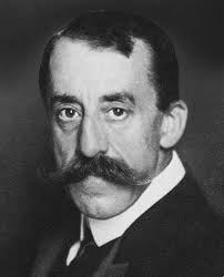
Peter Behrens (April 14, 1868- February 1940)
Peter Behrens is a german architect and designer. He was very important in the modern movement. From September 1877 to 1882 Behrens attended the christianeum Hamburg. In 1890 he married Lily Kramer and moved to Munich. At first, he worked as a painter, illustrator, and book binder. He was very interested in subjects related to the reform of life-styles. In 1899 Behrens accepted the invitation of the Grand Duke Ernst-Ludwig of Hesse to be the second member of his recently inaugurated Darmstadt Artists’ Colony. Here he built his own house and fully conceived everything inside (furniture, paintings, towels, pottery, etc.). It is said that this was a turning point in his life when moved away and wanted to change to a more unadorned style. He then became one of the leaders of architectural reform during the turn of the century and was a designer of factories, and office buildings in glass, brick, and steel (example: Aeg Turbine hall). While in Berlin (1936) Adolf Hitler wanted Behrens to be apart of his dream for Berlin to get new headquarters but was rejected by Alfred Rosenberg. Hilter really admired his Saint Petersburg Embassy. Four years later Behrens died in Hotel Bristol in Berlin.
Compare
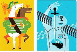
Henry Van De Velde
Peter Behren
I chose these two pieces because they really stood out to me. The fluidity that they both possess does a great job in capturing the attention of its audience. They relate to each other because they have more of a geometric vibe. A lot of thought was put into where every single line should be placed and the location/curve of the line. Even though these two pieces of art have very different meanings they both still have some physical similarity.
Graphic Design is seen in all quarters of the world. Everywhere you look there is graphic design; street/restaurant signs, door numbers, food packaging, posters, etc. Graphic Design is the creative process combining technology and art. To be a successful graphic designer one needs to be capable of intertwining typography, images, colors, and symbols to take an idea and translate it into a visual message.
-art with a purpose
-diligent
-tedious
-hard work
– visual skill and knowledge of communications and technology
-a commitment
-art translated onto a computer
-exasperating
-irksome
-worth it
– satisfying
-enjoyable
-branding
-inventive
-imaginative
-experimental
-visionary
-original
-expressive
-perceptive
-beautiful
-overwhelming
-stunning
-wonderful
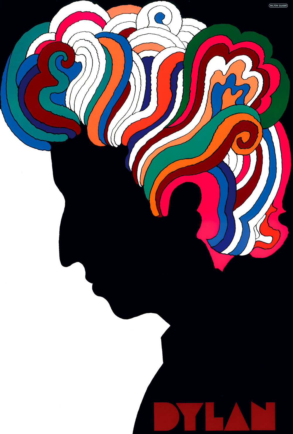
-psychedelic
-eye opening
-mind altering
-breath taking
-intimidating
-spectacular
-striking
-out-of-this-world
-magnificent
-significant
-impelling
-cool
-exciting
-fabulous
-stimulating
-alluring
-splendid
-glorious
-angelic
-ravishing
-fascinating
-harmony
-expanding one’s horizon
-filled with different perspectives
-a revelation
Quotes
Milton Glaser
“There are three responses to a piece of design- yes, no, and WOW! Wow is the one to aim for”
Paul Rand
“The public is more familiar with bad design than good design. It is, in effect, conditioned to prefer bad design, because that is what it lives with. The new becomes threatening, the old reassuring.”
Neville Brody
“Digital Design is like painting, except the paint never dries”
Frank Chimero
“Good design is all about making other designers feel like idiots because that idea wasn’t their’s.”
Jeffery Zeldman
“Content precedes design. Design in the absence of content is not design, it’s decoration.”
Chapter 1 Reading Response Graphic Design is a major that has many different categories. From the class text assigned, Read chapter 1 of, Guide to graphic design, edition 1 by Scott W. Santoro, I was introduced to many topics that I can see myself pursuing after completing school. These topics include Type design, Publication Design, and Brand Identity Design.
Type Designer Type design interests me because typography was definitely my favorite subject that was covered in Technology workshop. In Guide to graphic design Sam W. Santoro states, “A type designer creates new letter forms and fonts to develop a complete typeface family.” Personally I enjoy the artistic side of graphic design. So using my artistic abilities to come up with a creative font seems like a great fit for me.
Max Miendinger (1957) is the famous typographer from Switzerland who created the type face, Helvetica. This font is classified as a san serif font.
Video
Publication Designer Growing up I always loved reading magazines. My favorites were always the ones with the most creative designs.
During my senior year of High School I was apart of the Yearbook class. That was what made me want to be a Graphic designer. My design for the sports template as well as the Sandy hook template was chosen to be used in the book. My teacher said in my review that I have an eye for graphic designs and coming up with creative and eye grabbing ideas.
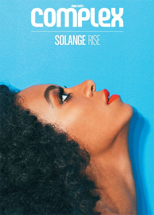
Brent Rollins is an Art director who created Complex magazine’s June/July issue. It stars R&B singer Solange, with her red lipstick and blue background providing an incredible aesthetic feel. Where the magazine’s title ‘Rise’ with Solange looking up creates a connection between text and imagery.
http://www.brentrollins.com/
Brand Identity
As well as Type design and Publication design, Brand Identity is a very artistically based type of Graphic design. Santoro states, “For any company to succeed it must establish its own, unique brand that is burnt into the mind of it’s audience. A logo can accomplish this function by presenting a face for the viewer to see a visual identity”. In order to graduate from my high school, Masuk it was mandatory to complete a capstone project. The topic that I chose was Graphic Design. I worked with a start up online talent competition. I got to give the companies graphic designer my teenage opinion on things which was vital due to teenagers being their main audience. I was asked about where certain information should be put due to importance as well as what the design for the award should be (my sketch was used). My favorite task I had was helping create the companies logo. My enjoyment while completing my mandatory shadowing hours convinced me that graphic design is the career path for me.
Company website: http://www.highschooltalentbattles.com/
A great production designer Wayne Hunt created the logo and design for, Moon Rock Cafe


,%201907,%20Vorderseite_bearbeitet-1.jpg?sequence=1)