By Margaret Metzger

Random Words

50 Words

  1. trail mix
  2. chocolate
  3. worms
  4. blanket
  5. hot coco
  6. marshmellows
  7. peanut butter
  8. jelly
  9. sandwich
  10. river
  11. fish
  12. grapes
  13. wine
  14. wedding
  15. stage
  16. singer
  17. music notes
  18. flute
  19. guitar
  20. asparagus
  21. vegetable
  22. brocoli
  23. tree
  24. leaves
  25. butterfly
  26. caterpillar
  27. ant
  28. farm
  29. pig
  30. donkey
  31. shoe
  32. foot
  33. toe
  34. nailpolish
  35. salon
  36. scissors
  37. rock
  38. paper
  39. lamp
  40. bulb
  41. sun
  42. beach
  43. surfer
  44. shark
  45. blood
  46. band aid
  47. surgen
  48. germ
  49. molecule
  50. atom

Pairs

  1. trail mix, nailpolish
  2. salon, worms
  3. leaves, bandaid
  4. wine, music
  5. vegetable, wedding
  6. singer, ant
  7. caterpillar, scissors
  8. surfer, marshmellows
  9. butterfly, sandwich
  10. broccoli, flute
  11. fish, chocolate
  12. stage, asparagus
  13. shoe, hot coco
  14. shark, peanut butter
  15. blanket, lamp
  16. blood, jelly
  17. paper, river
  18. grapes, bulb
  19. donkey, guitar
  20. rock, babies

Design and Play

Paul Rand described the problem with art as how best to arouse curiosity, hold attention, and engage creative faculties. Rand has found two factors that impact this problem. These factors are the kind of problem chosen for study and the why in which it is posed. He describes how basic rules and disciplines must be followed. He compares design to a game and how the rules must be followed to be successful. He states, “The rules are the means to the end, the conditions the player must understand thoroughly, and work with, in order to participate.” Unfortunately, some schools give little guidance to students. He later describes how arrangements may be pleasing and pretty but have no meaning. He explains how there are relationships in art including harmony, order, proportion, and many others. Throughout the article he talks of several teaching styles. One of these teaching styles is that teaching should alternate between theoretical and practical problems. I agree with Rand in the aspect that there are certain rules in art and design that should always be followed. I agree that there should be meaning rather than just visual appeal. However, I think sometimes the rules must be broken for art to expand and grow over time.

5 Classic Typefaces

Of the five classic typefaces, I like Baskerville the best because of how great the thick to thin contrast of the letters is. It is very visually appealing. In this typeface I also like the sculpted serifs. I really like the way the g and the y look in this font. I like how the g is very fancy and sophisticated, and the y has a slight ball on the end. I like Helvetica less because of how simple it is. I don’t like the look of the sans serif in Helvetica as much as the sculpted serif in Baskerville. All the lines are one width and perfectly straight or perfectly round; there is no variation.  I also don’t like how the dot on the i and j are squares rather than circles.  All of the five classic typefaces are very beautiful, but I like Baskerville the best, and I like Helvetica less.

Design Comparison

Piet Zwart
Piet Zwart lived from 1885 to 1977.  He was a Dutch designer, typographer, photographer, and industrial designer.  He worked in the Netherlands during the 1920s and 1930s.  He worked for the NKF Company for a great deal of time.  He was influenced greatly by Constructivism and De Stiji. This is expressed in his work as he often used primary colors along with black and white.

Bradbury Thompson
Bradbury Thompson was an American designer who lived from 1911 to 1995.  He worked in a print shop in Kansas and later moved to New York in the 1930s.  There he worked for Westvaco Paper Company, working on their periodical Westvaco Inspirations for Printers from 1938 until 1962.  He was influenced by modernism.  This is expressed in his work as he had very simple and rational designs rather than decorative ones.

Designer Comparison
A personal logo designed by Piet Zwart and Bradbury Thompson’s spread from Westvaco Inspirations for Printers #152 have several similarities.  These two works relate to each other in the sense that they both use solid colors.  Zwart uses the primary colors while Thompson uses the four main printing colors.  Neither work is clearly based on, or in response to the other.  Thompson’s work was done about 20 years after Zwart’s, yet they are very similar in regards to color and overall composition.  They are balanced in a similar way and are both complex yet simple at the same time.  Both works are visually appealing and successful works.

Bradbury Thompson.  Spread from Westvaco Inspirations for printers #152.  1945.
Bradbury Thompson. Spread from Westvaco Inspirations for printers #152. 1945.
Piet Zwart.  Personal logo. 1927
Piet Zwart. Personal logo. 1927

Graphic Design is…

My Perspective
Graphic design is a form of communication.  It uses a combination of both art and technology to express a particular view point or idea.  There is always a purpose behind graphic design; it is never created simply to look pretty.  Graphic design is a multidisciplinary with a wide range of fields within it.
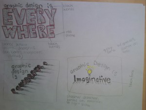
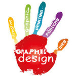
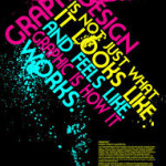
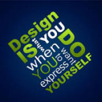
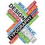
Graphic Design is…
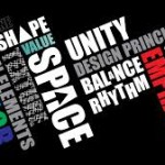
Creativity, expressive, bold, imaginative, unique, interesting, intellectual, inspirational, patterns, art, visual, communication, more than just words on a page, simple, complex, a weapon, useful, sexy, crisp, changing, neat, beautiful, compelling, eye music, juicy, playful, a visual language, important, brutally honest, social, broad, technical, marketing, everywhere, a point of view, powerful, influential, digital, lively, popular, practical, informative, personal, demanding, memorable, organized, dangerous, tasteful, ground breaking, loud

Quotes from graphic designers
“Graphic design is a creative process that combines art and technology to communicate ideas.” -Sharon Helmer Poggenpoh

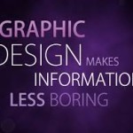
“Graphic design is complex combinations of words and pictures, numbers and charts, photographs and illustrations that, in order to succeed, demands the clear thinking of a particularly thoughtful individual who can orchestrate these elements so they all add up to something distinctive, or useful, or playful, or surprising, or subversive or somehow memorable.” -Jessica Helfand

“Digital design is like painting, except the paint never dries.”-Neville Brody

“Content precedes design. Design in the absence of content is not design, it’s decoration.” –Jeffrey Zeldman

“Design is the method of putting form and content together. Design, just as art, has multiple definitions; there is no single definition. Design can be art. Design can be aesthetics. Design is so simple, that’s why it is so complicated” -Paul Rand

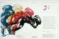
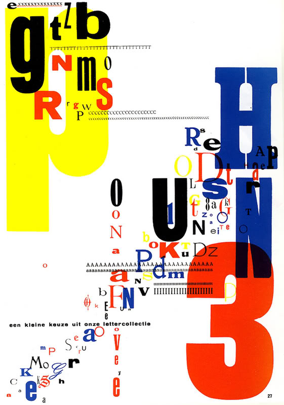
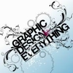
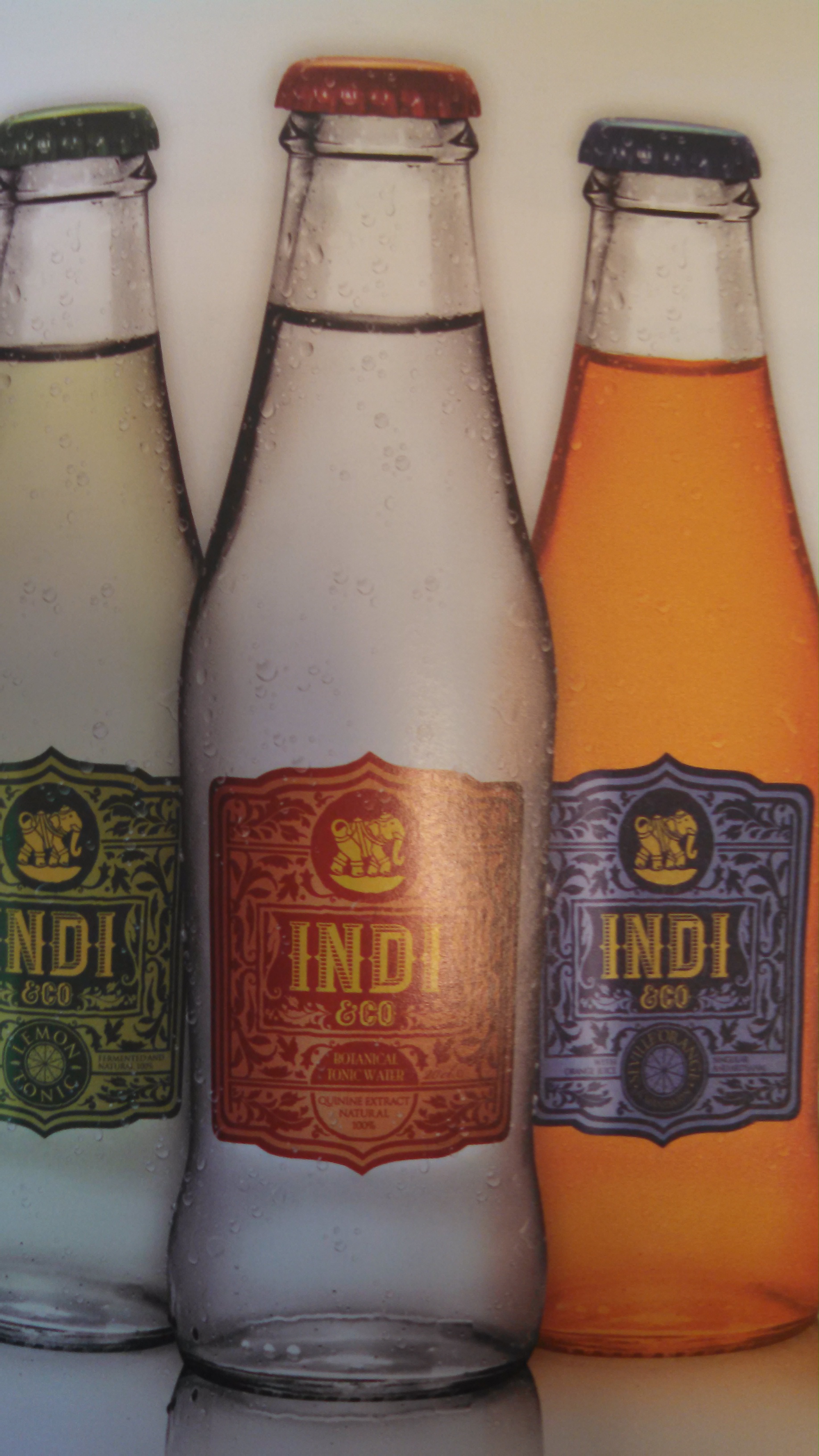
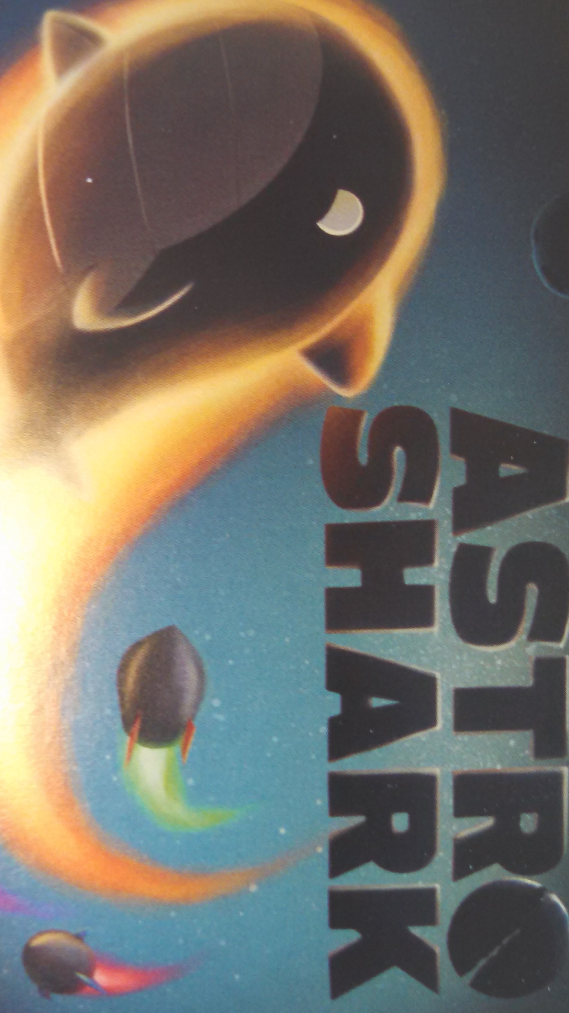
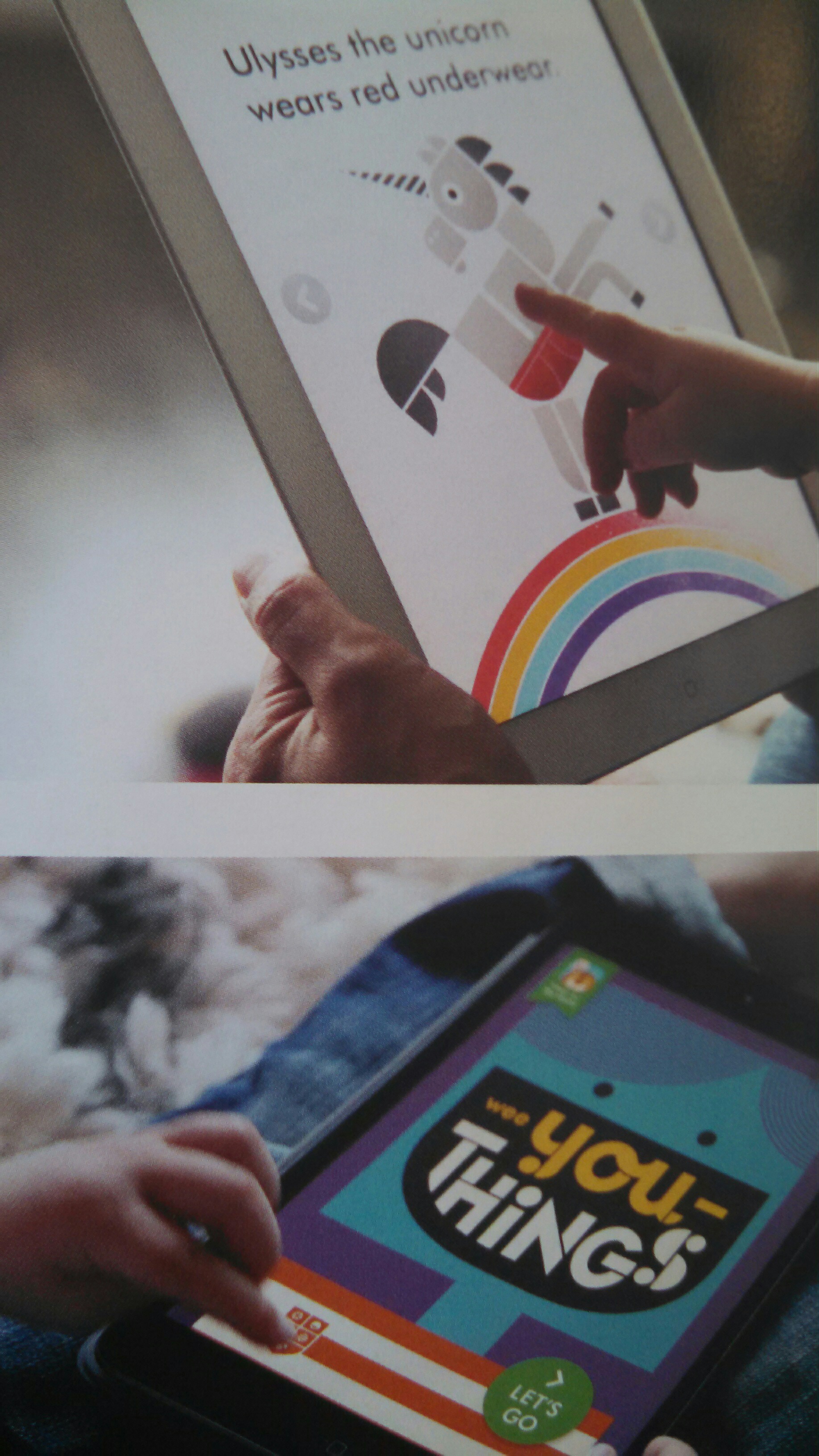
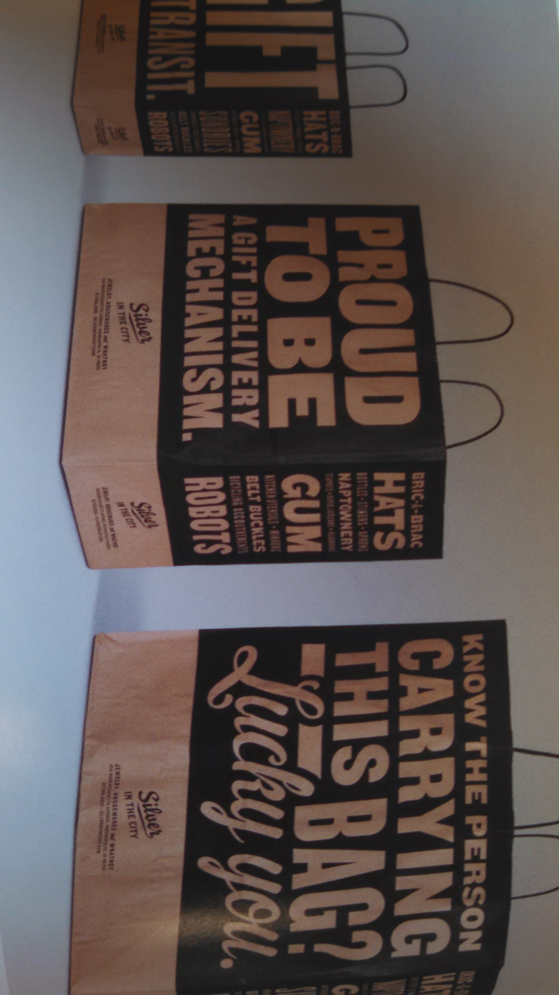
Inspirational Images
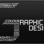
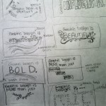
Thumbnails

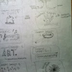
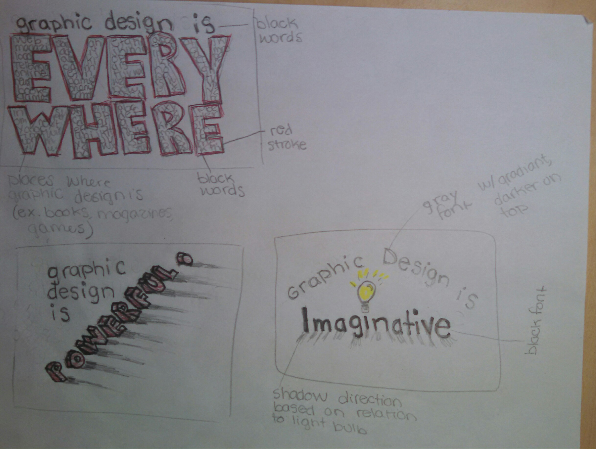
3 Thumbnails Expanded Further
IMG_20140901_110715_772-1

What is graphic design?

Chapter 1 Response
There are a variety of different categories and areas of graphic design. Motion design and interactive design are of interest to me. These areas physically bring what is created to life. This is so interesting to me because it adds so much more detail and interest to the original images and designs. It is also exciting to me because the viewer can physically interact with your design and creations. Some types of motion design are in the form of digital illustration. I would be successful at this because I enjoy creating illustrations through programs such as illustrator.

Book jacket design and package design are also interesting to me. The three dimensional aspect of these areas are very intriguing. I find it exciting how a single design can expand onto multiple surfaces. This can result in the design becoming broken up but at the same time it remains as one continuous design. These areas of design are also interesting to me because I would be able to hold or use the finished product rather than just look at it on a two dimensional surface. I would be successful in these areas because I am a very hands on type of person. I would be able to visualize physically holding a book or package and could successfully create a design to complement the surface of the product.

Publication design is also of interest to me, specifically in the form of magazines. I would be successful in this area because I enjoy organizing layouts. I would be able to create a visually appealing layout of ads and articles for a magazine.

I would be successful in any of the fields I listed because I have very good people and communication skills. I would be able to work with a customer or coworker and successfully express their thoughts and ideas through my work.

The book I researched is titled Communication Arts Design Annual 54. Below are sample images from this book in the fields of graphic design that I am interested in.


IMG_20140827_174817_139                   IMG_20140827_173356_851 IMG_20140827_175122_815                   IMG_20140827_174933_498

A designer who specializes in motion design and animation is Lok Neville Lee.  He works for a company called Unit 9.  He has a site titled as Lok Neville Lee.  This site displays videos and images of some of his designs.

Christina Ortiz is a designer who specializes in package design.  Her website contains both her portfolio and resume.

In the book I researched, Froeter design was listed in the category of publication design, specifically catalogs.   However, this company does not seem to specialize in one specific area of graphic design.  Their website contains sample work and information about the company.