By Samantha Moore

Words & Pairs

Words

  1.  Apple.
  2. Lips.
  3. Water.
  4. Tears.
  5. Pencil.
  6. Music.
  7. Bill Gates.
  8. Matt Damon.
  9. Laptop.
  10. Tattoo.b
  11. Chipotle.
  12. Mt. Monadnock
  13.  Cat.
  14. Goldfish.
  15. Salt.
  16. Landyard.
  17. Keene
  18. Chair
  19. Desk.
  20. Soup.
  21. Tea.
  22. Honey.
  23. Perfume.
  24. Slipper.
  25. Mascara.
  26. Powder.
  27. Book
  28. Pillow.
  29. Bottle
  30. Bowl.
  31. Lights.
  32. Blanket.
  33. Keychain.
  34. Lotion.
  35. Basket
  36.  Campus.
  37. Jeep.
  38. Rake.
  39. Shovel
  40. Trees.
  41. Zoo
  42. Tiger
  43. Miley Cyrus.
  44.  Starbucks.
  45.  NYC
  46. Uniform.
  47. Gun.
  48. Backpack
  49. Beach.
  50.  Paris.

Pairs

  1.  Apple lips
  2.  Laptop tears
  3.  Starbucks goldfish
  4.  Key-chain lotion
  5.  Blanket paris
  6.  Lights bowl
  7.   Cat mascara
  8.  Matt Damon salt
  9.  Landyard honey
  10.   Perfume slipper
  11.  Trees campus
  12.   Uniform Bill Gates
  13.  Music Pencil
  14.  Water desk
  15.  Pillow soup
  16.  Tea jeep
  17.  Rake Miley Cyrus
  18.  Chipotle tattoo
  19.  Beach gun
  20.  Tiger NYC

The Design and the Play

In the article by Paul Rand, he states that students need natural talent to design well.  I do think that some people can be taught to design with a meaning behind it, I’m not sure if I believe it is something that cannot be taught. “The results of such vagaries are sometimes pretty, but mostly meaningless…atmosphere of freedom, absent of certain disciplines  which would evoke ideas.” (157). The designs should not just be pretty to look at they also need to be efficient and have a meaning and make the viewer think. I agree with Rand on this because there is a time and place for everything, and when wanting to get a point across, the art has such a deeper meaning than if it just looks nice, anyone with or without natural talent can make a pretty piece of art, but not everyone can create appealing art that has a meaning. Having limits on work is definitely beneficial in the long run because it really pushes the designer to work harder and think outside of the box, for example when we have limited fonts to use in class.

The Five Classic Typefaces Comparisons

Out of the five classic typefaces my favorite font is Baskerville, and my second favorite is Helvetica. Even though all the fonts seem very similar, Baskerville stands out to me because the sculpted  serif, and the contrast between the thickness and thinness is very attractive and elegant to me. I think overall it’s a beautiful font and I like the curved brackets. Baskerville has a lot of characters and design to it, so it’s eye-catching to me, unlike Bodoni which seems like a plainer, simpler version of Baskerville. Even though this font is from the 1700’s it does not appear to be outdated, and I think it’s super interesting that Benjamin Franklin was a fan of John Baskerville’s fonts. Helvetica is my second favorite because I like how simple and plain it is, yet it’s so modern looking that I’m not bored looking at it. It’s so creative and different that the dot on the “i” is a square. As I’m typing this I’m realizing that this is Helvetica font too. It’s everywhere and I did not even realize but it’s so subtle and not in your face. I like how clean cut it is, and legible it is.

Designer Comparison

Robert Thorne vs. Filippo Marinetti

Robert Thorne

Robert Thorne, a British type designer developed a font that he named “FatFace” in 1803  (Industrial Expansion) which had a super bold look to it. This new font was used for posters, pamphlets and whatever was needed to be used on text to be extra eye-catching and to stand out. It originated from the term Egyptian serifs. Shortly after this the font started getting more creative having, shadows, inline, italics, and 3D characteristics added to it.

Filippo Marinetti

Filippo Marinetti created futurism work (1910-1918) he was a poet and writer, Marinetti created a work called “The Words to Freedom” about chaos of war. There are barely any images, just fonts laid out where “speed and noise” create visual poetry. The font was in swirls and had a lot movement which kept the eye busy and looking all over the page.

Comparison

Typography can be a very important part of graphic design, while reading through chapter 2 of Guide to Graphic Design the work by Robert Thorne and Filippo Marinetti really kept my interest. Both artist use typography to make art, without using many colors or images. If Thorne did not create the idea of “FatFace” maybe Marinetti would not have thought of “The Words to Freedom”.

Graphic Design is…

1. My Perspective on Graphic is visual communication. Using either, images, words, and art it gets a message across. Graphic design is everywhere from book covers, magazine covers, logos, posters, and so much more. A well thought out piece of graphic design is more then just what meets the eye, it makes the viewer intrigued and think about what they are looking at before they have that “ah-ha!” moment. Graphic design should be eye-catching and grabs the viewer attention which leads to sells, and being successful.

2.

  1. unique
  2. different
  3. thoughtful
  4. funny
  5. smart
  6. witty
  7. ah-ha
  8. bold
  9. makes a statement
  10. not so average
  11. visual communication
  12. interesting
  13. unusual
  14. crazy
  15. proud of your work
  16. display
  17. thinking
  18. crazy
  19. wild
  20. important
  21. needed
  22. enjoyable
  23. fascinating
  24. out of the box
  25. agreeable
  26. humorous
  27. clever
  28. responsive
  29. social
  30. careful
  31. courteous
  32. deliberate
  33. discreet
  34. helpful
  35. tactful
  36. aware
  37. observant
  38. well thought-out
  39. gesture
  40. alert
  41. brilliant
  42. brainy
  43. capable
  44. cunning
  45. deep
  46. gifted
  47. keen
  48. knowledgeable
  49. sharp
  50. wise
  51. sensible
  52. individual
  53. inventive

3. Quotes

“I’ve never had a problem with a dumb client. There is no such thing as a bad client. Part of our job is to do good work and get the client to accept it.” – Bob Gill

“It’s through mistakes that you actually can grow. You have to get bad in order to get good.” -Paula Scher

“A designer knows he has achieved perfection not when there is nothing left to add, but when there is nothing left to take away.” – Antoine de Saint-Exupery

“Digital design is like painting, except the paint never dries.”- Neville Brody

“Socrates said, “Know thyself.” I say, “Know thy users.” And guess what? They don’t think like you do.” – Joshua Brewer

“Good design is all about making other designers feel like idiots because that idea wasn’t theirs.” – Frank Chimero

Inspirational Images

1-no-one-brilliant-logo-design 50-cleverLogos 1122 2249802750_fae9e1b15e 395903328818_TD9HdD6H_l animal-logo-design-graphic-design-012

1Art-Machine businesscardyoga commercial,inspiration,weird,advertising,graphic,design,creative-5b5c6c33b1d88e9d7e58a353f2626802_h_large creative-advertising-50 creative-business-cards-fitness creative-packaging-4-21-1 creative-packaging-4-34 Divorce-Lawyer-Business-Card hXxrMZc8U-1V5f7mPHqBzA image_11 lovely-package-oh-my-gold-1-e1401916189389 lovely-package-simpsons-wine-1-e1406122848413 vodka Words-Kill-Wars-3download-5 download-4

What is graphic design?

(I did not have the text guide to graphic design yet so this is me just writing about areas of graphic design that interest me as a career path.)

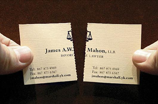
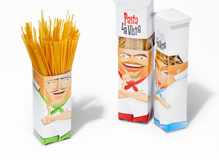
As a career I think working in packaging and advertisement is a good fit for me. To me graphic design is visual commutation that is eye-catching and gets a message and a purpose across. Graphic design can be used in many different ways such as media, posters, book covers, labels, street signs, tee-shirts, menus, almost everything you look at has been designed and is meant to draw in attention. When going into a food store for example if every box was plain white and just labeled “pasta” in a boring black font it still gets the point across of what it is, but if there are multiple boxes with the same product inside the average person would probably pick out the more appealing and interesting box. In marketing people want their products to be sold and when a customer stops and takes a moment to really look at the labeling it is more likely to stick into someones head. This seems like a good fit for me because it’s not just thinking in the box it is literally going out of the box to be so intriguing that someone chooses “my” product over other competitors products because they think my designs are more eye-catching and they want to try out the product.  This field of graphic design interests me because my entire life I’ve grown up seeing packaging, some amazing, some super boring but it is not a completely unknown field for me. I’m used to seeing it literally everywhere and I’m comfortable with it. I want to make a difference and see my designs on shelves and knowing it’s sitting in people’s homes. My goal is to have an object in such creative packaging that the customer does not even need to like the actual thing inside the box, they just want to purchase my design for the looks.

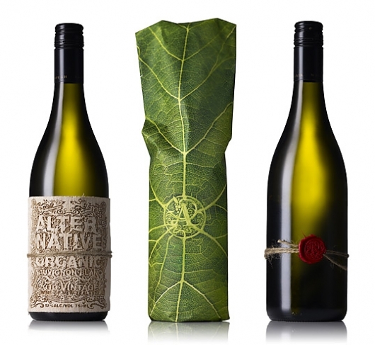
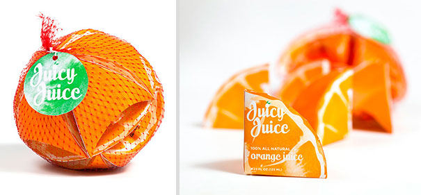
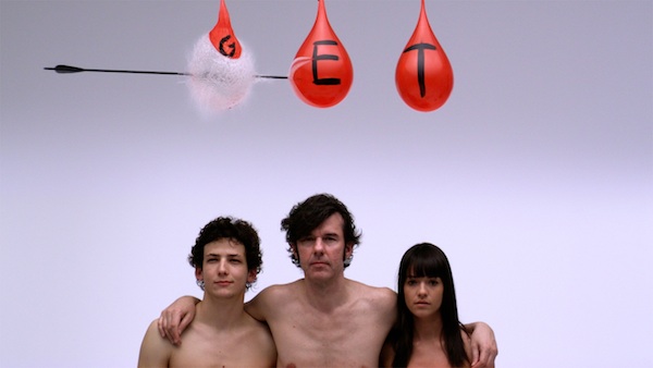
I looked at the books “New Design Paris” by Edward M. Gomez, and “Graphic Design Annual 2014” published by Graphis. In “New Design Paris” this picture really caught my interest because it is want I hope to do being as a career. And the second picture from”Graphic Design Annual 2014″.download-1 download-3

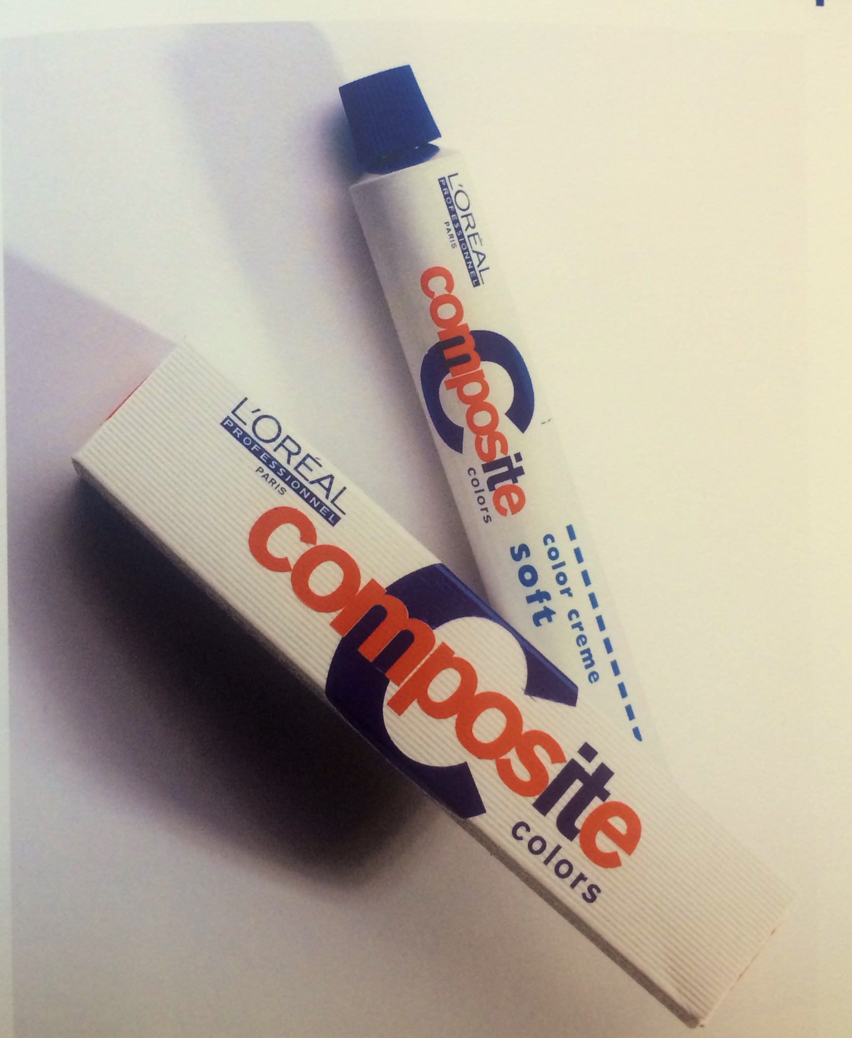
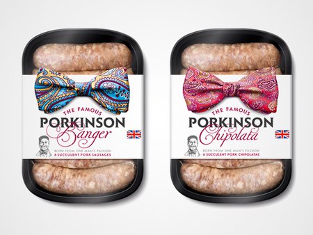
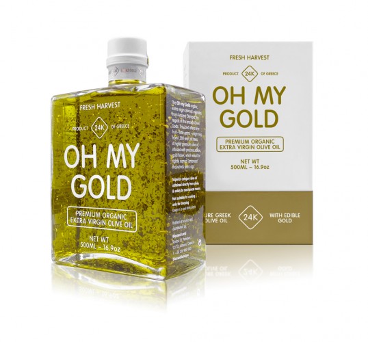
This is dieline.com and it is a website of a bunch of great packaging designs.

http://www.thedieline.com/

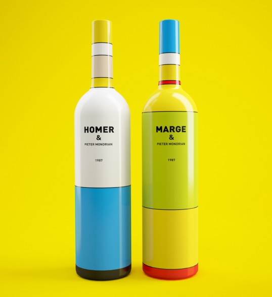
This is the website for Lovely Packaging, which is another amazing cite of package designs.

http://lovelypackage.com/

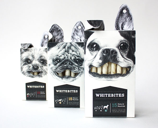
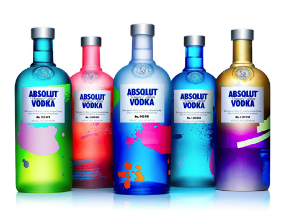
And this is my favorite website of packaging design because it is literally so creative and unique.

http://www.boredpanda.com/creative-packaging-designs-2/