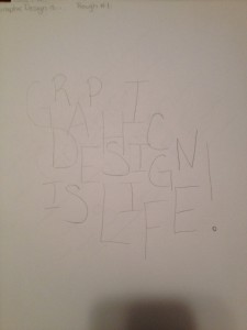
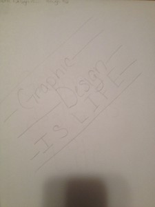
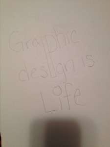
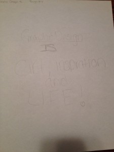
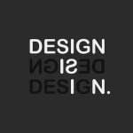
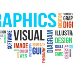
By Shannon Tufts

Random Words & Pairs

  1. Toothpaste
  2. Flag
  3. Shoes
  4. Pen
  5. Clipboard
  6. Yarn
  7. Computer
  8. Mirror
  9. Shirt
  10. Band
  11. Guitar
  12. Coffee Cup
  13. Vaccuum
  14. Socks
  15. Mop
  16. Scale
  17. Printer
  18. Lamb
  19. Light Bulb
  20. Marker
  21. Remote
  22. Binder
  23. Notebook
  24. Speakers
  25. Dresser
  26. Pillow
  27. Picture Frame
  28. Bookshelf
  29. Shower Curtain
  30. Popsicle
  31. Trash Bin
  32. Purse
  33. Ouija
  34. Storage Bin
  35. Apple Sauce
  36. Clip Board
  37.  Hair Scrunchie
  38. Cell Phone
  39. Hamper
  40. Scale
  41. Paper
  42. Backpack
  43. Post-It Notes
  44. Textbook
  45. Kindle
  46. Mattress
  47. Laptop
  48. Nail Clippers
  49. Suit Case
  50.  Deoderant

Pairs

  1. Hair Scrunchie Mattress
  2. Toothpaste Vaccuum
  3. Lightbulb Purse
  4. Lamp Scale
  5. Trash Bin Bookshelf
  6. Computer Yarn
  7. Ouja Shoes
  8. Applesauce Pillow
  9. Flag Pen
  10. Marker Deoderant
  11. Backpack Mirror
  12. Kindle Shirt
  13. Hamper Guitar
  14. Nail Clipper Speakers
  15. Picture frame Shower curtain
  16. Popsicle Band
  17. Binder Socks
  18. Remote Textbook
  19. Dresser Printer
  20. Suitcase Map

Design and The Play

The article ‘The Design and The Play’ makes you think a lot about how a Graphic Designer should come up with their designs instead of how students in an early classroom setting create them now. Especially when coming from a high school setting where you start to learn about Graphic Design and you are pretty much left to your own devices to figure it out yourself. I can agree with the writer of the article on when leaving students (and kids) up to their own ways of making patterns and designs that it’s not really teaching them to create something that truly has meaning by  just letting them play around and not teaching anything. As a designer, the work that is created not only has to be visually appealing but needs to have some meaning as well, according to ‘The Design and The Play’. Something that is not being developed in schools since not all teachers are directing students to practice applied design instead of just the basics, something that I can see both sides too. Sometimes, you are going to have a job to do for a client where the meaning of what you are doing is not going to be as important as the look and design of it. And there are other times when doing a job that the meaning is going to be just as important, if not more important than the appearance of the work done.

Typefaces Comparison

To the untrained eye, typefaces look relatively the same. They may notice small differences, like whether or not a font has serifs or not. However, someone who works with type can pick up the differences and know the similarities. Out of the five Classic Typefaces, the one that I like the most is Century and the one that I like less is Helvetica Neue. Both are great typefaces and both have their uses and are widely used since the 1900s. I like Century for the curved brackets which add interest and the slab serifs at the bottom of the letters which help to create a visual line when reading. Century has a lighter weight than Helvetica, and it has the brackets that Helvetica does not have. Most text books use Century because it is easy to read. Helvetica has aspects that Century doesn’t have as well, so it is not all just once sided. For instance, Helvetica has a square dot over the letter ‘i’. Helvetica also has a double story ‘a’ that is not found with Century. Both typefaces played a major role in the development of type in the 20th Century.

Design Comparison

While you can look at pieces of and design and to the untrained eye they look both similar and different. Each designer puts their own touch onto everything that they do. Two designers that can be seen as similar and different are Lucian Bernhard and Edward McKnight Kauffer. Lucian Bernhard was born in Stuttgart, Germany in 1883 and began his career as a designer by studying at Munich Art Academy before going to Berlin in 1901 to work. His career as a prolific designer brought posters, but also trademarks, packaging, type, textiles and much more and it was inspired by the famed Beggarstaffs James Pryde and William Nicolson. In his work the product that was advertised would have the trade name or company name in big letters spread out on a spacious background that was usually a solid color. His ‘Priester’ poster in 1905 was so stark and its colors were startling at that period that it would immediately catch the eye of the viewer. Edward McKnight Kauffer, an American designer who worked primarily in England, born in 1890. His career was inspired by Ludwig Hohlwein’s posters which brought on his works of simple designs. Kauffer’s poster for the Daily Herald in 1918 featured a yellow background with black text found only at the bottom and the top has images of origami like birds to symbolize the caption “Soaring to Success”.

While the two works are not that far off in years there are things that are both similar and different to them. Both designs are rather simple and appeal to the eye. The simplicity in the two are the very basic use of a word and an image against a plain background. However they are different in the way that Kauffer’s poster for the Daily Herald has an intricate version of birds soaring across the top of the page, which is unlike Hohlwin’s two matches seen in the middle of the page. While the Priester poster was apart of the Modern movement, and Kauffer’s poster was in the Futurism movement you still see plenty of what makes the works of two very different designers relatively the same.

bernhard,design,lucianbernhard,matches,minimalism,poster-98cda4216508d418811b459b1d090d8e_h4580002388_0229e5b283_b

Graphic Design is…

Graphic Design is…
life, art, everywhere, inspiration, important, key, forever, my world, my away of expressing myself, bold, simplicity, work, rewarding, visualizing, thinking, physical, electric, print, love, passion, adventure, the place to be, the way to go, putting a smile on someone’s face, beautiful, turning someone’s dreams into reality, imagination, working together, a part of history, futuristic, forever evolving, always there, changing the way you think, about the client, problematic, pleasing to the eye, different for everyone, sharing ideas, bringing people together, opening a world of possibilities, displeasing, different, success, a career, admitting defeat, never giving up, always being a few steps ahead, taking one step forward and three steps back, accomplishing a new goal, not being afraid to bend the rules, setting the bar higher and higher.

Graphic Design is a way of relaying information and ideas in a visual way. It is an expression of ideas from boy the designer and the client. While it does include a lot of work, the end result of the client being happy with the work you’ve done and walking out the door, not only with a smile on their face but also ready to say great things about what you’ve done. That is what totally rewarding about the stress that can be encountered as a designer. Putting something unique together to be displayed in a magazine, book, stationary set or anything is graphic design. No matter how simple, or how complex it is.

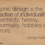
Inspirational Quotes

“There are three responses to a piece of design- yes, no, and WOW! Wow is the one to aim for.” -Milton Glaser

“Graphic design will save the world right after rock and roll does.” -David Carson

“Never fall in love with an idea. They’re whores. If the one you’re with isn’t doing the job, there’s always, always, always another.” -Chip Kidd

“Good design is all about making other designers feel like idiots because that idea wasn’t theirs.”
-Frank Chimero

“Content precedes design. Design in the absence of content is not design, its decoration.” -Jeffrey Zeldman

“Good design is obvious. Great design is transparent.” -Joe Sparano

“Design creates culture. Culture shapes values. Values determine the future.” -Robert L. Peters

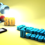
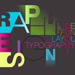
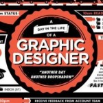
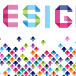
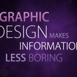
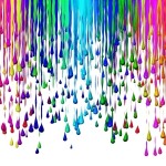
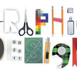
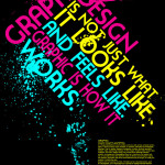
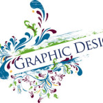
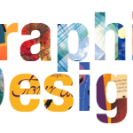
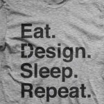
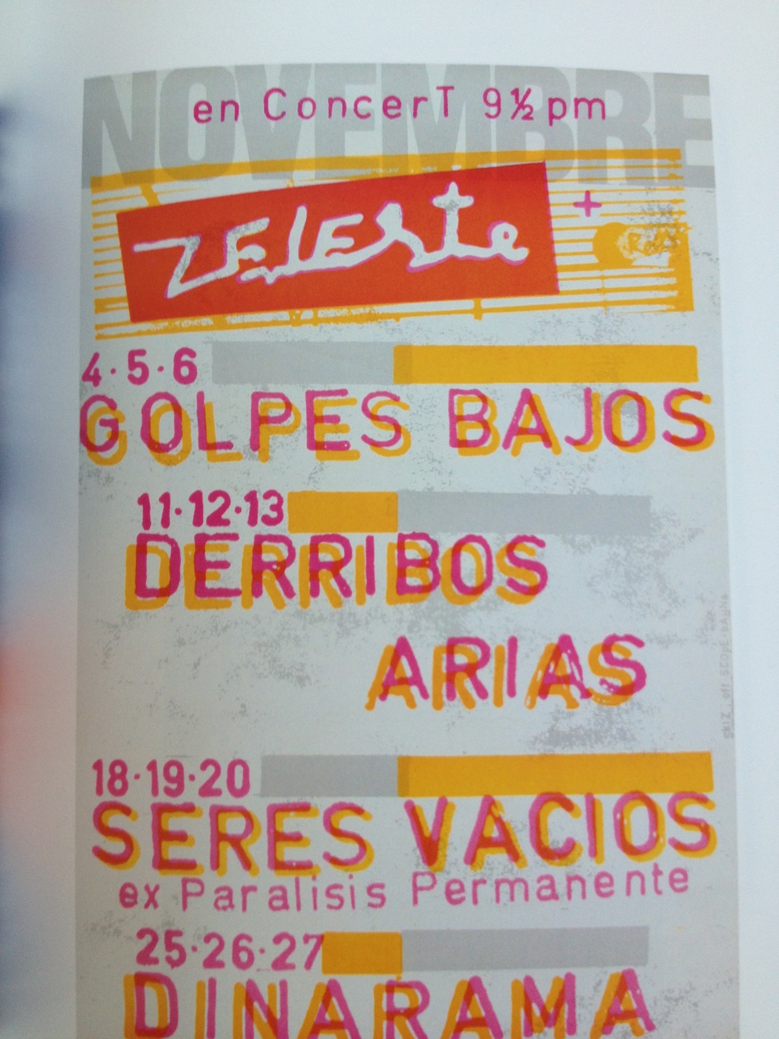
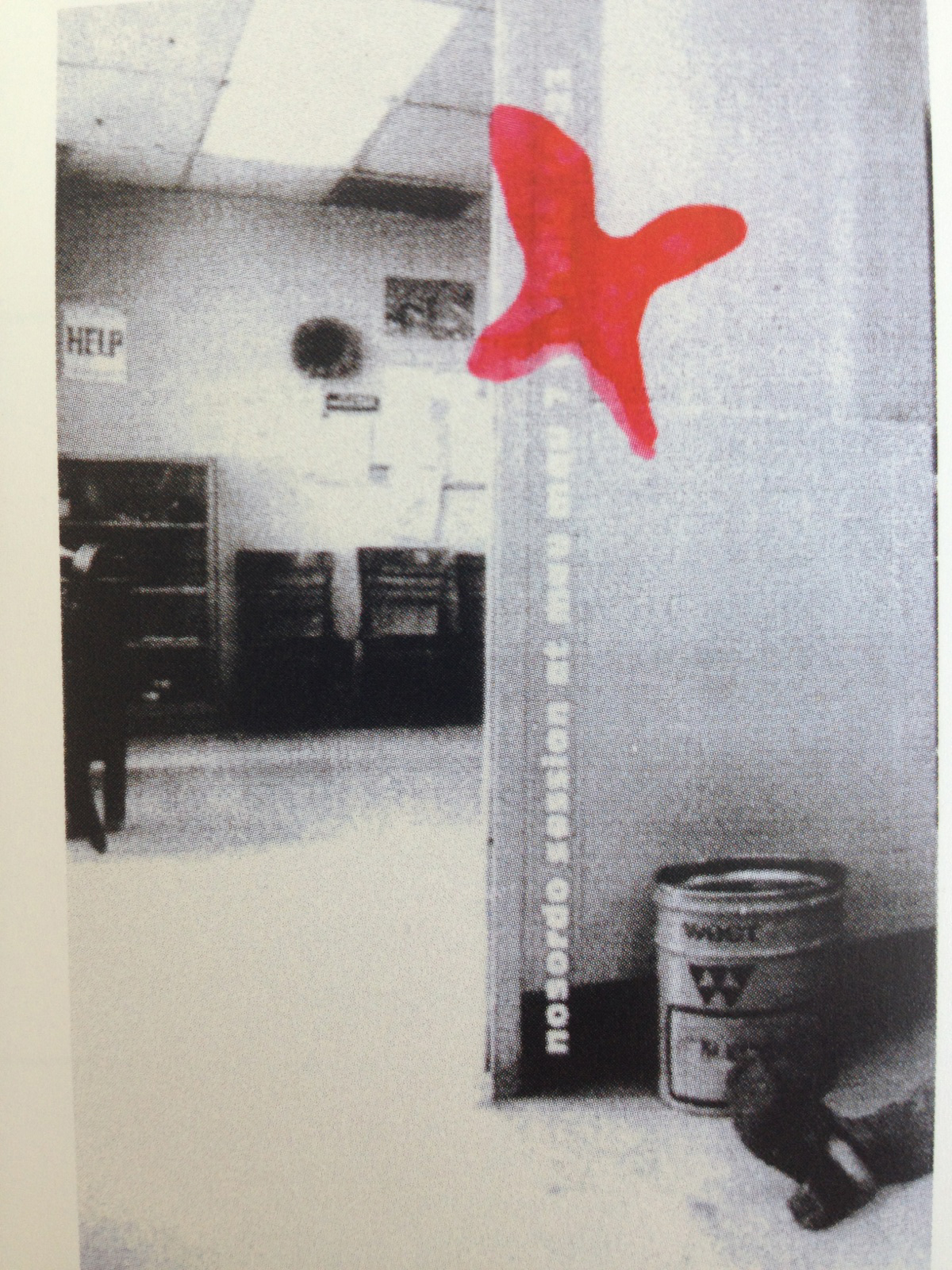
Inspirational Images

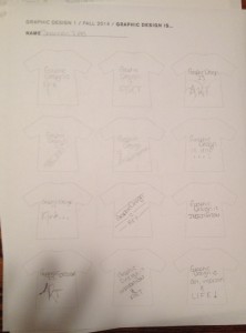
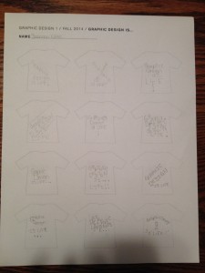
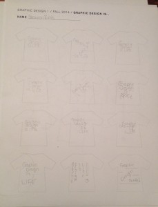
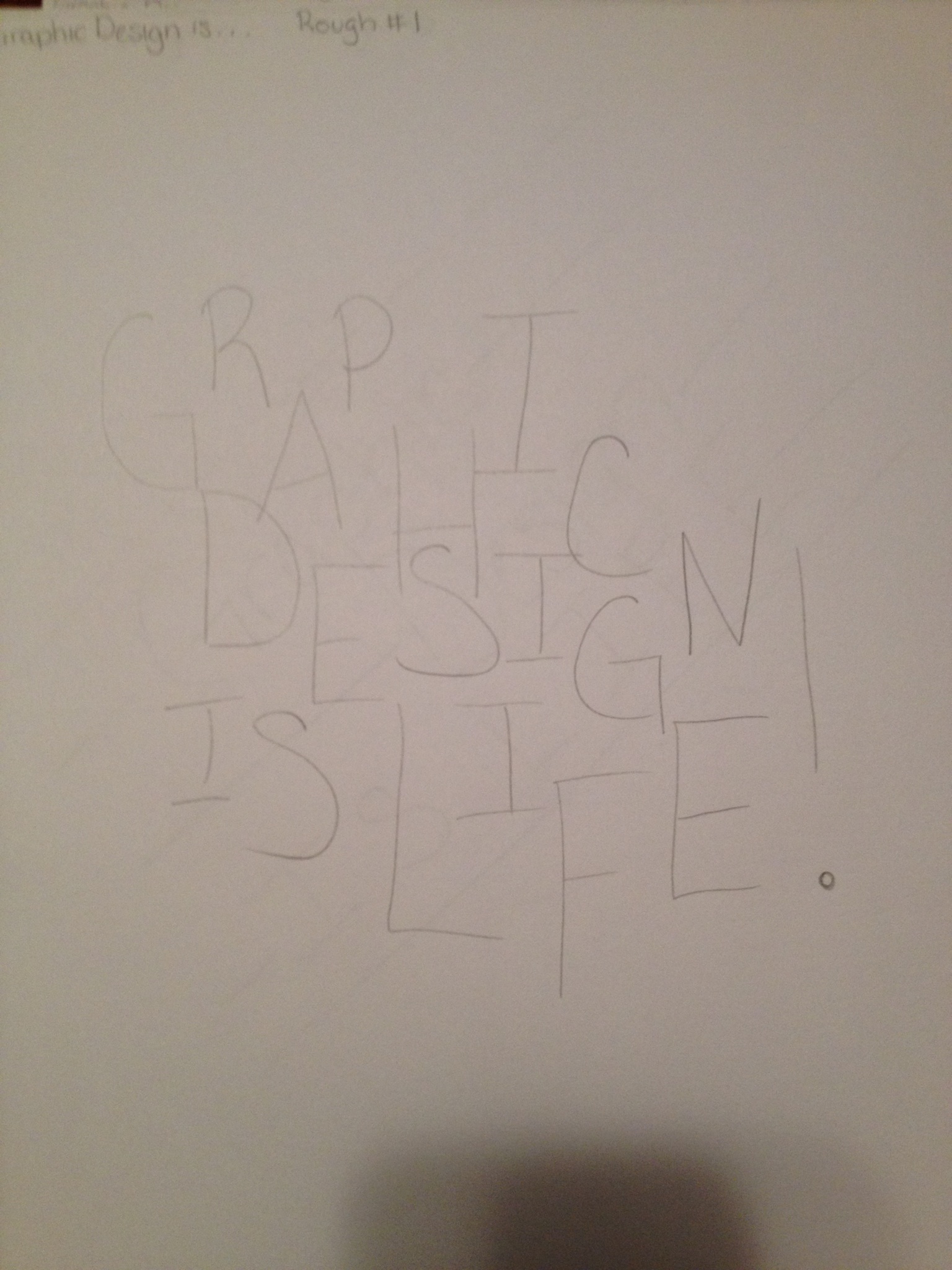
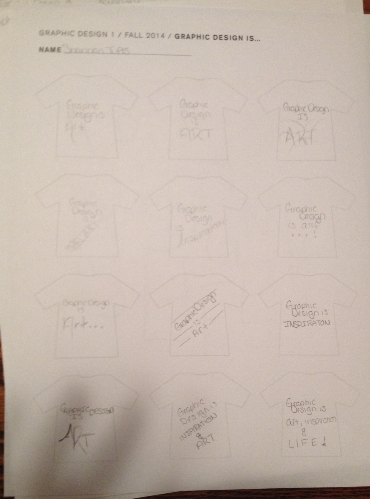
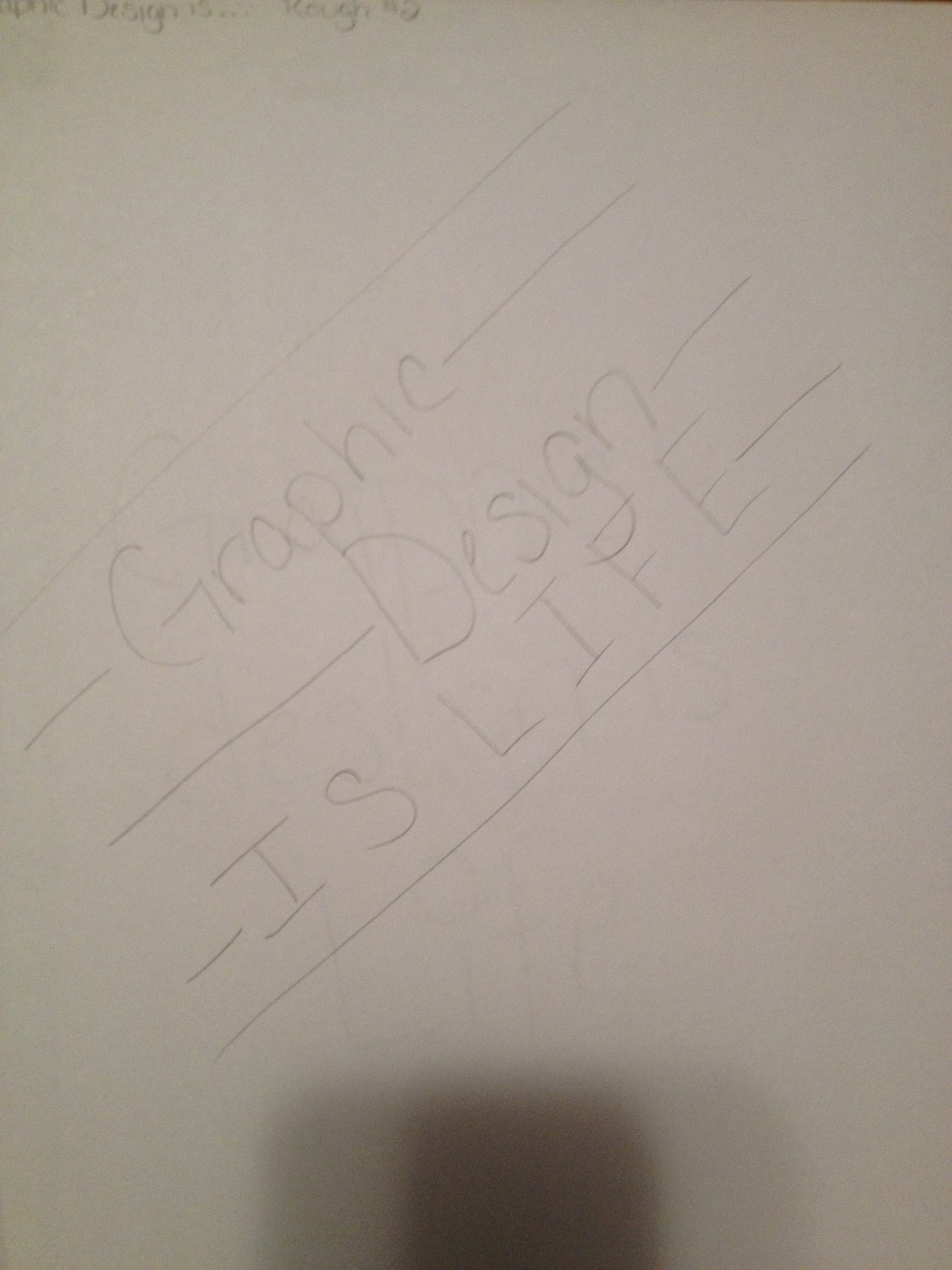
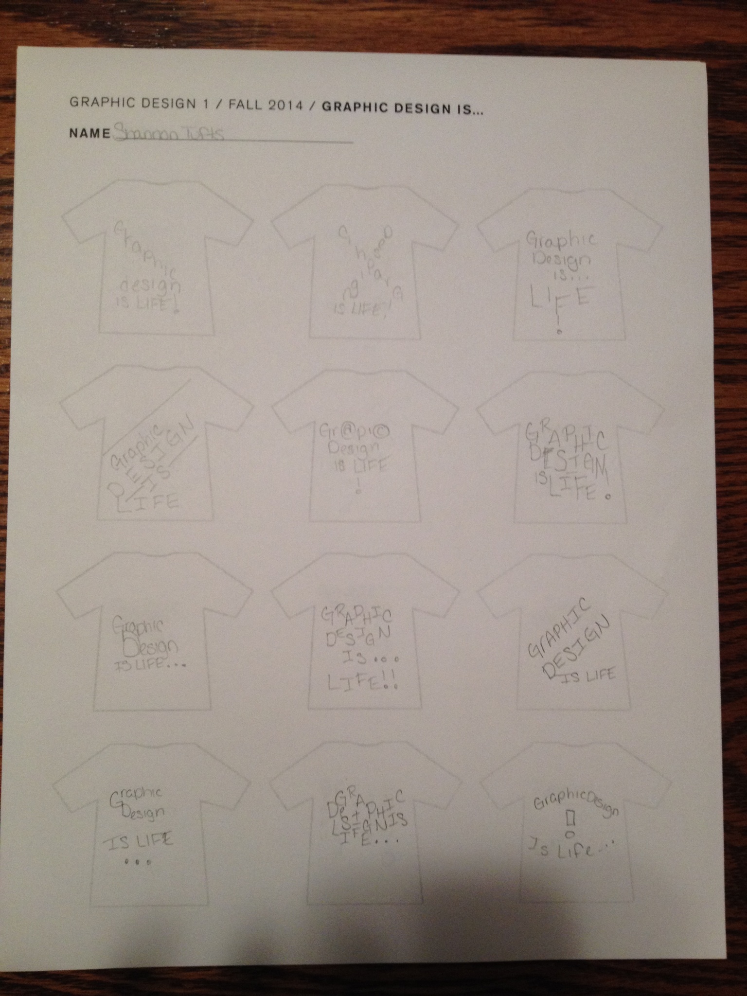
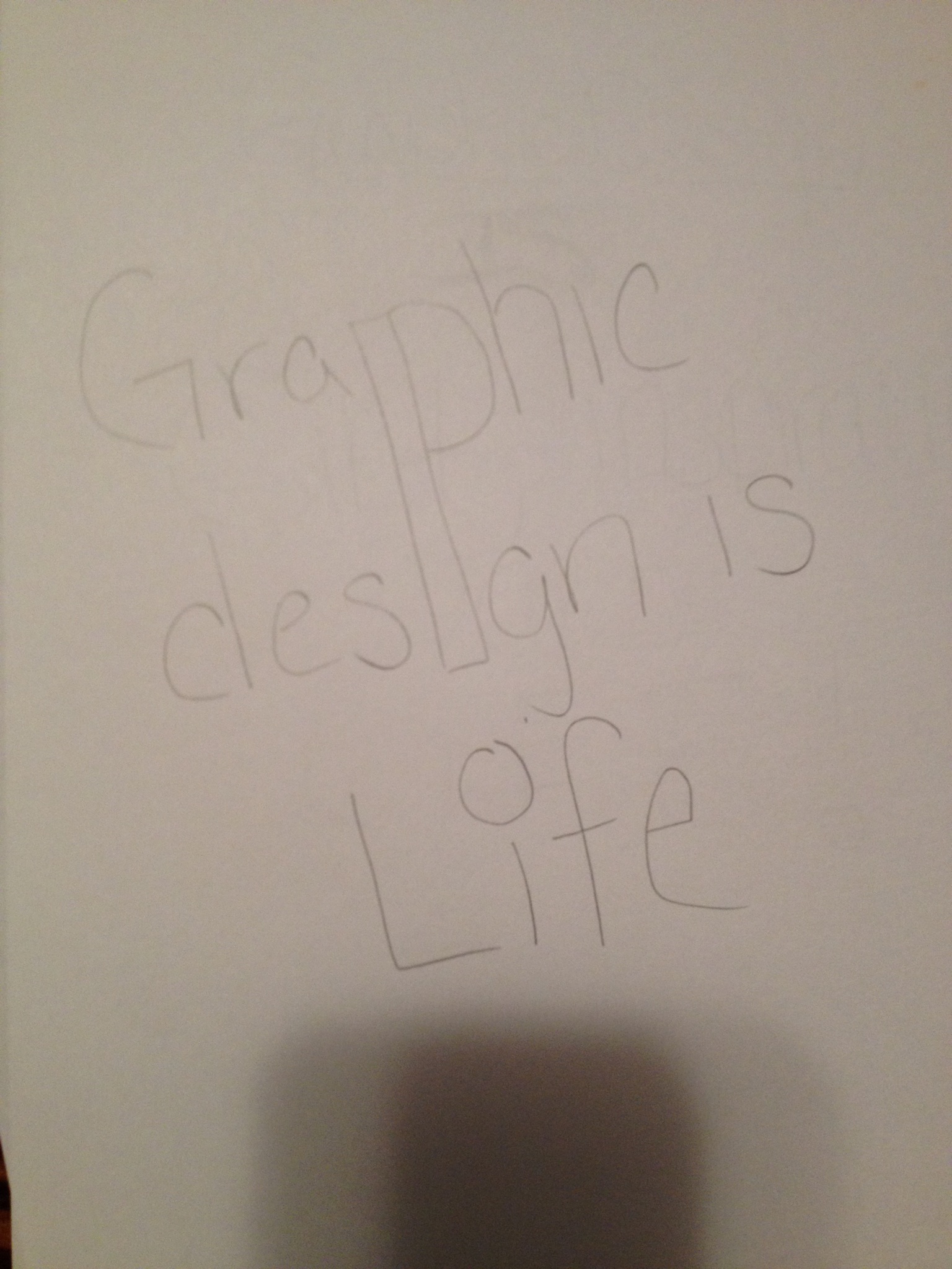
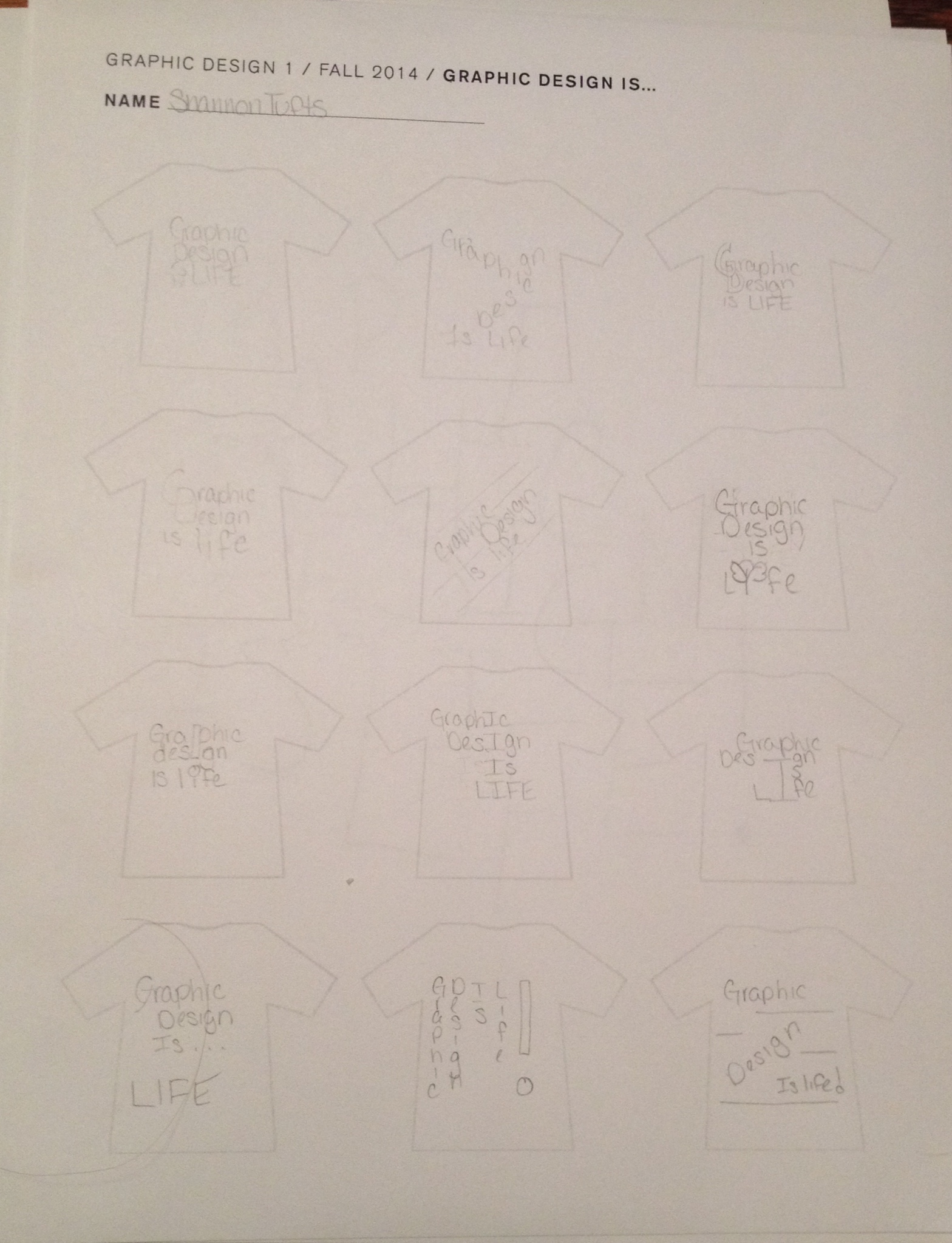
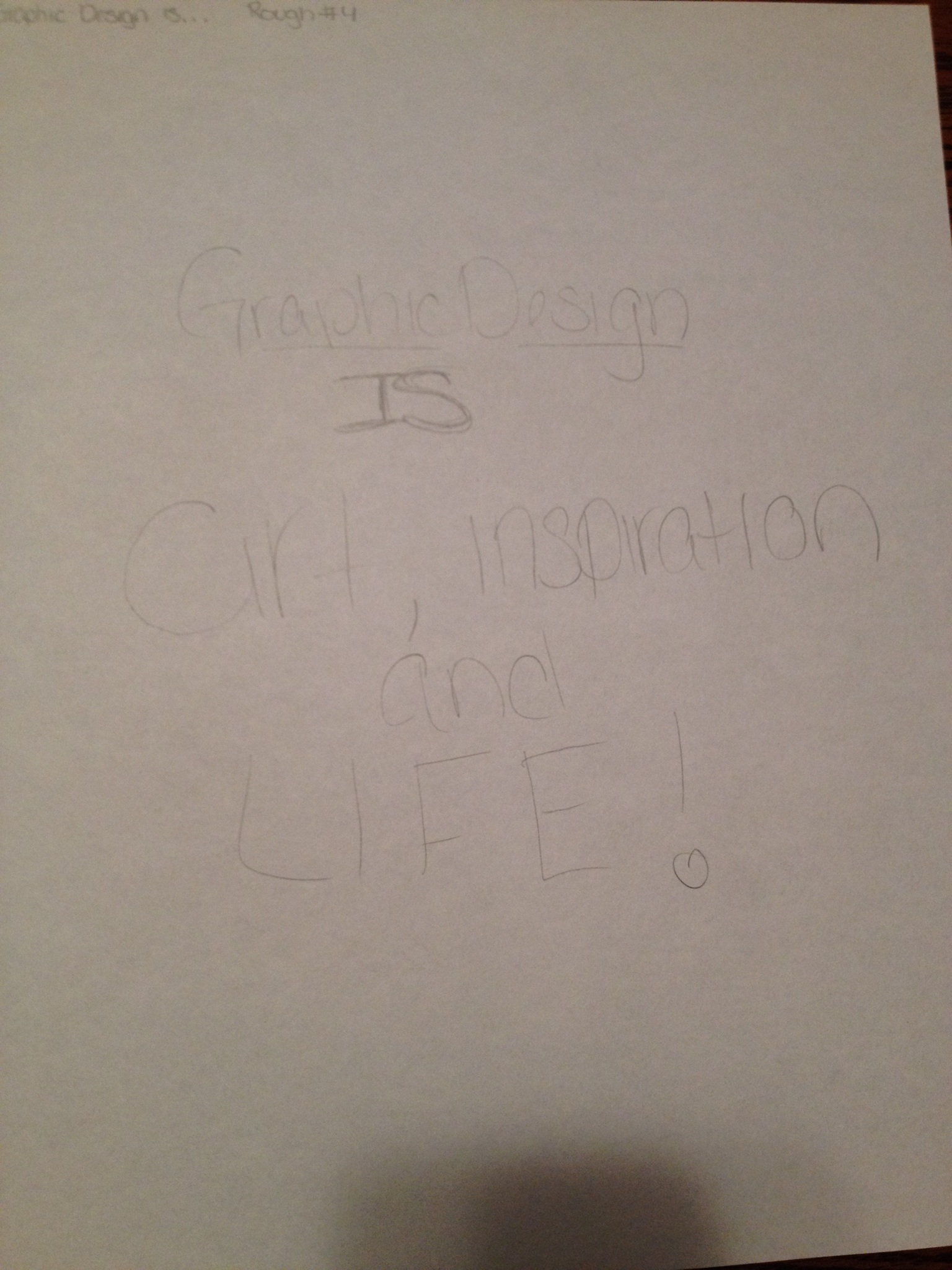
Thumbnails and Developments

IMG_1202 IMG_2525 IMG_4677 IMG_7079 IMG_8796 IMG_8880 IMG_9845

What is Graphic Design?

UnknownGraphic Design is a visual expression of ideas placed on just about anything: shirts, business cards, envelopes, stationary etc. It also gets other people to see the same vision in different ways.

Career Interests

• Corporate Design – I believe that corporate design would be a good fit for me because you need to stay consistent with the company’s visual identity and it would also allow for the work done to be completely pressed upon the public’s minds. I have always thought that sometimes simplicity is nice and it gets the message across quickly, and that is what I’ve seen a lot in some of corporate designs.

• Book Design – Designing for books would also work for me not only because of my love for books, but also knowing that you helped make that book happen, even though they are more and more electronic readers.

• Book Jacket Design – This would also work for me because of my love for books and reading and I always thought that looking at the cover of a book really can give you insight as to what’s inside the book.

• Signage Design – I know that I always get lost or don’t always know where I’m going while driving and I’m not alone. Making signs to tell people where to go would not only help myself but it would be help to all the other people that need to know where to go. Sometimes going into small towns you see those “Welcome to…” signs and they’re elaborate and fun looking and to me that just seems like a great way to do some work.

• Brand and Identity Design – Making logos has always been something that’s been fun and interesting for me through high school. Using Illustrator to create something that you will see on everything that company has to produce is a good feeling. Looking at it and saying “I did that” has always been something that will put a smile on my face and make everything worth while.

Book Research

• Hidden Graphics by Oscar Guayabero and Jaume PujagutIMG_9853IMG_4980

Designers Links

SoroDesign

SoroDesign has a portfolio of all the book covers they’ve done spread out in an interesting format.

Go Media

Go Media displays the corporate work they’ve done for local companies in Ohio, including some logos.

David Airey

David Airey does some logo designs and this page contains pictures of his work for some shoe companies, Berthier Associates, a shopping bag company and more.

Matthew Sebert

Matthew Sebert has a portfolio that includes some information designs including flyers and posters for the Keene Music Festival.