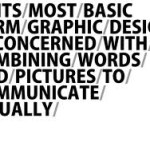
By Taylor Troy

Random Words

50 Words:

  1. Combat
  2. Headphone
  3. Journal
  4. Website
  5. Marathon
  6. Surfboard
  7. Drama
  8. Kangaroo
  9. Attitude
  10. Personality
  11. Text
  12. Joint
  13. Turtle
  14. Rainbow
  15. Lightning
  16. Weekend
  17. Gift
  18. Sail
  19. Zone
  20. Silence
  21. Knowledge
  22. Etiquette
  23. Circus
  24. Trap
  25. Purse
  26. Dinosaur
  27. Demon
  28. Devil
  29. Angel
  30. Fire\
  31. Print
  32. Nails
  33. Thumbtack
  34. Hanger
  35. Techno
  36. Fog
  37. Curtain
  38. Shop
  39. Laundry
  40. Trash
  41. Elephant
  42. Summer
  43. Fumes
  44. Juice
  45. Fish
  46. Dream
  47. Concert
  48. Smoothie
  49. Speakers
  50. Jungle

Pairs

  1. Marathon nails
  2. Demon rainbow
  3. Weekend etiquette
  4. Lightning turtle
  5. Trash website
  6. Laundry gift
  7. Angel fumes
  8. Combat kangaroo
  9. Devil juice
  10. Fish thumbtack
  11. Headphone sail
  12. Joint journal
  13. Circus attitude
  14. Smoothie speakers
  15. Jungle Print
  16. Hanger zone
  17. Dream trap
  18. Elephant shop
  19. Summer knowledge
  20. Fire personality
  21. Curtain concert
  22. Dragon purse
  23. Surfboard drama
  24. Techno silence
  25. Fog text


Design and Play

The concept of “freedom,” is not necessarily a characteristic of good graphic design. Creating a visually appealing design is only half the battle, the other half is meaning. Even a design with only information can show meaning with the typography, layout, placement, etc. Good designs can be found and kept current through years. Paul Rand’s article, The Design and Play, show examples of puzzles, games, books, symbols, grids, etc., to show the impact of abstract art. For example, the black and white crossword puzzle found in the back of an everyday newspaper, is the form of geometric abstract design. It is a layout that is strategic and portrays strong form. The geometric shapes, balance, symmetry, and flow make abstract useful. My favorite design was the Chinese character because of the white background playing a dominant shape as well. The shape and overall form it took was well balanced which allowed my eye to flow through effortlessly. To me, it looks like it could be a symbol or logo. The cubist artwork caught my attention as well. A simple layout with all of its’ harsh lines of type, mixed with the center shape of what looks like an outlined face with flower shapes. I am mostly drawn to it because of the high contrast. The text being rigid, the face human-like with natural round shapes, followed with flowers that are basic black which create the flowers to appear more sketched and harsh. Not only does it appeal visually, it also has meaning. This article enforces the importance of simpleness, and recognizing the rules and disciplines involved with good design. When the article stated that, “Disciplines De Stijl encouraged- functional use of material and meaningful form” really portray what this article is about, discipline.

5 Classic Typefaces

Out of the 5 classic typefaces century is my favorite, and my second pick being Baskerville. Both of them are serif fonts. They both have thick and thins, which to me, adds personality and depth to the type. Not only does it add personality, but it is easy to read as well and flows smoothy with the eye. The hooks on baskerville are very curvy with smaller serifs, while century is curvy as well but with very large serifs. Century’s style is more curved and rounded, while baskerville has more of an U curve. The counters inside of Baskerville are also smaller than century’s. The openness off century and rounded curves really draw attention to meand make the eye flow within the dark and thin variation of the lines. Century’s serifs have a very deep curve in them as well, adding a more curvy look to the type. My least favorite is Helvetica Neue. The consistency of the thick line, and the type not having any serifs makes the font dull. However, I do think Helvetica is the easiest font to read out of all of them.

Graphic Design is..

Graphic Design

Graphic Design is the ability to turn an idea into a visual story. In order for the final product to be effective the image needs to communicate a point, or story line. If the symbol, type, size, color, etc. doesn’t flow, the design is ineffective. Graphic design is found everywhere in our world. Down to the logo on our shirts, the billboards on the highway, to the bathroom signs in a restaurant. The design can be simple and clean and convey a type of style that can be understood in a certain way. Others are in your face, bold, and convey a more dramatic meaning. It is ever changing because graphic design depends on the purpose and goal message.
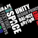
50 Words

Innovative, New, Thought-provoking, Eye catching, Vibrant, Exciting, Dramatic, Simple, Visual, Voice, Divine, Powerful, a Story, Creative, Passion, Love, Feelings, Memorable, Everywhere, Everything, Money, Outside the Box, Unusual, Limitless, Vision, In Between the Lines, Unique, Jaw-Dropping, Me, Edgy, Love, Technology, Invisible, Strategic, Personable, Understanding, Mean, Always Changing, Photoshop, Hate, Abnormal, Interesting, Appealing, Clean, Style, Bold, Loud, Connective, Perceptive, Questioning, Inventive, Dilligent

Quotes

“Design is a plan for arranging elements in such a way as best to accomplish a particular purpose.” – Charles Eames

“A designer knows he has achieved perfection not when there is nothing left to add, but when there is nothing left to take away.” – Antoine de Saint Exupéry

“The public is more familiar with bad design than good design. It is, in effect, conditioned to prefer bad design, because that is what it lives with. The new becomes threatening, the old reassuring.” – Paul Rand

“Content precedes design. Design in the absence of content is not design, it’s decoration.” – Jeffrey Zeldman

“Nothing is original. Steal from anywhere that resonates with inspiration or fuels your imagination. Devour old films, new films, music, books, painting, photographs, poems, dreams, random conversations, architecture, bridges, street signs, trees, clouds, bodies of water, light and shadows. Select only things to steal from that speak directly to your soul. If you do this, your work (and theft) will be authentic. Authenticity is invaluable, originality is non-existent.” – Jim Jarmush

“It’s not where you take things from-its where you take them to.” -Jean-Luc Godard
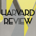
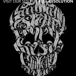
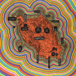
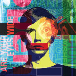
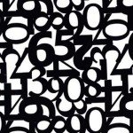
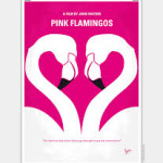
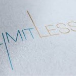
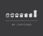
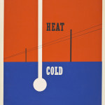
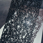
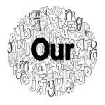
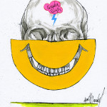
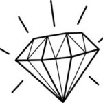
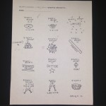
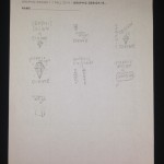
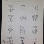
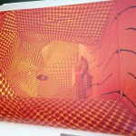
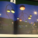
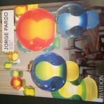
Visual Inspirations

Thumbnails

What Is Graphic Design?

Advertising/Marketing

This category really captures why I love graphic design. The idea of creating an eye-catching label in order to promote a brand, product, or service is what really started my passion. In high school, I was the Graphic Design Manager for our school store. There, I began creating posters, business cards, flyers, and designing the store. While doing this, I realized that I enjoyed looking at a product, and thinking of a way to promote it using words, colors, prints, etc. I love the idea of someone telling me details of what they are promoting, the look they are going for, and be able to expand on it and create something that fits and suits each product. Nothing is ever the same with graphic design, and that makes everything more fun and unpredictable.

Type

Type would be a great field of Graphic Design to get into because of the importance. Type is everywhere and most of the time, the most important factor of the design. All of the different font faces, serifs, hooks, etc. of a word can really create a personality. Being able to master the ability to make the fonts come alive, and tell the story without reading it yet, is an amazing talent and really intrigues me. Ever since I was little, during classes I would just draw my name over and over in different colors, styles, and layouts. I also love playing with words and designs, because I love English and writing. Being able to do both of those studies in Graphic Design is ideal.

Brand and Identity Design

The idea of creating a single logo for a specific product and being able to incorporate the feel of the product, as well as make it visually appealing and eye catching is a true talent. Having a single logo represent a product, and make it memorable for the customer to identify every time he/she sees it truly incorporates design. I personally would love to make a logo for a clothing company. I love the idea of working with shapes and color schemes to create a design that can all come together and tell a story.

Dragon Fly Marketing
I found dragonfly marketing to be incredibly inspiring. This website provides examples of great designs in the field of advertisements. Each advertisement has the ability to grab attention and tell a story.

CMYK
CMYK is a great magazine to get inspiration and ideas for color combinations, layouts, and portfolios.

Print Magazine
PrintMag has great examples of different texts, styles, and prints. I like this website because the “image of the day” is always eye catching and makes you think. The images are always fun which provide a personality for the designs.

Shutterstock is a website that provides thousands of forms of designs. Usually, the designs are a logo or a way to represent an object. This is a great way to get ideas to connect a design and a product together. Here, you can find a lot of logo inspiration.

WebDesignerMag provides great examples of work. I really liked the “Hot 100” spread. The work is beautiful and can inspire a lot of work.

Even though CommArts focuses on the communication aspect of design, it still shows examples of beautiful work. This website helps me think of ways to connect with the design by using words and layouts.

DigitalArts provides examples of colorful, vibrant, pieces of work.

ComputerArts provides web design specific to graphic design.

Luke Lucas is an artist that has great examples of type, spacing, lines, and visual relationships.


Research

Jorge Pardo does an amazing job using space, layout, and colors. His art is visually appealing and makes your eye wander all throughout the page rather in one spot.