From 5 Classic Typefaces

5 Classic Typefaces

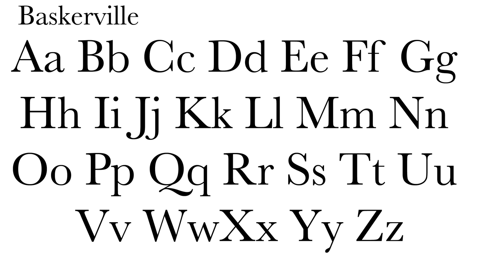
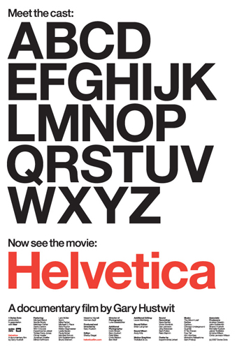
After studying the five typefaces (Garamond, Baskerville, Bodoni, Century, Helvetica Neue), I began to understand the differences between them all. My two favorites are Baskerville and Helvetica Neue. Baskerville is crisp and elegent the way that the thicks and thins add character to each letter. The letters all flow well with each other especially with the lower case letters having cury serifs. Helvetica Neue is also nice because I see it as the most “universal” font of the five. It can be used universally for just about any occation and the sharpness of the lines are visually strong and make the type very legible.

If I had to choose a font that I liked the least it would most likely be Bodoni because the blocky and cut off serifs to me are kind of awkward when reading. Yes serifs are supposed to make a text easier to read and flow from letter to letter, but I find the flat serifs distracting and unappealing. It honestly just looks unfinished compared to a typeface like Baskerville.

5 Classic Typefaces

The font that I enjoy the most is Helvetica Neue, a sans-serif typeface which means that it does not include the small lines at the end of the characters. This typeface was only used for display use. I found this pretty interesting because in modern society Helvetica Neue can be found almost everywhere, from computer keys to commercial advertisement. I like Helvetica Neue because it is simple and modern yet its still a great looking typeface without all of the fancy serifs. The typeface that I dislike the most out of the five classic typefaces is Century, a serif typeface, which means that lines continue off of the character. I dislike this font because I feel as though Century has less elegant lines that. For example, Garamond and Baskerville have beautiful lines that go from very bold to very thin, unlike Century who’s lines stay relatively consistent and they also remind me of every and any textbook that I have read in my life.

type

Last year in one of my into classes for graphic design, we went over some of the basic fonts. I truly didn’t understand why any of it really mattered because your still creating the words and putting them on a page so why did it matter what type face they were. but the foreground project gave me a strong perspective change. The type face you choose to use ultimately decides what the mood or feeling will be for the whole piece of work. this is why i enjoy using helvetica. its a strong and bold type face with no  crazy serifs or any unnecessary curves. It allows the work to look professional and also stern with out really having to think to much about it. As for the type face that i do not care so much for, it would have to be Bodoni, a lot of things with Bodoni bother me, for one im not a fan of how uneven the line changes can be, from thick to thin in some parts with longer serifs. compared to the togetherness and sternness of Helvetica i think its a weaker font.

5 Classic Type Faces

After studying, reading and learning about the 5 classic types faces (Garamond, Baskerville, Helvetica, Century and Bodoni), I came to the conclusion that I appreciate Garamond most. With Garamond, the thick strokes and downward slope on the serifs appeal to me. The fact that the font is not as stiff and monotone compared to some of the other fonts (like Helvetica) is kind to my eyes. There is also something about the old style of the font that i appreciate; it reminds me of the old printing used in the past and gives me a sense of history.

If I were to choose a font that I liked “a little less” out of the 5, Century is what I would have to pick from the group of fantastic fonts. The curved brackets and the lighter weight of the typeface, where the pen would find its end point on the letter is pleasant. Compared to Garamond’s sculpted serif, Century’s slab serif doesn’t settle as well with me; it looks like it was cut-off abruptly. Both are nice fonts, with similarities and differences, but the sense of flow and history rather than the thought of modern day and “edginess” when studying the fonts forced me to choose Garamond over Century.

5 Classic Typefaces

Out of the 5 classic typefaces century is my favorite, and my second pick being Baskerville. Both of them are serif fonts. They both have thick and thins, which to me, adds personality and depth to the type. Not only does it add personality, but it is easy to read as well and flows smoothy with the eye. The hooks on baskerville are very curvy with smaller serifs, while century is curvy as well but with very large serifs. Century’s style is more curved and rounded, while baskerville has more of an U curve. The counters inside of Baskerville are also smaller than century’s. The openness off century and rounded curves really draw attention to meand make the eye flow within the dark and thin variation of the lines. Century’s serifs have a very deep curve in them as well, adding a more curvy look to the type. My least favorite is Helvetica Neue. The consistency of the thick line, and the type not having any serifs makes the font dull. However, I do think Helvetica is the easiest font to read out of all of them.

5 Classic Type Faces

After looking at the five type faces, Helvetica is my favorite, followed closely by Century. The reason that helvetica and century are my favorites is because of their simplicity. Both of these fonts, to me, are very eye catching as well as very legible. Whatever project you are doing, you can use either of these fonts and it is easy to make it work with a design. I also really like how century has a sort of cursive effect to its letters, like the “t” and “y”, unlike all of the other options. Helvetica doesn’t have any serifs which makes it unique, compared to the other four. I think both of these fonts have a professional effect to them which also makes them more appealing.

5 Classic Type Faces

The research on the five classic typefaces has lead me to me picking Baskerville as my favorite type. Baskerville had a eye appealing class that I didn’t get from any of the other texts. After being able to recognize Baskerville I found the type on many brochures and magazines that had a sense of elegance, importance and exclusiveness. The Sculpted Serifs leave you with a nice disappearing sharpness that you don’t see in the other types, in the others you have an abruptness at the end of each letter. Curved brackets of Baskerville help transition the thick body into thin sharp ending of each serif. I also appreciated the fact that Baskerville was made in the 1700’s and is still relevant. Benjamin Franklin integrated this typeface into to a portion of the federal governments publishing.

baskabc-01

The typeface I disliked was Bodoni. I felt as if Bodoni was unfinished having unsculpted serifs leaving a jagged and abrupt look to the typeface. I felt as if the thick to thin contrast was to great. Bodoni felt as if it had been deconstructed but too much had been removed leaving it bare. Unlike Baskerville smooth transitions Bodoni was all right angles with very thin serifs that are harsh on the eye.

5 Classic Typefaces

I came to the conclusion that I like Baskerville and Century the most. Both of them are serif fonts and after reading about the 5 classic types faces, they both stuck out to me. They have unique thick and thins, which I think personally adds character and depth. They flow well and are not hard to read. Baskerville specifically has curvy smaller serifs. For instance, I like how the g is very sophisticated, and the y is fat at the end. While Century has a similar look but with larger serifs. Century’s style is rounded, and Baskerville is thin and classy. Many would say these typefaces look unfinished, but I think that is a positive aspect. When you read text you don’t want it to look boring and similar and you also don’t want it to look too crazy. These typefaces are a great in between.

Helvetica Neue is one of my least favorites. The thick line that never changes, and the type not having any serifs makes it bland. However, I do think Helvetica Neue is best used when there are any road signs or bus signs because its the easiest font to read. Century and Baskerville have sophisticated serifs and shape but Helvetica Neue is pretty straight forward.


5 Classic Typefaces

After studying the five typefaces, (Garamond, Baskerville, Bodoni, Century, Helvetica) I began to understand their similarities and differences. Now when viewing these five fonts, I personally am attracted to Helvetica because of its simplicity. I find the minimalism of its very sharp non-varying lines visually strong and attention grabbing. With the right use of typography helvetica can be a very appealing font. I believe Helvetica is the most “universal” fonts. Out of the five fonts I am least attracted to Bodoni. I find the blocky serifs to look odd without the curved brackets that give the typeface an appealing varying of line. The extreme thick and thin contrast of shapes combined with the serifs is unattractive to me. I think the look is a little to extreme.


The Five Classic Type Faces

Helvetica

After learning about the five classic type faces, Helvetica is still my favorite because of how easy it is to work with in Graphic Design. The other four fonts are more stylistic with their variety in line size and serifs, because of this people may favor them because they are more visually pleasing. The reason I still favor Helvetica is because of it’s simplicity and how universal it is. Another type face out of the five that I favor is Century, it is one that everyone has heard of and is the second simplest out of the five.

Helvetica pic