From Design Comparison

Designer Comparison

Robert Thorne vs. Filippo Marinetti

Robert Thorne

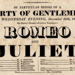
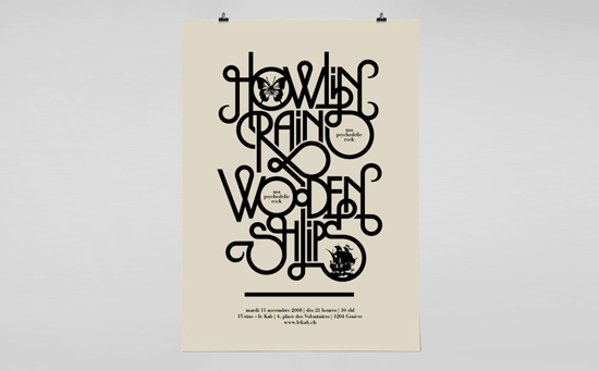
Robert Thorne, a British type designer developed a font that he named “FatFace” in 1803  (Industrial Expansion) which had a super bold look to it. This new font was used for posters, pamphlets and whatever was needed to be used on text to be extra eye-catching and to stand out. It originated from the term Egyptian serifs. Shortly after this the font started getting more creative having, shadows, inline, italics, and 3D characteristics added to it.

Filippo Marinetti

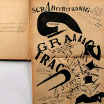
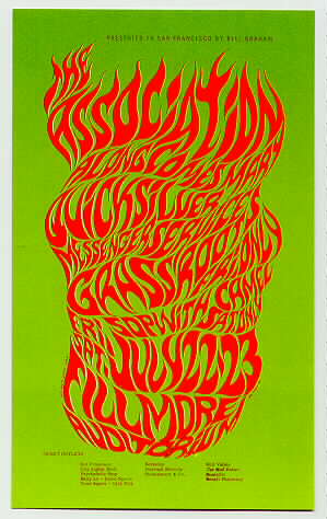
Filippo Marinetti created futurism work (1910-1918) he was a poet and writer, Marinetti created a work called “The Words to Freedom” about chaos of war. There are barely any images, just fonts laid out where “speed and noise” create visual poetry. The font was in swirls and had a lot movement which kept the eye busy and looking all over the page.

Comparison

Typography can be a very important part of graphic design, while reading through chapter 2 of Guide to Graphic Design the work by Robert Thorne and Filippo Marinetti really kept my interest. Both artist use typography to make art, without using many colors or images. If Thorne did not create the idea of “FatFace” maybe Marinetti would not have thought of “The Words to Freedom”.

Design Comparison

Piet Zwart
Piet Zwart lived from 1885 to 1977.  He was a Dutch designer, typographer, photographer, and industrial designer.  He worked in the Netherlands during the 1920s and 1930s.  He worked for the NKF Company for a great deal of time.  He was influenced greatly by Constructivism and De Stiji. This is expressed in his work as he often used primary colors along with black and white.

Bradbury Thompson
Bradbury Thompson was an American designer who lived from 1911 to 1995.  He worked in a print shop in Kansas and later moved to New York in the 1930s.  There he worked for Westvaco Paper Company, working on their periodical Westvaco Inspirations for Printers from 1938 until 1962.  He was influenced by modernism.  This is expressed in his work as he had very simple and rational designs rather than decorative ones.

Designer Comparison
A personal logo designed by Piet Zwart and Bradbury Thompson’s spread from Westvaco Inspirations for Printers #152 have several similarities.  These two works relate to each other in the sense that they both use solid colors.  Zwart uses the primary colors while Thompson uses the four main printing colors.  Neither work is clearly based on, or in response to the other.  Thompson’s work was done about 20 years after Zwart’s, yet they are very similar in regards to color and overall composition.  They are balanced in a similar way and are both complex yet simple at the same time.  Both works are visually appealing and successful works.

Bradbury Thompson.  Spread from Westvaco Inspirations for printers #152.  1945.
Bradbury Thompson. Spread from Westvaco Inspirations for printers #152. 1945.
Piet Zwart.  Personal logo. 1927
Piet Zwart. Personal logo. 1927

Design Comparison

Wes Wilson vs. Milton Glaser

After reading chapter two in the book, Wes Wilson and Milton Glaser were two artist whose work connected with me the most. Wes Wilson was the very first artist to create a psychedelic poster which was fascinating to the art world because it was something new and creative. Milton Glaser was a graphic design artist who was best known for creating the Bob Dylan Poster and other logos that are seen daily by everyone. What I really enjoy about both these artist is how they use vibrant colors in their work and its not just plain, its rather more abstract than anything.

Wes Wilson’s style of art was very unique and different because it seemed like he wanted to confuse everyone who was viewing his work. Even though he was the first to create this psychedelic style of art, others soon caught on and his career was basically over. I really enjoy this style of art because when viewing it, you have to find the message behind it yourself rather than it being told to you directly.

Milton Glaser also really captured this abstract style of art in some of his work but not all of it. He was responsible for creating the I <3 New York Logo and especially the Bob Dylan Poster. These two examples both show how he was talented in both sides of the spectrum, ranging from being really abstract to being really simple art designs. “Glaser’s poster of Bob Dylan, which became an icon for the 1960’s experience brought psychedelic language to mainstream America” p 64 Guide To Graphic Design. This quote just shows how his use of unusually depiction’s of what something looks like is appealing to the human eye and is appreciated.

Both Wes Wilson and Milton Glaser have a shared interest in the psychedelic style of art and so do I because it more than just art, its creativity. Their use of vibrant colors and strange fonts brings out the real artist inside of them and artist like me who are more abstract can connect well to these artist.

7421201_origWes Wilson. Concert poster for The Association. 1966

bob-dylan-poster-milton-glaser        Milton Glaser. Dylan. 1966

Design Comparison

Lucian Bernhard vs. Shigeo Fukuda

Both Lucian Bernhard and Shigeo Fukuda created designs with a very similar minimal, and bold look to them. Fukuda and Bernhard’s simplistic approach made a great impact on how design can communicate ideas and be strong at the same time without having any unneeded decretive aspects involved. These two famous designers, may not have been designing to communicate the same things, but the way they presented their work was.

Lucian Bernhard was born in Germany in 1883 and past away in 1972. Lucian was one of the biggest impacts on modern day minimalism. Bernhard created the style in which he called “poster style”, which is what all his famous designs are created in. Poster style is when all imagery is solid shapes, and uses as little information as possible to advertise/ promote the idea. So most all Bernhard’s designs are the brand name and a very simplistic almost paper cut-out looking image of the product, for example in his most famous design for Priester, which is a match company, so the only information on the advertisement is an image of two matches, with Priester presented rather large at the top.

Shiego Fukuda was born in Tokyo in 1932 and past away in 2009. Fukudas designs were very simplistic and logo like, much like Bernhards, yet Fukuda tried to convey his on personal beliefs and views into his work, intend of just representing something for what it is, he liked to make the viewer think more.

The two designs I chose to compare from Fukuda and Bernhard are, Fukudas 1982 Happy Earth Day Poster, and Bernhards 1910 Manoli cigarette poster advertisement. Both Posters have that simple solid shape style with very muted, small color selection with essentially one major image being portrayed. Obviously that simplistic approach done by Bernhard in 1910 was so effective at communicating, that the style was still being worked with in 1982, a whole 72 years later. The Manoli Cigarette poster and the Earth Day poster, physically appear similar, but their difference is what they are saying. Bernhards is what you see, a pack of cigarettes, there is no more meaning behind it. Fukudas is still minimal, but the imagery of a axe sprouting a leaf, with the headline “Happy Earth Day”, is speaking more towards an opinion.   


Design Comparison

John Heartfield vs. Tadeusz Trepowski

It is amazing that when there is a large-scale war, how much it affects the populace can be seen not only through books and novels but largely through art. Take Guernica, for example, in which the famous painter Pablo Picasso was so distraught by the bombings in the city he painted a mural 3.5 meters high and 7.8 meters wide. The April 26, 1937 bombings induced chaos in the Basque region’s city, and many died as a result of the bombs dropped by German and Italian warplanes. The black, white, and gray mural has become a symbol of anti-war and a reminder of the suffering, shock, and pain experienced by victims of bombings. Graphic Design has been affected in similar ways by the wars of the past centuries, especially including those of World War I (WWI) and World War II (WWII). War posters and war propaganda are some of the most visually impacting and influential pieces to come out of their eras, and the diversity in which designers expressed their opinions on the war is equally amazing.

Designer John Heartfield was born in Germany in 1891 as Helmut Herzfeld, but as a protest against the Weimar Republic and the German militarism occurring in home country, he changed his name to John Heartfield. He criticized the Nazi party in everything he worked in, and was a pioneer in the use of art as a political weapon. A member of the German Dada movement, an offshoot of the Dada movement. The Dada movement sprouted out of the aftermath of WWI as a reaction to a world perceived as mad by many artists and designers. Heartfield specialized in photomontage, and his work was showcased all over the world. For many years, he stayed in Germany to do his work despite the threat of assassination. He ended up dying in East Berlin in 1968.

Tadeusz Trepkowski was a Polish designer born in 1914, and became part of an outgrowth of Dadaism known as Surrealist philosophy. Surrealist philosophy involved juxtaposed images placed in certain ways to help solve problems. This issues were usually complex and the resulting images had a larger visual impact than what was usually seen at first glance. Trepkowski worked mainly in poster design, commercial art, and display design. He lived through both WWI and WWII, so it is easy to understand why Trepkowski had designed powerful war posters.

In regard to these two designers, I specifically looked at John Heartfield’s 1936 photomontage Have No Fear – He’s a Vegetarian, and Tadeusz Trepkowski’s antiwar poster from 1953 commonly known as Nie! Both war posters rely on a strong understanding of the time and the conflicts occurring then. Despite being designed about twenty years apart, the emotions such as anger and frustration that accompanied many who lived through the war are evident. Both also heavily rely on the importance of symbols, such as the Nazi swastika and the French helmet on the rooster in Have No Fear – He’s a Vegetarian or the outline of a bomb in Nie! But what also makes these two pieces of design stand out from each other are just as important. John Heartfield’s use of a black and white photomontage showcases the subject in a brighter light. Unlike Nie! color would be much more distracting and take away from the message that Adolf Hitler is hungrily eyeing France as his conquest, or in this case, his victim. The photographs also make it seem more like it could have been a photo that was real, which also helps showcase the amount of irony Dadaism is known for. Nie!, on the other hand, features a muted color palette of shades of brown against a stony blue background. Trepkowski’s use of a warmer color on the building featured against the background inside the bomb immediately evokes the image of a city burning, such as London during the Blitz. Trepkowski also uses graphic elements instead of photomontage, creating a much more poster-like feel rather than that of a photograph.

Have No Fear - He's A Vegetarian. John Heartfield, 1936 Antiwar poster. Tadeusz Trepkowski, 1953.

Design Comparison

Henri de Toulouse-Lautrec vs. Vladimir and Georgii Stenberg

Looking through our graphic design book I was most interested in the work done by Henri de Toulouse-Lautrec a French artist and designer from the late 19th century and the Stenberg brothers Vladimir and Georgii Russian designers from the 1920s-1930s. I like them because even though they were from different time periods their style of work was different but at the same time very similar, also the topic in which they based their work was very similar; Toulouse designed some of his work for the Moulin Rouge night club in Paris. While the Stenberg brothers designed posters for the cinemas in what was at the time Soviet Russia. While they may be two very different things both a cinema and a night club were places for people to congregate and have a good time.

I looked specifically at Toulouse’s “La Goulue” and the Stenberg brothers “Poster for Man with a movie camera”, I found them interesting because while they are from two different time periods and of a different composition style they at a base level share the same artistic style. Both pieces have this cut out look to them, that invokes a sort of collage feel. As well they both use very simple and vibrant colors, the primary colors, but while they look the same and share a similar topic they are uniquely different, Toulouse’s has a more artistic feel and the Stenberg Brothers as with the Constructionist movement has a more dynamic and purposeful image.

Design Comparison

While you can look at pieces of and design and to the untrained eye they look both similar and different. Each designer puts their own touch onto everything that they do. Two designers that can be seen as similar and different are Lucian Bernhard and Edward McKnight Kauffer. Lucian Bernhard was born in Stuttgart, Germany in 1883 and began his career as a designer by studying at Munich Art Academy before going to Berlin in 1901 to work. His career as a prolific designer brought posters, but also trademarks, packaging, type, textiles and much more and it was inspired by the famed Beggarstaffs James Pryde and William Nicolson. In his work the product that was advertised would have the trade name or company name in big letters spread out on a spacious background that was usually a solid color. His ‘Priester’ poster in 1905 was so stark and its colors were startling at that period that it would immediately catch the eye of the viewer. Edward McKnight Kauffer, an American designer who worked primarily in England, born in 1890. His career was inspired by Ludwig Hohlwein’s posters which brought on his works of simple designs. Kauffer’s poster for the Daily Herald in 1918 featured a yellow background with black text found only at the bottom and the top has images of origami like birds to symbolize the caption “Soaring to Success”.

While the two works are not that far off in years there are things that are both similar and different to them. Both designs are rather simple and appeal to the eye. The simplicity in the two are the very basic use of a word and an image against a plain background. However they are different in the way that Kauffer’s poster for the Daily Herald has an intricate version of birds soaring across the top of the page, which is unlike Hohlwin’s two matches seen in the middle of the page. While the Priester poster was apart of the Modern movement, and Kauffer’s poster was in the Futurism movement you still see plenty of what makes the works of two very different designers relatively the same.

bernhard,design,lucianbernhard,matches,minimalism,poster-98cda4216508d418811b459b1d090d8e_h4580002388_0229e5b283_b

John Heartfield and Shigeo Fukuda

Two designers that interested me are Shigeo Fukuda (1932-2009) and John Heartfield (1891-1968). Both of the artists were very interested in political, anti-war posters. Perhaps the war that influenced their views the most was WWII, where Heartfield was involved in the Hitler rebellion, producing anti-Nazi posters, and Fukuda was developing his personal style as a student.

During his schooling, Shigeo Fukuda became interested in the Swiss International Style, which preaches simplicity and minimalism. This school of design is seen in his work as he uses solid colors and bold lines. His anti-war ideas were easily reflected in his work because of the readability and universality of his style. Both sides involved in a war would be able to understand the message Fukuda showed.

The work of John Heartfield directly reflects his anti-Nazi views as he uses swastikas and pictures of Nazi leaders like Hitler and Goring. His skills in the new medium of photomontage allowed the people in the posters to be easily recognized because they were from real photographs.

The two pieces of design I chose are Fukuda’s war poster “Victory” from 1989, and Heartfield’s magazine cover from the October 1934 issue of AIZ. Both of these designs are anti-war and anti-Nazi with the image of a fist. Heartfield’s cover features a very dominant and powerfully raised fist that contains people raising their fists too. The people inside the arm give color and shadow to the arm as well as reinforcing the overarching image and concept. The cover has very little type and a solid background of a similar color to the images of people in the large fist. Having the fist be the only image on the page allows the image to be unobstructed and easily read. The time period (and probably text) shows that it is a anti-war design, while the imagery alone on Fukuda’s design display its anti-war statement. Using only the three colors of red, black, and white, Fukuda shows a fist coming out of a swastika as well as a tag saying “Victory – 1939…1989”. I interpret the imagery to mean that people had to fight and struggle against the Nazi regime. In the design, two years are presented. 1939 is the year that World War II began and 1989 is the date that the poster was circulated. Similar to Heartfield, Fukuda introduced little type to the design and kept a solid background. Just like the magazine cover, this was done in order to focus on the image and the concept presented.

I do not think that Fukuda’s poster is in response to Heartfield’s cover because of the large amount of time between the printing of these two designs. Fukuda may have gotten loose inspiration from the AIZ magazine cover, but because there is such a large difference in style and the fist is a universal symbol of strength and struggle, the two are not directly related.

AIZ Cover - Heartfield Victory - Fukuda

Project 1

Areas of Interest:

Advertising (Logos): I think Advertisement is something id be interested in because its a way to express your artistic ability through commercials, billboards, magazines, etc. Have you ever seen a commercial and thought “I can do better than that!” Growing up my mom would get sick of me yelling that while watching T.V. I believe Advertisement would be an awesome career, because when your idea is a huge hit, it could instantly go viral. And I believe I have many creative ideas for any ordinary tv commercial.

advertisment design sprite


Type Design: I also think Type design would be very interesting when creating new fonts and awesome typography. illustrator grew on me over the past year, and all of a sudden i found myself writing my name is weird and wacky fonts. This definitely isn’t my first choice, but when in doubt, it would be a very exciting career.

lekab-4

and last but not least,

Brand and Identity Design: My absolute favorite, once I returned home from Vail, Colorado I had took out my folder full of brochures and stickers from all the ski mountains i had conquered over the time of being there, and i had thought to myself, what if I created these logos for these impeccable mountains? So there I was drawing for hours these made up ski mountain logos but none of them really excited me. Until I thought of snowboards, and how interesting and absolutely awesome it would be if I designed snowboards for some huge brand company such as Burton, the house, or even Volcom for that matter. So for my first choice, brand design would be the best career choice for me, not only because of my love for snowboarding, but for the excitement i would feel every time i completed a new design for people to shred with.

70158

Books: “Unspecial Effects for Graphic Design” by Bob Gill, “Graphic Illustration” by Thoma, and

“The Big Book of Logos” By David E. Carter


Websites: justanotherfoundry.com

a blog about typography and all of Tim Ahrens work

chpadvertising.com/#portfolio

chpadvertising.com/logo-design

these two sites are information on logo and website design

dexigner.com/directory/cat/Advertising-Design/Designers.html

A list of Advertising designers and all their awesome work!