Baskerville and Garamond
Although there are elements that are pleasing to the eye in all five of the Classic Typefaces, I decided to focus on Baskerville and Garamond, the two oldest of the five typefaces.
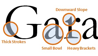
Garamond is the older of the two typefaces, created in 1617 by Frenchman Claude Garamond. Due to primitive printing technology of the time, Garamond was created to be able to deal with the printing process. As a result, the aesthetics of the type are less pleasing to the eye than it’s eighteenth-century English counterpart, Baskerville. The letter forms for Garamond are more consistent, and appear to be based off of a slightly ovular circle, with less variation in the thickness of the strokes and an angled stress that runs through the letters, which are really only particularly noticeable in the vowels a and e. The serifs on this typeface also seem to be heavier as a result of their size and thickness. The downward strokes evoke an older feeling that, couple with the heavy serifs give this typeface an almost clumsiness that seems to belong to the older textbooks I used to read in high school and grade school, which for me evokes a much more boring feeling that the more dynamic Baskerville.
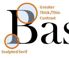
Baskerville, on the other hand, is an English font published in 1757 by businessman John Baskerville. Just looking at the font in comparison to Garamond, it immediately has a more elegant and dramatic feel. Having a printing process that was much more effective and better resources allowed typefaces to change. For example, the serifs are not a heavy and are much more sculpted for stylistic purposes than for printing purposes. The angle of the stress is much closer to vertical, and more easily noticed by the eye, making it more appealing to the viewer. The heavy brackets in Garamond were virtually eradicated by Baskerville in his development of his typeface, giving it a much more streamlined feeling when reading it. Overall, the thinner type flows lighter and I find it easier to read. Especially in a book with hundreds of pages and very small type, I feel like this type would work better when it came to squishing lines of type on a page, because it would not be so much black with little letting between them. Overall, I find Baskerville more eye-catching and reader-friendly, and would be more inclined to turn to Baskerville first.