Color Translations
Combine the translations you have developed into 50 powerful color illustrations.
Process
Working in illustrator, create layered color compositions with your black and white translations. Use background colors for some and try some on a white or black background. Most of them will look great layering two images or maybe three. Create surprising texture and color combinations that add life to the images.
Honor the Form
Try to avoid obscuring the image by combining two or three complex translations. Try combining the simple with complex. If you can’t tell what the image is then ease back. Sympathetic colors can clarify complex images. Use opacity if absolutely necessary.
Don’t overthink it!
If you can make something great with one colored translation on a colored background go for it. Use silhouettes and solid shapes. Complexity is great and we love it, but simple is beautiful.
Clipping Masks
Some of your color images must use clipping masks to constrain a texture (halftone, hand drawn, etc.) inside a simpler shape. Have fun with this.
Convert
Convert your hand drawn translations in one of two ways:
- Image Trace: If the translations has large areas of simple black such as a silhouette or filled outline form then use OBJECT > IMAGE TRACE. This will create vector shapes you can color or use as a clipping mask.
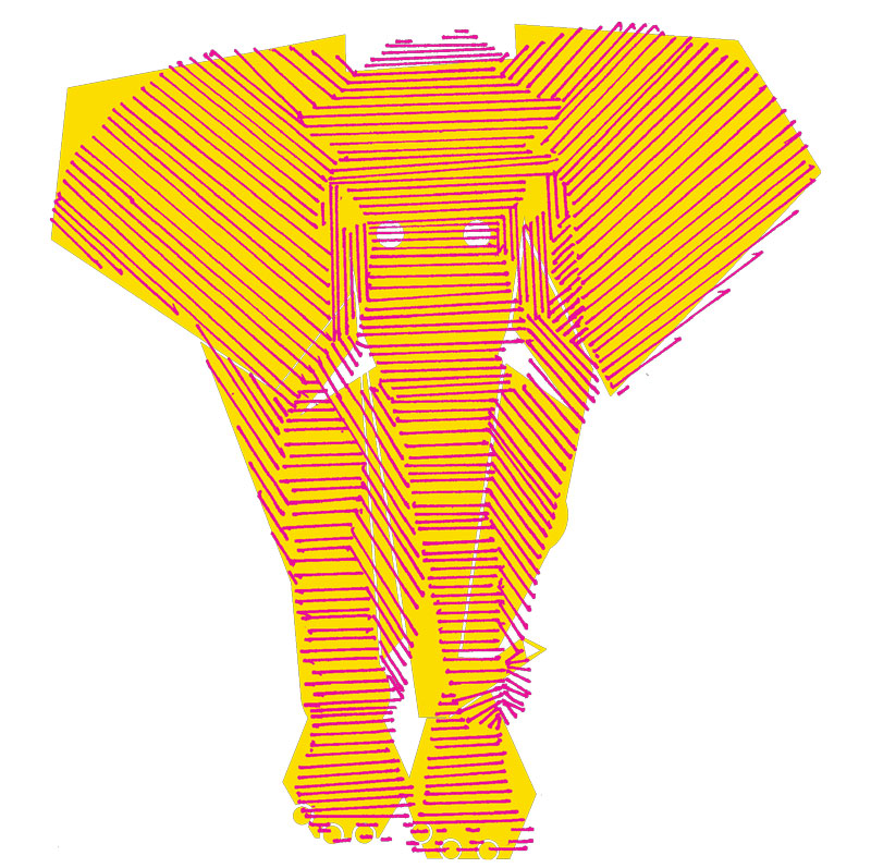
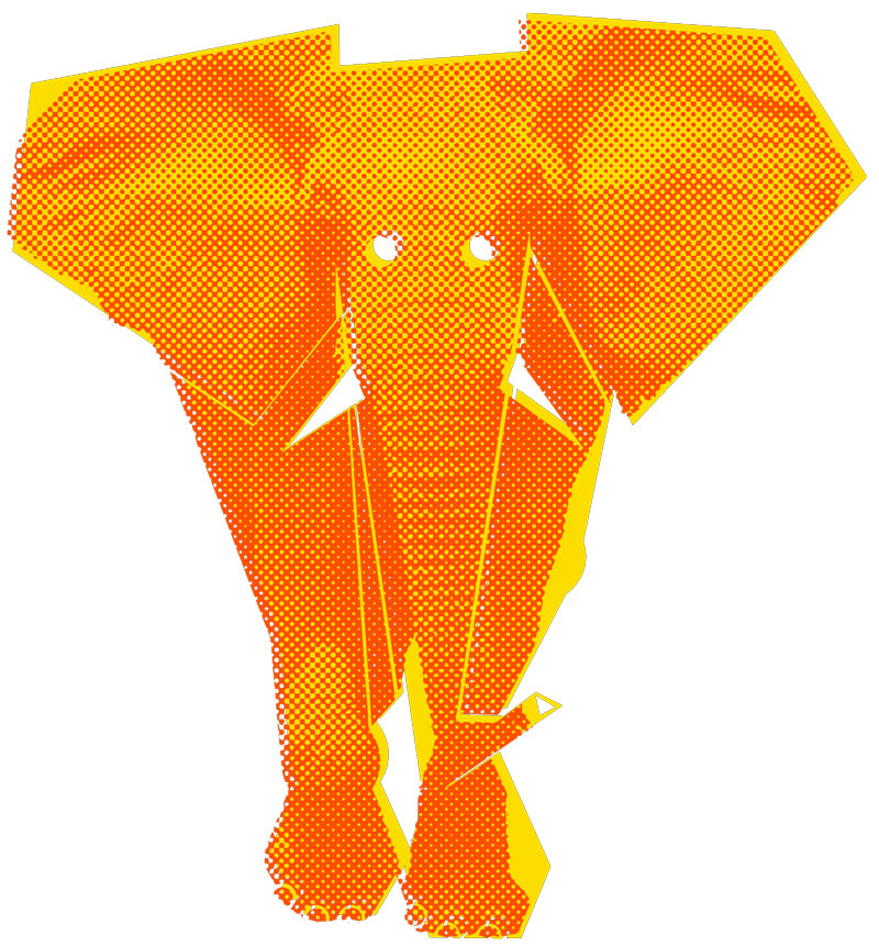
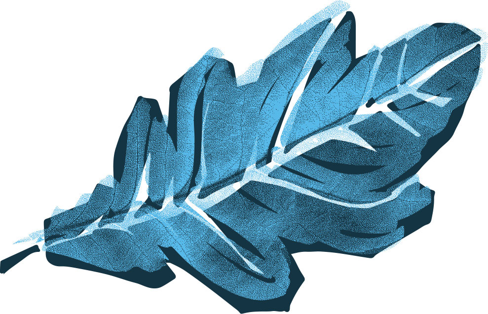
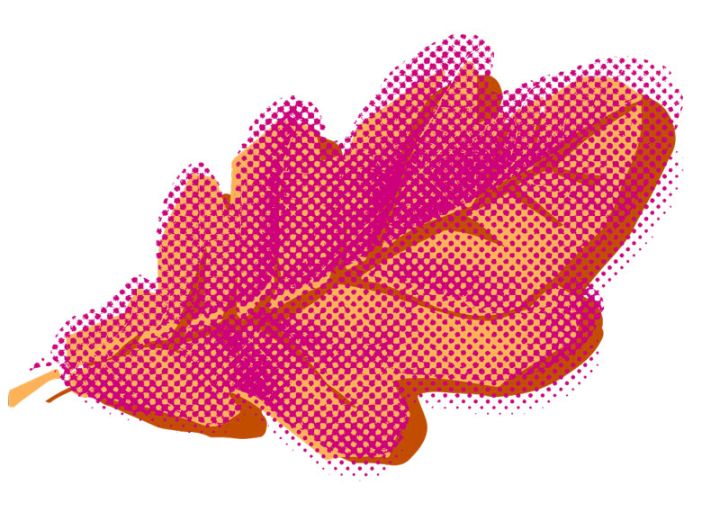
- Bitmap: If the translation is complex such as stippling, or straight lines then use PhotoShop to create a BITMAP image that can be brought into Illustrator and colored.
- Halftone Photo: You may also use your original black and white photograph and convert it to BITMAP using 50% Threshhold, Diffusion Dither, or Halftone Screen (lines, round, ellipse, etc.). Experiment with using course halftones with a very low translation as well as higher fidelity halftones.
Colors
Use the Pantone Matching System (PMS) / Solid Coated — Experiment with analogous colors (similar) and complimentary colors (opposites) for effect. Some images will look better with colors that are more sympathetic (light green, dark green, green-blue) and others will light up with opposite colors (green + orange).
50 Color Translations
You must use all 21 of the black and white translations as part of your 50 color illustrations. You will need to use each translation more than once. You may also combine three or more translations. The list is below:
- outline
- silhouette
- stippling
- straight lines
- thin marker: outline the forms
- thin marker: fill in outlined forms
- expressive renderings
- different expressive renderings
- still different expressive renderings
- auto-trace: Use illustrator auto-trace
- curvy high contrast vector: adapt form outlines above
- geometric vector: adapt geometric outlines above
- Pure Abstraction: Use a triangle to create all forms and values using that shape. Avoid letting the shapes touch each other
- type illustration: use large and medium size letters. Do not use words. Evoke the dynamism of you creature
- pixels: Use a 64 x 64 pixel grid at 72dpi. Black only, no gray
- coloring book style: draw a cartoon character over the photo using lines. Digitize to enhance
- geometric shape abstraction: simplify details / highlight essential features (eyes, claws, wings) using circles & polygons
- geometric modified: working with the geometric shape abstraction, go in and unify the shapes, smooth them out, reintroduce organic forms to create a simplified high contrast version with repetitive shapes.
- Invent your own translation: create a completely new way of realizing the form of your animal
- Single Line: One line to define the form.
- Gradient: choose a translation and give it gradients.
Due Thursday, November 13
9 of the best color translations printed and trimmed / must be as visually different as possible
50 Color Translations in PDF on DropBox