Filippo Marinetti and Piet Zwart were both innovators at the style of design that they worked in. As for Piet Zwart(1885-1977) he was a pioneer of modern typography. Although Zwart was formally trained as an architect and photographer at the School of Applied Arts in Amsterdam in 1902, he later began to experiment with different typography methods such as bold lines, mixing upper and lower case letters, etc. He did not adhere to traditional typography rules, but used the basic principles of constructivism and “De Stijl”( abstract, economical style. It was influential on the Bauhaus and constructivist movements.) in his commercial work. His work can be recognized by its primary colors, geometrical shapes, repeated word patterns and an early use of photomontage.
Like Zwart, Filippo Marinetti(1876-1944) found design later in his life as he was originally a poet editor. Marinetti was also an innovator of a style of design which is called the futurist movement. Futurism was introduced when Marinetti published an article of Futurism in a Paris newspaper. Marinetti’s stirring words established futurism as a revolutionary movement in which all the arts were to test their ideas and forms against the new realities of scientific and industrial society.
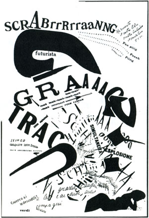
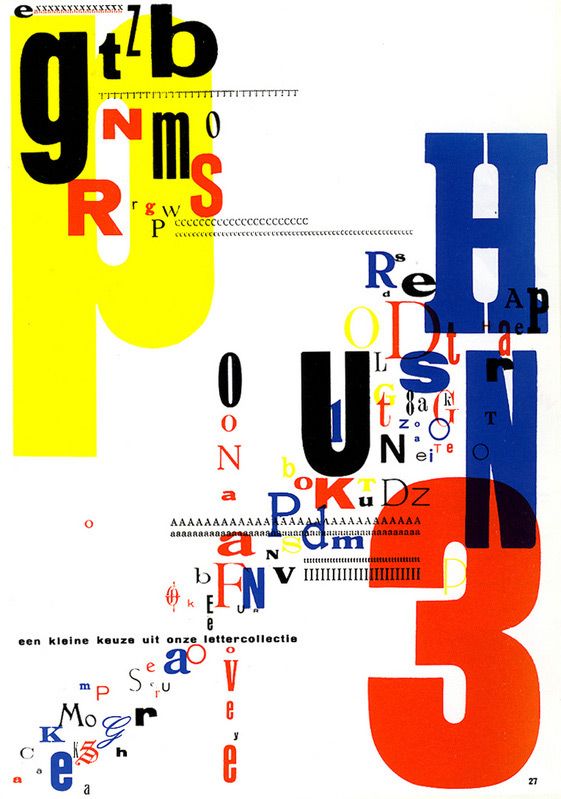
The first piece on the left-hand side is titled “SCRABrrRrraaNNG” by Filippo Marinetti, 1919. Compared to “Trio-Reclameboek” by Piet Zwart, 1931. From taking a glance at both images you can see the physical resemblance that they both share. Both pieces use multiple fonts, both use bold and thin lines, and they both seem as though they are hiding some kind of message to tell to the viewer. Both of these pieces seem as though they are breaking the rules of the design norm for their period. I also found it interesting how both designers found graphic design later in their lives and how they were both founders of their own style.