Henri de Toulouse-Lautrec VS Paula Scher
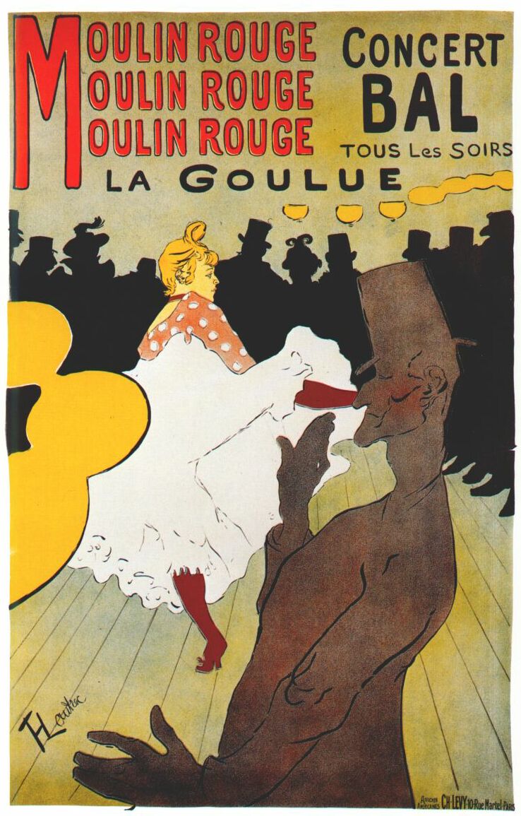
Henri de Toulouse-Lautrec was a French artist, born in 1864. La Goulue, made in 1891, came from the inspiration of Japanese woodcuts. This influence helped Lautrec create a visually impacting poster with the use of flat color and line. The repeating “Moulin Rouge” stood out to me the most in La Goulue. After reading more about it, I learned that the reason why the words are tripled is to create a bouncing effect, to mimic the rhythm of the dancing hall being portrayed. The letters throughout the entire poster are capitalized, but the rounded edges of the font create an inviting look to the poster. The joyous setting being shown through the dancing people is used to spark the audience interest into attending.
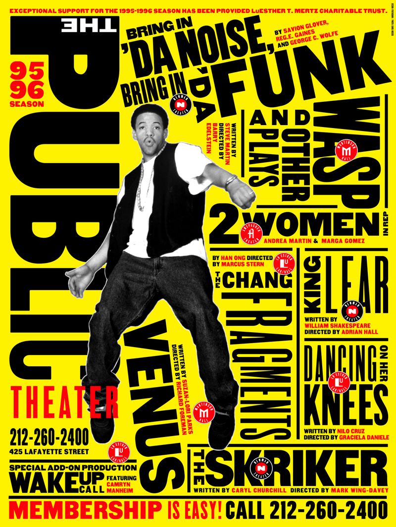
Paula Scher’s, born in 1948, uses New York City as an influence to create energetic and bold designs. The pentagram shown below is a seasonal campaign poster made for The Public Theater. She uses typography to her advantage to emphasize entertainment and excitement. Much like Lautrec, she uses flat color and lines to create a visually impacting poster. Scher placed words in a funky way by angling their baselines to express more emotion. We see the same qualities in La Goulue with the use of repetition in words. Ironically enough, both posters use the same four colors: red, yellow, black, and white. All of these aspects create a very inviting look for the two posters, which was the goal for both artists.
La Goulue by Henri de Toulouse-Lautrec | The Public Theater by Paula Scher