Paul Rand
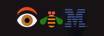
Paul Rand is an American designer who is most noted for his logo design. Some of his most recognized logo designs are ABC, IBM, UPS, and many others. Some of Rand’s most famous work was for the magazine covers of Direction magazine, Rand did these designs for no fee granted he could have full artistic freedom. Another designer who I found interesting was Peter Behrens, who was a German architect and designer. I’m going to be comparing one of Behrens pieces to Rand’s IBM poster.
![]()
![]()
![]()
Peter Behrens
Behrens, who was a German Architect and Designer was very important to the modernist movement, which is essentially the dynamic expression of abstract form, while being used for practical manners. Behrens is responsible for designing AEG from the ground up, this is also known as brand identity. He designed their logo, packaging, and everything else in between.
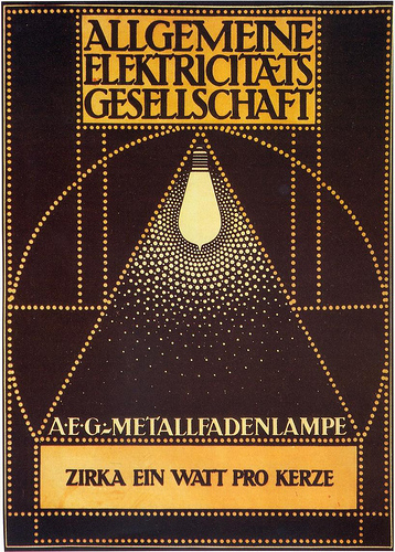
The piece from Behrens that I am going to be comparing with Rand’s IBM poster is Behrens poster for AEG electric lamps, and is pictured below.
These two pieces are comparable because they are examples of historic pieces of Graphic Design from the 1900’s. It is interesting because they are both marketing tools for two different corporations which the designers worked for. Rand worked for IBM while Behrens worked for AEG. Rand’s poster is an example of design being simple, yet effective. The poster uses symbols for each letter and is a creative solution to the design problem. Behrens poster is a poster for electric lamps that uses circles repetitively around the focal point (the lightbulb) and the typography up top. The poster uses three different colors, all of which work well together. In my opinion Rand’s poster is a stronger design because of the color theory, and simplicity.