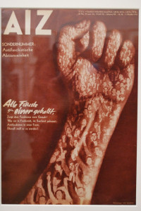
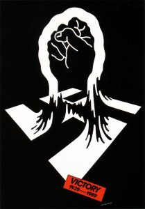
Two designers that interested me are Shigeo Fukuda (1932-2009) and John Heartfield (1891-1968). Both of the artists were very interested in political, anti-war posters. Perhaps the war that influenced their views the most was WWII, where Heartfield was involved in the Hitler rebellion, producing anti-Nazi posters, and Fukuda was developing his personal style as a student.
During his schooling, Shigeo Fukuda became interested in the Swiss International Style, which preaches simplicity and minimalism. This school of design is seen in his work as he uses solid colors and bold lines. His anti-war ideas were easily reflected in his work because of the readability and universality of his style. Both sides involved in a war would be able to understand the message Fukuda showed.
The work of John Heartfield directly reflects his anti-Nazi views as he uses swastikas and pictures of Nazi leaders like Hitler and Goring. His skills in the new medium of photomontage allowed the people in the posters to be easily recognized because they were from real photographs.
The two pieces of design I chose are Fukuda’s war poster “Victory” from 1989, and Heartfield’s magazine cover from the October 1934 issue of AIZ. Both of these designs are anti-war and anti-Nazi with the image of a fist. Heartfield’s cover features a very dominant and powerfully raised fist that contains people raising their fists too. The people inside the arm give color and shadow to the arm as well as reinforcing the overarching image and concept. The cover has very little type and a solid background of a similar color to the images of people in the large fist. Having the fist be the only image on the page allows the image to be unobstructed and easily read. The time period (and probably text) shows that it is a anti-war design, while the imagery alone on Fukuda’s design display its anti-war statement. Using only the three colors of red, black, and white, Fukuda shows a fist coming out of a swastika as well as a tag saying “Victory – 1939…1989”. I interpret the imagery to mean that people had to fight and struggle against the Nazi regime. In the design, two years are presented. 1939 is the year that World War II began and 1989 is the date that the poster was circulated. Similar to Heartfield, Fukuda introduced little type to the design and kept a solid background. Just like the magazine cover, this was done in order to focus on the image and the concept presented.
I do not think that Fukuda’s poster is in response to Heartfield’s cover because of the large amount of time between the printing of these two designs. Fukuda may have gotten loose inspiration from the AIZ magazine cover, but because there is such a large difference in style and the fist is a universal symbol of strength and struggle, the two are not directly related.

