The Guide to Graphic Design book talked about many different types of Design. Areas of graphic design that interested me were Type, Brand Identity and Publication design. These three were similar to my interests and were fields where I think I would excel.
Type
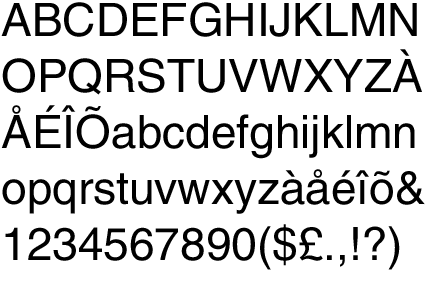
I chose Type designs because I’m very interested in the way fonts interact with peoples emotions. Being a graffiti artist I’ve experienced how letters and the way they are presented can impact a design drastically. I feel as if my skills in graffiti art could transcend into the Type area of design. I also enjoy the detail that type design goes into, having the eye for changing such small pieces of the design is very important in my opinion.
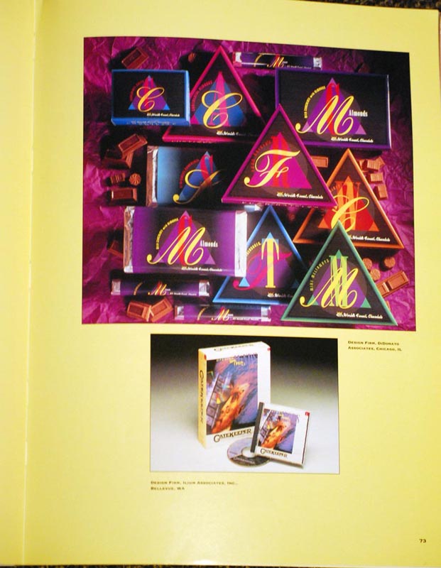
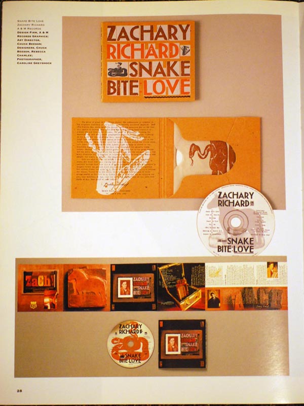
Publication
Publication Design really sparks my interests as well. I enjoy the idea of an always-changing subject matter, I feel as if that would keep a design job fresh. Publication Design offers a challenge of extreme uniqueness. You have to produce something that is always going to be different but it has to be synced with the article it’s attached to. I also like producing with a medium that’s tangible flipping through pages of a magazine has always been personally satisfying than being on the web. I think that an ever-changing subject matter would be a great fit for me. I like to stay up with the times for the most part. I believe I would be useful at researching new things to be promoted and designed in a magazine or periodical.
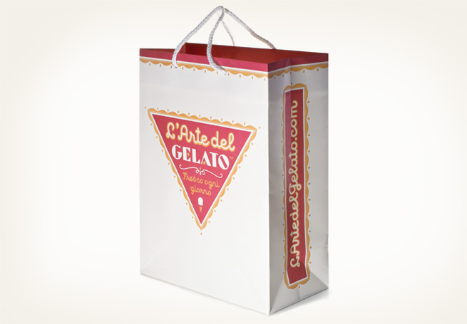
Brand Identity
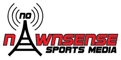
Brand and Identity design personally is the most interesting field that Guide to Graphic Design mentioned. A lot of my interest in Graphic Design spawned from seeing different companies logos. I think Brand Identity is one of the major components to having a successful company or business. I believe that the way I create would be very useful in Brand Identity. I like to expand on previously used ideas or projects, slipping in techniques or parts of previous designs into a new project. Keeping a trend or pattern with remnants of past designs much like many brands do. Having a recognizable symbol that can be altered around the changes in the culture, time or brand.

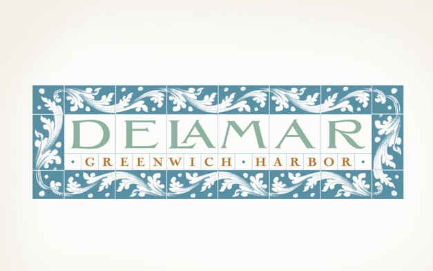
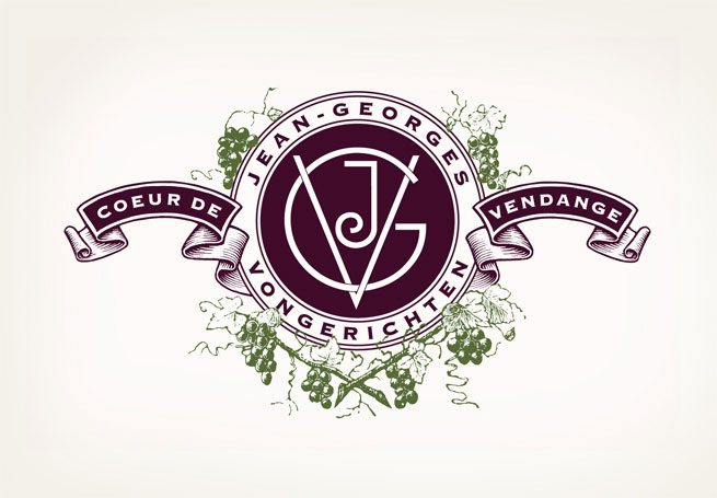
The examples above are brand logos done by Dever Design. Dever is firm I found in the Hot Graphics USA II book I referenced from. Dever Designs is a company out of Maryland. Their brand identity and Publication work struck me as clean and professional. Their website below has a great collection of various designs they offer.
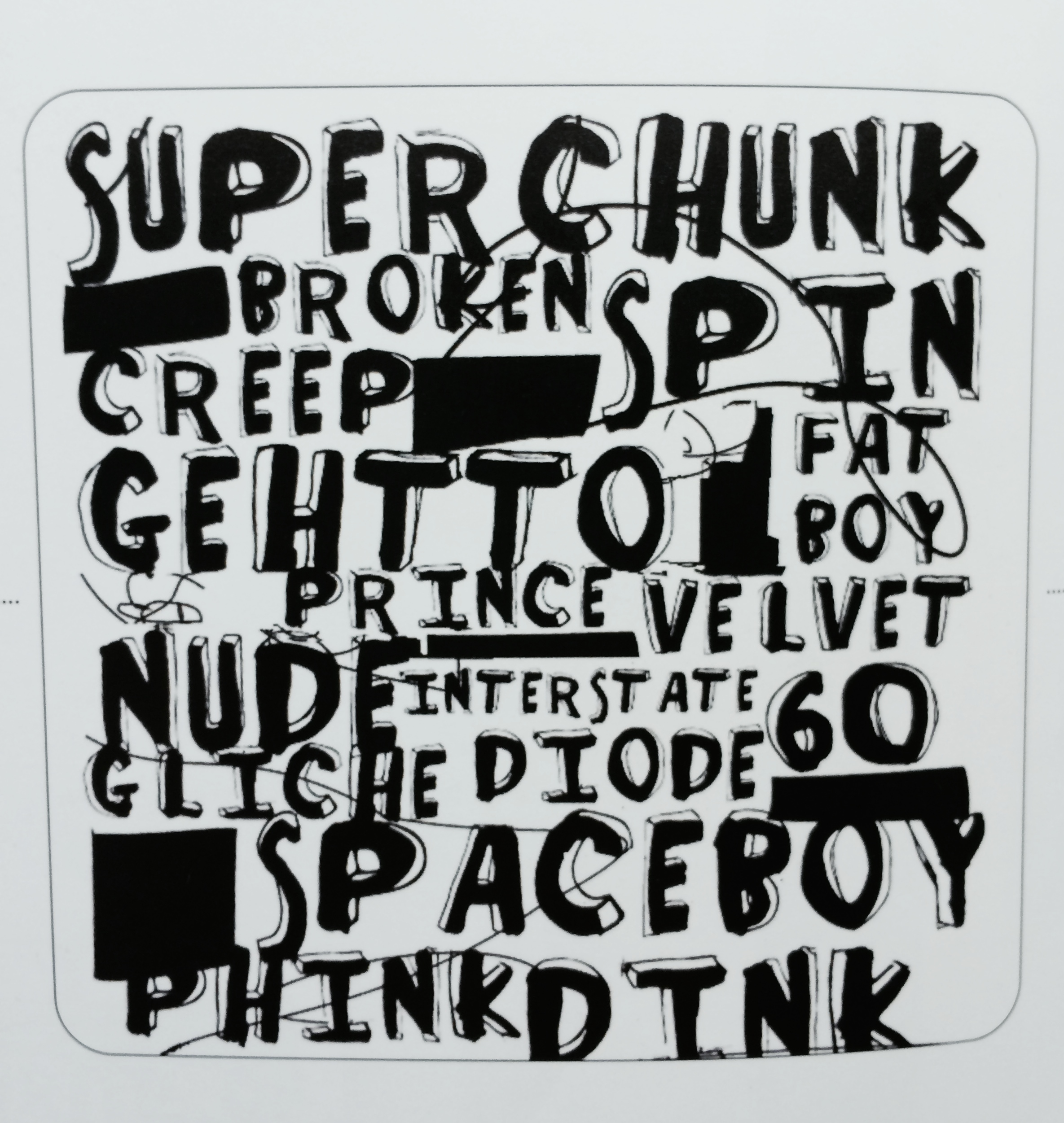
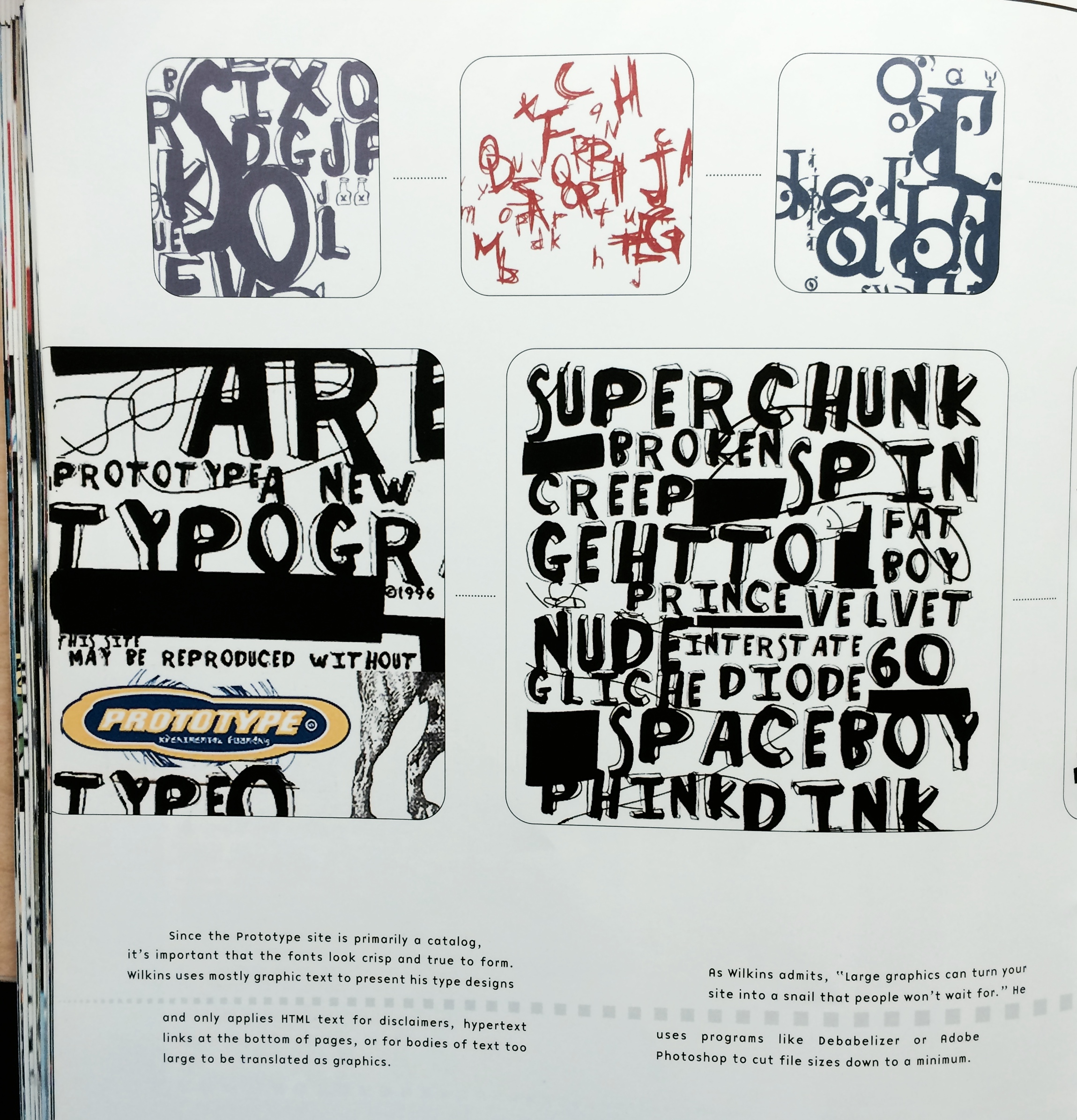
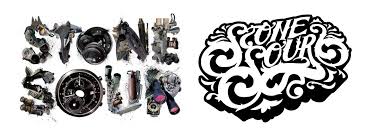
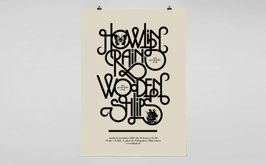
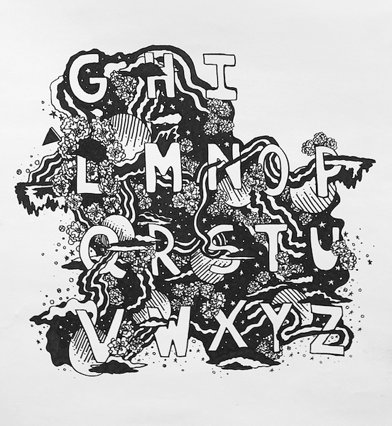
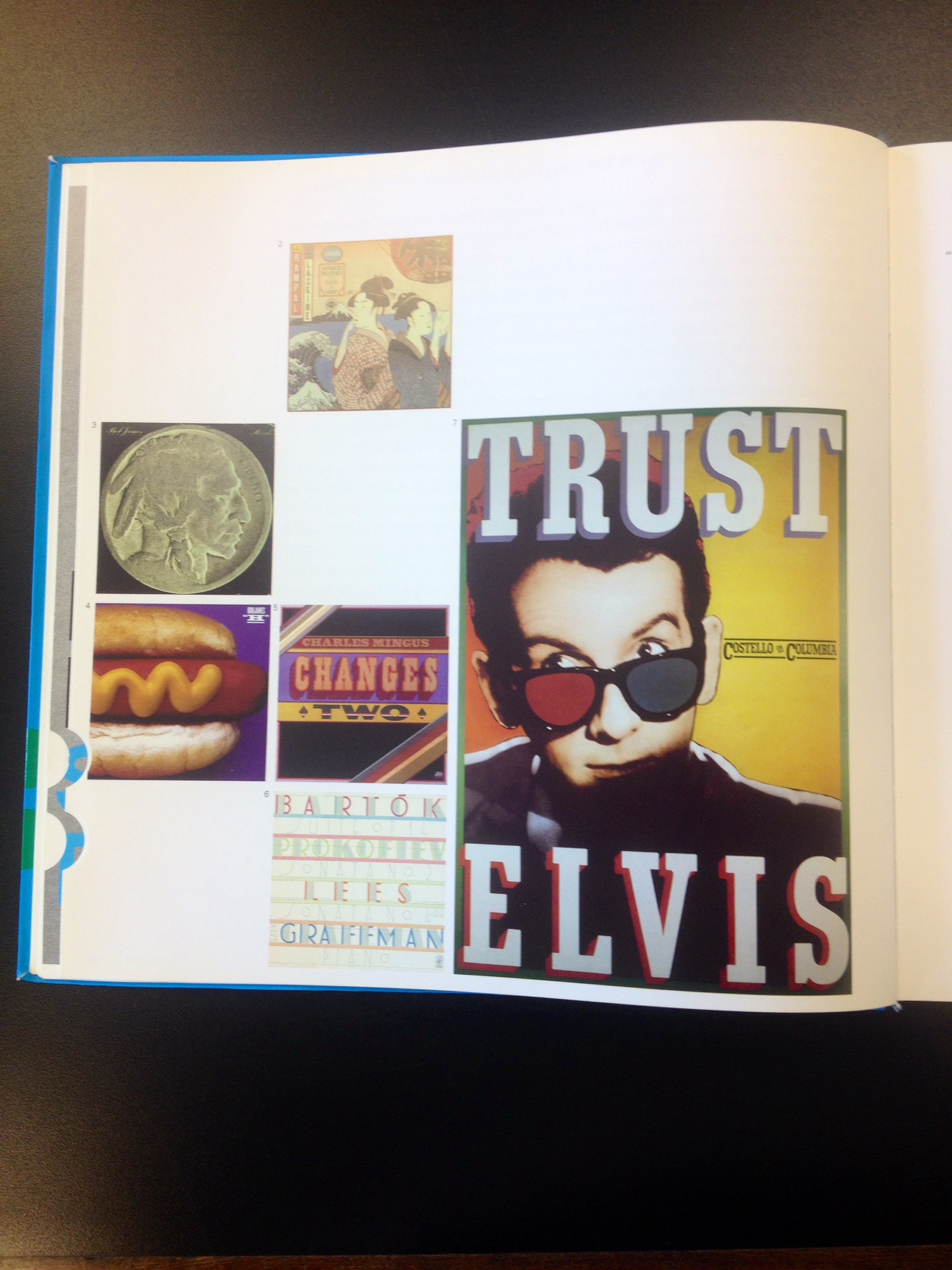
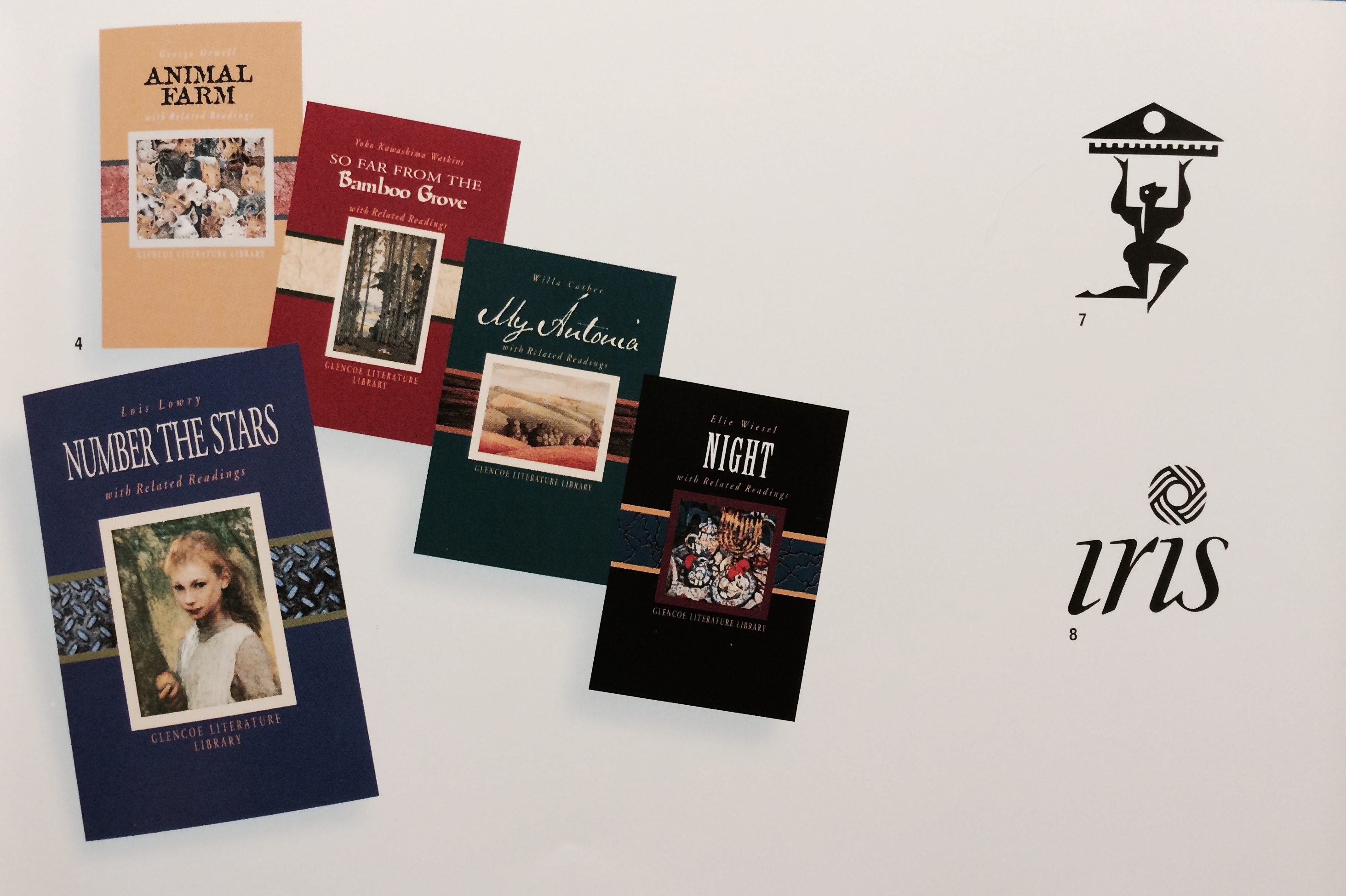
These type designs above are from Charles Wilkins of Prototype. I was drawn to this page in particular for the very rough font in the center of the page. This was a great example of Type Design. I referenced the book Typography Miles/Donnelly. More from the designer Charles Wilkins can be found on his new firms website.
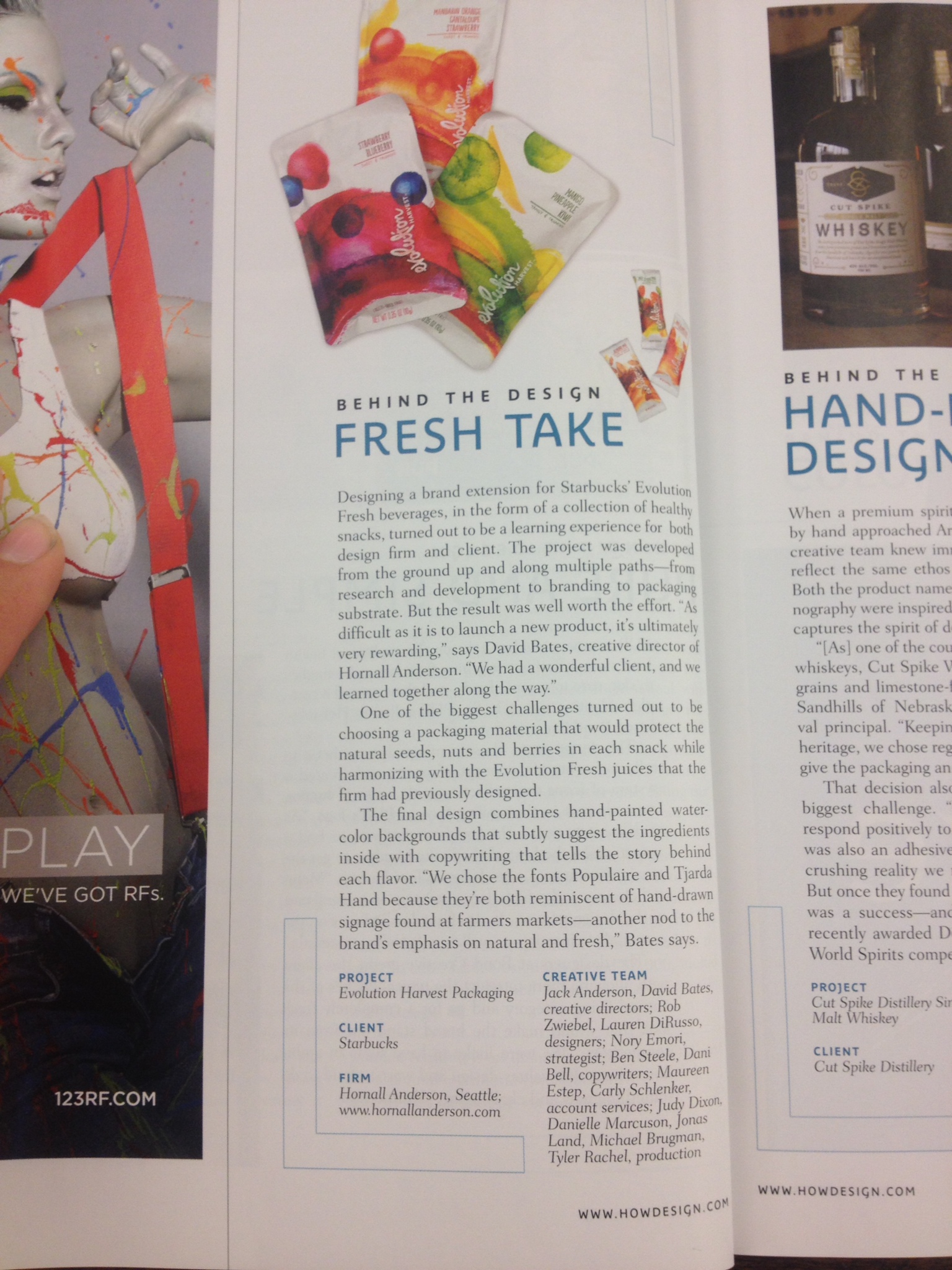
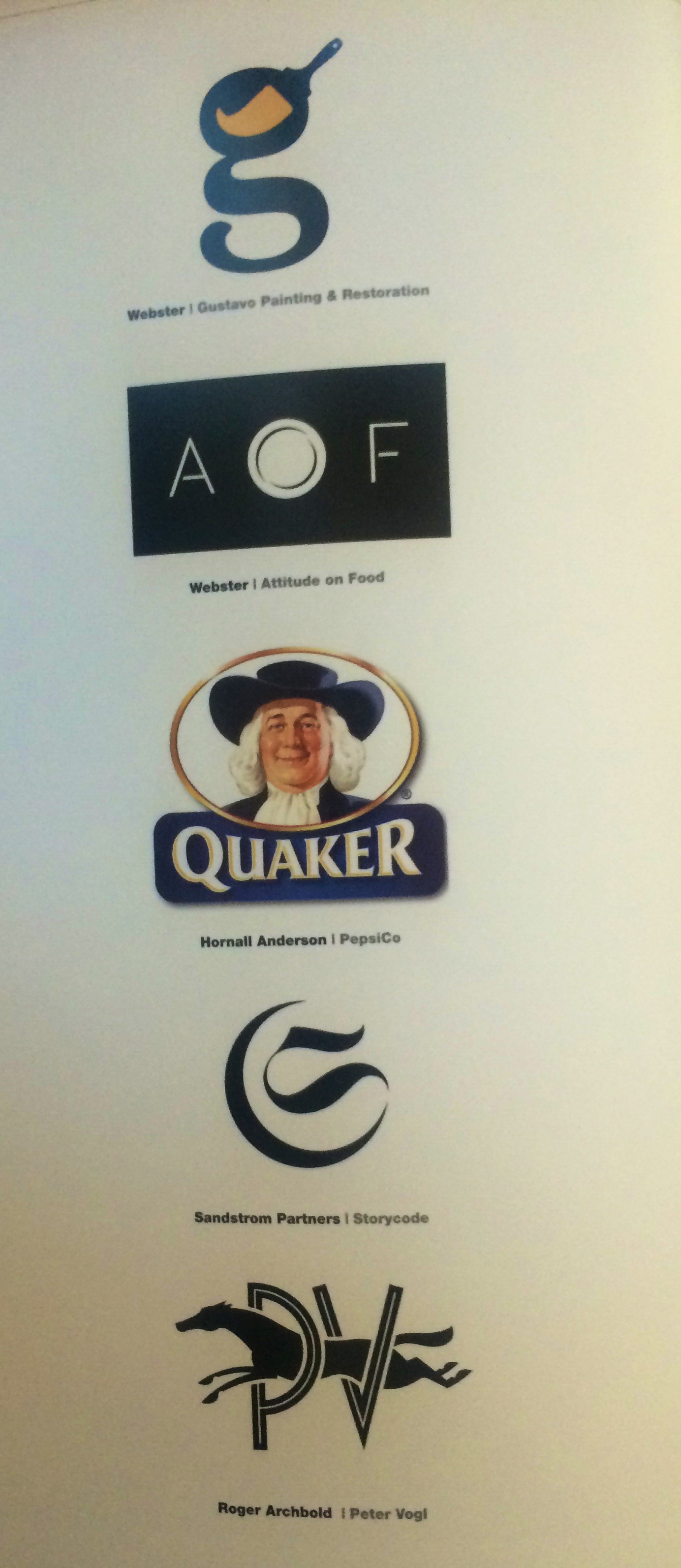
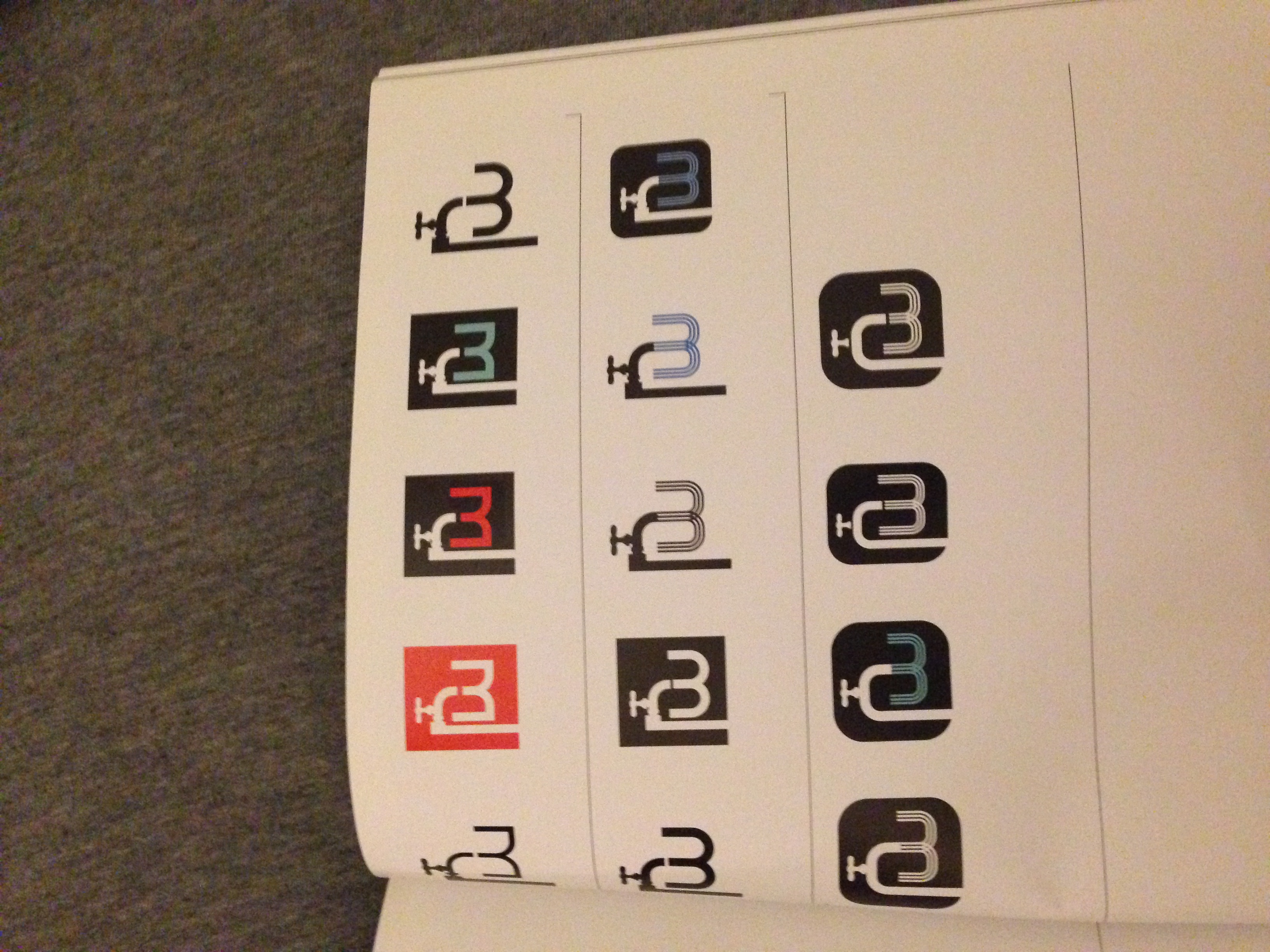
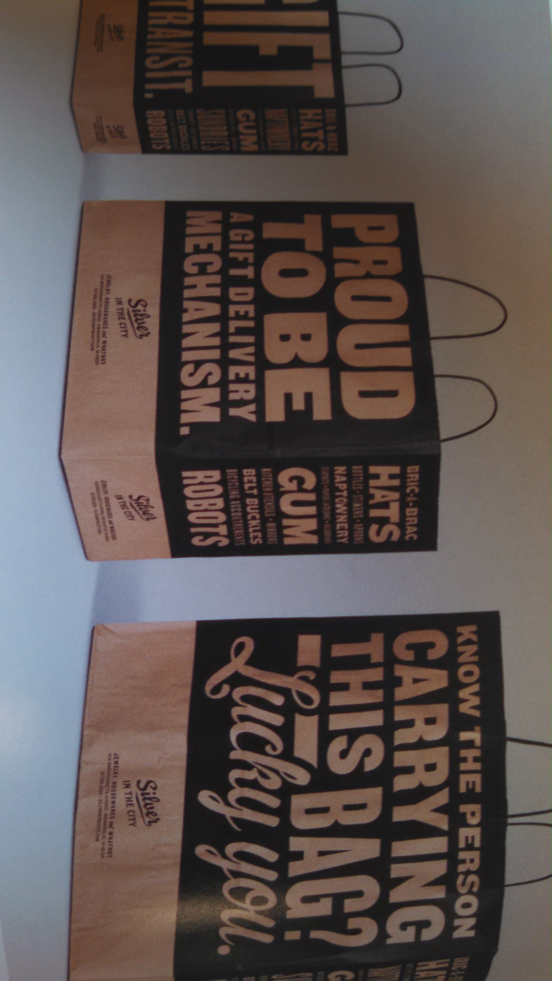
Another great example of brand identity I found in Hot Graphics USA II was from the firm Hornall Anderson. Their website below goes into great depth showing countless brand work they’ve done recently.
![]()
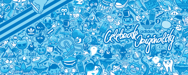
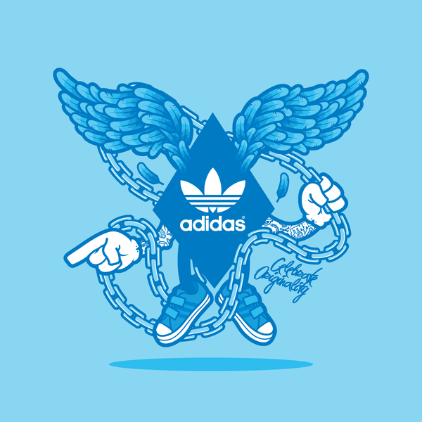
An awesome website I found on my own search lead me to stumble upon Jared Nickersons work. His brand work with Adidas blew me away. The style and technique he took was very attractive and new. His work and Behance account are below. His Behance account is filled with great pieces from his brand work with other companies as well.
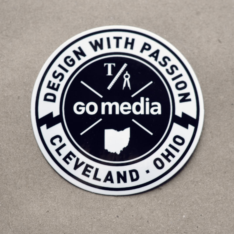
The best site I found during my research happened to be GoMedia Design firm out of Cleveland. There branding was top notch, the logos they display on their site are maticulously made. Their site had great links to where they go for inspiration and other designs firms. Some logos they displayed were even hand drawn with styles all across the board, from sleek to tattoo inspired lettering. It was definitely great to see a company with such a broad spectrum of talents.