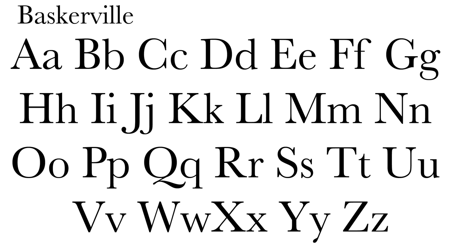
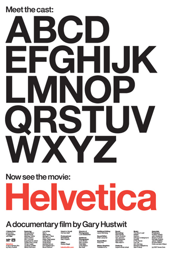
After studying, reading and learning about the 5 classic types faces (Garamond, Baskerville, Helvetica, Century and Bodoni), I came to the conclusion that I appreciate Garamond most. With Garamond, the thick strokes and downward slope on the serifs appeal to me. The fact that the font is not as stiff and monotone compared to some of the other fonts (like Helvetica) is kind to my eyes. There is also something about the old style of the font that i appreciate; it reminds me of the old printing used in the past and gives me a sense of history.
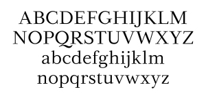
If I were to choose a font that I liked “a little less” out of the 5, Century is what I would have to pick from the group of fantastic fonts. The curved brackets and the lighter weight of the typeface, where the pen would find its end point on the letter is pleasant. Compared to Garamond’s sculpted serif, Century’s slab serif doesn’t settle as well with me; it looks like it was cut-off abruptly. Both are nice fonts, with similarities and differences, but the sense of flow and history rather than the thought of modern day and “edginess” when studying the fonts forced me to choose Garamond over Century.