Out of the five classic typefaces my favorite font is Baskerville, and my second favorite is Helvetica. Even though all the fonts seem very similar, Baskerville stands out to me because the sculpted serif, and the contrast between the thickness and thinness is very attractive and elegant to me. I think overall it’s a beautiful font and I like the curved brackets. Baskerville has a lot of characters and design to it, so it’s eye-catching to me, unlike Bodoni which seems like a plainer, simpler version of Baskerville. Even though this font is from the 1700’s it does not appear to be outdated, and I think it’s super interesting that Benjamin Franklin was a fan of John Baskerville’s fonts. Helvetica is my second favorite because I like how simple and plain it is, yet it’s so modern looking that I’m not bored looking at it. It’s so creative and different that the dot on the “i” is a square. As I’m typing this I’m realizing that this is Helvetica font too. It’s everywhere and I did not even realize but it’s so subtle and not in your face. I like how clean cut it is, and legible it is.
The Five Classic Typefaces
Century vs Garamond
My favorite typeface out of the five classic typefaces is Century. One of the first qualities that popped out the most is that Century is very easy to read. In fact, it is a very popular typeface because of its legibility. I picked Garamond as my second choice because the comparison between the two fonts is interesting. An obvious difference that the two typefaces have is their boldness. Like Garamond, Century pays attention to thick and thin strokes within the letters, but it is not as dramatic as Garamond’s style. These less exaggerated features makes Century’s typeface bolder than Garamond’s. The boldness of this font helps create great legibility for reading purposes. Garamond’s attention to think and thin features make the font harder to read because the letters are not as bold. The spacing between letters is different between the two fonts. The letters are evenly spaced out in the Century typeface, which is another characteristic that helps its legibility. The letters in Garamond are pushed close together, obviously making it harder to read. Another reason why Century is more legible than Garamond is because the letters are sized evenly. For example, with Garamond’s features, compared to the other letters, the lower case “a” has a small bowl. By changing the size of features in the letters within the font, it decorates the font style to appear hand written.
5 Classic Typefaces
Out of all five classic type faces the two I chose were Helvetica Neue and Garamond. Helvetica Neue was the typeface I mostly liked. This typeface is everywhere. On the gravitate online website I read that it used by Apple for there iOS mobile devices which I found very cool. We all have Apple products and text all day every day so Helvetica Neue is part of our every day life. Even in class when we watched that video about it, I think its awesome that we go around reading all these signs that are part of our everyday life and most of them are in the typeface Helvetica Neue. Garamond is a very different typeface compared to Helvetica Neue and I chose these two because of how much time is between the creation of these. Garamond was created in the 1600’s while Helvetica Neue was created in the 1900’s. I like that Garamond has the difference in thickness within the strokes. Reading Steve Bowden’s page I found it very interesting that Claude Garamond had created typefaces that were used for royally ordered book series. Also that almost 100 years after Garamond’s death the typeface became a popular one.
Classic Typeface Comparison
Baskerville and Garamond
Although there are elements that are pleasing to the eye in all five of the Classic Typefaces, I decided to focus on Baskerville and Garamond, the two oldest of the five typefaces.
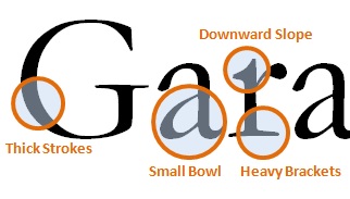
Garamond is the older of the two typefaces, created in 1617 by Frenchman Claude Garamond. Due to primitive printing technology of the time, Garamond was created to be able to deal with the printing process. As a result, the aesthetics of the type are less pleasing to the eye than it’s eighteenth-century English counterpart, Baskerville. The letter forms for Garamond are more consistent, and appear to be based off of a slightly ovular circle, with less variation in the thickness of the strokes and an angled stress that runs through the letters, which are really only particularly noticeable in the vowels a and e. The serifs on this typeface also seem to be heavier as a result of their size and thickness. The downward strokes evoke an older feeling that, couple with the heavy serifs give this typeface an almost clumsiness that seems to belong to the older textbooks I used to read in high school and grade school, which for me evokes a much more boring feeling that the more dynamic Baskerville.
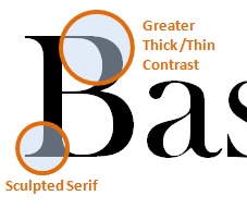
Baskerville, on the other hand, is an English font published in 1757 by businessman John Baskerville. Just looking at the font in comparison to Garamond, it immediately has a more elegant and dramatic feel. Having a printing process that was much more effective and better resources allowed typefaces to change. For example, the serifs are not a heavy and are much more sculpted for stylistic purposes than for printing purposes. The angle of the stress is much closer to vertical, and more easily noticed by the eye, making it more appealing to the viewer. The heavy brackets in Garamond were virtually eradicated by Baskerville in his development of his typeface, giving it a much more streamlined feeling when reading it. Overall, the thinner type flows lighter and I find it easier to read. Especially in a book with hundreds of pages and very small type, I feel like this type would work better when it came to squishing lines of type on a page, because it would not be so much black with little letting between them. Overall, I find Baskerville more eye-catching and reader-friendly, and would be more inclined to turn to Baskerville first.
Typeface Comparison
The five typefaces we had to look at were for the most part very similar and unless one looked hard enough would in fact say they were the same, but looking at them there were some key differences; like how one was sanserif and the ones that were serif had different types of serifs, also the differing thicknesses of the type, etc. I chose to look more closely at Baskerville and Helvetica, I much preferred Baskerville over Helvetica for a few reasons. Baskerville is a serif type and I just prefer serif typefaces to sanserif ones like Helvetica, they tend to be a bit more ornate with the different shapes and curves of the serifs unlike sanserif that just seem too plain. Baskerville is a thick and thin typeface meaning in some spots the type is thinner it resembles handwriting more so than Helvetica that is one uniform thickness. That’s not to say I don’t like Helvetica because I do like it in some contexts, every typeface has its use but compered to the other typefaces I just didn’t like it as much, one thing I did prefer about it though was that the “g” had a more modern look without so much swirling, that Baskerville’s had also the g was closed. Another thing was that there was more of a size distinction between the upper and lower case letters in Baskerville that I liked. Each Typeface is good and they each have a purpose that suits their styles.
Typefaces Comparison
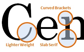
To the untrained eye, typefaces look relatively the same. They may notice small differences, like whether or not a font has serifs or not. However, someone who works with type can pick up the differences and know the similarities. Out of the five Classic Typefaces, the one that I like the most is Century and the one that I like less is Helvetica Neue. Both are great typefaces and both have their uses and are widely used since the 1900s. I like Century for the curved brackets which add interest and the slab serifs at the bottom of the letters which help to create a visual line when reading. Century has a lighter weight than Helvetica, and it has the brackets that Helvetica does not have. Most text books use Century because it is easy to read. Helvetica has aspects that Century doesn’t have as well, so it is not all just once sided. For instance, Helvetica has a square dot over the letter ‘i’. Helvetica also has a double story ‘a’ that is not found with Century. Both typefaces played a major role in the development of type in the 20th Century.
Bodoni and Century Typefaces
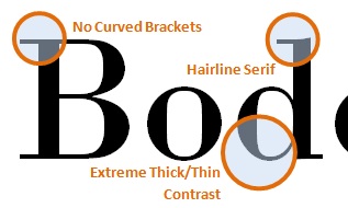
The two typefaces I chose are Bodoni and Century. Bodoni is more appealing than Century is because of it’s severe contrast between thicks and thins in the letter forms. The Century font has a slight difference between thick and thins, but it isn’t as noticeable or distinguishable. The contrast of weights within the letters of the Bodoni font makes it more modern looking and interesting. Having more similar thicks and thins doesn’t require the viewer to be as engaged by the type. It is easier for viewers to glance over the words rather than pay attention to the words created by the font. If viewers are not engaged by the font, then it is not doing it’s job.
The other main difference between the Century and Bodoni fonts is in their brackets. The brackets on the Bodoni font are completely straight, while the brackets on the Century typeface are curved. Although it can be argued that the curved brackets on the Century typeface is more visually appealing than the straightness of Bodoni type, it can be counteracted by stating that they are over-compensating for the lack of interest of the font because of the similar thickness of the letters. I do appreciate the flourish that the curved brackets bring to the Century font, but it distracts the viewer. Although it is not over the top like some elegant typefaces, it is enough for the viewer to focus on the form of the letters rather than the message the type is conveying. The curved brackets do not appear to have any function other than to be aesthetically appealing. Having straight brackets on the Bodoni font allows viewers to focus on the message of the words rather than the letters themselves. There is nothing unnecessarily added to the type. Having the bare minimum, but not to the extent of Helvetica, makes the Bodoni font more appealing and functional than the Century font.
Design Comparison
Moulin Rouge, Henri de Toulouse-Lautrec (1891)
Henri de Toulouse-Lautrec (1864-1901) was a French painter, printmaker and illustrator. As an artist he made many strides in the Art Nouveau movement. The “Moulin Rouge” piece stood out to me the most out of his work, because of it’s sharp figures and strong use of color.Throughout his life Lautrec traveled through France depicting the nightlife of mostly Paris. Lautrec’s most influential medium was in his commercial advertising, and events in theatre. Some of the movement’s pieces were influenced by Japanese art forms and woodblock prints. Lautrec was influenced by the japanese woodblock, creating contrast with sharp lines and even exploring new forms of typography that was fairly new for the time. He furthered the possibilities of poster arts through his use of color and typography. The fun vibrant setting shown through the people dancing is used to spark the audience’s attention, which is does for me.
Dylan, Milton Glaser (1966)
Milton Glaser (1929-Present) is an American graphic designer who was responsible for creating the I <3 New York Logo and many other logo pieces but for my comparison I am more interested in his advertisement for Bob Dylan. In this piece “which became an icon for the 1960’s experience, brought psychedelic language to mainstream America” (Guide to Graphic Design, 64). Through the piece he created a state of mind, with just the color and line. “The contrast of vivid colors with the dark silhouetted profile reflects Glaser’s response to the Modernist “Less is more” dictum: “Just enough is more.” (Smithsonian, Sign of the Times, Edwards, 1)
The rise of rock ’n’ roll in the 1960s, generated a particular genre of poster art similar to the rise of poster artwork in the Art Nouveau era of the early 19th Century. Henri de Toulouse-Lautrec and Milton Glaser works share a similar style in color and emphasis on the figure. Glaser said he “was interested in Art Nouveau at the time”. “That was an influence for the colors and shapes in the picture.” Glaser’s piece depicting Bob Dylan with kaleidoscopic hair, has been described as “psychedelic” and is often associated with rock posters. Lautrec’s most influential medium was in his commercial advertising, promoting scenes and events in theatre within the arts much like Glaser’s promotion for Dylan.
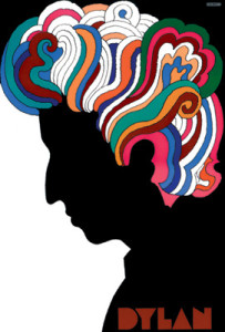 Dylan, Milton Glaser, 1966
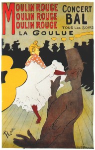 Moulin Rouge, Henri de Toulouse-Lautrec (1891)
Design Comparison
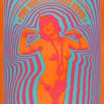
Victor Moscoso (1936)
During the 1960s and 1970s, residing in San Francisco but from Spain, Victor created psychedelic rock posters and advertisements with relation to the Underground Comix. Along with billboards, t-shirts and many other materials, his psychedelic designs and styles full of vibrant colors and hypnotizing creations were influenced by the artist Josef Albers; one of his teachers from Yale, Albers was the first of the rock poster artists to use photographic collage on a majority of his posters. Moscoso received international consideration from his work and created many album covers for musicians including Herbie Hancock, Jerry Garcia and other known artists of the era.
April Greiman (1948)
During the late 1970s and early 1980s, Greiman was one of the first designers to to hold of computer technology to use it as a design tool. Those who thought that computer technology and digitalization would harm the design world were proved wrong by the work that Greiman created from it. She utilizes color, image and words to express her voice through her pieces.

Both artists used their creative abilities to create a new form of design. Moscoso with the unique psychedelic posters for local musicians and Greiman with her innovative use of the new computer technology to create works of voice and style.
Design Comparison
Filippo Marinetti and Piet Zwart were both innovators at the style of design that they worked in. As for Piet Zwart(1885-1977) he was a pioneer of modern typography. Although Zwart was formally trained as an architect and photographer at the School of Applied Arts in Amsterdam in 1902, he later began to experiment with different typography methods such as bold lines, mixing upper and lower case letters, etc. He did not adhere to traditional typography rules, but used the basic principles of constructivism and “De Stijl”( abstract, economical style. It was influential on the Bauhaus and constructivist movements.) in his commercial work. His work can be recognized by its primary colors, geometrical shapes, repeated word patterns and an early use of photomontage.
Like Zwart, Filippo Marinetti(1876-1944) found design later in his life as he was originally a poet editor. Marinetti was also an innovator of a style of design which is called the futurist movement. Futurism was introduced when Marinetti published an article of Futurism in a Paris newspaper. Marinetti’s stirring words established futurism as a revolutionary movement in which all the arts were to test their ideas and forms against the new realities of scientific and industrial society.
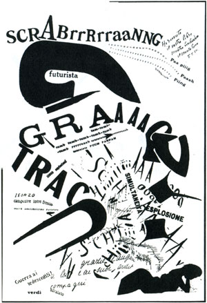
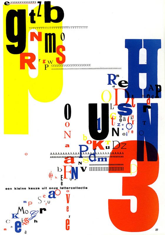
The first piece on the left-hand side is titled “SCRABrrRrraaNNG” by Filippo Marinetti, 1919. Compared to “Trio-Reclameboek” by Piet Zwart, 1931. From taking a glance at both images you can see the physical resemblance that they both share. Both pieces use multiple fonts, both use bold and thin lines, and they both seem as though they are hiding some kind of message to tell to the viewer. Both of these pieces seem as though they are breaking the rules of the design norm for their period. I also found it interesting how both designers found graphic design later in their lives and how they were both founders of their own style.