Henri de Toulouse-Lautrec vs. George Lois

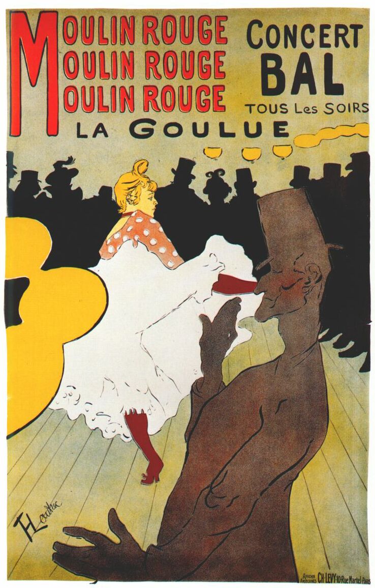
Henri de Toulouse-Lautrec (1864-1901) was a French painter, printmaker and illustrator. As and artist he made many strides in the Art Nouveau movement. Throughout his short life Toulouse-Lautrec traveled depicting the fresh nightlife of Paris. Filled with many artists and students Henri had a vast amount of inspiration in Paris. Lautrec’s most influential medium was in his commercial printing, promoting scenes and events in theatre. Art Nouveau was heavily influenced by Japanese art forms and woodblock prints. Lautrec also took influence from these woodblocks in many of his posters. Creating contrast with sharp lines and even exploring typography that was fairly new for the time. Lautrec even slipped in subtle cultural happenings in his posters. For example in his poster “La Goulue” (below) the woman in a happy public setting is expressing discomfort hinting to the feminism movement that was then hitting Europe. Lautrec personally furthered the possibilities of poster arts to have a social and political voice.


Fast forward to 1931 George Lois is born. During his life he was involved in advertising design and the New York School era of design. This is where images, text and type collided together. This type of design brought a new meaning to advertising. Repeatedly putting text with associated pictures, creating continuous campaigns that became very popular. Typograms also steamed for this age of design. George Lois became the art director of Esquire magazine. Lois would go on to create countless influential covers and other pieces of design for the magazine and other companies. One of the most Iconic is the front cover of the April 1968 issue of Esquire Magazine depicting Muhammad Ali shot with arrows. This cover drawing readers in to a very controversial story involving many social issues at the time race, segregation, religion, draft laws and the most talked about man in professional sports.


I chose to compare these two images because even with a large gap in time and leaps of advancement in technology they are portraying in very similar ways with similar concepts. Both a scene of a person followed by text.

“La Goulue” by Lautrec is very simplistic in terms of technology projecting a scene of dancing in France. At first glance it seems as if it’s just that, but with further analysis you begin to see the social undertones. A very joyful dance floor with the only detailed person being an unhappy woman, in a time of progression of women’s freedoms and feminist advancements. This woman stands alone and she comes along with a subtle yet interesting message leaving you curious. This was the beginning of mediums such as this carry a voicing message.

I compared it to the Esquire cover because I feel as if the “La Goulue” poster paved the way for more evocative covers such as the Muhammad Ali Esquire to come. This cover by Lois and photographer Carl Fischer cannot be ignored. The most controversial man in sports is standing alone in front of you bleeding from multiple arrows sticking out of him. He is in a position similar to the one of Jesus Christ on the cross. This screams a thousand times louder than Lautrec’s message but the end result is similar. It leaves you wondering why this African American Gold medal boxer is being shot with arrows. Lois leaves Muhammad the main focus of the page seemingly tacked to page. The magazine title left behind him leading you to more information. You start to ask yourself is it about race, his change to a controversial religion, or is it about his battles to avoid the draft.

The 77 years that separate these two covers or posters shows the change in technology of printing and freedoms of press. The messages are very different in volume but without Lautrec’s poster with a subtle message you don’t have Lois’s screaming cover. Both of these designs show text with an image and most importantly a message that came on a widely available piece of press.

henri-de-toulouse-lautrec-moulin-rouge-la-goulue-plakat-09709

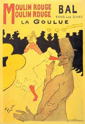
Henri de Toulouse-Lautrec “La Goulue” 1891

tumblr_n0uqv4AHN61qcyj2vo1_1280

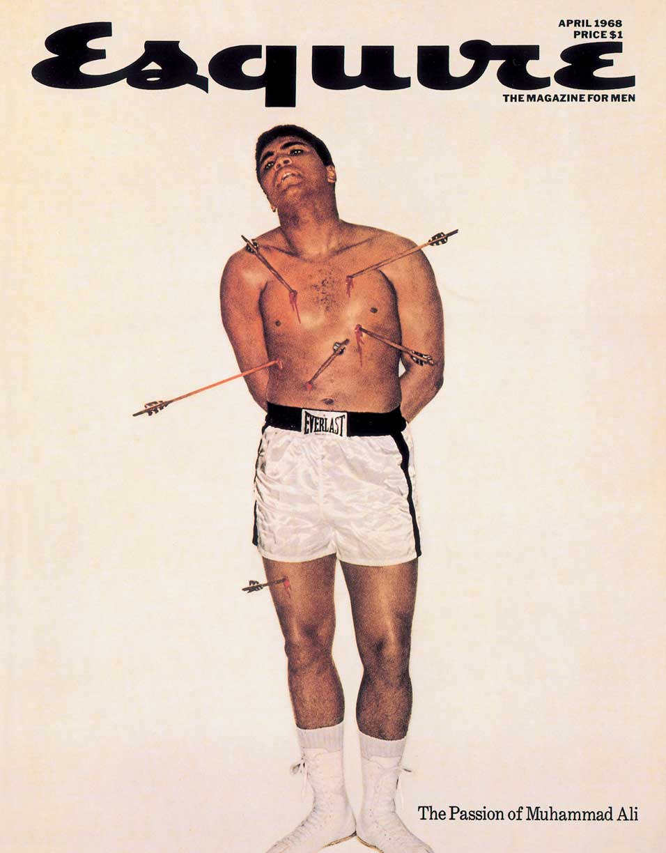
George Lois Art Director And Carl Fischer Photographer Esquire Magazine April 1968

Design Comparison

Victor Horta (1861-1947) was a Belgian architect. Victor began studying architecture at the Académie des Beaux-Arts. He went to Paris from 1887 to 1880 and worked in the studio of the interior decorator Jules Debuyson.

Henri de Toulouse-Lautrec (1864-1901) was a French artist. He is heard along with artist such as Van Gogh as one of the most famous artists during the Post-Impressionism period.

Victor used the Art Nouveau  which was a style developed in Europe and North America at the end of the 19th century it was a style of natural forms that were translated into high contrast shapes and patterns. They were very appealing and reflected traditions on history and the classics. In his architectural work he had the stairway in the Tassel House as his main focus. The spacial movement created an organic flow to both the exterior and interior.

91418726_f96132ab6b


Henri also used the Art Nouveau and his became the most expression pieces. Commercial printing was when graphics and color could be combined and reproduced with losing its quality. In his piece called La Goulue he uses flat color and line but the way he works it, it creates a strong visual impact by having the solid black crowd and the dancer against each other. By doing what he did with the simple colors and line he causes the paper to become a part of the drawing. Here you also see typography and it flows nicely with the images like the way he put moulin rouge, rather than just being put on the page.

h2_32.88.12

These two images struck out to me the most while reading through the chapter. Both are from the time period of the Art Nouveau. Also both have sort of like a hidden blend of images in them that make them  very famous. The stairway has the natural organic vine like that flows all around, which I find absolutely gorgeous. In the print the use of the solid black crowd creates a spacial distance and makes the dancer stand out showing that she is the importance in the print. With these similar comparisons i found it interesting because just looking at them you would never think that these works would be similar.


Design Comparison Post

In the class text there were two designers that caught my eye.

Henry Van De Velde (April 3, 1863- October 15, 1957)

Henry van de velde (2)

Henry Van De Velde was born in Amtwerp, Belgium on April 3, 1863. He was a painter, Architect, and an Interior designer. He is one of the main founders and representatives of Art Nouveau in Belgium. He spent a lot of time in Germany and influenced  a lot of the architect  and design in the 20th century. In the beginning he was actually a painter but in 1892 he devoted his time to interior design. Van de Velde was strongly influence by John Ruskin and William Morris’ English arts and crafts movement.  Henry Van De Velde was one of the first designers to incorporate curved lines with the abstract style. In 1899, He settled in Weimer, Germany. By 1905 Henry Van de Velde had established the Grand-Ducal School of Arts and Crafts with the help of the Grand Duke of Weimer. During World War 1 due to being a foreigner, he had to leave Germany and go back to his native lands. He lived in both Switzerland and the Netherlands for some time. He died at age 93 in Zurich.

Peter Behrens (April 14, 1868- February 1940)

Peter_Behrens,_um_1913

Peter Behrens is a german architect and designer. He was very important in the modern movement. From September 1877 to 1882 Behrens attended the christianeum Hamburg. In 1890 he married Lily Kramer and moved to Munich. At first, he worked as a painter, illustrator, and book binder. He was very interested in subjects related to the reform  of life-styles. In 1899 Behrens accepted the invitation of the Grand Duke Ernst-Ludwig of Hesse to be the second member of  his recently inaugurated Darmstadt Artists’ Colony. Here he built his own house and fully conceived everything inside (furniture, paintings, towels, pottery, etc.). It is said that this was a turning point in his life when moved away and wanted to change to a more unadorned style. He then became one of the leaders of architectural reform during the turn of the century and was a designer of factories, and office buildings in glass, brick, and steel (example: Aeg Turbine hall). While in Berlin (1936) Adolf Hitler wanted Behrens to be apart of his dream for Berlin to get new headquarters but was rejected by Alfred Rosenberg.  Hilter really admired his Saint Petersburg Embassy. Four years later Behrens died in Hotel Bristol in Berlin.

Compare

Henry Van De Velde Henry Van de velde

Peter BehrenPeter Behren

I chose these two pieces because they really stood out to me. The fluidity that they both possess does a great job in capturing the attention of its audience. They relate to each other because they have more of a geometric vibe. A lot of thought was put into where every single line should be placed and the location/curve of the line. Even though these two pieces of art have very different meanings they both still have some physical similarity.


Design Comparisons

Paul Rand

Paul Rand is an American designer who is most noted for his logo design. Some of his most recognized logo designs are ABC, IBM, UPS, and many others. Some of Rand’s most famous work was for the magazine covers of Direction magazine, Rand did these designs for no fee granted he could have full artistic freedom.  Another designer who I found interesting was Peter Behrens, who was a German architect and designer. I’m going to be comparing one of Behrens pieces to Rand’s IBM poster.

ups-logoibm-logo abc-logoibm-poster-design


Peter Behrens

Behrens, who was a German Architect and Designer was very important to the modernist movement, which is essentially the dynamic expression of abstract form, while being used for practical manners. Behrens is responsible for designing AEG from the ground up, this is also known as brand identity. He designed their logo, packaging, and everything else in between.

aeg

The piece from Behrens that I am going to be comparing with Rand’s IBM poster is Behrens poster for AEG electric lamps, and is pictured below.

These two pieces are comparable because they are examples of historic pieces of Graphic Design from the 1900’s. It is interesting because they are both marketing tools for two different corporations which the designers worked for. Rand worked for IBM while Behrens worked for AEG. Rand’s poster is an example of design being simple, yet effective. The poster uses symbols for each letter and is a creative solution to the design problem. Behrens poster is a poster for electric lamps that uses circles repetitively around the focal point (the lightbulb) and the typography up top. The poster uses three different colors, all of which work well together. In my opinion Rand’s poster is a stronger design because of the color theory, and simplicity.

lamp poster

Design Comparison

Paul Rand (1914-1996)
Paul Rand was considered to be one of the most influential American graphic designers of his time, and looking at his work I can see why. He designed many posters and corporate identities, including the logos for IBM, UPS and ABC. Rand studied at the Pratt Institute from 1929 to 1932, and the Art Students League from 1933 to 1934. He taught design at Yale from 1956 to 1969, and beginning again in 1974. He was interested in Modernism and logo designs which is what he did with his career. I really like his logo designs, because he helps prove that great works wont go out of style.

Ivan Chermayeff (b. 1932)
I really like Ivan Chermayeff’s poster Between the Wars because it is a very simple way to convey a huge message. Once I started looking into his work, I realized that he has created a vast majority of logos that are still popular today. He has created logos for Showtime, NBC, The Museum of Modern Art and many more. Chermayeff studied at Harvard University, the Institute of Design in Chicago, and graduated from Yale University, School of Art and Architecture. In 1956, Chermayeff and Tom Geismar began their firm Chermayeff & Geismar & Haviv and they are still designing today, almost 60 years later. Chermayeff was interested in Advertising Design, and almost all of his works have been advertisements, or logos for companies. 

19-26

Paul Rand and Ivan Chermayeff are very similar in the fact that they are both graphic designers that focus on logos, but have both branched out and done books as well as posters. Rand was Chermayeff’s teacher at Yale and he then became one of Chermayeff’s biggest inspirations. Chermayeff mentions that not only was Rand an inspiration, they were good friends. I think that Chermayeff’s work reflects the simplicity and timeless effect of Rand’s work.

Design Comparison

Henri de Toulouse-Lautrec VS Paula Scher

Henri de Toulouse-Lautrec was a French artist, born in 1864. La Goulue, made in 1891, came from the inspiration of Japanese woodcuts. This influence helped Lautrec create a visually impacting poster with the use of flat color and line. The repeating “Moulin Rouge” stood out to me the most in La Goulue. After reading more about it, I learned that the reason why the words are tripled is to create a bouncing effect, to mimic the rhythm of the dancing hall being portrayed. The letters throughout the entire poster are capitalized, but the rounded edges of the font create an inviting look to the poster. The joyous setting being shown through the dancing people is used to spark the audience interest into attending.

Paula Scher’s, born in 1948, uses New York City as an influence to create energetic and bold designs. The pentagram shown below is a seasonal campaign poster made for The Public Theater. She uses typography to her advantage to emphasize entertainment and excitement. Much like Lautrec, she uses flat color and lines to create a visually impacting poster. Scher placed words in a funky way by angling their baselines to express more emotion. We see the same qualities in La Goulue with the use of repetition in words. Ironically enough, both posters use the same four colors: red, yellow, black, and white. All of these aspects create a very inviting look for the two posters, which was the goal for both artists.

Lautrec_moulin_rouge,_la_goulue_(poster)_1891 6a00d834550b5f69e20120a6a7b388970c-800wi
La Goulue by Henri de Toulouse-Lautrec | The Public Theater by Paula Scher

Designer Comparison

Robert Thorne vs. Filippo Marinetti

Robert Thorne

Robert Thorne, a British type designer developed a font that he named “FatFace” in 1803  (Industrial Expansion) which had a super bold look to it. This new font was used for posters, pamphlets and whatever was needed to be used on text to be extra eye-catching and to stand out. It originated from the term Egyptian serifs. Shortly after this the font started getting more creative having, shadows, inline, italics, and 3D characteristics added to it.

Filippo Marinetti

Filippo Marinetti created futurism work (1910-1918) he was a poet and writer, Marinetti created a work called “The Words to Freedom” about chaos of war. There are barely any images, just fonts laid out where “speed and noise” create visual poetry. The font was in swirls and had a lot movement which kept the eye busy and looking all over the page.

Comparison

Typography can be a very important part of graphic design, while reading through chapter 2 of Guide to Graphic Design the work by Robert Thorne and Filippo Marinetti really kept my interest. Both artist use typography to make art, without using many colors or images. If Thorne did not create the idea of “FatFace” maybe Marinetti would not have thought of “The Words to Freedom”.

Design Comparison

Piet Zwart
Piet Zwart lived from 1885 to 1977.  He was a Dutch designer, typographer, photographer, and industrial designer.  He worked in the Netherlands during the 1920s and 1930s.  He worked for the NKF Company for a great deal of time.  He was influenced greatly by Constructivism and De Stiji. This is expressed in his work as he often used primary colors along with black and white.

Bradbury Thompson
Bradbury Thompson was an American designer who lived from 1911 to 1995.  He worked in a print shop in Kansas and later moved to New York in the 1930s.  There he worked for Westvaco Paper Company, working on their periodical Westvaco Inspirations for Printers from 1938 until 1962.  He was influenced by modernism.  This is expressed in his work as he had very simple and rational designs rather than decorative ones.

Designer Comparison
A personal logo designed by Piet Zwart and Bradbury Thompson’s spread from Westvaco Inspirations for Printers #152 have several similarities.  These two works relate to each other in the sense that they both use solid colors.  Zwart uses the primary colors while Thompson uses the four main printing colors.  Neither work is clearly based on, or in response to the other.  Thompson’s work was done about 20 years after Zwart’s, yet they are very similar in regards to color and overall composition.  They are balanced in a similar way and are both complex yet simple at the same time.  Both works are visually appealing and successful works.

Bradbury Thompson.  Spread from Westvaco Inspirations for printers #152.  1945.
Bradbury Thompson. Spread from Westvaco Inspirations for printers #152. 1945.
Piet Zwart.  Personal logo. 1927
Piet Zwart. Personal logo. 1927

Design Comparison

Wes Wilson vs. Milton Glaser

After reading chapter two in the book, Wes Wilson and Milton Glaser were two artist whose work connected with me the most. Wes Wilson was the very first artist to create a psychedelic poster which was fascinating to the art world because it was something new and creative. Milton Glaser was a graphic design artist who was best known for creating the Bob Dylan Poster and other logos that are seen daily by everyone. What I really enjoy about both these artist is how they use vibrant colors in their work and its not just plain, its rather more abstract than anything.

Wes Wilson’s style of art was very unique and different because it seemed like he wanted to confuse everyone who was viewing his work. Even though he was the first to create this psychedelic style of art, others soon caught on and his career was basically over. I really enjoy this style of art because when viewing it, you have to find the message behind it yourself rather than it being told to you directly.

Milton Glaser also really captured this abstract style of art in some of his work but not all of it. He was responsible for creating the I <3 New York Logo and especially the Bob Dylan Poster. These two examples both show how he was talented in both sides of the spectrum, ranging from being really abstract to being really simple art designs. “Glaser’s poster of Bob Dylan, which became an icon for the 1960’s experience brought psychedelic language to mainstream America” p 64 Guide To Graphic Design. This quote just shows how his use of unusually depiction’s of what something looks like is appealing to the human eye and is appreciated.

Both Wes Wilson and Milton Glaser have a shared interest in the psychedelic style of art and so do I because it more than just art, its creativity. Their use of vibrant colors and strange fonts brings out the real artist inside of them and artist like me who are more abstract can connect well to these artist.

7421201_origWes Wilson. Concert poster for The Association. 1966

bob-dylan-poster-milton-glaser        Milton Glaser. Dylan. 1966

Design Comparison

Lucian Bernhard vs. Shigeo Fukuda

Both Lucian Bernhard and Shigeo Fukuda created designs with a very similar minimal, and bold look to them. Fukuda and Bernhard’s simplistic approach made a great impact on how design can communicate ideas and be strong at the same time without having any unneeded decretive aspects involved. These two famous designers, may not have been designing to communicate the same things, but the way they presented their work was.

Lucian Bernhard was born in Germany in 1883 and past away in 1972. Lucian was one of the biggest impacts on modern day minimalism. Bernhard created the style in which he called “poster style”, which is what all his famous designs are created in. Poster style is when all imagery is solid shapes, and uses as little information as possible to advertise/ promote the idea. So most all Bernhard’s designs are the brand name and a very simplistic almost paper cut-out looking image of the product, for example in his most famous design for Priester, which is a match company, so the only information on the advertisement is an image of two matches, with Priester presented rather large at the top.

Shiego Fukuda was born in Tokyo in 1932 and past away in 2009. Fukudas designs were very simplistic and logo like, much like Bernhards, yet Fukuda tried to convey his on personal beliefs and views into his work, intend of just representing something for what it is, he liked to make the viewer think more.

The two designs I chose to compare from Fukuda and Bernhard are, Fukudas 1982 Happy Earth Day Poster, and Bernhards 1910 Manoli cigarette poster advertisement. Both Posters have that simple solid shape style with very muted, small color selection with essentially one major image being portrayed. Obviously that simplistic approach done by Bernhard in 1910 was so effective at communicating, that the style was still being worked with in 1982, a whole 72 years later. The Manoli Cigarette poster and the Earth Day poster, physically appear similar, but their difference is what they are saying. Bernhards is what you see, a pack of cigarettes, there is no more meaning behind it. Fukudas is still minimal, but the imagery of a axe sprouting a leaf, with the headline “Happy Earth Day”, is speaking more towards an opinion.