Design Comparison

John Heartfield vs. Tadeusz Trepowski

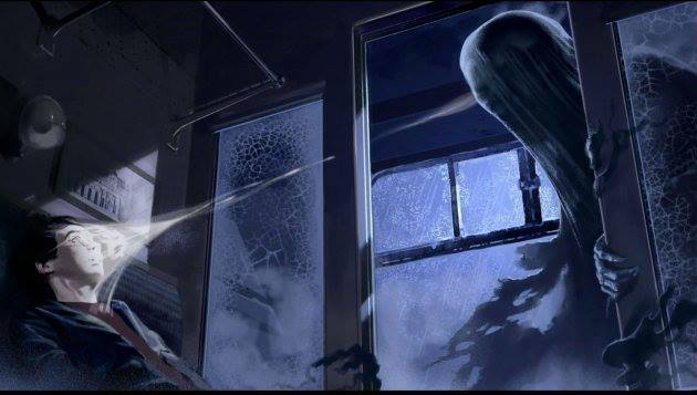
It is amazing that when there is a large-scale war, how much it affects the populace can be seen not only through books and novels but largely through art. Take Guernica, for example, in which the famous painter Pablo Picasso was so distraught by the bombings in the city he painted a mural 3.5 meters high and 7.8 meters wide. The April 26, 1937 bombings induced chaos in the Basque region’s city, and many died as a result of the bombs dropped by German and Italian warplanes. The black, white, and gray mural has become a symbol of anti-war and a reminder of the suffering, shock, and pain experienced by victims of bombings. Graphic Design has been affected in similar ways by the wars of the past centuries, especially including those of World War I (WWI) and World War II (WWII). War posters and war propaganda are some of the most visually impacting and influential pieces to come out of their eras, and the diversity in which designers expressed their opinions on the war is equally amazing.

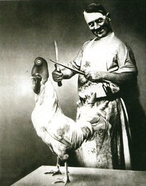
Designer John Heartfield was born in Germany in 1891 as Helmut Herzfeld, but as a protest against the Weimar Republic and the German militarism occurring in home country, he changed his name to John Heartfield. He criticized the Nazi party in everything he worked in, and was a pioneer in the use of art as a political weapon. A member of the German Dada movement, an offshoot of the Dada movement. The Dada movement sprouted out of the aftermath of WWI as a reaction to a world perceived as mad by many artists and designers. Heartfield specialized in photomontage, and his work was showcased all over the world. For many years, he stayed in Germany to do his work despite the threat of assassination. He ended up dying in East Berlin in 1968.

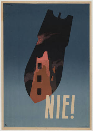
Tadeusz Trepkowski was a Polish designer born in 1914, and became part of an outgrowth of Dadaism known as Surrealist philosophy. Surrealist philosophy involved juxtaposed images placed in certain ways to help solve problems. This issues were usually complex and the resulting images had a larger visual impact than what was usually seen at first glance. Trepkowski worked mainly in poster design, commercial art, and display design. He lived through both WWI and WWII, so it is easy to understand why Trepkowski had designed powerful war posters.

In regard to these two designers, I specifically looked at John Heartfield’s 1936 photomontage Have No Fear – He’s a Vegetarian, and Tadeusz Trepkowski’s antiwar poster from 1953 commonly known as Nie! Both war posters rely on a strong understanding of the time and the conflicts occurring then. Despite being designed about twenty years apart, the emotions such as anger and frustration that accompanied many who lived through the war are evident. Both also heavily rely on the importance of symbols, such as the Nazi swastika and the French helmet on the rooster in Have No Fear – He’s a Vegetarian or the outline of a bomb in Nie! But what also makes these two pieces of design stand out from each other are just as important. John Heartfield’s use of a black and white photomontage showcases the subject in a brighter light. Unlike Nie! color would be much more distracting and take away from the message that Adolf Hitler is hungrily eyeing France as his conquest, or in this case, his victim. The photographs also make it seem more like it could have been a photo that was real, which also helps showcase the amount of irony Dadaism is known for. Nie!, on the other hand, features a muted color palette of shades of brown against a stony blue background. Trepkowski’s use of a warmer color on the building featured against the background inside the bomb immediately evokes the image of a city burning, such as London during the Blitz. Trepkowski also uses graphic elements instead of photomontage, creating a much more poster-like feel rather than that of a photograph.

Have No Fear - He's A Vegetarian. John Heartfield, 1936 Antiwar poster. Tadeusz Trepkowski, 1953.

Design Comparison

Henri de Toulouse-Lautrec vs. Vladimir and Georgii Stenberg

Looking through our graphic design book I was most interested in the work done by Henri de Toulouse-Lautrec a French artist and designer from the late 19th century and the Stenberg brothers Vladimir and Georgii Russian designers from the 1920s-1930s. I like them because even though they were from different time periods their style of work was different but at the same time very similar, also the topic in which they based their work was very similar; Toulouse designed some of his work for the Moulin Rouge night club in Paris. While the Stenberg brothers designed posters for the cinemas in what was at the time Soviet Russia. While they may be two very different things both a cinema and a night club were places for people to congregate and have a good time.

I looked specifically at Toulouse’s “La Goulue” and the Stenberg brothers “Poster for Man with a movie camera”, I found them interesting because while they are from two different time periods and of a different composition style they at a base level share the same artistic style. Both pieces have this cut out look to them, that invokes a sort of collage feel. As well they both use very simple and vibrant colors, the primary colors, but while they look the same and share a similar topic they are uniquely different, Toulouse’s has a more artistic feel and the Stenberg Brothers as with the Constructionist movement has a more dynamic and purposeful image.

Design Comparison

While you can look at pieces of and design and to the untrained eye they look both similar and different. Each designer puts their own touch onto everything that they do. Two designers that can be seen as similar and different are Lucian Bernhard and Edward McKnight Kauffer. Lucian Bernhard was born in Stuttgart, Germany in 1883 and began his career as a designer by studying at Munich Art Academy before going to Berlin in 1901 to work. His career as a prolific designer brought posters, but also trademarks, packaging, type, textiles and much more and it was inspired by the famed Beggarstaffs James Pryde and William Nicolson. In his work the product that was advertised would have the trade name or company name in big letters spread out on a spacious background that was usually a solid color. His ‘Priester’ poster in 1905 was so stark and its colors were startling at that period that it would immediately catch the eye of the viewer. Edward McKnight Kauffer, an American designer who worked primarily in England, born in 1890. His career was inspired by Ludwig Hohlwein’s posters which brought on his works of simple designs. Kauffer’s poster for the Daily Herald in 1918 featured a yellow background with black text found only at the bottom and the top has images of origami like birds to symbolize the caption “Soaring to Success”.

While the two works are not that far off in years there are things that are both similar and different to them. Both designs are rather simple and appeal to the eye. The simplicity in the two are the very basic use of a word and an image against a plain background. However they are different in the way that Kauffer’s poster for the Daily Herald has an intricate version of birds soaring across the top of the page, which is unlike Hohlwin’s two matches seen in the middle of the page. While the Priester poster was apart of the Modern movement, and Kauffer’s poster was in the Futurism movement you still see plenty of what makes the works of two very different designers relatively the same.

bernhard,design,lucianbernhard,matches,minimalism,poster-98cda4216508d418811b459b1d090d8e_h4580002388_0229e5b283_b

John Heartfield and Shigeo Fukuda

Two designers that interested me are Shigeo Fukuda (1932-2009) and John Heartfield (1891-1968). Both of the artists were very interested in political, anti-war posters. Perhaps the war that influenced their views the most was WWII, where Heartfield was involved in the Hitler rebellion, producing anti-Nazi posters, and Fukuda was developing his personal style as a student.

During his schooling, Shigeo Fukuda became interested in the Swiss International Style, which preaches simplicity and minimalism. This school of design is seen in his work as he uses solid colors and bold lines. His anti-war ideas were easily reflected in his work because of the readability and universality of his style. Both sides involved in a war would be able to understand the message Fukuda showed.

The work of John Heartfield directly reflects his anti-Nazi views as he uses swastikas and pictures of Nazi leaders like Hitler and Goring. His skills in the new medium of photomontage allowed the people in the posters to be easily recognized because they were from real photographs.

The two pieces of design I chose are Fukuda’s war poster “Victory” from 1989, and Heartfield’s magazine cover from the October 1934 issue of AIZ. Both of these designs are anti-war and anti-Nazi with the image of a fist. Heartfield’s cover features a very dominant and powerfully raised fist that contains people raising their fists too. The people inside the arm give color and shadow to the arm as well as reinforcing the overarching image and concept. The cover has very little type and a solid background of a similar color to the images of people in the large fist. Having the fist be the only image on the page allows the image to be unobstructed and easily read. The time period (and probably text) shows that it is a anti-war design, while the imagery alone on Fukuda’s design display its anti-war statement. Using only the three colors of red, black, and white, Fukuda shows a fist coming out of a swastika as well as a tag saying “Victory – 1939…1989”. I interpret the imagery to mean that people had to fight and struggle against the Nazi regime. In the design, two years are presented. 1939 is the year that World War II began and 1989 is the date that the poster was circulated. Similar to Heartfield, Fukuda introduced little type to the design and kept a solid background. Just like the magazine cover, this was done in order to focus on the image and the concept presented.

I do not think that Fukuda’s poster is in response to Heartfield’s cover because of the large amount of time between the printing of these two designs. Fukuda may have gotten loose inspiration from the AIZ magazine cover, but because there is such a large difference in style and the fist is a universal symbol of strength and struggle, the two are not directly related.

AIZ Cover - Heartfield Victory - Fukuda

Graphic Design is..

Graphic Design

Graphic Design is the ability to turn an idea into a visual story. In order for the final product to be effective the image needs to communicate a point, or story line. If the symbol, type, size, color, etc. doesn’t flow, the design is ineffective. Graphic design is found everywhere in our world. Down to the logo on our shirts, the billboards on the highway, to the bathroom signs in a restaurant. The design can be simple and clean and convey a type of style that can be understood in a certain way. Others are in your face, bold, and convey a more dramatic meaning. It is ever changing because graphic design depends on the purpose and goal message.

50 Words

Innovative, New, Thought-provoking, Eye catching, Vibrant, Exciting, Dramatic, Simple, Visual, Voice, Divine, Powerful, a Story, Creative, Passion, Love, Feelings, Memorable, Everywhere, Everything, Money, Outside the Box, Unusual, Limitless, Vision, In Between the Lines, Unique, Jaw-Dropping, Me, Edgy, Love, Technology, Invisible, Strategic, Personable, Understanding, Mean, Always Changing, Photoshop, Hate, Abnormal, Interesting, Appealing, Clean, Style, Bold, Loud, Connective, Perceptive, Questioning, Inventive, Dilligent

Quotes

“Design is a plan for arranging elements in such a way as best to accomplish a particular purpose.” – Charles Eames

“A designer knows he has achieved perfection not when there is nothing left to add, but when there is nothing left to take away.” – Antoine de Saint Exupéry

“The public is more familiar with bad design than good design. It is, in effect, conditioned to prefer bad design, because that is what it lives with. The new becomes threatening, the old reassuring.” – Paul Rand

“Content precedes design. Design in the absence of content is not design, it’s decoration.” – Jeffrey Zeldman

“Nothing is original. Steal from anywhere that resonates with inspiration or fuels your imagination. Devour old films, new films, music, books, painting, photographs, poems, dreams, random conversations, architecture, bridges, street signs, trees, clouds, bodies of water, light and shadows. Select only things to steal from that speak directly to your soul. If you do this, your work (and theft) will be authentic. Authenticity is invaluable, originality is non-existent.” – Jim Jarmush

“It’s not where you take things from-its where you take them to.” -Jean-Luc Godard

Visual Inspirations

Thumbnails

Graphic Design is…

Graphic Design is all around us. It is on our food, our clothing, our appliances, everything! A world without graphic design would be like a blank canvas, all the walls would be bare, our food would be boring, our clothes would all look the same, there would be no personal expression, and there would be no need for art in any matter. Graphic design is what makes everything unique and special in its own way. It is what catches your eye when you are walking down the street, it is what makes you want to try a new restaurant, it even helps you choose what brand of pasta you want to buy. It can be clean and simple, but it can also be “messy” and unique. One of the main things that I truly love about graphic design, is that no matter what you choose to do, there is no wrong way. Sure, it might not please everybody, but very little work does. I love art that has no boundaries, and is unlike other works of art. To me, graffiti is a type of art, but many people look at it and say that it’s dirty, but it’s all up to your own interpretation.

  1. Life
  2. Passion
  3. Love
  4. Creativity
  5. Fun
  6. Enjoyable
  7. Everything
  8. Art
  9. Emotion
  10. Inspirational
  11. Never right or wrong
  12. Simple
  13. Complex
  14. Clean
  15. Organized mess
  16. Therapeutic
  17. Typography
  18. Photography
  19. Professional
  20. Interesting
  21. Conveys a message or meaning
  22. Important
  23. Rule Breaking
  24. Personal style
  25. Individual
  26. Organized Chaos
  27. Eye catching 
  28. Everything is different (never the same)
  29. Imagination
  30. Easy
  31. Colors
  32. Everywhere
  33. Always changing
  34. Marketing
  35. Advertising
  36. Publishing
  37. Posters
  38. Logos
  39. Book Covers
  40. Communication
  41. Information
  42. Visually appealing 
  43. Packaging
  44. Labels
  45. Happiness
  46. Technology
  47. Drawings
  48. Web based designs
  49. Where words translate to images
  50. All around you

“There are three responses to a piece of design – yes, no, and WOW! Wow is the one to aim for.”  -Milton Glaser
“The public is more familiar with bad design than good design. It is, in effect, conditioned to prefer bad design, because that is what it lives with. The new becomes threatening, the old reassuring.” -Paul Rand
“It’s through mistakes that you actually can grow. You have to get bad in order to get good.” -Paula Scher
“Good design is all about making other designers feel like idiots because that idea wasn’t theirs.” -Frank Chimero
“A designer knows he has achieved perfection not when there is nothing left to add, but when there is nothing left to take away.” -Antoine de Saint-Exupéry


Graphic Design is…

My Perspective 

Graphic design is using the elements of text, icons, and color to make a well-composed statement that represents an idea or simply sends a message.Graphic design can be found everywhere throughout our daily lives. All you have to do is take a look around! Without graphic design I feel as though our lives would be a lot more plain. We use graphic design for business, advertising, or by using designs to express ourselves.

Graphic Design is…

Passionate, cool, silly, funny, colorful, makes a statement, symbolizes, raises awareness, eye catching, everywhere, contrasts, pops, thoughtful, time consuming, expressive, expensive, awesome, dope, can be simple, can be complex, artists discretion, flexible, creates emotion, makes simple text fun to read, witty, bold, unique, descriptive, visual, fresh, structured, interesting, thoughtful, business, skillful, trippy, inspiring, advertises, ideas, appealing, overlooked, stylized, historic, creative, simple, frustrating, loud, universal, clean, exciting

5 Quotes

“There are three responses to a piece of design – yes, no, and WOW! Wow is the one to aim for.”

-Milton Glaser

“You can have an art experience in front of a Rembrandt… or in front of a piece of graphic design.”

-Stefan Sagmeister

“It’s through mistakes that you actually can grow. You have to get bad in order to get good.”

-Paula Scher

“A designer knows he has achieved perfection not when there is nothing left to add, but when there is nothing left to take away.”

-Antoine de Saint-Exupéry

“Digital design is like painting, except the paint never dries.”

-Neville Brody

 Inspiration

1518287064616_R5vacDFt_l tumblr_mbscnbeAIW1qzqwamo1_500 Pop-Art-Ray-Ban-Rare-Prints-Ads images-2 images-1 subway-logo-large cool_graphic_tshirt_designs_7 images-2 stock-vector-idea-concept-125214002 graphic-design-inspiration-1 images three_dimensional_typography_004 images-3 images-5 cyberexe-1765341 images-4 art-coke-design-graphic-design-gritty-illustration-Favim.com-40457 images-6 graphic-design-mujjo-logo-colour GraphicDesignPlagiarism13 cyberexe-1765341 graphic_Design_in_the_letter_G_by_Mattie7777 graphic-design-breda-2012-big

Thumbnails 

IMG_0476IMG_0477


Graphic Design Is

Graphic design is communication. It’s the connection a person makes between an object, sign, environment, product, typeface or piece of art. Graphic design connects a person to a message, sometimes that message maybe small or rather meaningless. Other times it can be powerful, important and moving. Graphic design is the way we display information on a grand, eye-catching scale. Many understand but do not even notice the design work that is around them from clothing, street signs, buildings, spaces and packaging, Graphic design must be able to incorporate business and art together, to create a clear yet interesting message. Graphic design is a universally understood language.


1. Creative 2. Expression 3. Classic 4. New aged 5.Tangible 6. Unhinged

7. Communication 8. Type 9. Style 10. Eccentric 11. Clear 12. Research

13. Planning 14. Mapping 15. Dope 16. Fresh 17. Eye Catching 18. Meaningful

19. Packaging 20. Marketing 21. Visual 22. Language 23. Fluid 24. Interactive

25. Multi-surfaced 26. Groovy 27. An Ism 28. Subtle 29. Articulate 30. An Explanation

31. A Statement 32.Enviromental 33. Branding 34. Personal 35. Bold

36. Expansive 37.Jazzy 38. Perspective 39. Advertising 40. Informative 41. Loud

42. Impact 43. Moldable 44. Quality 45. Precise 46. Hidden 47. Misconceived

 48. Hearing visually 49. Connective 50. Professional Art

Visual Inspirations

Quotes

“Great designers seldom make great advertising men, because they get overcome by the beauty of the picture – and forget that merchandise must be sold.”

James Randolph Adams

“Only when the design fails does it draw attention to itself; when it succeeds, it’s invisible.”

John D. Berry

“Design is intelligence made visible.”

Don Newgren

“The secret to creativity is knowing how to hide your sources.”

Albert Einstein

“Graphic design is the paradise of individuality, eccentricity, heresy, abnormality, hobbies and humors.”

George Santayana

Thumb nails

IMG_7730  IMG_7732

Graphic Design is [ ]

Graphic Design is……

Graphic Design is seen in all quarters of the world. Everywhere you look there is graphic design; street/restaurant signs, door numbers, food packaging, posters, etc. Graphic Design is the creative process combining technology and art. To be a successful graphic designer one needs to be capable of intertwining  typography, images, colors, and symbols to take an idea and translate it into a visual message.

-art with a purpose

-diligent

-tedious

-hard work

– visual skill and knowledge of communications and technology

-a commitment

-art translated onto a computer

-exasperating

-irksome

-worth it

– satisfying

-enjoyable

-branding

branding

-inventive

inventive

-imaginative

imaginative38-eye-logo-design

-experimental

-visionary

-originalimgres-1

-expressive

imgres-2

-perceptive

-beautiful

-overwhelming

-stunning

-wonderful

-psychedelic

images

-eye opening

tripadvisor-Logo-300x200

-mind altering

-breath taking

breathtaking

-intimidating

-spectacular

-striking

'shocking'

-out-of-this-world

out-of-this-world

-magnificent

-significant

-impelling

-cool

cool

-exciting

-fabulous

-stimulating

-alluring

-splendid

-glorious

-angelic

-ravishing

-fascinating

fascinating

-harmony

-expanding one’s horizon

-filled with different perspectives

-a revelation


Quotes

  • Milton Glaser

mitonglaser miltonglaser_dylan

“There are three responses to a piece of design- yes, no, and WOW! Wow is the one to aim for”

  • Paul Rand

paul randd paul rand

“The public is more familiar with bad design than good design.  It is, in effect, conditioned to prefer bad design, because that is what it lives with. The new becomes threatening, the old reassuring.”

  • Neville Brody

neville brody nevile brody

“Digital Design is like painting, except the paint never dries”

  • Frank Chimero

frank chimeroo frank chimero

“Good design is all about making other designers feel like idiots because that idea wasn’t their’s.”

  • Jeffery Zeldman

zeldman-happy-cogimgres


“Content precedes design. Design in the absence of content is not design, it’s decoration.”

Graphic Design is…

Graphic Design is…

Graphic Design I’m sure has many meanings but for a short way of putting it, I think it is art that can be through technology. Being able to use your imagination to create a design using type and illustration.

Graphic Design is…

Everywhere/ sly/ ideas brought to life/ marketing/ powerful/ simple/ communication/ art/ breaking boundaries/ business/ color/ bringing together/ competitive/ typography/ working with a team/ advertising/ entertaining/ your imagination/ beautiful/ crazy/ bringing brands to life/ inspirational/ logos/ eye catching/ love/ illustration/ amazing/ fun/ hard work/ a visual language/ working with computers/ creative/ discovering/ deep thinking/ sweet/ attractive/ printing/ a tough job/ being decisive/ branding/ universal/ helpful/ constantly upgrading/ a job/ energy/ life/ visual music/ technology/ deep/ memorable.

Quotes:

“There are three reposes to a piece of design- yes, no, and WOW! Wow is the one to aim for”. – Paul Rand

“It’s through mistakes that you actually can grow. You have to get bad in order to get good”. -Michael Bierut

“A designer knows he has achieved perfection not when there is nothing left to add, but when there is nothing left to take away”. – Chip Kidd

“Never fall in love with an idea, they’re whores. If the one you’re with isn’t doing the job, there’s always, always, another”. – Marian Banties

“Digital Design is like painting, except the paint never dries”. – Joshua Brewer

Inspiration Pictures:

50c1141cb06de.image poster2 design-inspiration 1_1354200569830 design-is-everywhere 103549306 ipod billboard cometogether2 service-header-billboard hel_yeah_tica_t_shirts-r7a567f6bc9b549ceb336dd2e87fa7895_va6lr_512 John-Butler-Trio-T-shirt-Design-by-Claire-Foxton graphic-design graphic-designing web Graphic+Design+Wallpapers+13 color-in-graphic-designgraphic_design_1_poster_by_mechatron2300-d2e2d52 314232537598_TaW1Vrr7_l graphic

Thumbnails:

IMG_5288 IMG_5289