The film, Helvetica (2007), honestly interested me in some parts, but other parts, like the Helvetica font, bored me very much. It was interesting to me to watch some of the type designers, like Matthew Carter, create letters. I hadn’t realized how much work is actually put into just a couple of letters, let alone 26 and then another 10 numbers, plus all of the other characters used in writing/grammar. I also hadn’t actually realized how often Helvetica is used; after watching the film, I began noticing it everywhere. Many of the speakers in the film mentioned that Helvetica is “just there”. Each speaker had a different way of explaining it, but in a way they were all very similar explanations. There were two explanations that stuck with me, I actually tried explaining to a friend about Helvetica and my explanation to her was very similar to them. Michael Bierut’s first line in the film was his explanation of Helvetica. Bierut said, “Everywhere you look, you see typefaces. But there’s one you probably see more than any other one, and that’s Helvetica. You know, there it is, and it seems to come from nowhere. You know, it seems like air? It seems like gravity?” (Helvetica, 2007). I really liked that quote because it’s one of the perfect ways of explaining Helvetica as something out in the world, if that makes sense. Something outside of writing an essay. It’s just there, and we really don’t notice it at all unless its specifically pointed out. Like Bierut said, it’s like air. Another explanation I loved was told by Jonathan Hoefler, an american typeface designer. He said, “It’s hard to evaluate it. It’s like being asked what you think about off-white paint. It’s just… it’s just there. And it’s hard to get your head around, it’s that big.” I also like that quote because it’s almost exactly how I described Helvetica to my friend. I kept trying to think of other ways to explain it but I just couldn’t. It’s exactly like off white-paint. It’s bland, it’s boring, it’s everywhere. It’s used so much that we don’t even really notice it anymore. Erik Spiekermann, a german typographer, had a bit of a different aspect on this, but still kind of similar to both Jonathan and Michael. Spiekermann brought out the point that Helvetica is often times just used because it’s there. What I took from is quote, is that Helvetica is a default and it’s what people decide to use when they don’t want to actually search for a different typeface. Spiekermann had said, “Most people who use Helvetica, use it because it’s ubiquitous. It’s like going to McDonald’s instead of thinking about food. Because it’s there, it’s on every street corner, so let’s eat crap because it’s on the corner.” I got the vibe from Spiekermann that maybe he doesn’t love Helvetica as much as others. He may be bored of Helvetica, like it’s overused. I agree with that personally, I think Helvetica is overused and boring. I like a little excitement when looking at advertisements or pictures or book covers etc. Helvetica doesn’t do anything but sit there like all other Helvetica logos, looking boring and bland. It’s like Cheerios. They’re bland, the box is bland, the shape and color is bland, yet it’s one of the most popular cereals.
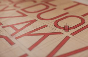
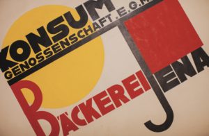
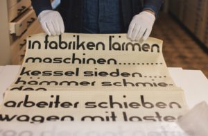
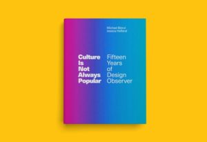
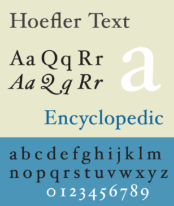
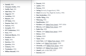
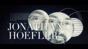
The following images are images of the speakers I mentioned, as well as some of their work, including books some have written, fonts they have created, and a few images of the process of creating fonts:
Michael Bierut


Jonathan Hoefler

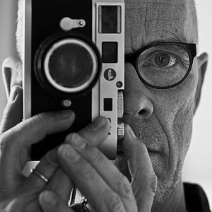
Erik Spiekermann