My Reaction:
Personally I thought the overall context of the film was rather boring, although when considering a documentary on typography how juicy can the subject matter really be? However, the movie did offer a variety of insights and perspectives about graphic design that I have never thought of before. By following the history of Helvetica the viewer also gets a history of the many movements and styles that typography and graphic design has moved through within the last few decades. From the 50’s chaotic and colorful ads, the boom of helvetica and it’s modern simplicity, and then the rise of a more abstract perspective, one realizes just how vital the role of typography is in graphic design. I thought it was interesting to see the wide variety of work that each artist produced and how extremely different they were from one another. As someone who has worked largely with studio art, I really enjoyed seeing how creativity works and looks like in such an unfamiliar medium. Some specific artists that really stood out to me were Paula Scher, Massimo Vignelli, and David Carson.
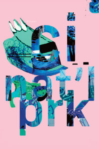
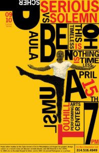
Paula Scher
“I realized that typography could have personality the way drawing did… that type had spirit and could convey mood. It could be your own medium.”
This quote stuck with me because as I was listening to her talk, I had a similar realization in the sense that creativity truly is limitless an can be applied to all aspects of life. After viewing Scher’s work this idea of typography being a medium within itself was only strengthened as many of her pieces feature strong examples of text. Text that not only suggests a break from the previous modernistic style, but demonstrates her own unique approach.

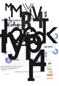
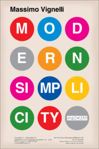
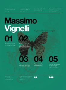
Massimo Vignelli
“The Life of a Designer is the life of fight, fight against the ugliness. Just like doctors fight disease.”
Although artists may not save lives like doctors do, they are still extremely important within our society. Vignelli’s quote makes one question; what would the world look like without art? Streets would be devoid of color, Businesses and companies would lack uniqueness, and creativity and expression would become a standard.


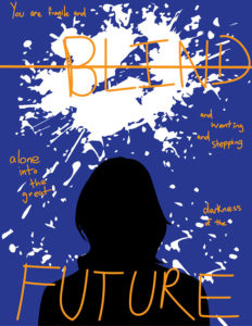
David Carter
“Don’t confuse legibility with communication, just because something is legible doesn’t mean it communicates. More importantly, it doesn’t mean it communicates the right thing.”
I thought that this idea was important to emphasize because it was where the film highlighted the shift in helvetica’s significance. Carson talks about how certain words or phrases can have different moods or can be read differently within graphic design and that Helvetica isn’t always the right way to go. Carson’s opinions seemed to be rather similar to Stefan Sagmeister who stated that the simplistic style that helvetica is associate with tends to “bore the shit out of him”.