Reaction:
I did not expect much from a documentary about the font Helvetica but, it did open my eyes to a few things. It was interesting to see all of the advertisements and signs that were using the same font, side by side, because before I had never picked up on just how widespread it had become. I can try and say that I was younger back when it really spread and that children do not pay attention to the font of things but, even now, it wasn’t until after the film that I started to see the patterns in my day to day life. Another thing that surprised me was that the font itself was somewhat controversial. Personally, I have never thought that a font could have that big of an affect on the population until Paula Scher connected it to the Vietnam War. Although it wasn’t the most exciting documentary, I do believe it had some helpful takeaways in regards to moving forward in this class.
David Carson:


“Don’t confuse legibility with communication. Just because something is legible doesn’t mean it communicates and, more importantly, doesn’t mean it communicates the right thing.”
I needed to include this quote because it points out something that seems so simple, yet many people are oblivious to it. There are different fonts out there for a reason. They weren’t just created for fun, they each have an underlying effect on the readers’ interpretations of what is being said. Like in texting, you can use punctuation or capitalization but, at the end of the day, what you are trying to say still might not come across as you intended it to because text doesn’t have tone. Font adds this tone and gives the text personality so the readers feel a certain way about what is being said. If you use the wrong font, people might interpret the information incorrectly.
Lars Müller:


“I think i’m right calling Helvetica the perfume of the city. It is just something we don’t notice usually but we would miss very much if it wouldn’t be there.”
Personally, I don’t pay very close attention to the details within the signs around me. I read them and move along without any thought put into it. But, even without paying attention, the font conveys a mood and affects how you interpret what you just read. Something that I hadn’t considered was, what if these signs were in a different font? They wouldn’t give the same effect as they do now, better or worse, it will change how one perceives the information. Even though it is not something we notice on a day to day basis, we would notice if it were different.
Erik Spiekermann:

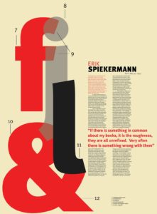


“Most people who use Helvetica, use it because it’s ubiquitous. It’s like going to McDonald’s instead of thinking about food because it’s there, it’s on every street corner, so let’s eat crap because it’s on the corner.”
I thought this quote was important to highlight because it points out the impact of a “trend.” In todays’ society, a trend begins when one person, usually a celebrity or someone with a following on social media, posts something new they tried out. It could be anything; new/old hairstyle, makeup look, style of clothing, tv show, food recipe, or in this case, a font. Someone sees if online, tries it themselves and it snowballs from there. Now it’s a trend. Everyone wants to hop on the trend and it spreads and spreads until it eventually dies out on its own due to the incoming of the new trends. The whole point is that if something someone is doing is successful then you should do it too. Helvetica was used and successful, so everyone else saw that as an easy way to get to on top.