The Five Typefaces
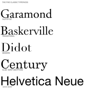
There are five classic typefaces, Garamond, Baskerville, Didot, Century, and Helvetica. Each font has special characteristics that makes it unique. Some differ from having serifs or be simply being flat and strait. Although these typefaces may look different they actually have many similarities. These typefaces surround our everyday lives whether it be in books, signs, television or magazines, these typefaces are involved.
Century
Century typeface has been around for a very long time when it comes to talking about fonts. Century Schoolbook is a transitional serif typeface designed by Morris Fuller Benton in 1919 for the American Type Foundation at the request of Ginn & Company, a textbook publisher, which wanted an especially easy-to-read face for textbooks. I find this font to be very clean and specific to the point. There isn’t many fancy elements to this font but it is commonly used for textbooks. I enjoy this typeface because it gives the appearance that its fancy with light strokes.
Helvetica
The first version of Helvetica was created in 1957 by Max Miedinger, a Swiss typeface designer. Miedinger wanted a font that was clear to the eye and could be used in a variety of ways. It was originally called Neue Hass Grotesk. In 1960, the typeface’s name was changed to Helvetica, which means “Swiss” in Latin. I personally dislike this font for its boring appearance. This style of font is basic and strait with out any fancy strokes.