Gestalt Psychology In Design
After reading the links on Gestalt theory, I learned that the main principle is viewing things as a whole, in unity, rather than in individual pieces. The movement of Gestalt Psychology started in Germany in the 1920s in an attempt to better understand how the human brain perceives things. This can be applied to design because it focuses on how we view designs and break down complex patterns and group them into an easier to follow, organized system. Our brains want us to see visual elements in a structured fashion. In order to organize all of the signals and visuals surrounding us all the time, Gestalt psychologists have developed a list of 11 design principles that “try to explain when and how our minds perceive different visual components as being part of the same group.”
Symmetry
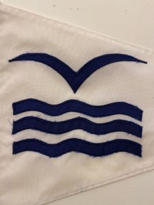
Symmetry because I can easily imagine folding this in half and view the same image on each side. At first, I thought it could be something else such as hierarchy or variety because I was grouping the waves together and looking at the bird-like V separately. However, after reading the differences between those principles, I think symmetry is a better fit.
Proximity
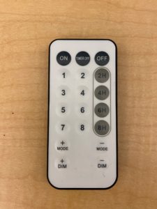
Hierarchy/Proximity because the elements that are similar to one another to make it easier for the consumer to understand. Some of the elements are emphasized more, such as the black and gray buttons, and the circle surrounding the gray buttons creates organization and divides the remote into different sections.
Rhythm
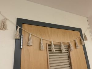
Rhythm because each of the tassels is evenly spaced from the other. I thought about choosing continuation/repetition because the tassels are repeated but since they are all equidistant from one another I’d argue rhythm fits more.
Repetition
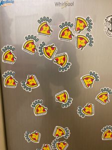
Repetition because there is a bunch of the same pizza magnets. They are not evenly spaced nor facing the same way so it can’t be rhythm. They are all rotated different ways so your eyes move all around.
Movement
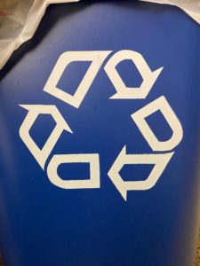
Movement because when you read it your eyes move in a circle following the arrows. This creates a motion effect. This shows the intended path that the readers are supposed to follow. We read left to right so this looks more like a circle.
Variety
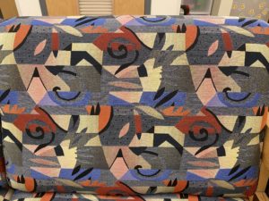
Variety because there all different elements scattered about the surface. It seems like there is some system and organization formed by the colors and shapes. Our eyes move all across this but when you look closer you can see lines and waves formed.