Principles of Design
1. Balance
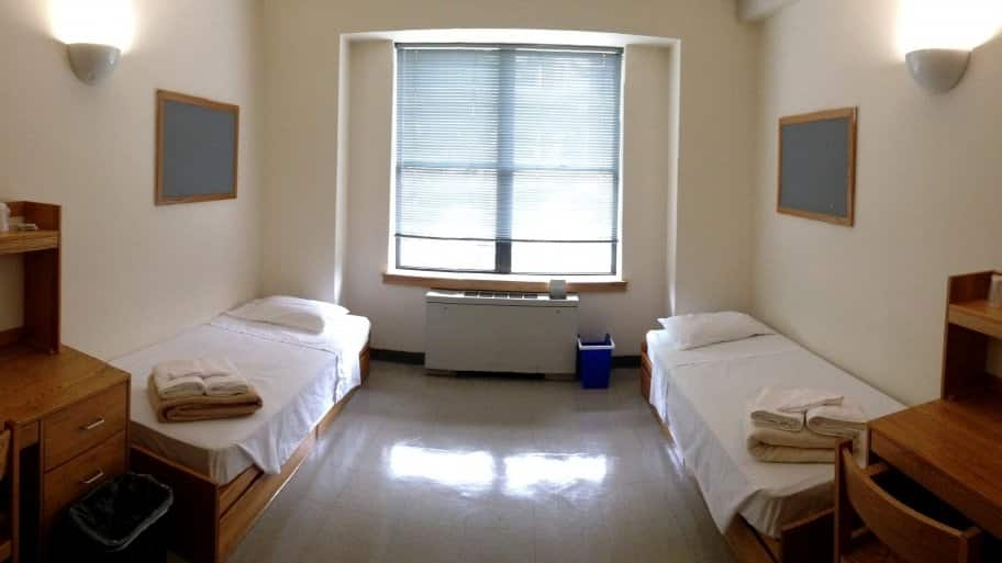
Balance has always satisfied me because it makes objects/things look even and I enjoy looking at it. I choose a picture of a dorm room because the suite I live in at Keene has two identical rooms that are connected. The suite holds 4 people (two on each side) and is evenly spaced out with a bathroom in the middle making it balanced. Balance makes two different things identical in every shape or form but the same because of the look.
2. Rhythm

Rhythm has been around for ages and is a very important design in our everyday lives. A heartbeat is a rhythm that keeps us alive and doesn’t stop until we are dead. It always amazed me how pretty much it’s rhythm that keeps us alive and I find that very interesting I can feel my heartbeat every day and can get a check-up at the doctor’s if it is irregular or having issues. All animals have a heart varying in sizes but they all have a rhythm to them which is what keeps them alive
3.Emphasis

Growing up as a kid, my family was Catholic and would attend church every Sunday for Mass. When you walk in the church the first thing that should catch your eye is Jesus on the cross above the altar typically where the priest would speak. The church would purposely do this so that everyone attending mass can notice the lord on the cross usually candles will be around it as well. Emphasis is a major key for getting a message across which is the main reason why I enjoy this design.
4. Repetition
:max_bytes(150000):strip_icc()/Getty_repetition-183814724-58b9a3843df78c353c11806d.jpg)
Repetition is a great design because it shows an object that is completely the same and just copying it again. a funny example I thought of is the repetition of writing on a whiteboard in detention. I’ve seen it a hundred times in things like books, movies, and T.V shows. Repetition is seen everywhere and can be used in many different fields such as advertising and marketing.
5. Proportion/Scale
Proportion/Scale is a great way to compare different objects that don’t have the same size. An example I thought of is the Verizon commercials where they show the difference between the two major networks. They compare the scale of range the networks cover on a map of the United States and compare the two. Since its a Verizon commercial, they are going to have a much larger range than their major competitor AT&T.
6. White Spaces
White spaces, in my opinion, makes some designs really pop and that’s a big reason why I enjoy it so much. An example I thought of right off the bat is the USA Network logo with the”s” in the middle being all white space. I really liked hope they thought of that and it makes the s really stand out instead of the rest of the logo which is all black. White space is a very commonly used design that I notice everywhere in logos, adds, and even paintings.
Gestalt’s Theory
After reading the pages on Gestalt’s Theory, it made me realize that everything in design must be looked at as a whole and not individual parts. I never heard of “Gestalt” so I learned it was German and pretty much means a pattern, figure, form, or structure that is unified. Gestalt is used in our everyday lives and we don’t even realize we see it almost everywhere we go. A major idea that comes out of this is that in our world we perceive many different signals at the same time. The way we notice these is by using our brains to organize what we see and keep us from going crazy. Gestalt psychologists have come up with a list of these perceptions which are tools for designers when creating their work. All of these designs have there own specialty to them which helps designers in their field figure out different art pieces they can create.