Principles of Design
6 out of 11 examples of principles of design in the real world are as follows:
-
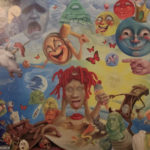
- Movement
The design in this vinyl cover guides the user’s eyes in a predetermined path. The right side of the composition is heavy with movements and color, thus moving our eyes from right to rest of the picture.
-

- Repetition
This composition consists of repeated elements. It unifies the deign and gives it consistency.
-

- Contrast
This composition of the vinyl has two contrasting colors: red and yellow. The contrast creates an interesting visual.
-

- Balance
This composition has visual equilibrium. It helps create visual focus by using visual weights. The picture is very symmetrical and very centered.
-

- Proportion/ Scale
The proportion of the size of the bear sculpture is bigger comparative to the relative surrounding. Thus, the larger elements give it higher importance.
-
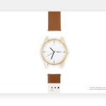
- White space
The negative space in this poster gives all the focus to the watch. The element in the center gets emphasized due to the white space around it.
Gesalt theory
The example of perceiving the face of a person we know well made me understand Gesalt theory better. We forget to pay attention to the small core features as nose, ears, eyes, etc. and rather look at a face as a whole.
To my understanding, Gesalt theory plays with our psychology of subconsciously arranging parts to create a whole, and hits two birds with one stone. As for example, the logo of Unilever as a hole is a big U that represents the brad and if you pay closer attention, the logo has smaller 25 symbols important to the brand. Thus, Gesalt principal helps two ideas: aesthetic and functionality come across the table in a creative way.