Comparing Baskerville and Didot
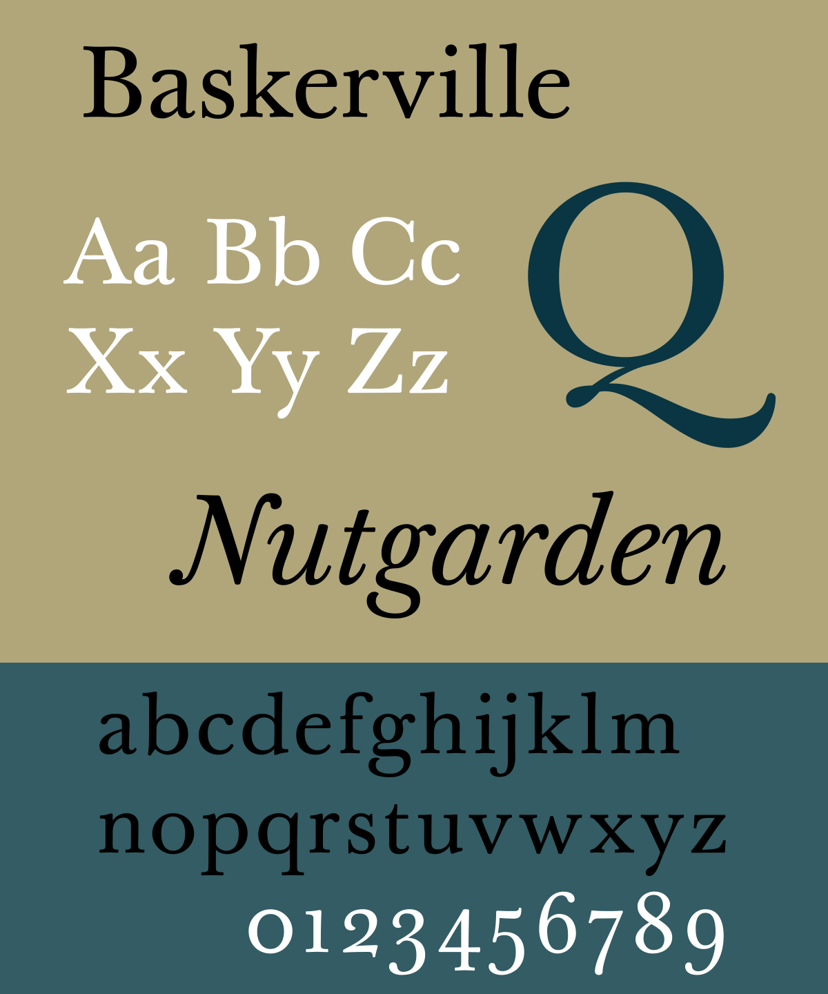
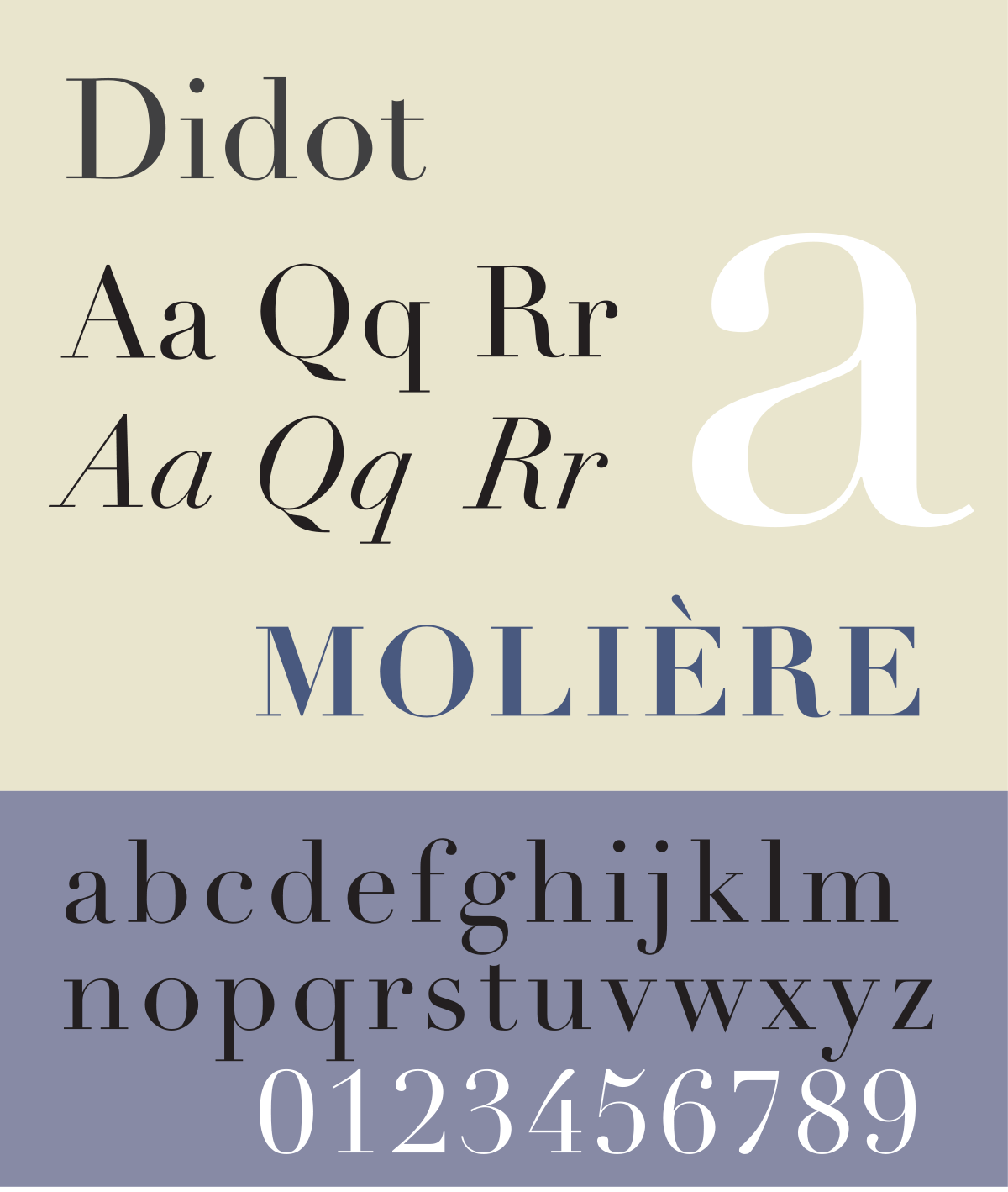
I chose to compare and contrast between the Transitional typeface, ‘Baskerville’ and Neoclassical Typeface, ‘Didot’. Both of the fonts are very wide for thei heights. They both are serif fonts. However, the serifs are heavily bracketed in Baskerville and is unbracketed in Didot. That is the biggest difference I can see. If I had to compare the two fonts as clothings, I would put Baskerville in the ‘dressy’ category whereas, put Didot in the category of ‘professional’ category.
Talking about their history, Baskerville was designed in the 1750s by a Englishman John Baskerville. It is a transitional typeface that was a refinement to the old typefaces. The contrast between thicks and thins of the letters is very visible in this font. This font was very popular for book designs.
Didot was named after the famous French printing and type-producing family. It includes a group of fonts that were developed from 1784-1811. It falls under the neoclassical category as it is one of the modern typefaces. This font is known for increased stroke contrast in the letters.
Overall both of the typefaces even though look similar have their own differences.