The articles about Gestalt theory explained about seeing things as a whole, rather than individual pieces. The first one gave the example of a familiar face. When we see someone we know, we make sense of their facial features as a whole instead of focusing on the individual parts, like the nose and eyes, ears and mouth. Gestalt was started in Germany in the 1920s, and Gestalt actually stands for pattern, figure, form, or structure that is unified. Unified is a key word in Gestalt Psychology. Things are seen in unity. As one whole.
Balance
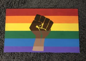
This is originally an All Lives Matter picket sign that I painted over and hung in my window in my dorm. I believe this is balance because of how the stripes all form together even through the fist, and the color schemes flow perfectly.
White Space
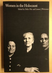
This is the cover of my Women in the Holocaust book for class. I saw this and immediately thought of white space. Technically, the space is black, but it shows the same concept. The background is all black, which puts all the focus on the women. This shows the importance of the women.
Movement
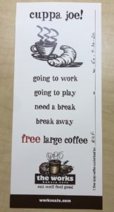
This coupon for a free coffee at The Works shows movement because of the layout of the words. It causes you to read downwards in a way, rather than all left to right.
Repetition
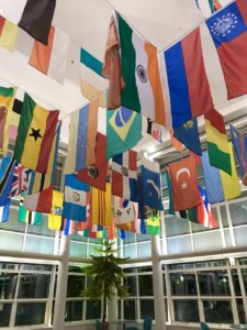
I originally took a photo of my portable charger with a repetitive design, but it seemed too boring. I got really excited when walking past the student center and ran inside to take a picture of the flags in the flag room. I think this could go either repetition or variety. I chose repetition because of the repeating of flags. They’re not all the same flag, but they’re all flags lined up in rows and columns.
Unity
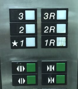
This is a picture of the elevator buttons in Holloway. I noticed how they were all slightly different, but all unified at the same time with the rows of rectangles and how they’re all perfectly lined up with each other.
Variety
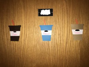
This is a door in Holloway with name tags shaped like what I’m assuming is supposed to be iced coffee. I blurred the room numbers for privacy. I chose this as variety because of the colors of the name tags and how they’re all different. They don’t have the same color scheme and they don’t really flow.