The Gestalt Theory
In the 1920s, a movement in Berlin, Germany had a goal to understand how our minds perceive things as a whole rather than individual elements. An example of this is a face. We look at faces in our day to day life because it is what surrounds us but, we look at it as a whole, even though it is actually just a whole bunch of individual pieces that our brain puts together so now we just refer to it as one thing. In order to understand why, Gestalt psychologists came up with 11 principles to explain this theory; simplicity, figure-ground, proximity, similarity, common fate, symmetry, parallelism, continuity, closure, common region, and element collectiveness. These principles work to explain when and how our brain perceives images the way it does.
Repetition

Repetition is something that is commonly seen in advertisements. Growing up, the way you learned was from repetition and that is why so many brands use it as a tactic to burn it into our brains. The act of repetition doesn’t have to be the exact thing over and over again. Like in this photo, it is the same bottle but different sizes.
Emphasis

Emphasis is when the design makes it so the focal point of the piece is dominating to the viewers. Just like a spotlight on a theater stage, it is used to basically shine an “invisible” spotlight on the main part of the big picture. It is a major factor of how artists get their message across. In this piece, it is represented by the two walls closing in on what looks like the main character.
Balance
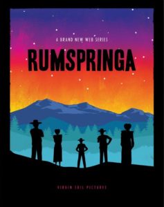
Balance is achieved when the components of the piece all hold an equal “visual weight.” It provides structure and stability to the design. In this example, this is represented by the five people lined up across the bottom of the image.
White Space
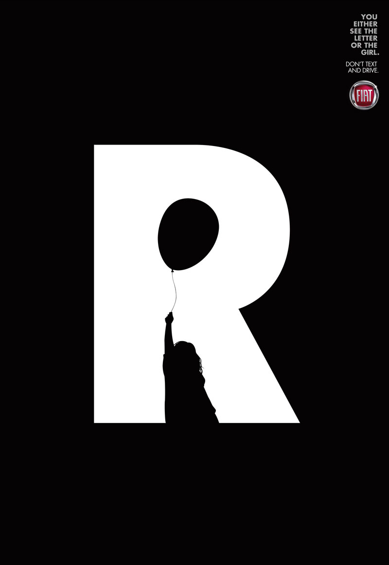
White space, also referred to as negative space, is used to emphasize an element in a piece. In this example above, your brain has two different parts that they could take from the frame. You could see the letter “R”, highlighted in the white or, you could see the little girl holding a balloon, which is creating the shape of the “R.” With the use of the black background, your eyes are directed right towards the middle to collect the information highlighted by the white.
Contrast
Contrast uses conflicting colors to draw the viewers attention to the main part of the design. In the poster above, the man is in black and white on a bright red background, which immediately draws your attention to the middle of the frame. Our eyes always pick out the components that stand out and look like they are misplaced and brands take advantage of that.
Movement

Movement is how the placement of the elements in the design direct the viewers eyes through the information. If your eye gets stuck anywhere, then that means a component is breaking up the flow of the design. In the example above, the artist designed a path to read the quote by using images to move our eyes in the right direction.