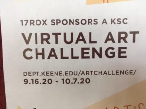
The kerning on this poster makes it slightly more difficult to read than it has any reason to be. Because of the amount of space in between the letters in “VIRTUAL ART CHALLENGE”, the first two words somewhat blend together. The letters should be closer together to avoid this.