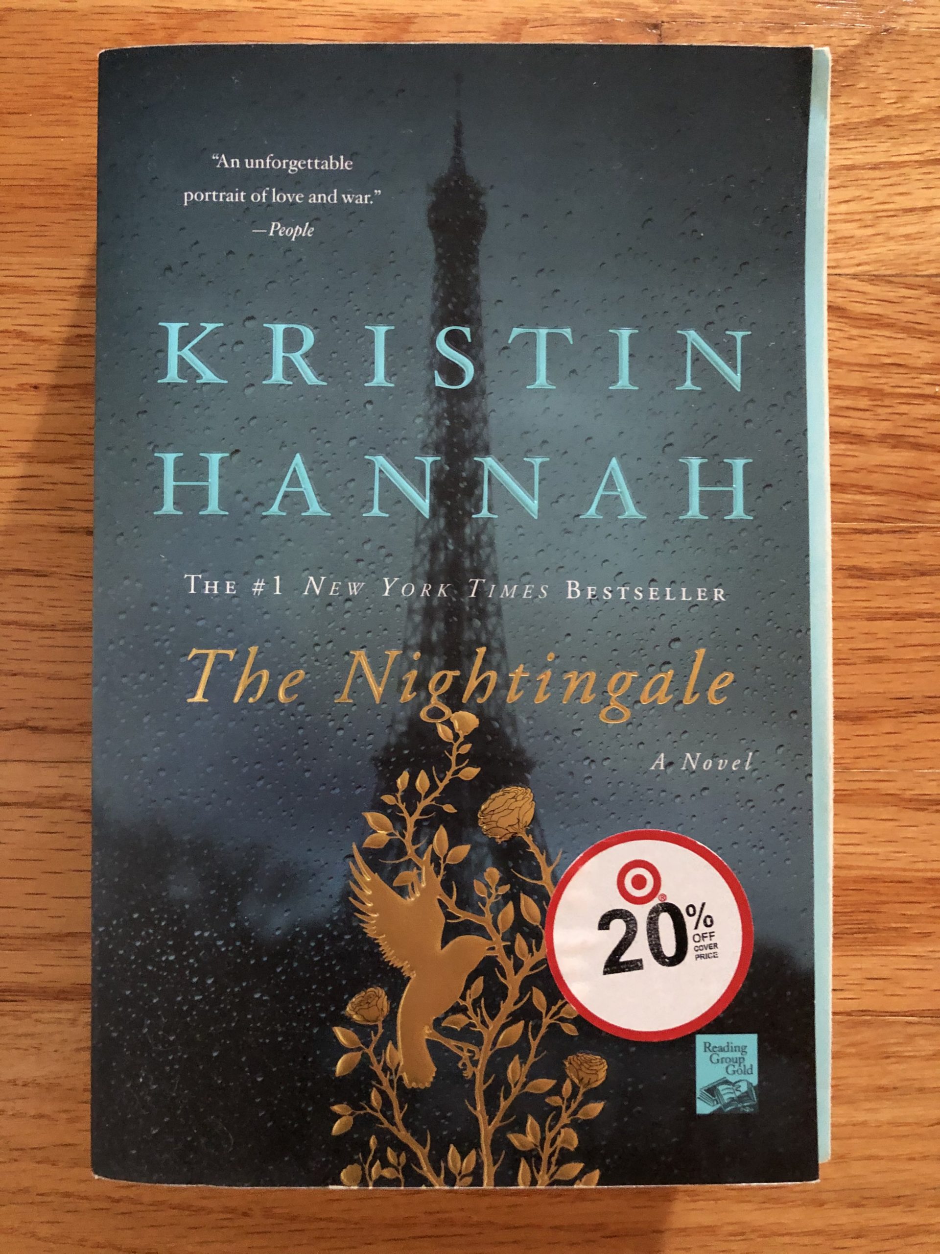
I feel as though the letters in gold are way too far apart. After looking at the author’s name that is already spaced farther apart, it feels like the title in gold should be closer together.
I feel as though the letters in gold are way too far apart. After looking at the author’s name that is already spaced farther apart, it feels like the title in gold should be closer together.