Personal Response
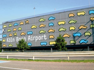
The film Helvetica let me view font through a different lens. I never cared much about which font I used or how it looked in my writing but after watching this film I notice font on the daily. It amazes me how many things in our lives use the same font. Helvetica is a font that can be used in many different settings. From brand and street signs to our tax forms and airlines Helvetica is everywhere. I feel like the Helvetica is the alpha of type face and took over all the others when it was made in 1957. Also in the film we learned about how fonts were created, this was very interesting and made me wish I could work back then with cutting the steel and stamping. Everything now seems so easy. Learning about these artists was very impactful and interesting however I did not care much for how much emphasis is put on the font.
David Carson :
“Don’t confuse legibility with communication. Just because something is legible doesn’t mean it communicates and, more importantly, doesn’t mean it communicates the right thing.”
This quote stood out to me because I resinate with this is my life on how even if you can understand what you are viewing but can not understand the meaning behind it. Meaning is more powerful than the visual alone.
Dimitri Bruni :

“We like restrictions. We can’t operate without restrictions, and the more restrictions we have, the happier we are.”
I thought about this quote for a while after the film and I think it speaks volumes. In art when given structure it can help you look more out of the box to figure out the way to make the piece yours.
Paula Scher :

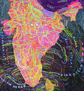
“I realized that type had spirit and could convey mood, and that it could be a broad palette to express all kinds of things.”
This quote was eye opening and lead me to believe that this is the reason I love art.