Personal Response:
I thought the film was more interesting that I expected, but I felt it was unnecessary to just have a dozen or so people just talk about their opinion of the font for almost an hour and a half. One thing I did appreciate about the film is that I never realized how much Helvetica is used until I saw hundreds of examples of Helvetia all in real life situations. I also did find it interesting to hear about a lot of people’s perspectives and I enjoyed learning about how a font is created, but overall I felt it was a little long.
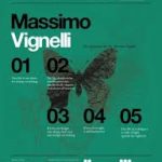
Massimo Vignelli:
There are people that thinks that type should be expressive. They have a different point of view from mine.
I personally completely disagree with Massimo in regards to text being expressive. I know walking all throughout high school and now college, I see a bunch of posters everywhere and there are so many fonts and colors that people use. I believe that text is expressive because I wouldn’t advertise a rock concert with a fancy, handwritten looking font. I think text should be expressive and the font will add an aditional layer of expression. Look below to see some great examples of Massimo Vignelli’s work.
-

- Massimo Vignelli
-
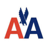
- American Airlines
-
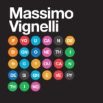
- Word Design
-
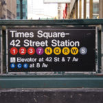
- New York City Sign
-
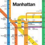
- NYC Subway Map
-
- Poster Design
Erik Spiekermann:
It’s air, you know. It’s just there. There’s no choice. You have to breathe, so you have to use Helvetica.
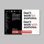
I disagree with Mr. Speikermann because I have actually never used Helvetica and I don’t plan on using it anytime soon. I know Helvetica is used a lot but it does not have to be used. If I personally were to create a logo or a sign, I would not use Helvetica because it is used so often and I think there are much better fonts to choose from that look better. One of my favorite fonts is Comic Sans. I know Helvetica is important but it is not one I would choose to use. As you can see below Erik Spiekermann has some great designs.
-
- Erik Spiekermann
-
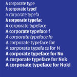
- Font Poster
-
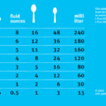
- Measurements Poster
-
- Book Jacket
-
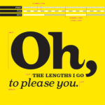
- Font Size Poster
-
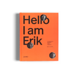
- Personal Book
Rick Poynor:
Type is saying things to us all the time. Typefaces express a mood, an atmosphere. They give words a certain coloring.
I like this quote because I agree with him. I have liked all three quotes but this one I agree with because I think font and typefaces are able to express a lot in what the text is saying. Like I said in the response to Massimo Vignelli’s quote, I believe that font adds an extra layer of expression to the text. The cool thing about typefaces is that they are able to add dimension and catch the attention of the people reading them. I think typefaces are so powerful because they are able to take words and add so many different contexts to them. See below for some really cool examples of Rick Poynor’s work.
-

- Rick Poynor
-
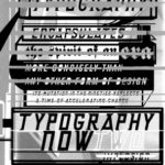
- Typography Poster
-
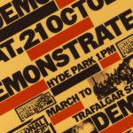
- Hyde Park Poster
-
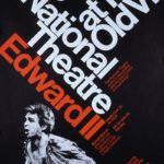
- Theatre Poster
-
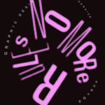
- No More Rules Poster
-
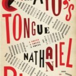
- Book Jacket