Pictures of the Principles
White Space

The logo for Federal Express is a perfect example of the use of white space. The letters on the logo create the shape of an arrow in the white space between the “E” and the “x” of the logo.
Contrast
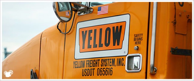
The design for the Yellow Freight System logo has always interested me. The contrast of the word “Yellow” and the actual color of the design, orange, creates a very unique image that captures the eye and makes the viewer think and remember the strangeness of the logo they saw.
Movement
![]()
This is the symbol/logo that appears on many Giant bikes, like my own. This image is a good example of movement because of the curved lines that appear to “flow” making the eyes follow the lines.
Proportion/Scale
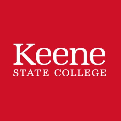
I like the proportions of the Keene State College sign. The “Keene” is large and catches the attention of the viewer, while the smaller “State College” informers the viewer of what can be found in Keene. Easy the follow, not too complex, and the font gives the feeling of education with the serifs.
Variety

This mural on campus is an interesting use of variety in graphic design. Multiple fonts are used to emphasize and words and make them”pop” or stick out and there are so many different shapes such as the owl, the archway and the faded crest in the background. The variety draws you in the mural and urges your eyes to take in everything it can see.
Repetition
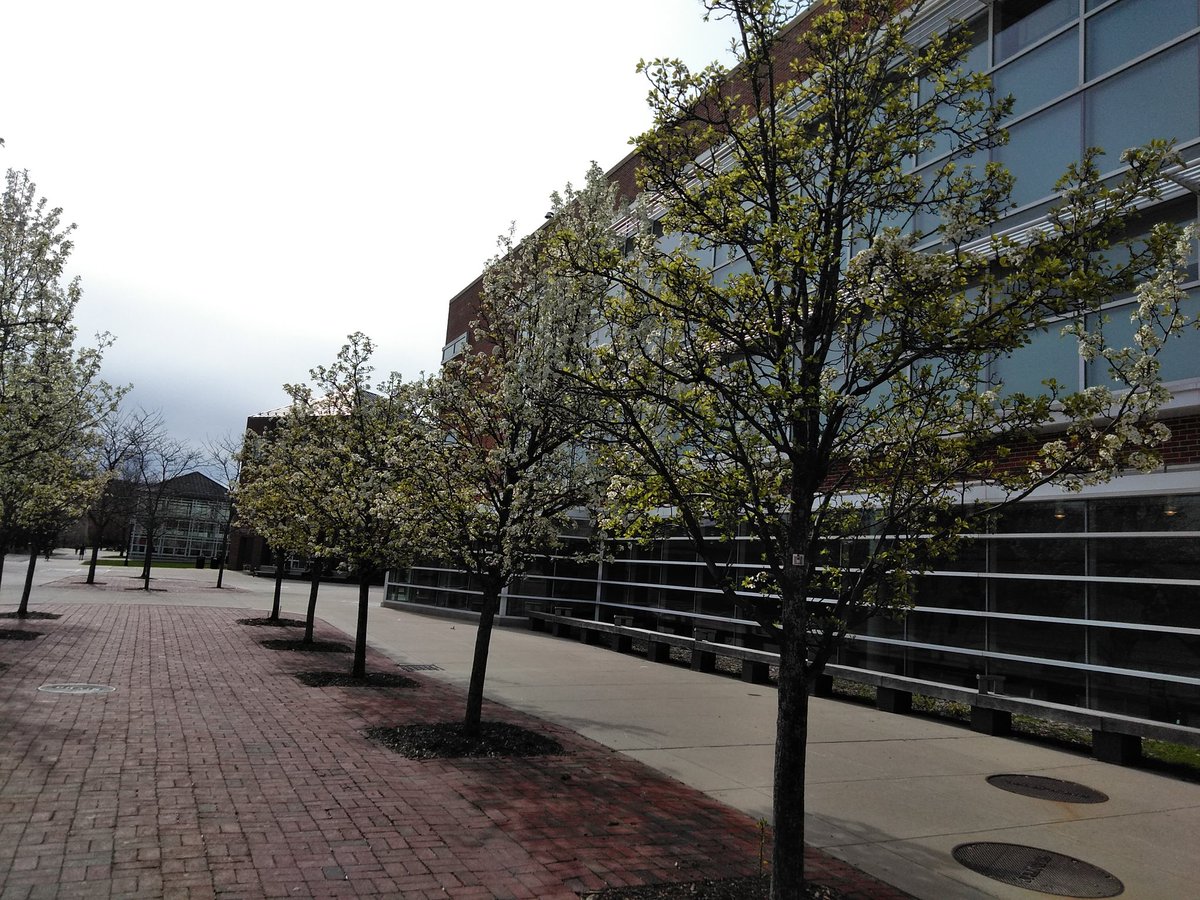
The trees on Appian Way create repetition. Four trees in a row, mirrored on the side walk give students walking down the street a unique and interesting image to look at. The repetition also mirrors the walking of students on campus as they move up and down the Way all day, back and forth with the trees “walking’ with them.
Side Note: I realize that these are not pictures that I personally took and I do apologize for that. However, I am a junior, taking 3 other upper level courses, working 2 jobs on campus, and trying to limit my time outside to reduce my chances of catching Covid. I simply do not have the time to go out and get 6 different pictures of graphic design in less than 2 days. Maybe if you had given me the weekend to do it I would’ve had time, but with the 12 graphics you want done and all the other work I am trying to stay on top of I could not fit that part of the assignment into my schedule. I hope you can understand and I did try to keep the images to designs that could be found on campus or in the surrounding area.
Gestalt Theory
Gestalt Theory explores the psychology behind graphic design and explains how the principles work in our minds. Different principles have different effects on the mind making the graphic design a more pleasing image to observe and make it easier for the image to portray a particular message.
Similarity
Similarity is an important aspect of graphic design because it allows images and shapes to be tied together even if they may not be close on the certain design. I like similarity because it can tie an image up and make it very pleasing and satisfying for the mind to observe.
Continuation
I enjoy continuation because it creates movement through a design and makes the message portrayed easier to understand through the direction of the movement.
Closure
Closure appeals to the minds ability to fill in blank space and close open shapes with what we know or assume should be there. I find this aspect the most satisfying to observe because of how it can create images with shapes that normally would not make any discernible.
Proximity
I find proximity interesting because of how placing shapes or images close together can make the mind think of how they are related to one another. Proximity allows a design to show relationships between two objects with obvious or obscure similarities.
Figure Ground
Figure ground is fun because of the optical illusions that are created using both the white and black space of an image. This aspect is very unique in that it allows for a higher degree of creativity and more utilization of the negative space.
Symmetry and Order
This aspect is possibly the more straight forward way to convey a message through graphic design in my opinion. It is easier to understand and gives the viewer a way to observe and determine a message with almost no thought process.