Six Principles of Design
White Space
White space consists of the empty space in found in design. White space can vary from a simple white background to an incorporation of white space creating a foreground design. White space is also known as negative space. The example I provided shows the Pepsi logo, which has white space in the background as well as a strip of white incorporated into the color of the design. This creates a clean-look to the logo and gives the audience a clear example of Pepsi’s trademark colors.

Repetition
Repetition is when a component is repeated throughout a design among other components. It’s commonly used to unify a composition and bring its components together. In my example of repetition, there’s a Target advertisement with multiple uses of the logo around an illustrated neighborhood colored in red and white. The Target logo repetition throughout the design brings the components of the illustration together to clearly advertise for the company.

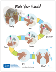
Movement
Movement refers to guiding the audience to a predetermined path in a design. It’s especially useful when creating a composition that goes through a step-by-step process, as shown in my example below. For this example, there’s a CDC guideline illustration on how to correctly wash your hands. For each step, there’s a path to it further down the page, therefore creating an element of movement throughout the design.
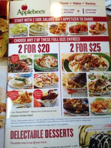
Hierarchy
Hierarchy includes the process of arranging components so that it conveys information to the audience in an organized and simple manner. Hierarchy is especially useful when there’s a lot of information to convey into a design. A classic example of this principle is found in resumes, as well as in restaurant menus. I chose this Applebee’s menu as an example because the information of food is organized into subcategories of appetizers first, then follows main entrees, and then desserts. The entrees are then further organized into price ranges for customer convenience.
Contrast
Contrast occurs when components in a design have very different properties. These properties include color, size, and shape. An example I inserted for contrast is a movie poster for “Taxi Driver” starring Robert De Niro. In this poster, there are contrasting colors of yellow and black on either the top or bottom half of the design. This contrasting in color helps to illustrate a taxi cab and a gun into the same piece, therefore creating a new visual element and creating focus on the taxi-gun centered on the poster.

Proportion/Scale
Proportion is the relationship between objects with reference to how big it is and its visual weight. When using this principle, it’s important to make the focal points of a design visible on a larger proportion/scale. For my example of proportion, I’ve included a poster of the 2020 Boston Calling music festival advertising its lineup of performing artists attending. The so-called “big name” artists are included in a bigger font size relative to the other bands performing because their popularity will strike more of the overall audience looking to attend. This is clear example of why proportion works in giving a higher importance in comparison to the smaller components, in this case the following artists attending.

Gestalt Theory
Gestalt theory directly relates to the perception of graphic designs, and tells us how we can understand our perception and interpretations of designs. Throughout the years, Gestalt psychologists have created lists to summarize basic principles of visual perception. These principles include simplicity, figure ground, proximity, similarity, common fate, symmetry, parallelism, continuity, closure, common region, and element connectedness. The eleven principles just listed show how and when our minds perceive differing visual components as being a part of the same grouping.