There are some really cool principles of graphic design. Some of them are more common than others which can be perceived as good or bad. The one thing that I like about the six I have chosen is that they can either be common and underrated or may just be over looked. The six I chose were: Movement, Repetition, Balance, Contrast, White Space, and Variety.
Movement
One thing that I really appreciate about movement is that it is able to take symbols, shapes, images etc and give them the illusion that they are moving even though they actually aren’t. This tricks your brain into thinking the items on the page are somehow creating movement, when it is just your eye following the items. We as humans are trained to read from top to bottom and left to right. This allows designers to use this to their advantage. By using the eye’s natural movement, they don’t have to actually make anything move. I think this principle is super cool and below are a few examples of movement.
-
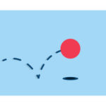
- Bouncing Ball
-
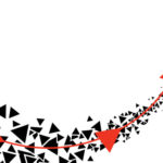
- Triangle Movement
-
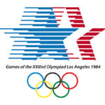
- Olympic Stars
Repetition
Repetition is one of those principals that I feel can be underused to it’s full potential or it is used to often. I appreciate repetition because it is a simple principle that can create some really cool stuff. Most people when they think of something repeating, they think it’ll get boring. The cool thing about repetition in graphic design is that people are able to repeat things enough where people can appreciate it, but not to much where it gets boring or losses it’s appeal. Apple uses repetition a lot in their advertisements by using the same material in different contexts so the company can send one consistent message across the board. Below are some really neat examples of repetition.
-
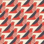
- Birds
-
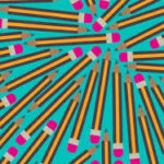
- Pencils
-
- Coca-Cola
Balance
People tend to over look how many types of balance there are in graphic design. I like balance because you can have multiple objects that take up the same space as one object, allowing your brain and eyes to relax because it isn’t as chaotic as having multiple sizes of items everywhere all over your design. Another cool thing about balance is you can have two completely different items on each side of the page and they can still balance out. Even of they aren’t exactly the same they can still balance out. I feel that balance tends to be over looked because it tends not to be as prominent as other designs. Below are some awesome examples of balance.
-
- Event Poster
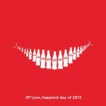
-
- Magazine Cover
-

- Movie Poster
Contrast
I think contrast is probably my favorite out of the 6 that I have on my list. That is because you can use so many different shapes and colors that your ability to contrast things, I believe, is endless. One thing that I think is cool about contrast is that it is great at catching people’s attention. Weather it be from 2 shapes, shapes on a different colored background, colored poster with different colored text. The list of contrast options can go on and on. Another thing that I appreciate about contrast is that it can be used everywhere, and I don’t think people get tired of it. One reason being that contrast can be used in so many different ways, it is always able to catch the eye. I think contrast is super cool and is able to be used in a variety of different settings. Below are some great examples of contrast.
-

- Bitten Apple
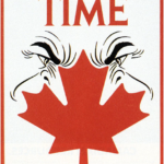
-
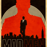
- MadMen Poster
-

- Rainbow Umbrella
White Space
I think white space is super cool because not only is it a versatile style of graphic design, it can also be an optical illusion. I think this is really cool because depending on how you use it, it can show so many different things. The neat thing about white space is that one picture can show more than one image or message. White space takes advantage of tricking your eye, because if you look at the page one way, you may see an image, but if you look at the page a different way, you could see a whole different image. That’s why I think white space is cool. It is a simple looking design that is able to convey multiple messages at once. Below are some cool examples of white space.
-
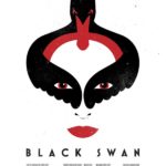
- Movie Poster
-
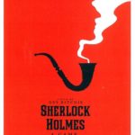
- Movie Poster
-

- Animals Poster
Variety
Variety is the last principle I have here on my list. One thing that I appreciate about variety is that, like contrast, there are so many different combinations you can choose from to make some really great designs. Another thing that I like about variety is that you can use so many different things to create cool designs. Below you can see some really cool variety designs.
-
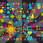
- Crazy Shapes and Colors
-
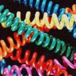
- Muti-Color Wristbands
-

- NBC Logo
Gestalt Theory
I learned that this theory states that when we look at things in graphic design, that we will take all of the separate pieces that makes the image and in our mind, make it into one solid image. That way our brain is able to understand it better and is able to make more sense of what we are looking at. As I was reading and thinking about it, I think this makes a lot of sense and the example of words kept coming into my head. I say words because I can have the word Graphic for example. The letters that make up the word are G R A P H I C. Now when you look at those letters by themselves, they don’t mean much, but if you put them together they are able to make a word that our brains can understand and we also know what the word means. I also think this applies to Graphic Design too because you could have multiple items make up a page but most of the time when you look at the page, you see the entire page, not just the lonely square for example. I think this theory makes a lot of sense and I look forward to working with it more.