Bad Kearning at Keene State
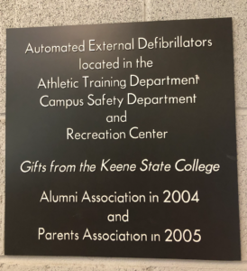
Kearning is difficult to see just with a quick glance. The letter spacing may look great and perfect when you just look at something quickly, but if the kearning was adjusted, the positive difference it would make for the design would be quite noticeable.
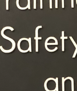
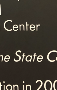
These are examples on this gift panel of bad kearning. The way the “e’s” are spaced isn’t as even as some of the letters.