Personal Reaction:
I had never seen Helvetica before this, nor knew so much about the typeface. Who knew one font could have so much history and impact. I fount the content of the movie to be really interesting, but the execution made it slightly less worth the watch. I did however, really appreciate how strongly the speakers and artists in the film felt about the font. They were so passionate about the work they had done around Helvetica, and the power it had in advertisements, newspapers, magazines, signage, and other formats that featured it. That was incredibly inspiring, something that I view to be as simple and trivial as a font, they believed to be beautiful.
Although I did not find the film to be the most compelling, I did think it was fascinating how often we see Helvetica everyday. Whether you go to the mall, are using the Internet, or even just driving around, chances are you saw at least one advertisement that used the Helvetica typeface. This one font can help convey a range of emotions and meanings, making it so popular and overused.
Mike Parker:
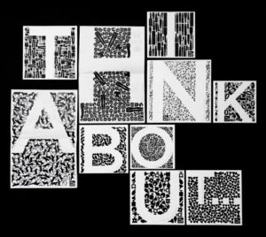
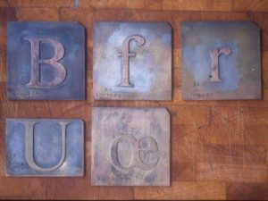
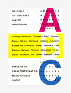
Known as the “Godfather of Helvetica,” Mike Parker was born in London and worked as a typographer for much of his life. The quote I chose from the movie that he said was, “It’s not a letter that’s bent to shape it’s a letter that lives in a powerful matrix in its surrounding space. It’s…oh it’s brilliant when it’s done well.” This quote really spoke to me because I believe what he was trying to say is that the letter itself is the backbone of typography, and the letter is not what is being manipulated but the space around it. This really changed my perspective on typography because I always focused on how the particular font makes the letters look, not how the letters make the font appear, if that makes sense. For example, in the image below with all different words on it, you can see that the letters/words created by them is the focus. All of the words are examples of Helvetica, just different versions of the typeface. It’s really interesting how different the font can look!
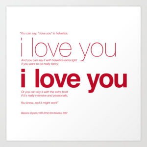
Massimo Vignelli:
“I can write the word dog with any type face and it doesn’t have to look like a dog. Some people want the word ‘dog’ to bark.”
This quote stood out to me because it really shows how Vignelli really expanded his ways of thinking and looked at this font with such a unique eye. It sounds as though Vignelli is trying to say that the meaning of words can be expressed through typeface. He looked at Helvetica and saw all of its potential. He found a way to get the consumer to feel a certain emotion based on the way the Helvetica was used and presented.

Michael Bierut:
I chose to include his quote on the power of Helvetica. “You cut to, this is after Helvetica was in full swing, same product. No people, no smiling fakery, just a beautiful big glass of ice-cold Coke, with the slogan reading. ‘It’s the real thing,’ period. Coke, period, in Helvetica, period. Any questions? Of course not. Drink Coke, period. Simple.”
I wanted to include this because I think it truly goes to show how impactful something so simple can be. When he spoke, he explained how he was disappointed he was with the ads in the 50s. He encouraged Helvetica because he felt that it would inspire change in the world of advertisements, and it did. Helvetica introduced more simplistic, easy-to-understand ads to the media. We still see a lot of Beirut’s work or work he has inspired in circulation today.